I got excited when I learned about the Ragnarok logo contest, so I decided to throw my hat into the ring.
These were the concept guidelines I gave myself when thinking about the concept.
For some reason, some of my images get rotated to landscape when uploaded using ecency. Apologies for twisting your head sideways.
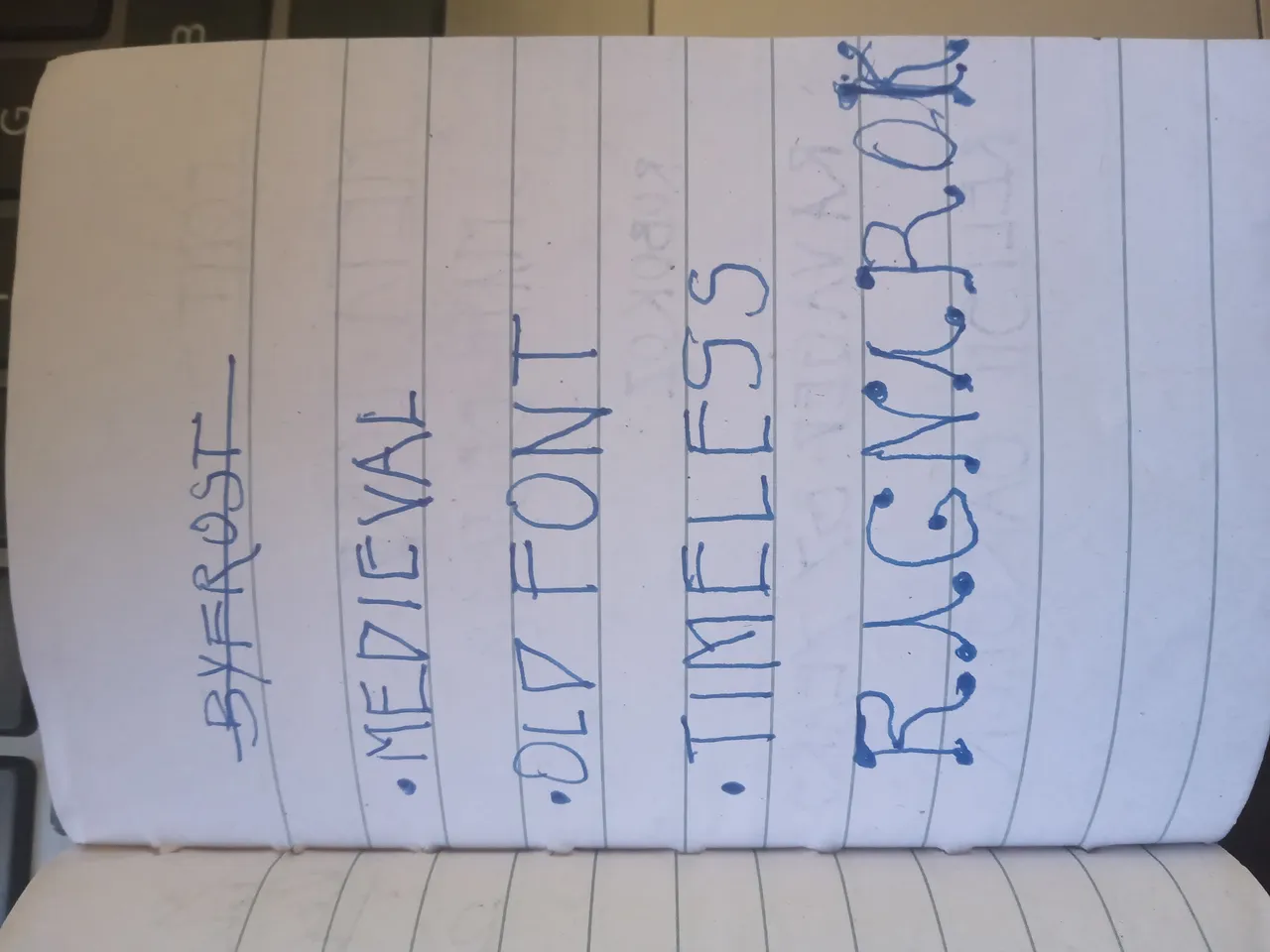
 Some of the fonts I used while trying out something that would bring out the theme of the game.
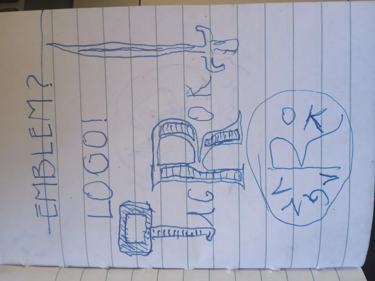 Do I include thor's hammer into the concept? And a sword? Should it be round or plain simple?
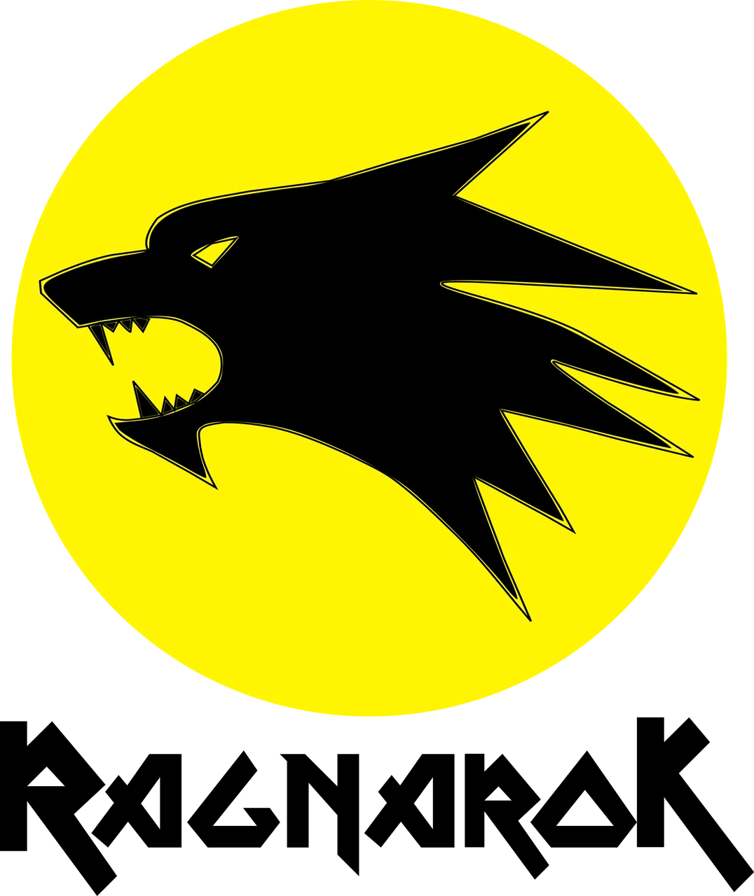
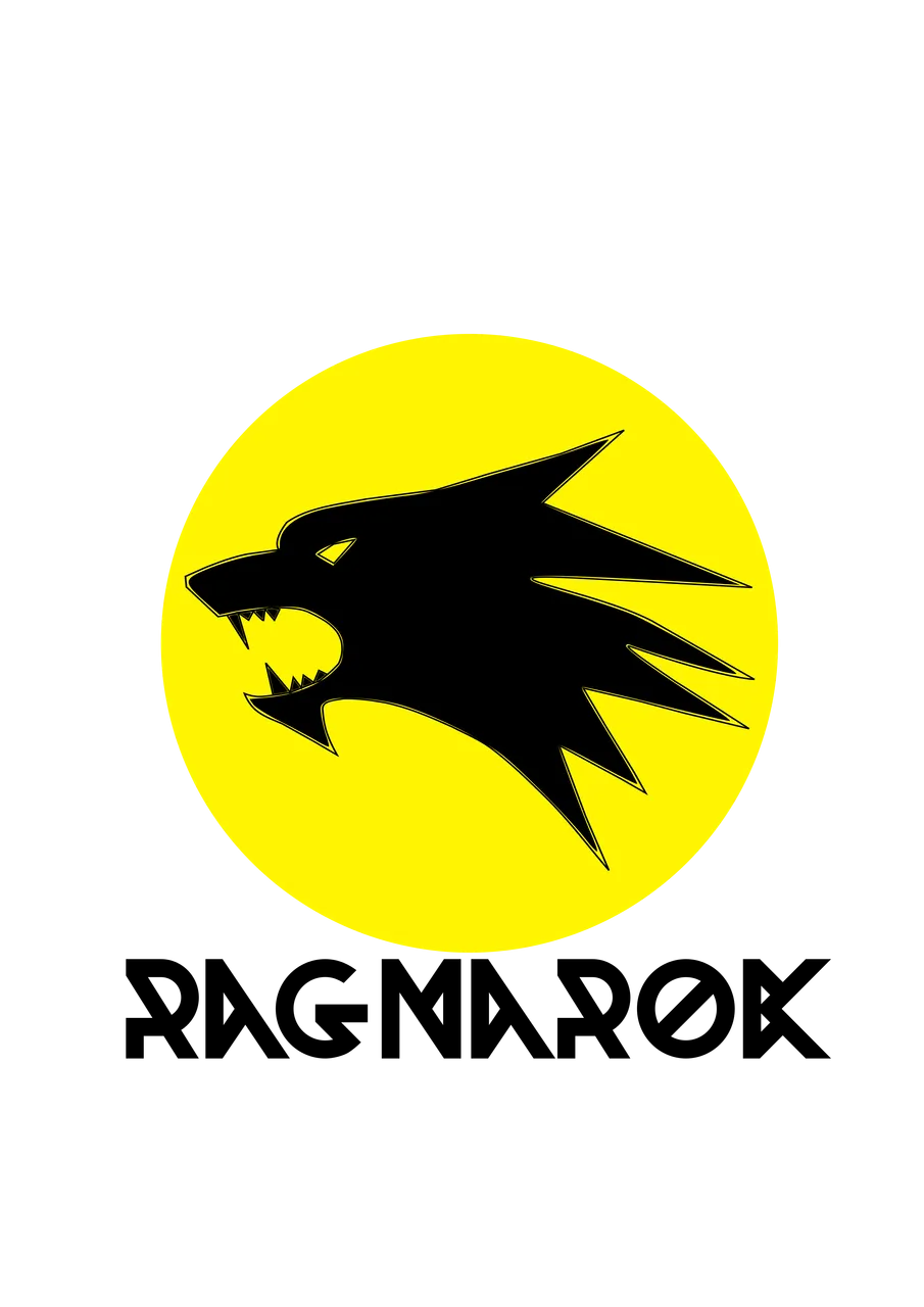
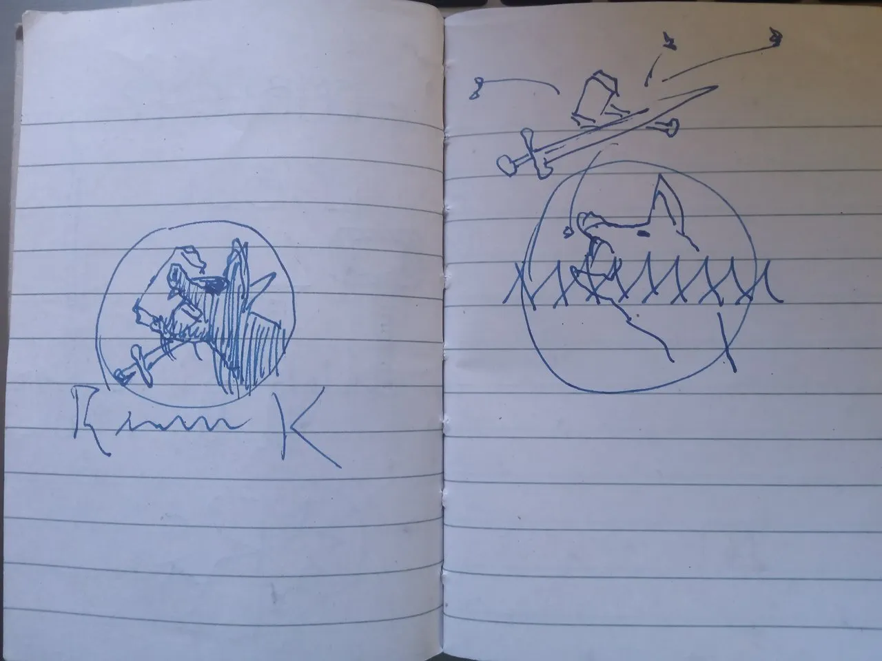 One of the scenes from the mythical story of Ragnarok that caught my imagination was that of Fenrir eating the sun. So I thought a depiction of the wolf with the sun in the background would serve as a cool concept.
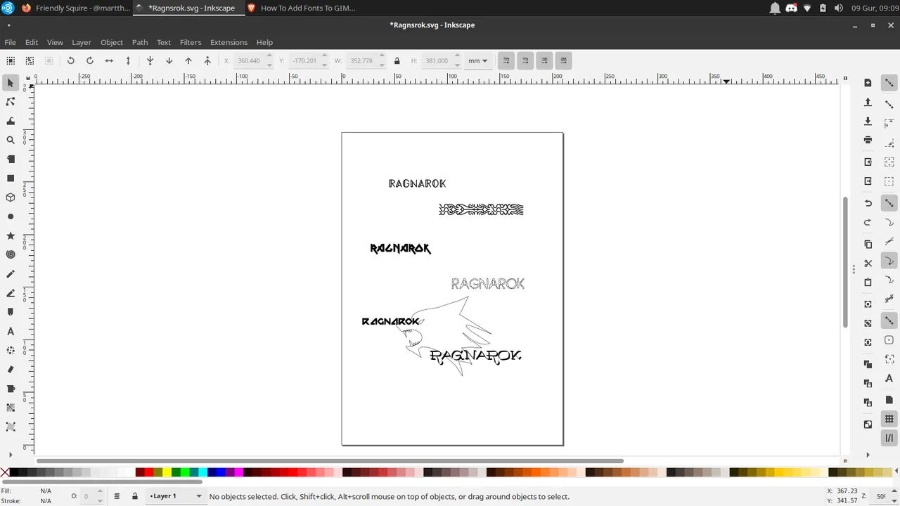 On into Inkscape. The different fonts side by side for comparison.
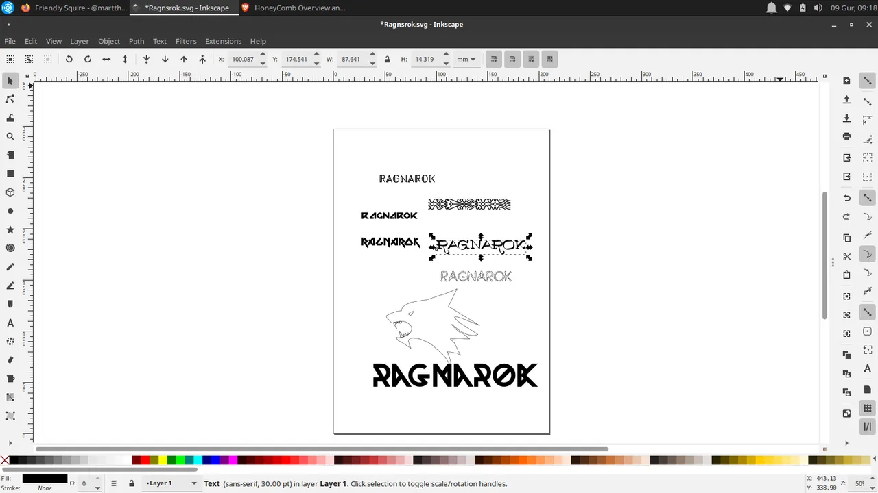 Found a new one online, thought it was really nice, with a Nordic feel and I'm guessing the gods will be pleased with it. Before they turn onto each other.
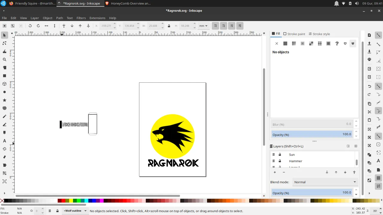 Still not sure bout the hammer.
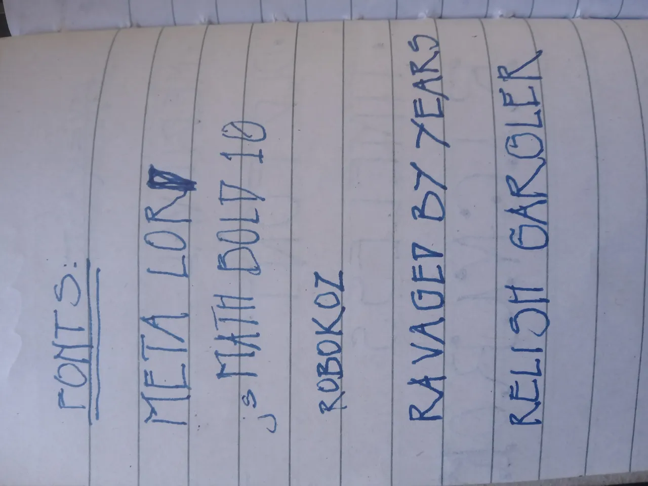
 The meta lord font is really nice
 This one isn't bad either. My preferred choice.
If selected, This logo concept is subject to improvements and adjustments where necessary.
I thought I would have enough time to come up with a polished logo, but narrowing it down to a single concept before the deadline should suffice for now.