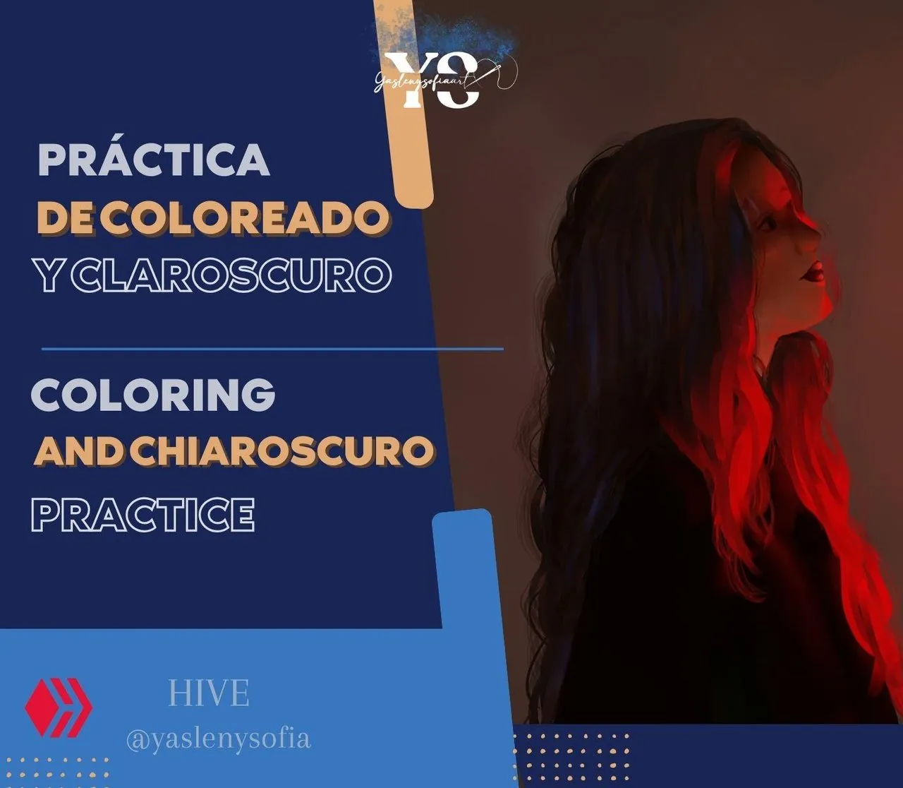
ESPAÑOL
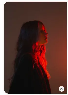
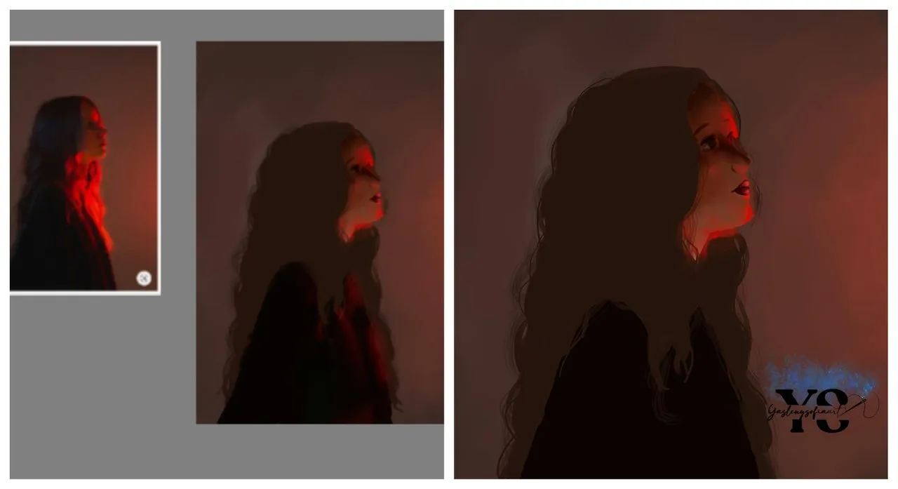
Saludos comunidad de @Sketchbook, he estado viendo y leyendo muchas cosas sobre la iluminación, tonos y colores en la ilustración, así el como dibujar cuerpos y demás elementos compositivos. Para esta ocasión, busqué en Pinterest imágenes de referencia, sobre todo aquellas que tuviesen mucho juego con las luces y sombras, la cual encontré en gran cantidad; Pinterest es un buen lugar para ayudarte en estas ocasiones. Comencé con una, donde su clave tonal es baja y la iluminación es roja, lo cual me pareció interesante de recrear.
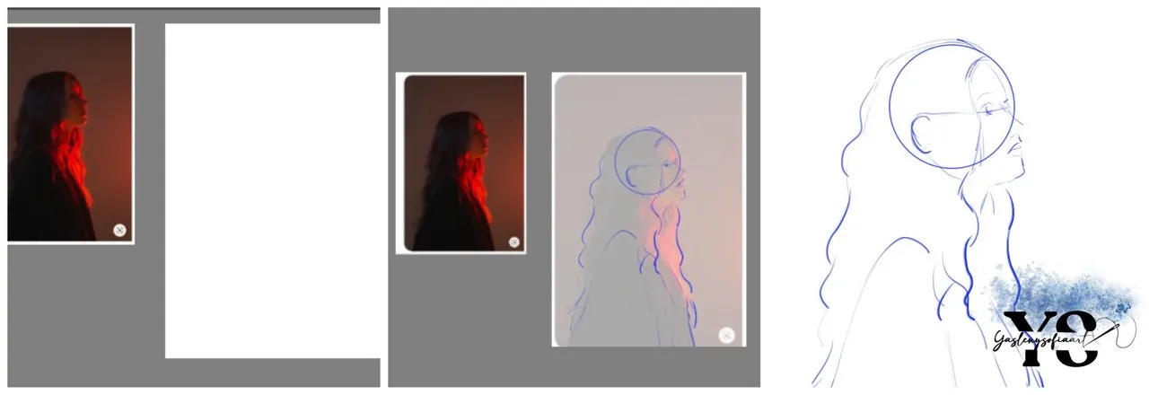
El primer paso fue hacer el boceto y para practicar la anatomía del cuerpo humano, dibujé las formas en como se estructura la posición en la que se encuentra la modelo de la foto. Ya con las líneas bocetadas, comencé pintado el fondo, ya que me acordé del consejo de una amiga desde hace mucho tiempo que, por recomendación se debería iniciar con el fondo (ambiente) y así se detalla mejor las matices y las luces que rebotan.
El fondo está compuesto por colores ocres y rojos en diversas escalas, acentuándose un rojo alto en la zona derecha-centrada de todo el recuadro. La imagen se compone de una persona en perfil con la mirada hacia arriba que, desde nuestra perspectiva es una luz lateral, pero la chica está de frente, así que, la luz para ella está totalmente frontal, intensa y unifocal.
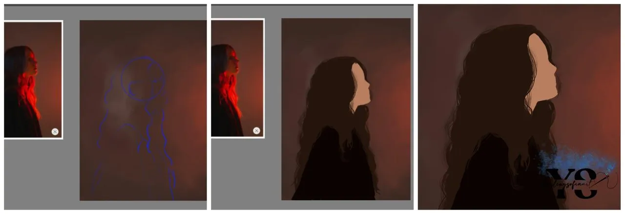
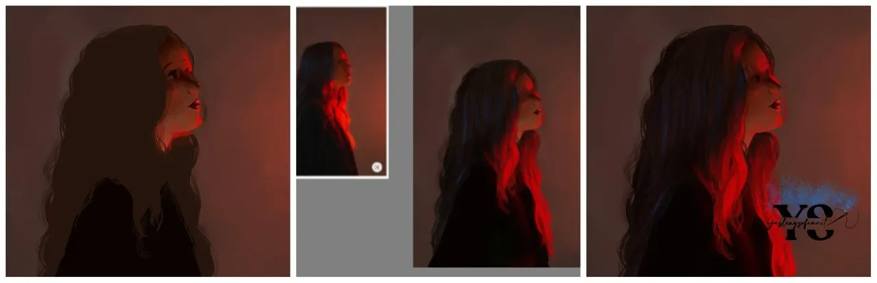
Ya con el fondo listo, procedí agregar los colores bases de la figura en cuestión, los cuales fueron un color piel, para las zonas del rostro y cuello, un color ocre para el cabello y uno mucho más oscuro, llegando a la escala baja, para la parte de la ropa.
Luego, le fui dando los detalles, como las partes con las luces rojas más intensas, los ojos y demás rasgos faciales, seguidamente el cabello y las ropas. Con el cabello, observé como unos pequeños matices azules, así que se los añadí.
En varias oportunidades, le cambiaba la nariz y el ojo, no me terminaban de agradar. Al final, la mirada no me quedó direccionando en el mismo sentido que la foto original, en vez de estar mirando hacia el cielo, está la hice como si mirara directamente al frente. Pero, debo admitir que me gustó mucho practicar las luces, sombras y la anatomía del cuerpo de esta manera, ahora quiero tomar varias referencias de Pinterest y recrearlas, para así ir mejorando poco a poco. Y, a ustedes ¿Qué les pareció el resultado?
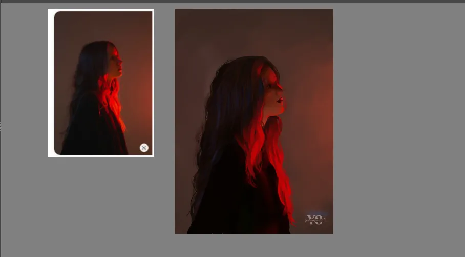
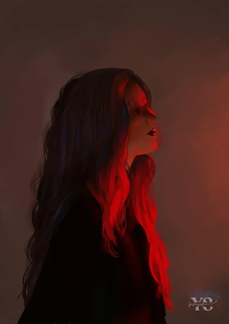
Ilustración hecha por mi autoría
Imagen de referencia: Fuente Pinterest, autor H
Programa de dibujo: Krita
Recurso: Tablet Gráfica Huion H420
Gracias por leer mi post. Espero que les haya gustado. Estaré atenta a responder sus comentarios. Pueden visitar mi blog, seguir mis contenidos y redes sociales

ENGLISH
Greetings @Sketchbook community, I've been seeing and reading a lot of things about lighting, tones and colors in illustration, as well as how to draw bodies and other compositional elements. For this occasion, I searched Pinterest for reference images, especially those that had a lot of play with lights and shadows, which I found in great quantity; Pinterest is a good place to help you in these occasions. I started with one, where its tonal key is low and the lighting is red, which I found interesting to recreate.
The first step was to make the sketch and to practice the anatomy of the human body, I drew the forms in how the position in which the model is in the photo is structured. Already with the lines sketched, I started painting the background, as I remembered the advice of a friend from long ago that, by recommendation should start with the background (environment) and thus better detail the nuances and the lights that bounce.
The background is composed of ochre and red colors in different scales, accentuating a high red in the right-centered area of the whole frame. The image is composed of a person in profile with her gaze upwards, which from our perspective is a side light, but the girl is facing us, so the light for her is totally frontal, intense and unifocal.
Once the background was ready, I proceeded to add the base colors of the figure in question, which were a skin color for the areas of the face and neck, an ocher color for the hair and a much darker one, reaching the low scale, for the part of the clothes.
Then, I gave him the details, like the parts with the most intense red lights, the eyes and other facial features, then the hair and the clothes. With the hair, I noticed some small blue shades, so I added them.
Several times, I changed the nose and the eye, I didn't like them. In the end, the gaze was not in the same direction as the original photo, instead of looking towards the sky, I made it as if it was looking straight ahead. But, I must admit that I really enjoyed practicing the lights, shadows and the anatomy of the body in this way, now I want to take several references from Pinterest and recreate them, so I can improve little by little. And, what did you think of the result?
Illustration made by my authorship.
Reference image: Source Pinterest, author H
Drawing program: Krita
Resource: Graphic Tablet Huion H420
Translated using DeepL
Thank you for reading my post. I hope you liked it. I will be attentive to answer your comments. You can visit my blog, follow my content and social networks.