𝓖𝓻𝓮𝓮𝓽𝓲𝓷𝓰𝓼
Hello dear Hive Learners, Welcome to the 19th lecture on Android App Development. In lecture 18 we use CardView to round the button to get a perfect rounded button. Before the lecture, I try the Material Design button to get a perfect round shape but I failed and that is why we learn the CardView role in design before the exact time. Today I successfully get the rounded Button by using a simple Material Design Button. With this button, we will also get a ripple effect on button clicks. With CardView we do not get the ripple effect. Today we will also write the logic for the new button that we had add-in lecture 18.

GitHub Link
Use this GitHub project to clone into your directory. It will constantly get updated in the following lecture so you will never miss the latest code. Happy Coding!.
What Should I Learn
- Get Rounded Material Design Button
- How to clear the screen.
- Use of CardView for TextViews
Assignment
- Design your calculator
- Write logic for Buttons
Procedure
We need to remove the Card View tag from all the XML code and change the simple Button tag to the Material Design Button tag.
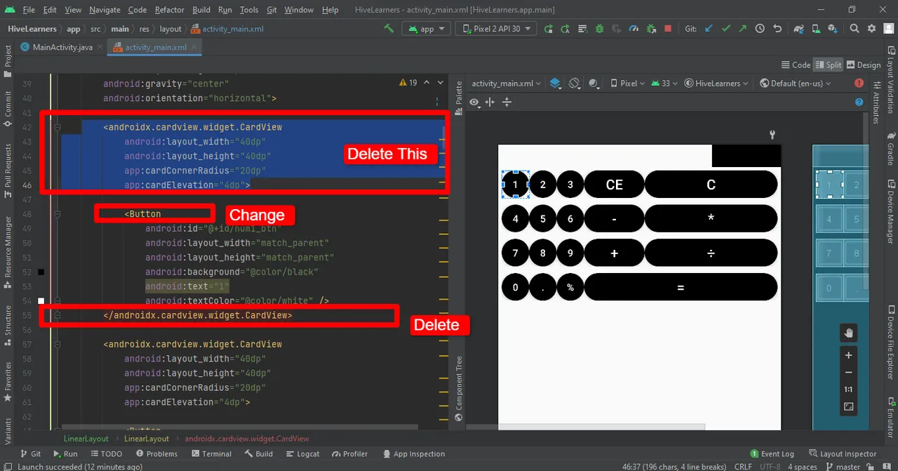
We also need to change some attributes in the Button. Here is the code for the full rounded Button. We add cornerRadius, marginRight, background tint, and width of the Material Design Button. The line style="@style/Widget.AppCompat.Button" is very important to get the corner rounded.
        <com.google.android.material.button.MaterialButton
            android:id="@+id/num1_btn"
            style="@style/Widget.AppCompat.Button"
            android:layout_width="40dp"
            android:layout_height="wrap_content"
            android:layout_marginRight="5dp"
            android:backgroundTint="@color/black"
            android:text="1"
            android:textColor="@color/white"
            app:cornerRadius="20dp" />

Repeat the same steps for all the buttons.

Now we add the CardView for TextView. We apply the CardView on screen_1 and to screen_2 to make it more beautiful.
 <androidx.cardview.widget.CardView
            android:layout_width="0dp"
            android:layout_height="wrap_content"
            android:layout_weight="1"
            app:cardBackgroundColor="@color/white"
            app:cardCornerRadius="4dp"
            app:cardElevation="4dp"
            app:cardUseCompatPadding="true">

            <TextView
                android:id="@+id/screen1_tv"
                android:layout_width="match_parent"
                android:layout_height="match_parent"
                android:textAlignment="center"
                android:textColor="@color/black"
                android:textSize="24sp" />
        </androidx.cardview.widget.CardView>

        <androidx.cardview.widget.CardView
            android:layout_width="wrap_content"
            android:layout_height="wrap_content"
            app:cardBackgroundColor="@color/cardview_dark_background"
            app:cardCornerRadius="4dp"
            app:cardElevation="4dp"
            app:cardUseCompatPadding="true">

            <TextView
                android:id="@+id/screen2_tv"
                android:layout_width="40dp"
                android:layout_height="wrap_content"
                android:textAlignment="center"
                android:textColor="@color/white"
                android:textSize="24sp" />
        </androidx.cardview.widget.CardView>

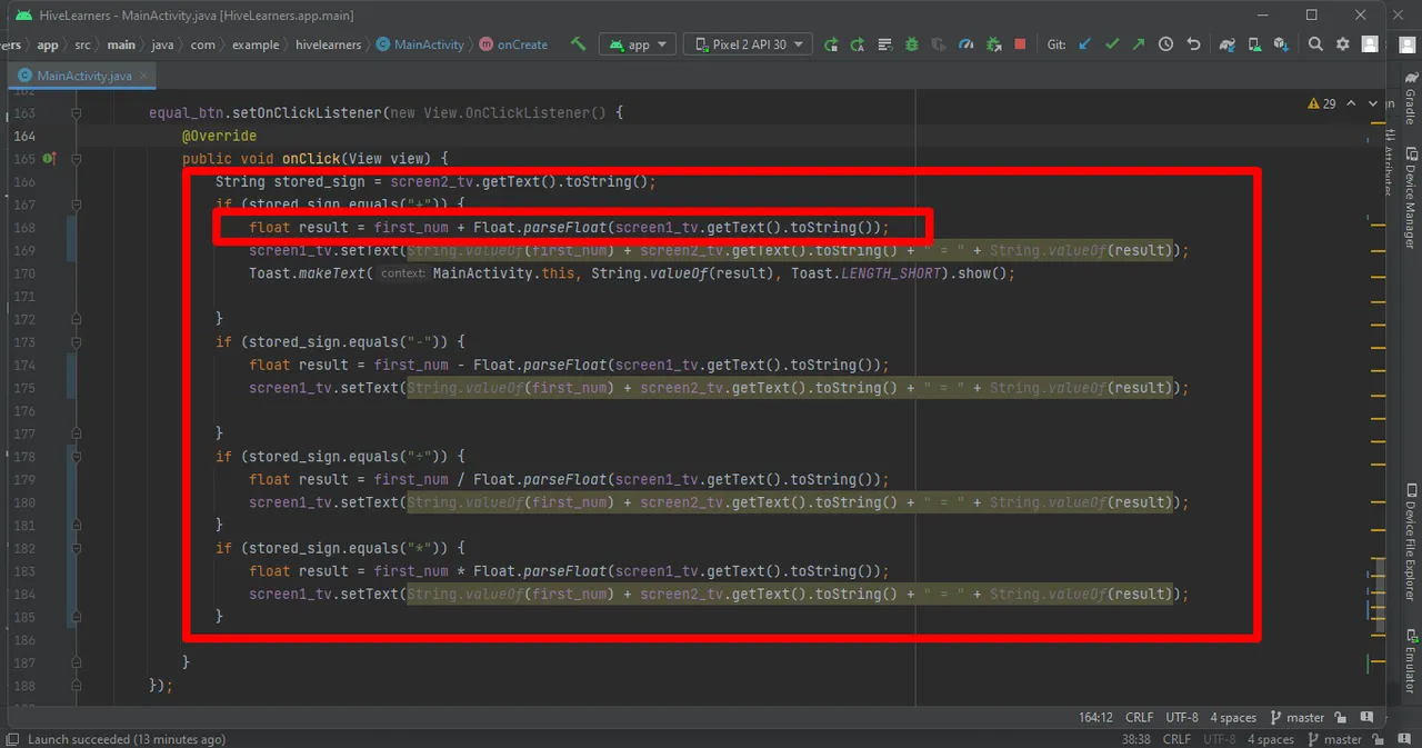
Now we will write the logic for all the newly added buttons. I also change the coding for the equal button. Now it is supporting the Float. It means now we can add the floating number.
Implement the on-click listener for the del_btn
del_btn.setOnClickListener(new View.OnClickListener() {
            @Override
            public void onClick(View view) {
                screen1_tv.setText("");
                first_num = 0;
                screen2_tv.setText("");
            }
        });


Thank You