Hey Hive Community! I know I said in my initial blog post that I would make posts a daily thing, but I can't have anything official while my profile pic is from a fairly predictive cyberpunk pc game released in 2000 ("Deus Ex", someone will reinstall it 😆).
Unfortunately my job building up the 5G network prevents me from doing a ton of multitasking, so I spent the past 2 weeks designing a personal brand logo and profile pic. I continue to interact with the community to let everyone know I still exist.
This piece was made using Gimp and Inkscape, on a 9 year old Samsung laptop running Ubuntu Linux 20.04 LTS. I only used the built in track-pad on the laptop.
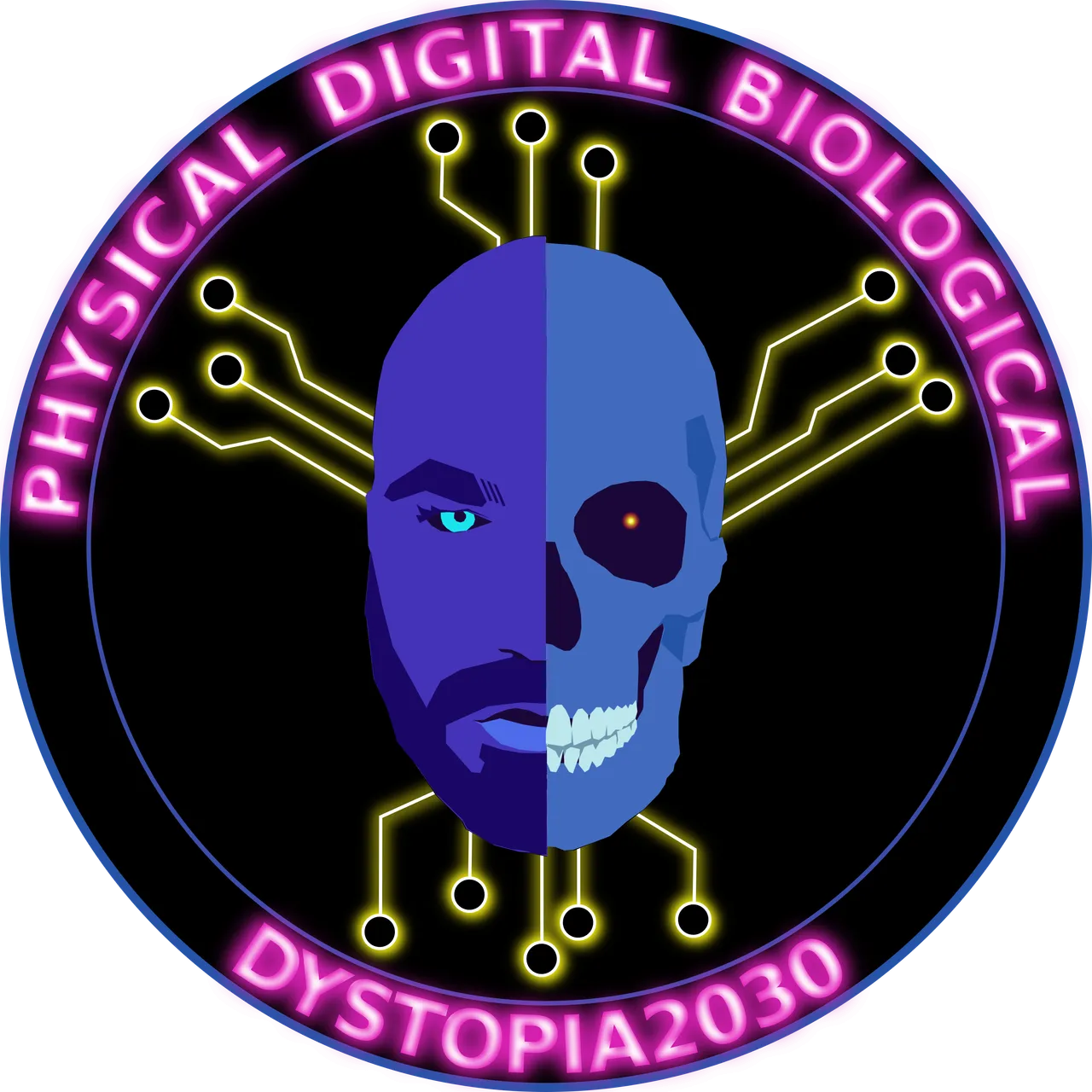
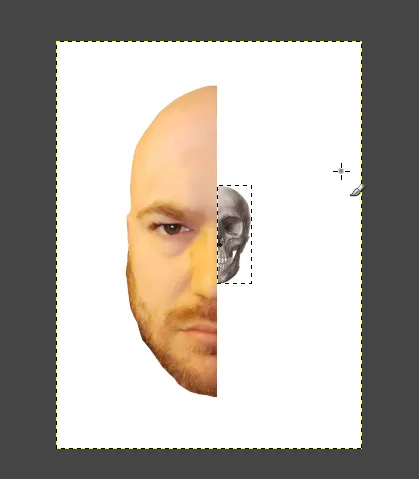
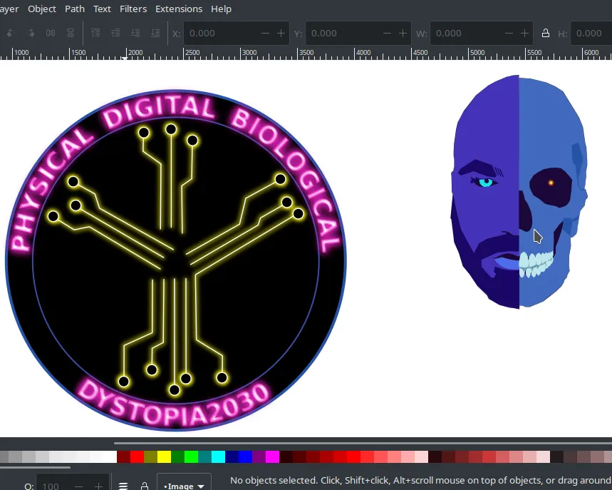
For the first phase, I imagined fusing a fully fleshed head with a skull. This would represent the "physical" and "biological" aspects of Klaus Schwab's description of the 4th Industrial Revolution ("4IR" going forward in this post). To make this I used my own face (yes I'm real!) and a pic of a skull I pilfered from the internet, only to be used as scaffolding. Don't hate.
 |  |
|---|---|
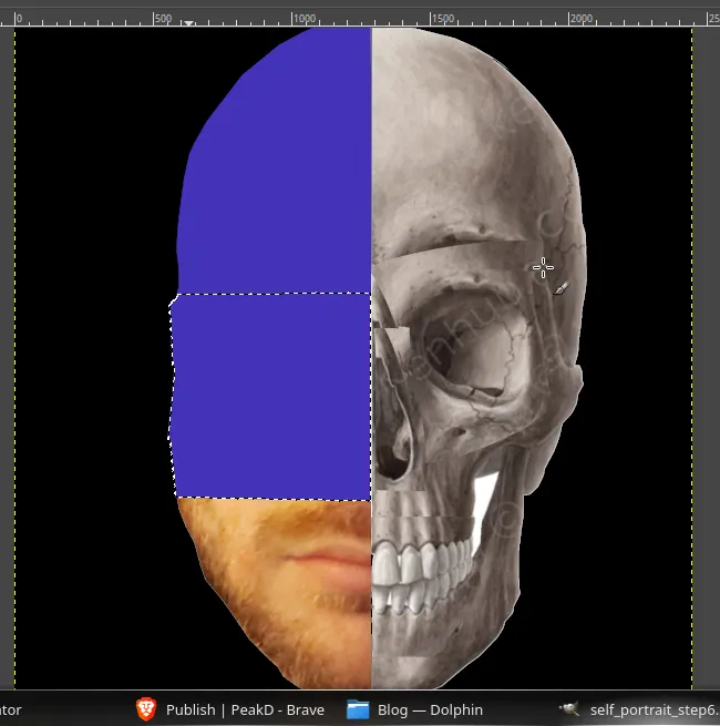 | 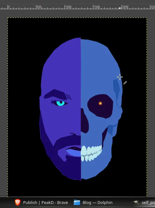 |
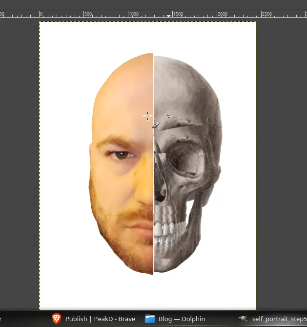
This part was done in Gimp. I used the transform tools to get the skull to somewhat match up with the form of my head. The Cage Transform tool was a big help in shifting the eye and nose cavities. After that I used the select and fill tools to color things up. I used a synthwave-cyberpunk type of palette for my colors. I used the blues for my portrait so things wouldn't be too bright. I used a neon blue for my iris to convey an augmented feel and I think the little red glow in the skull eye socket was a nice terminator touch. The final result, exported from Gimp, became my new profile pic, which I promptly uploaded as soon as I was done.
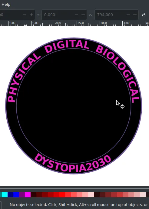
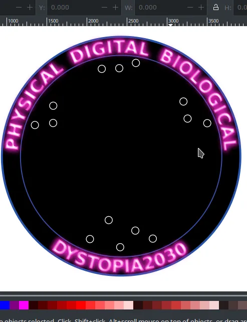
Now, I couldn't just have this mashup of my portrait and a skull as the logo by itself. I'm missing the "digital" part of Klaus Schwab's description of the 4IR. For this portion, I imagined a circular logo with my hive moniker and the 3 aspects of the 4IR. I didn't know how I would eventually organize them, but I eventually arrived at an arrangement I liked. Further still, I imagined integrated circuit traces leading to my portrait.
 |  |
|---|---|
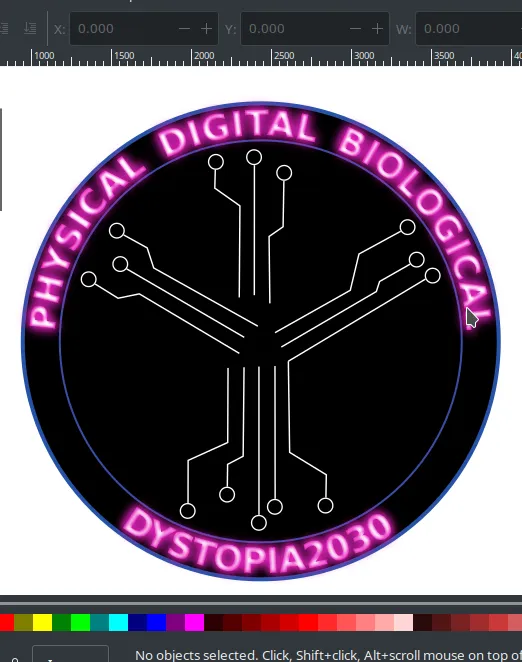 |  |
I used Inkscape for this part because I wanted portions of the logo to have a glow effect. It was too time consuming to do this in Gimp. At first I didn't know how to make the glow effect. I tried a method in which you use the interpolation extension from, say, white to pink and then using a Gaussian blur on the copies made by the interpolation. Recombining the copies with the original will make the glow effect. This was rather complicated with the text, so I found an alternate method. I made my text white and then used the drop shadow filter, both inward and outward, with the color I originally wanted the text to be. I found the filter worked well enough. I did the same with the traces, but only outward drop shadows were necessary. I chose yellow for the traces because it was complimentary to the blue of the portrait I was going to add to the center. It helped to break up the pinks and blues with something markedly different.
Next order of business for me is making a thumbnail template for my posts.
Thank you for reading. I hope it was helpful and informative.
**All images in this post are mine EXCEPT for the skull I used for scaffolding. The source is here.