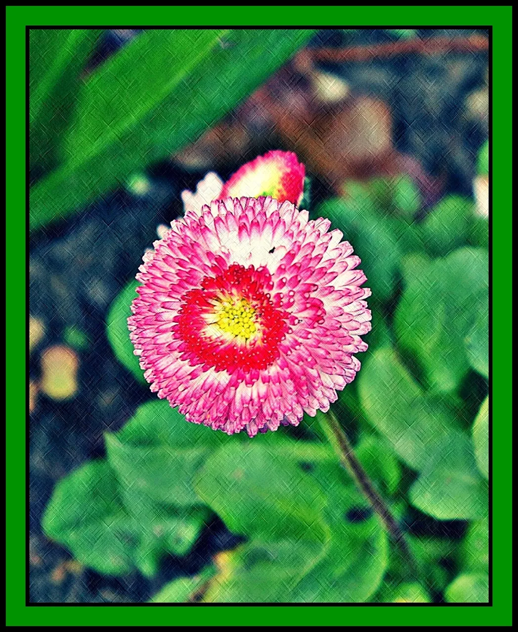
I love Photoscape. Free, easy-to-use and an excellent tool for transforming an okay picture into something rather splendid.
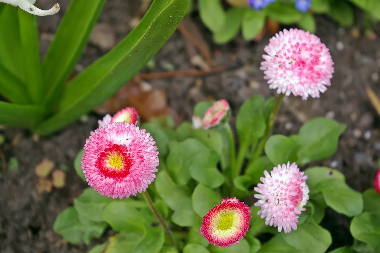
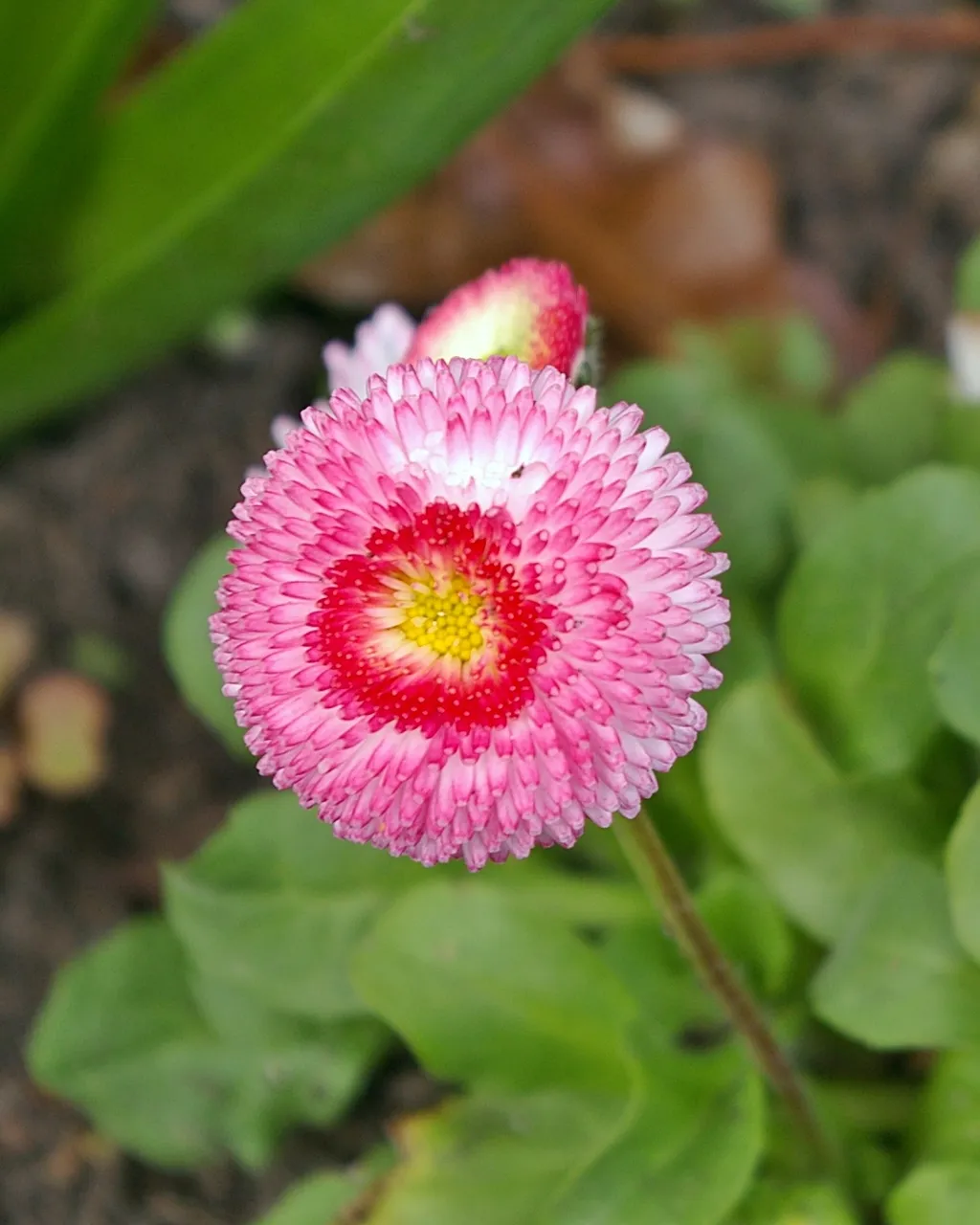
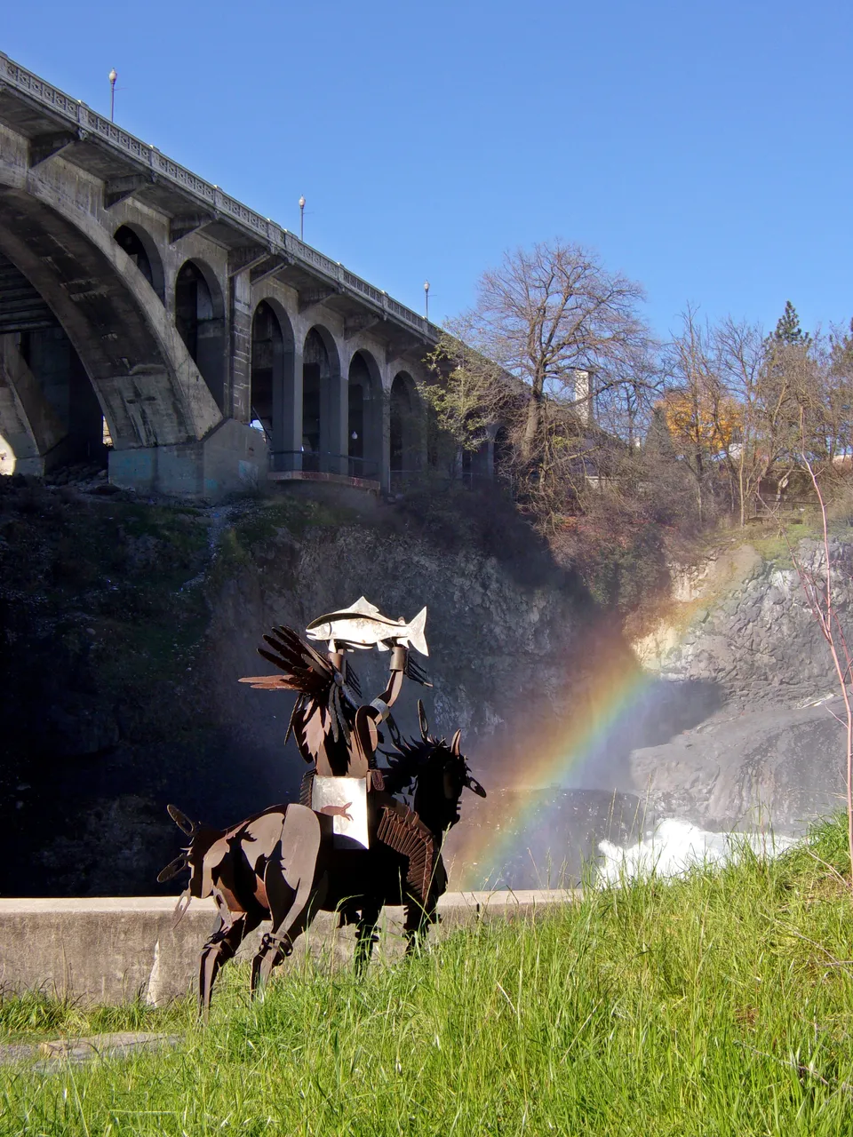
Please follow along as I start with this rather uninteresting picture - okay, but nothing spectacular.
Step 1
Crop. I often use the 8x10 dimension because it works better on most products at CafePress and RedBubble.
Next, I do some basic photoediting that helps about 90% of my photos.
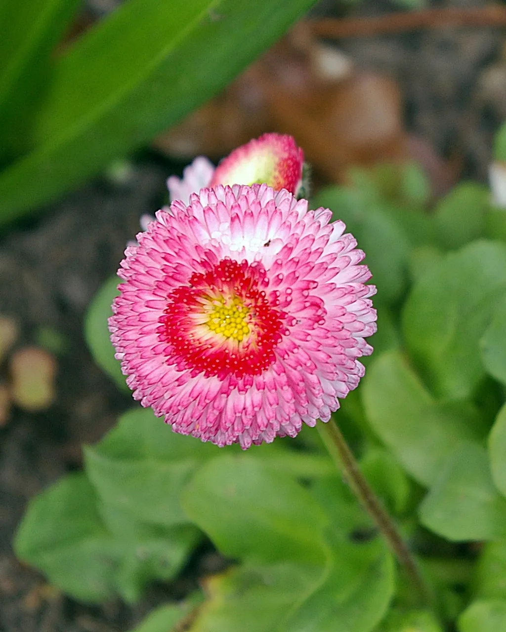
Step 2
auto-level. This works well for the vast majority of my pictures, but sometimes, it's overkill, so I'll undo it and repeat at lower settings.
Step 3
sharpen. Again, this works well for the vast majority of pictures. It works less well for close-ups of people.
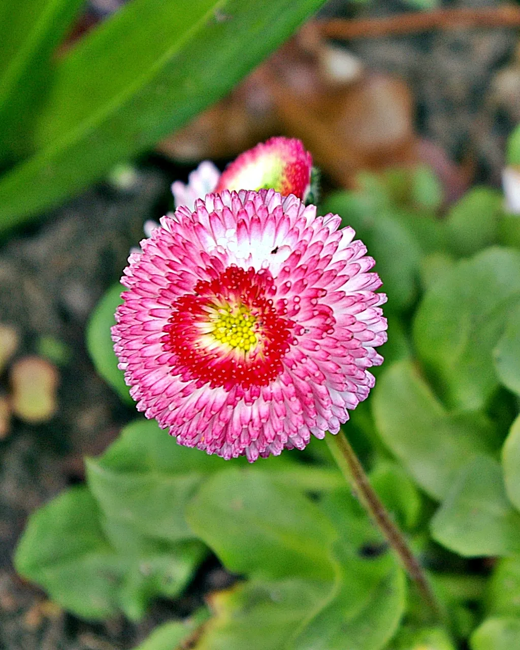
Step 4
color enhance. This one often goes afoul because there's only one setting for it which is often too strong. But this one turns very nice. It almost could have used another touch, to be honest... but let's see where we get before we make that decision.
Step 5
contrast enhancement. I often start bold and go with "high" on this setting. Usually, it's a very nice touch.
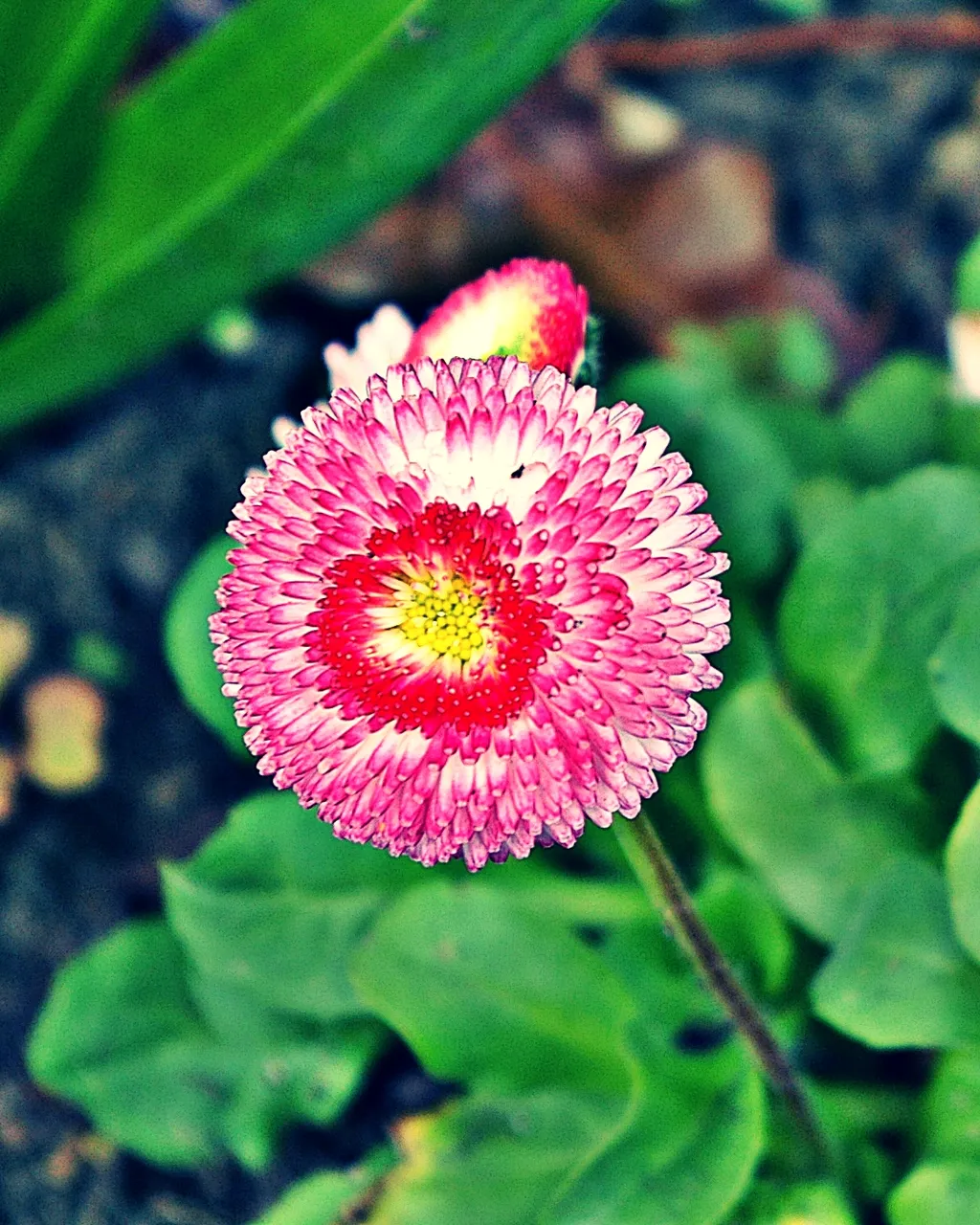
Step 6
backlight. This feature makes dark areas lighter. Be cautious as it's easy to overdo this one, but most images take one or two hits of this button without trouble. This image is really beginning to "pop" now!
Step 7
film effect. This is totally optional and totally up to your artistic eye, but I love the "cross process" option and will generally go with the "medium" setting. I like the richness this effect gives.
Step 8
texture. Another totally optional step and totally up to the artistic eye. I particularly like the cross-hatch effect of doing the diagonal line, reversing the image, repeating the diagonal line and re-reversing back to the original view. This is very useful when the depth of field was lacking in the original, and you just need that additional sharpness, but in a soft fashion. Here is the image before I reverse it back.
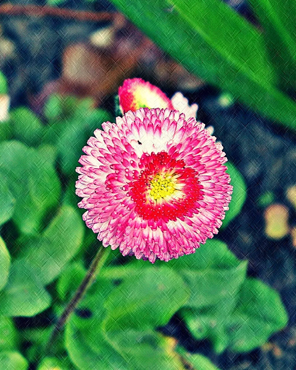
Step 9
margins. Totally optional, but when I'm transforming a photo salvage, it just feels more "polished" if I give it a frame.
I used 10 pixels of black, 50 of the green and then another 15 of the black. This preference changes quite frequently. You could even widen the middle margin in order to put your url, the image name or something else inside the frame.
And there you have it. I often go over to GIMP for a step or two, but I didn't feel that need with this image.

If you haven't already, please check out my other photo posts from the past few days:
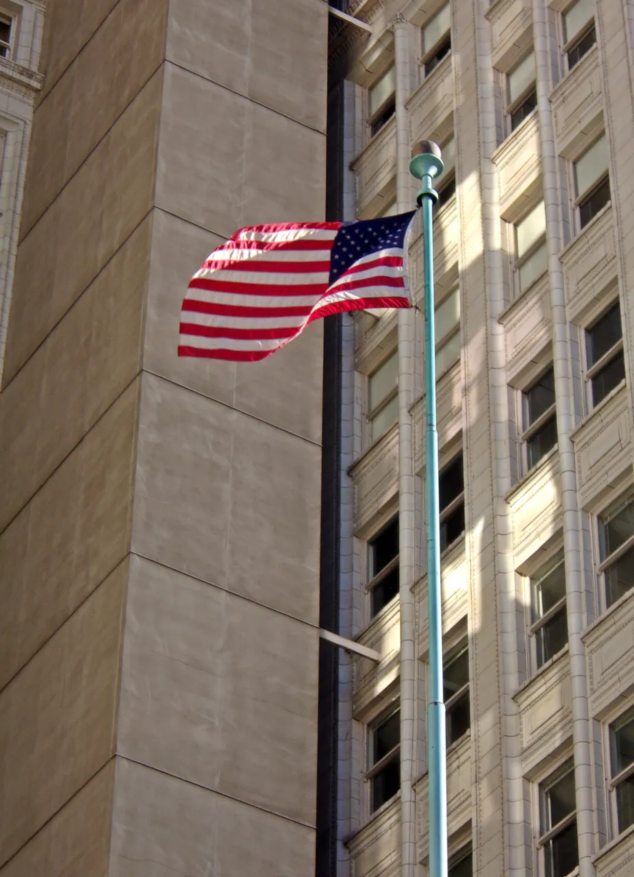
https://steemit.com/photography/@viking-ventures/6i4boa-old-glory-spokane
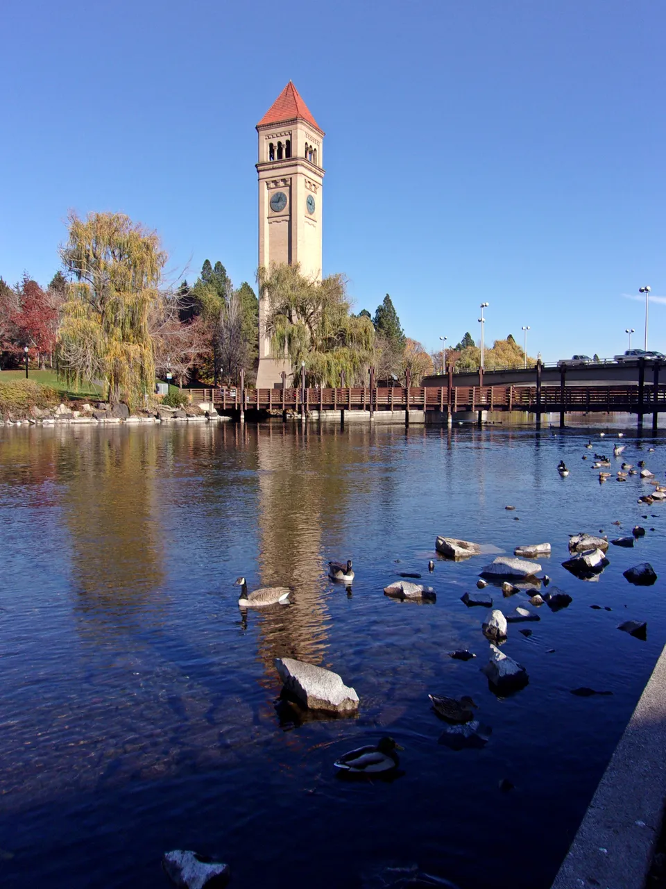
https://steemit.com/photography/@viking-ventures/clock-tower-river-view-reprisal
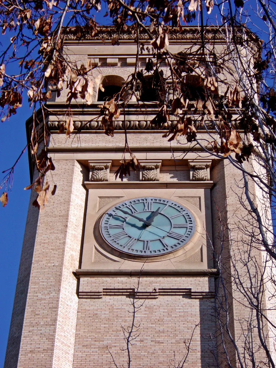
https://steemit.com/photography/@viking-ventures/fall-leaves-clock-tower-reprised
https://steemit.com/photography/@viking-ventures/salmon-legend-reprisal
Lori – photographer at Viking Visual, author, student-of-the-world.
Follow, upvote and resteem me here and on Facebook
Check out my work at: RedBubble, ImageKind, and CafePress.
Camera has changed from time to time, the photographer has not. :-)
Unless otherwise stated, all photos are original to me and © 2008-2018.