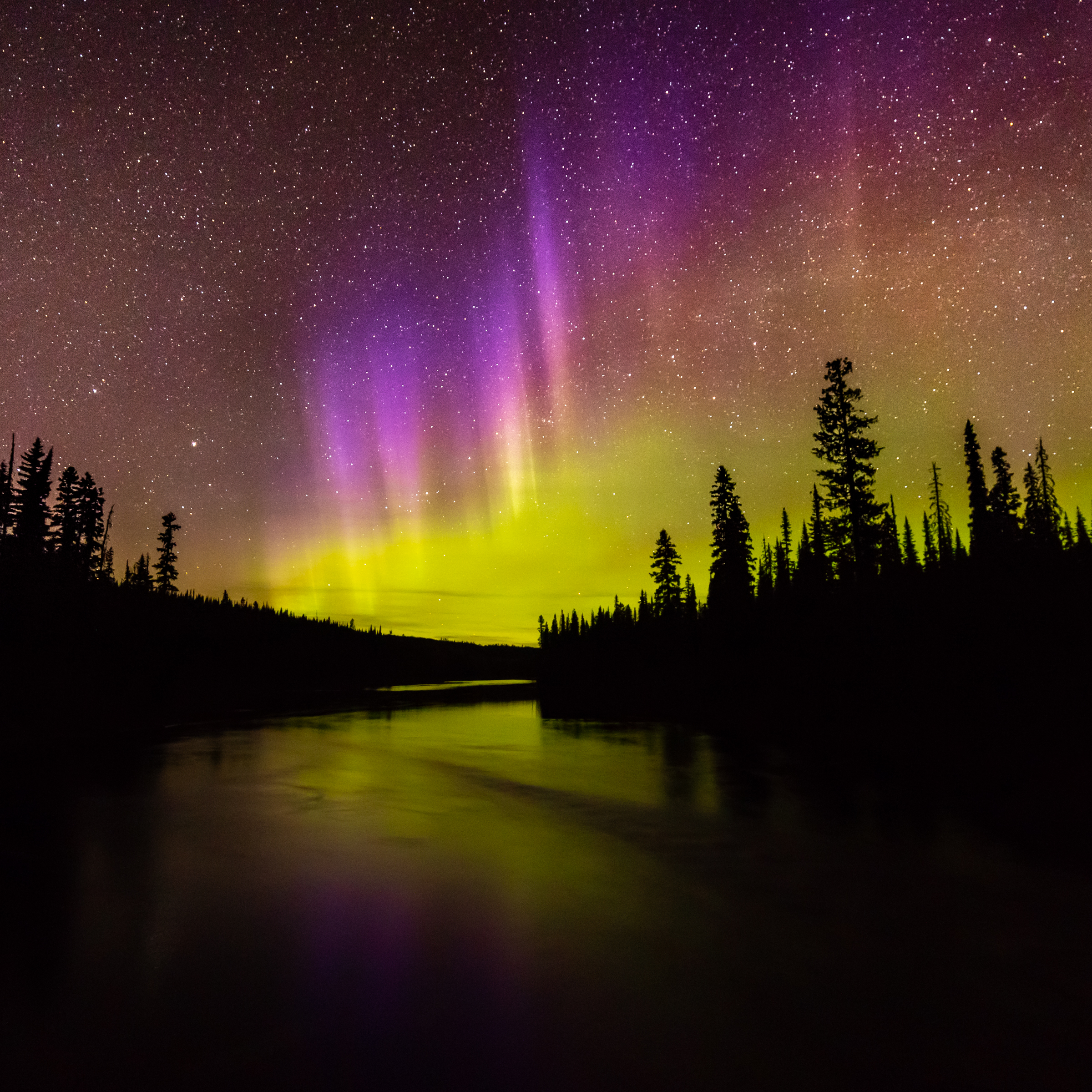
This is a shot of the Aurora Borealis or Northern Lights over the Crooked River this past week. The Crooked River sits at 54 degrees North in Northern British Columbia. It is a long exposure on a particularly dark night and I was happy to capture my first high altitude blue/purple fringed aurora. The blue/purple fringe on the top comes from the interaction of the solar wind with hydrogen and helium in the ionosphere. Below that is the band of red or blood aurora that forms around 250 – 500 km from high energy state excited oxygen atoms emitting light at 630 nm. The bottom layer is the more typically seen green aurora that forms between 100 – 250 km by excited oxygen atoms emitting light at 557.7 nano-metres.
At the lower edge of the curtain (below 100km), the density of molecules doesn't permit oxygen to emit light. It is however possible to see a low altitude fringe of blue or red below the green oxygen layer that comes from Nitrogen atoms either in its ionised or excited states respectively. This is not present in this photo and is typically only seen at very high latitudes when standing under a powerful overhead aurora.
I would like to talk a little about white balance when shooting auroras as there is a lot of confusion out there. Looking at the science of light the true colour of the aurora is best represented using a 'daylight' setting of white balance (which is typically around 5200K). I like to keep my shots as close to scientifically representative as possible and have used a white balance of 5150K for the shot above. The challenge is that most people expect the primary part of the aurora to be green, not a dirty yellow like in the shot above. After all I did say that the green band is emitting green light at 557.7 nano meters; so why can't you just adjust your white balance for that! I have done that for the shot below which has a white balance of 4000K.
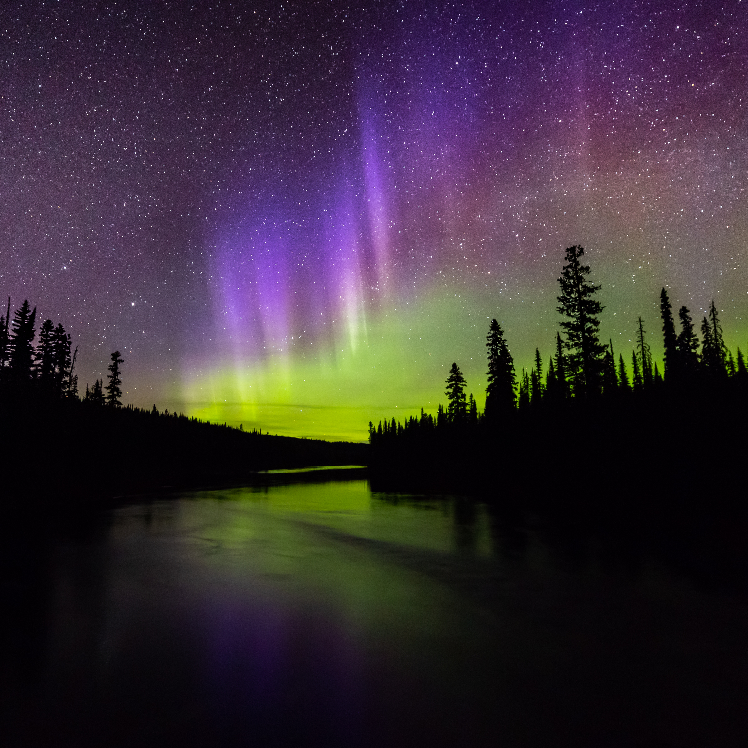
This might seem more natural to people with a greener aurora and a blacker sky. But it's not accurately representing what was happening. The green band actually does have a yellowish tinge as we are looking at the auroral oval on the horizon from a long way away. This happens for two main reasons. Firstly the shallow angle of observation on the horizon causes green and red bands to overlap and when you mix those primary colors your generate yellow. Secondly there is significant atmospheric distortion as you look towards the horizon which shifts the colour balance towards the red end of the spectrum. Both of these are in contrast to the vivid green you see with overhead auroras which should be represented as green in photos.
Adjusting the white balance down to a lower K value to achieve a green aurora and compensate for these colour shifts would be similar in concept to taking an orange photo of the sunset on the horizon and adjusting the shot to a much colder white balance to make the light from the sun white again. Not only would this not represent what was happening in reality, it would also distort all the other colors in the shot which were not subject to the same shifts. Importantly in the case of this aurora shot you have lost your red band which has now become purple. The red band should be much closer in appearance to its 630 nm wavelength than the green band is to 557.7 nm. This is because it is higher on the horizon and passes though less atmosphere before we see it (so less particulate pollution and water vapour). There is also no overlap in the center red section with the bright green lower altitude band.
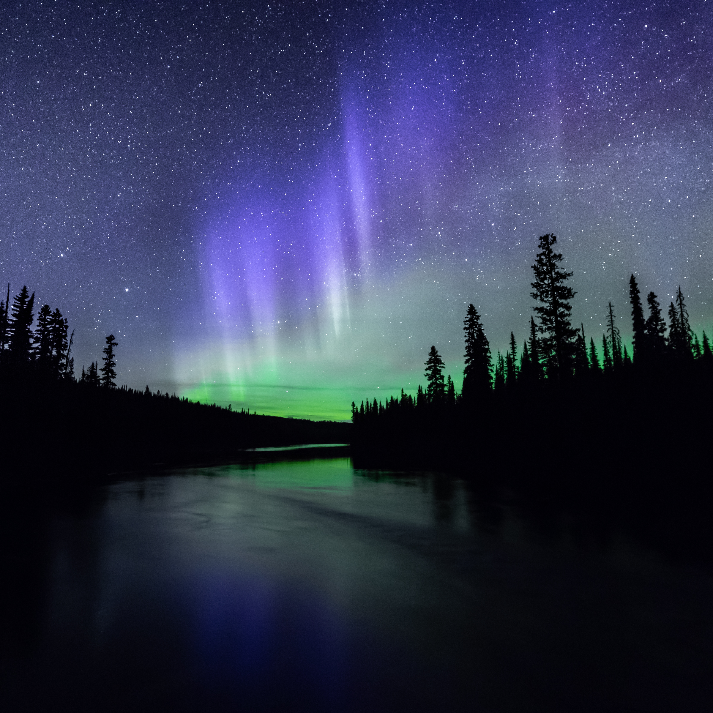
There is a trend at the moment on social media to use very low white balance numbers between 2500-3000K when shooting auroras. This gives you a bit of a science fiction look with a nice black sky. It fits with peoples view of the sky when looking with their own eyes, as it tends to remove all the natural warm airglow that the camera picks up (which comes from chemiluminescence and is not aurora related , you can read about it here). As an example I have posted below the same shot again with a white balance of 3000K to demonstrate this. To achieve this however you have now completely lost the red band from the photos.
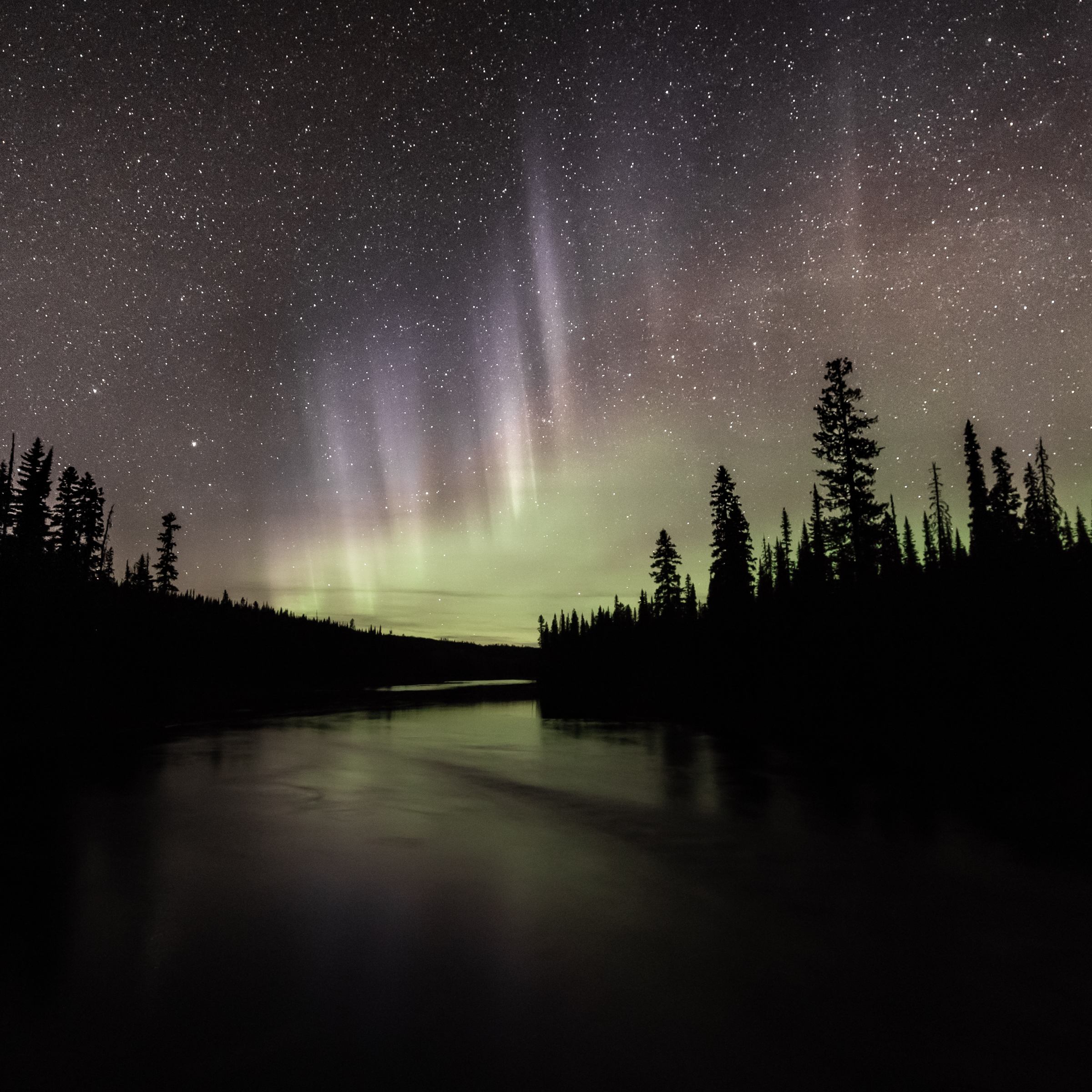
In short there is no "right or wrong" answer to how you should represent the aurora. After all photography is an art form. Personally as I have an engineering background I like my shots to be closest to the what was actually recorded on the sensor from a scientific phenomena perspective. The challenge is that this is not how we see the aurora to our naked eyes. We see using both the cones and rods in our eyes when looking at the night sky. Our rods operate in B&W and are much more sensitive, so we tend to see most of the night sky and the red and purple beams of the aurora in black and white. We also don't perceive there to be any colour in the natural airglow, the sky looks black to us at night. If the aurora is strong enough, we then start to see the very bright pulsing bands of green using our cones. The density of the atmosphere is higher in the lower altitudes and the aurora is physically closer to us, both create increased intensity of light. So we end up looking at a black and white background with pulses of vivid green that your brain latches onto.
I have done one final edit of the photo to try and represent what it was like to actually stand there and witness it. Don't let this shot put you off aurora chasing, overhead auroras are much more spectacular to the naked eye than ones on the distant horizon and you can see vivid pulsing colors all across the sky (such as seen in my post here where the storm was strong enough to cast a shadow). From a photographic perspective however you typically won't catch the colored fringe in the ionosphere from an overhead aurora due to the sheer intensity of the green light which washes out all the other colors (with the exception of the colors related to the low altitude Nitrogen fringe I talked about at the beginning of the article). It's the faint high altitude colour fringes captured on the camera which make this particular shot special for me. There is some irony that the best auroras to witness in person (high intensity overhead auroras) don't necessarily make the best photos as the unearthly green glow over everything removes all contrast in your photos and drowns out any of the more subtle colours of the aurora.
Hopefully you found all of that helpful; let me know which one you prefer! If you like learning about auroras I also have a detailed post on the aurora related phenomena called 'steve' here. I also have a post up of a rare blood aurora here .
Robert Downie
Love Life, Love Photography
All images in this post were taken by and remain the Copyright of Robert Downie - http://www.robertdowniephotography.com