Dear My Frineds,
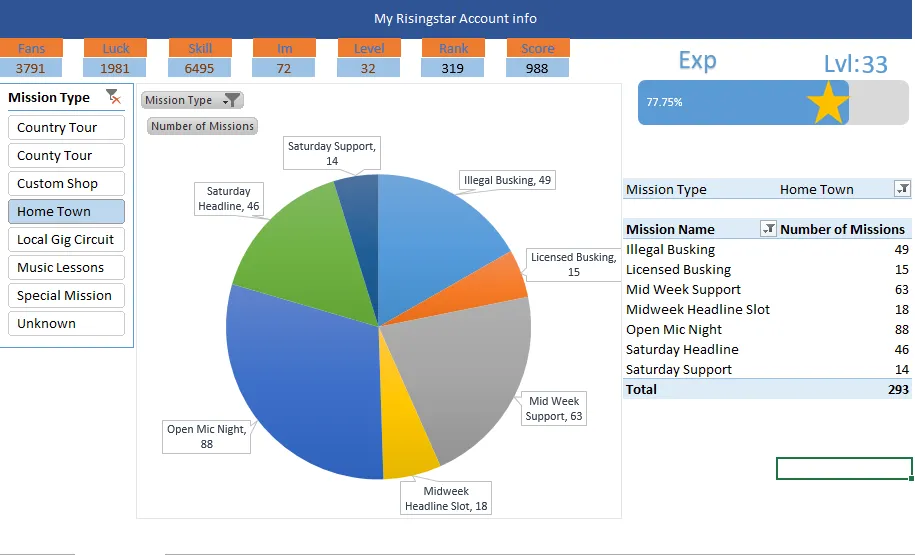
I would like to show you what I have done. I have updated my excel sheet to look more beautiful. Please take a look at it. This is the mission for Home Town. If I remove the filter my pie chart will be mess up so I will show only one place at a time.
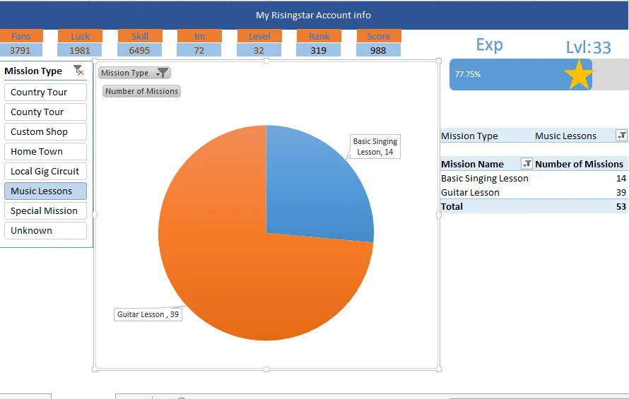
I removed legends to make the pie more bigger and I change the data label like the following image. I changed Data Label Shape to Rentangle Callout. This is more good looking I think.
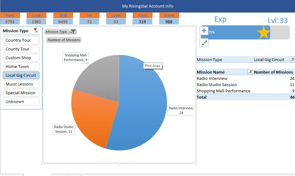
Below image is the for the Local Gig Circuit:
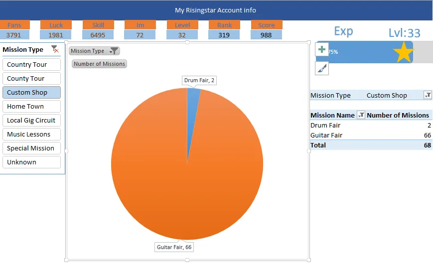
This is for custom shop.
This is for music lessons.
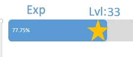
This star will move together with my exp. If my exp increase it will increase too. My current is Lvl 2 and lvl 33 the level I have to reach. I have reached 78% of level 33. Only this chart is interactive in my excel sheet. I now become Rank 319 and 12 rank up within 3 days. This is a good start for me.

If you want to play risingstar please use the following link:
https://www.risingstargame.com?referrer=beyondhorizonmm
If you want you can compare with my previous post.
https://www.splintertalk.io/@beyondhorizonmm/annlysing-my-account-data-using-pivot-table-and-chart