In my previous posts I showed how to enable the HTML API of XMRIG and storing the data quiered from the different rigs HTML API and I complete this with the installation of the Grafana and setting up graphs about the rigs tempretature, hash rate and fan speed.
Install Grafana
Grafana is one of the leading solution for running data analytics, pulling up metrics, monitoring apps.
Grafana provides out of the box multiple connectors to data sources like Prometheus, Graphite, InfluxDB, Loki, Elasticsearch, MySql, MSSQL, PostgreSQL, Stackdriver, CloudWatch, Azure Monitor or JSON.
Add Grafana repository and install Grafana
echo "deb https://packagecloud.io/grafana/stable/debian/ stretch main" > /etc/apt/sources.list.d/grafana.list

curl https://packagecloud.io/gpg.key | sudo apt-key add -

sudo apt install apt-transport-https

sudo apt update

sudo apt install grafana
Enable and start Grafana
sudo systemctl enable grafana-server

sudo systemctl start grafana-server
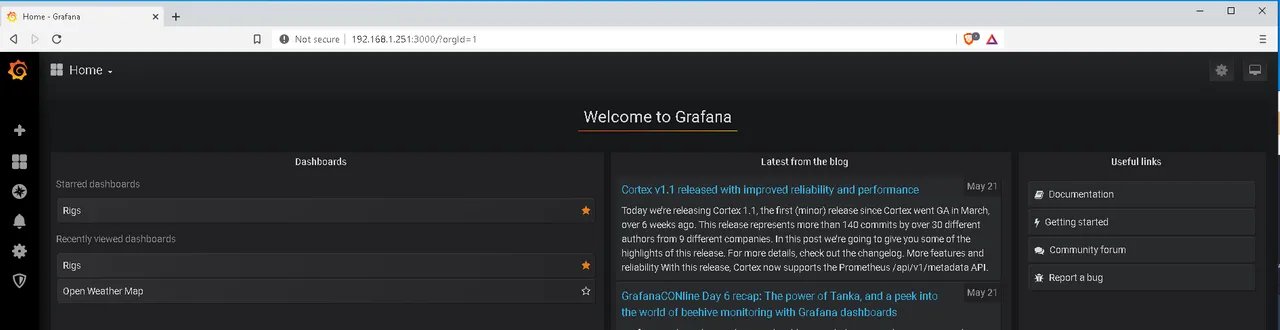
After this Grafana should be avaliable over HTTP on the port 3000. The default credentials are admin/admin.
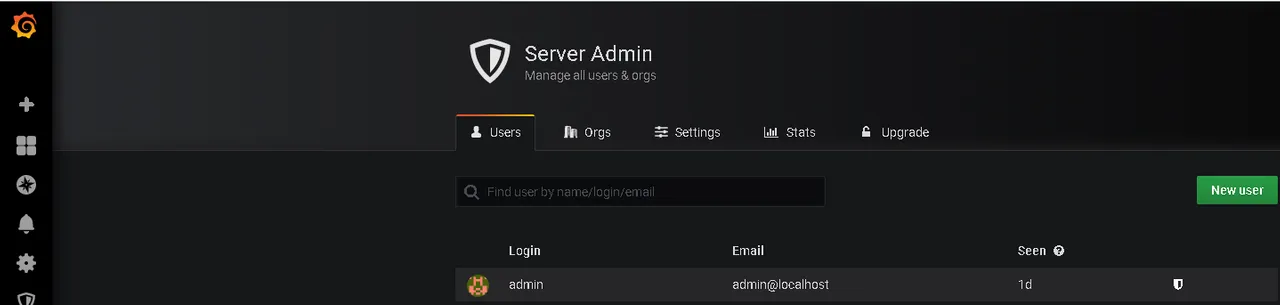
Add user
Grafana provides the option to invite new user, I don't have an email address setup for Grafana, therefore I will just create a new user under Server Admin -> Users instead of Settings -> Users.
Get ready for Graphs
Before any graph can be displayed on a dashboard, a data source, one or more queries, a dashboard and some panels to display data of the queries.
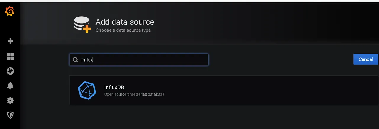
Add Data source
Data sources can be added on the settings panel of Grafana. Click on the gear wheel zahnrad and select Data Sources.
Then click on the green button "Add data source". Grafana will provide you a list of data source types you choose from.
Grafana even provides a search bar for the installed data sources. I will add my InfluxDB.
It is also possible to create a custom data source.
Enter the address of the database and its name. In my case it is 192.168.1.251 and the database name is "rigs".
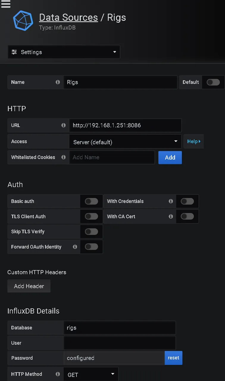
After this the datasource can be used to display its data on a dashbord.
Add Dashboard
A new dashbord can be added by clicking on the big + symbol in right top corner. The dashboard will be created with one empty panel.
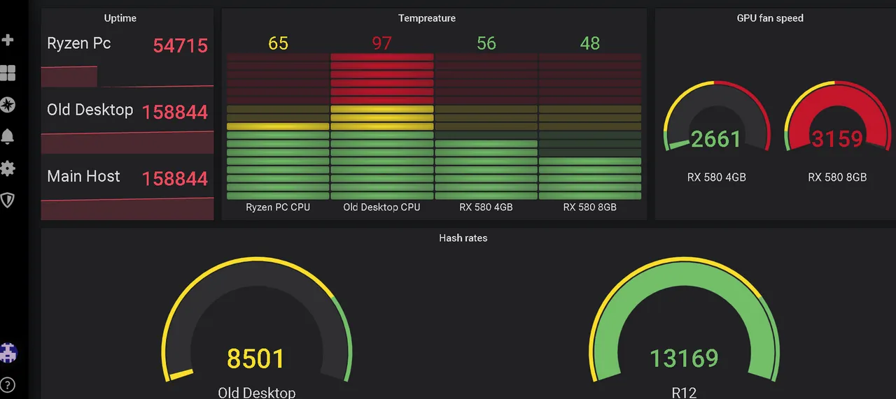
I want to display the tempreature of the rigs, their hash rates, the fan speed of the gpus and their uptime, so I will create four panels.
So I will add four panel in total.
Panel can be added the panel button in left upper corner.

Let's start the uptime panel, than tempreature, hashrate and fan speed.
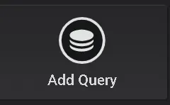
Add Queries
The data will be conjured with queries, which will be performed against the datasource configured in Grafana.
In order to add a queries to dashboard click on add query.
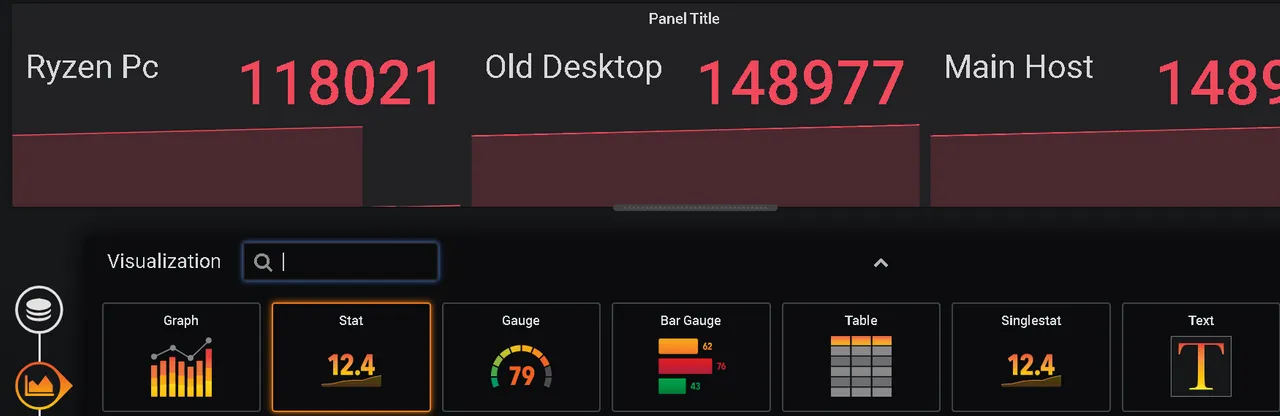
The default visualization is a graph. I will change this for the uptime late to the type "stats". Select the datasource for the queries.
Now a query can be writen. Grafana provides you a graphical interface for this, but I prefer the query language editor.
Don't forget to name the queries.
SELECT last("uptime") FROM "httpjson_telegraf-xmrigs" WHERE ("host" = 'masterlamps-ryzen-pc') AND $timeFilter GROUP BY time($__interval) fill(null)
Than select the visualization icon on the left side and change it to "stats" and change under the settings page the panels title.
The next will be for the temperature of the CPUs and GPUs of the rigs.
SELECT mean("temp_input") FROM "sensors" WHERE ("host" = 'masterlamps-ryzen-pc' AND "feature" = 'tdie') AND $timeFilter GROUP BY time($__interval) fill(null)
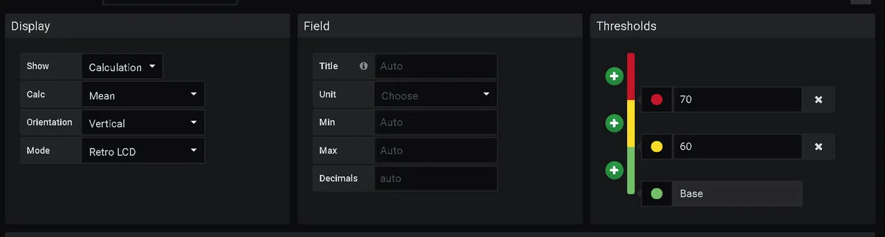
This time select under visualization bar gauge and set it to horizontal. The bar gauge is configured by default with to colors and a threshhold for each. I will add a third threshold and change to the colors to yellow and reds. Chips shouldn't be hotter than 70° celsius, if you want to keep them for a long time. I am fine with burning my Old Desktop CPU, though.
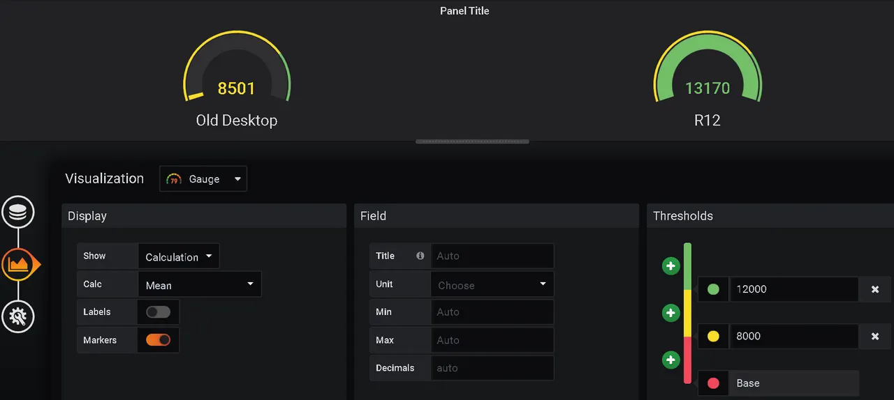
Next panel will display the fan speed of the GPUs. For this like to see it a gauge like velocity in the car.
SELECT mean("fan_input") FROM "sensors" WHERE ("host" = 'masterlamps-ryzen-pc' AND "chip" = 'amdgpu-pci-0600') AND $timeFilter GROUP BY time($__interval) fill(null)
](https://images.ecency.com/p/gT3y.png?format=match&mode=fit)
Now I will create most important panel - hashrates.
I want to display the hashrates on gauge but this time differently colored threshhold holds. The higher the value the better.
Now the panels for the dashboard are ready and can be arranged as you like.
The final version looks like this:
Please up vote, comment and resteem my post. If you like this please donate to 42D2sPUubqCCqK3MD8BnDDSyjgNqbrLH6HcHXrZWaqYZfUqyoDcRsfTQNp345N1NSDLr8qBJ5QqjQ4V95nix6qH9Je8BX2U
Thank you so much in advance.