Hello there,
Happy New Year 2021 everyone!
It's a new beginning, so it's the perfect time to think of ways to improve my beloved site Inkito.
Let's be real, after the lack of success this summer, I had left Inkito aside and pursued other projects. The first prototype (https://inkito.io/) specialized in displaying Hive comics and novels unfortunately did not attract creators.
Despite this hard fact, I still think there is a lot of potential in Inkito and the webcomic community could benefit from a step in the blockchain world.
So what can we learn from this prototype!
After taking a step back, these are the points that stand out to me:
Create Trust - the site needs to be extra polished for creators to share their work on it.
Blockchain as a bonus - the blockchain aspect of the site should not be the selling point but the cherry on the cake. So many people are skeptical about this technology and won't join in because of it. In terms of image, Inkito should be a great comics hosting site FIRST, and have a blockchain feature second.
Master marketing - What I realized is that bringing people over is the hardest thing. Especially at first when the site lacks content. So I need a solid marketing plan using social media platforms. Any ideas?
So what solutions can I bring to all this...
Image Optimization
This is actually a crucial point. The home page loading time is currently way too long on Inkito especially on a slow connection. It gets better in the reader as the next page loads while the current page is read.
But the home page sets the tone, creates trust, so it needs to be PERFECT! ;-)
To solve this I will be loading images with a different resolution depending on the device. I might have to change image hosting for that. I'm currently using IPFS.
This will be my primary focus as user experience depends a lot on it.
Gamification
To counter the blockchain trust issue. I think the experience should be "gamified". Just like in mobile games. You earn or buy coins, treasure chests, etc...
I would only add the feature that you can cash them out too! ;-)
So I would be changing the $ signs by token logos that pop like below.
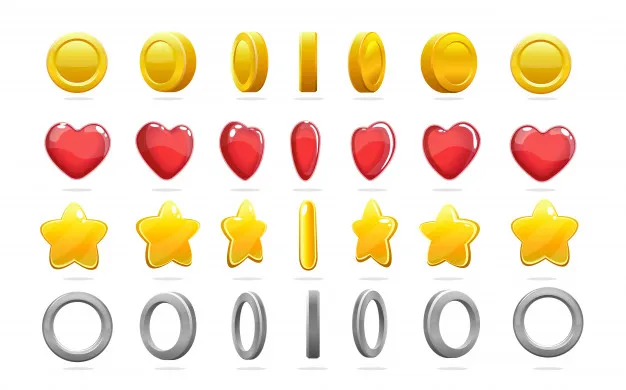
image from https://www.freepik.com/
I would also need to have my own wallet page for the experience to be seamless.
One point that stands out is that cashing Hive is difficult for non blockchain users.
I'm sure such service would come with time. In the mean time, I'll have to think of the best way to present this. Maybe a series of youtube videos to explain.
As this feature would be presented as a bonus, I can leave the withdrawal problem aside for now.
Redesign
This goes hand in hand with the previous point. The Inkito website has a clean design but the prototype lacked a little personality. Bringing funky recurrent characters and logos that pop should resolve that.
The style used by competitors is a cute manga style. So something like the images below would speak to the webcomic community.
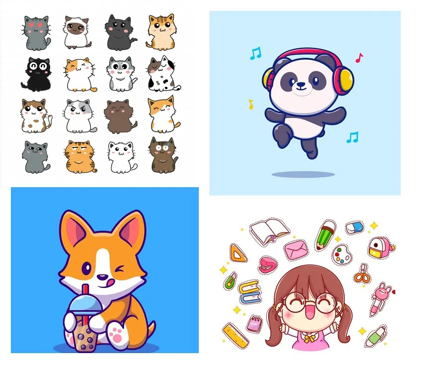
images from https://www.freepik.com/
Reading Experience
Finally I think the reading experience could be improved. I have to think mobile-first.
The best reading experience out there is probably from Kindle as it's their core business. So let's look at how they deal with it.
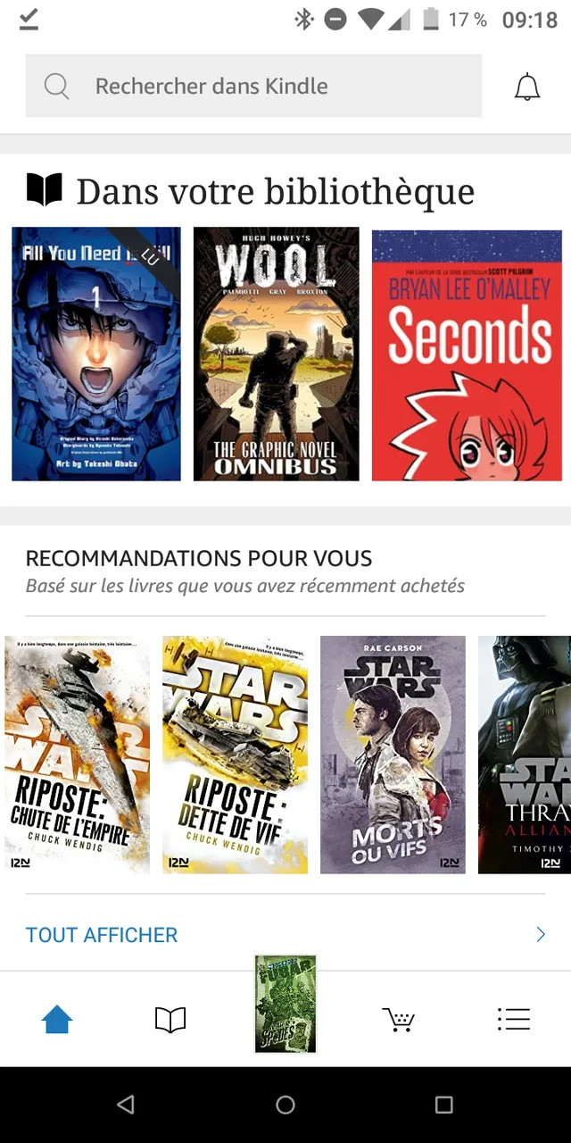
Kindle
- Home page
I can tell the focus is owned comics, showing first your library. This could be a way to approach this but might be more suited to a book purchasing app like this one.
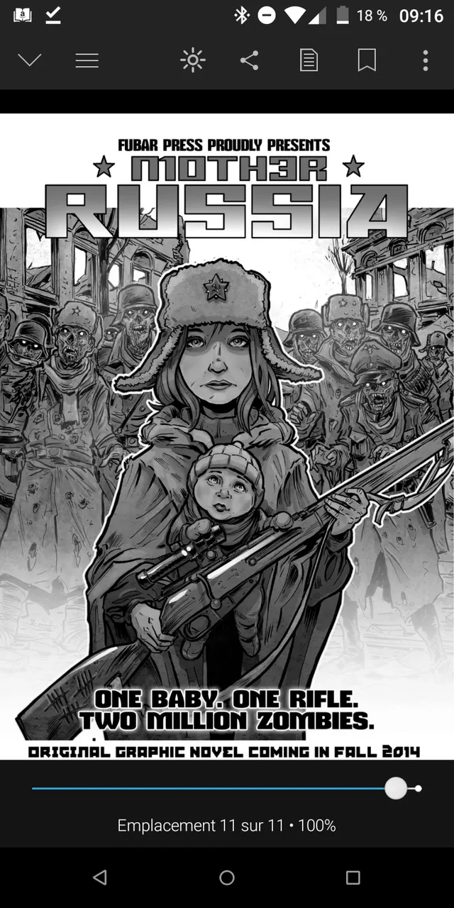
- Reading page
The reading is a horizontal slide. I like the slider that allows to skip easily through the story. If a page is not quite loaded it shows white for a few seconds before displaying.
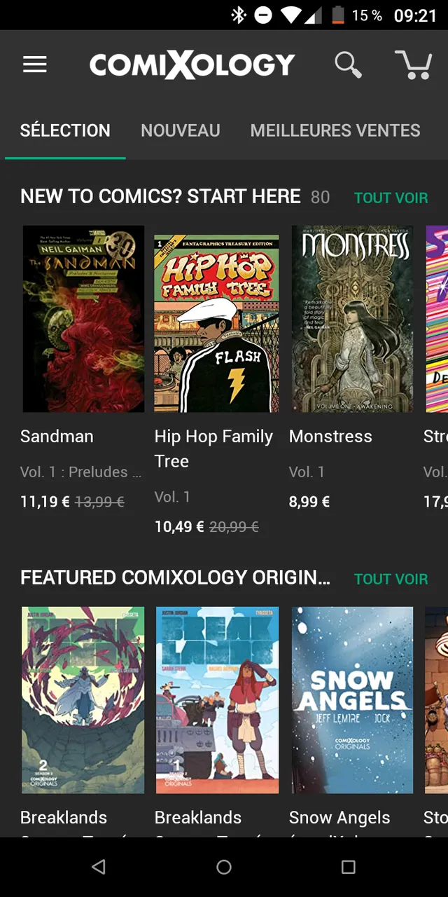
- Comixology
Let's look at Comixology that is also owned by Amazon but has a desktop reader too.
Home page
Their homage which focuses more on discovering new titles. I think I lean more towards this proposition. My home page shows trendy and new content mixed together to offer new creators more visibility. It's way more structured here.
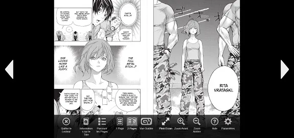
Reading page
I quite like the desktop reader, displaying pages as spread instead of single pages. It does give you the option to change that underneath.The black surrounding background makes it quite immersive.
-On desktop:
-On mobile
First thing you notice, the menu is very sober. The content is king here.
The reading experience is also swiping horizontally. A different approach than Webcomics specialized sites like Webtoons or Tapastic. Which one do you prefer?
You do have a menu when the page is clicked but very simple, mostly a page selection.
- Page selection
Seeing all this, my final though on the reading experience is that I should maybe experiment with a full screen mode. But I feel that my reading page is not so bad, so work on it would not be the priority.
That ends this first round of thoughts.
I'll be working on all this going forward. I'd love to have your thoughts on this.
See you on the other side,
Jrej