Colors as independent entities are beautiful, but the harmony of them is bliss. It's what color grading is; finding balance with colors.
The major strength of my photography and the selling point of my brand is my ability to play with colors, to deliver stunning images. I've been playing with colors since I started photography in 2018. After doing it consistently over a period of 3 years, I've learned that the best way to color grade a photograph is to ensure that there is harmony between each color in the photograph. Harmony in color grading is to find a balance between each color. To know when a color should be more or less.
Color harmony is a theory I created to explain color grading to people that ask me about it. I don't know if it's an existing theory. I just now Googled it, and it's an already existing theory. It's funny how I didn't know about that until now.
For my photo session with Lenora, I applied the science of color harmony. In this case, it was easier to do, because her outfit and the environment blended seamlessly(red and green in a mix looks really good; feels like Christmas 😁). While red and green can complement each other naturally, without balance the mix can still look awkward.
Check out the portraits I created for Lenora;
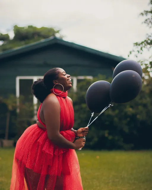
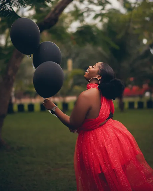
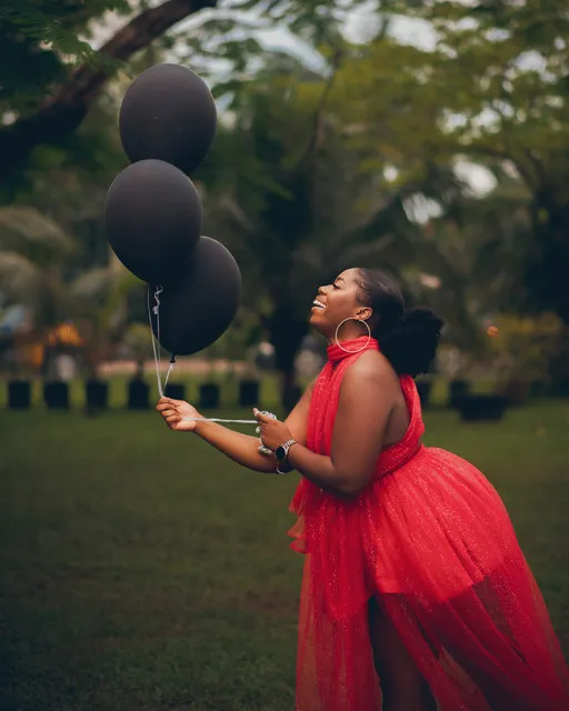
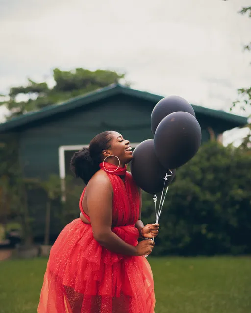
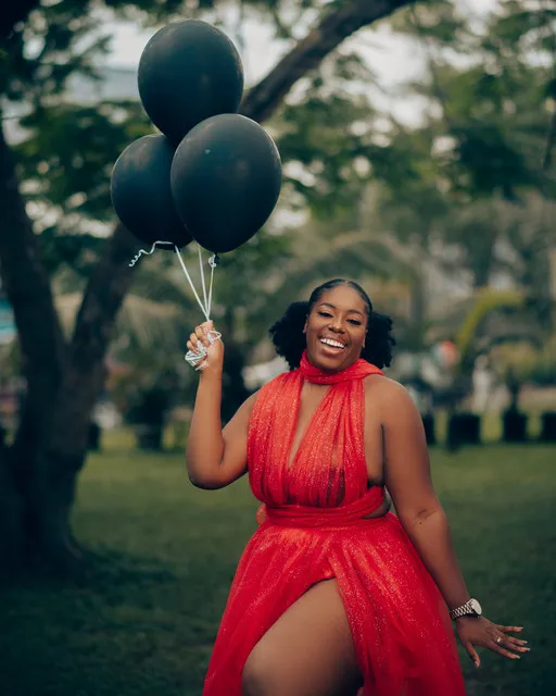
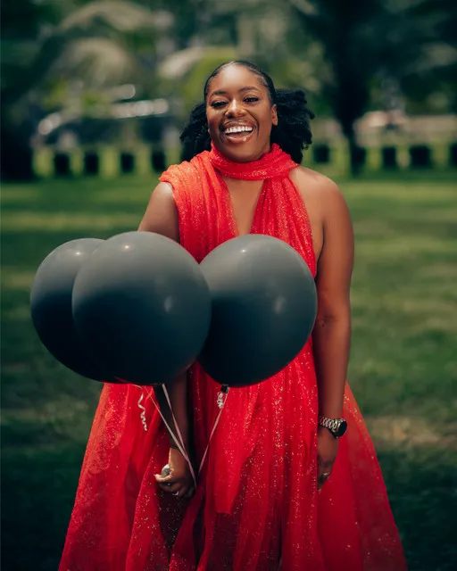
Aside from ensuring that the colors were properly blended, I added fades and grains to give the photos some dramatic feel. I really liked it.
We had fun creating these portraits for Lenora. The weather was great, the mood was lit, results were amazing.
What do you think about the colors? Which frame is your favorite?