➤ Hace tiempo que no hago este tipo de post que al igual que los otros disfruto muchos haciéndolo, y si tu eres de esas personas que les gusta subir las mejores fotos a sus redes sociales este post es para ti, utilizando Photoshop haremos un juego de colores que queda muy bonito visualmente y además es muy fácil e hacer solo sigue mis pasos, sin mas que agregar comencemos.
➤ I have not done this type of post for a long time that like the others I enjoy doing it a lot, and if you are one of those people who like to upload the best photos to their social networks this post is for you, using Photoshop We will make a game of colors that is very beautiful visually and it is also very easy to do, just follow my steps, without more than adding, let's start.
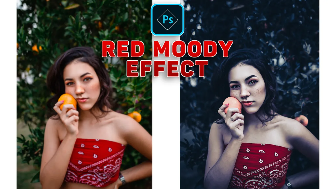
🔘 Este efecto consiste en darle más protagonismo al color rojo en la fotografía, y haremos eso con photoshop, yo estoy usando la versión 2020 pero creo que en cualquier versión es igual.
🔘 This effect consists of giving more prominence to the color red in the photograph, and we will do that with photoshop, I am using the 2020 version but I think that in any version it is the same.
➤Proceso:
➤Process:
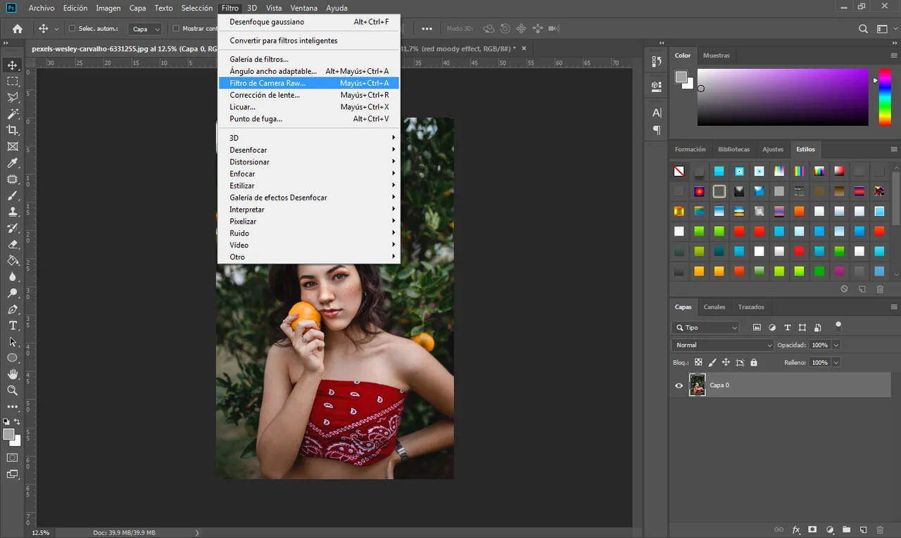
- Una vez ahí nos dirigimos a la cámara raw estos filtros nos ayudan a editar los parámetros de la fotografía de manera mas completa.
- Once there we go to the raw camera these filters help us to edit the parameters of the photograph more completely.
- Se nos abrirá ese menú y como pueden ver en la parte derecha hay unos controles, son los que usaremos para lograr el efecto que estamos buscando.
- This menu will open and as you can see on the right side there are some controls, they are the ones we will use to achieve the effect we are looking for.
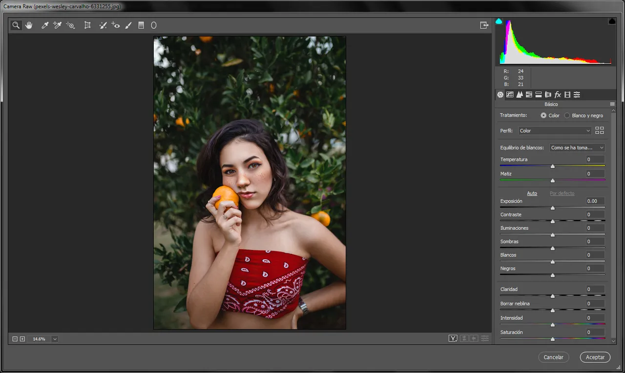
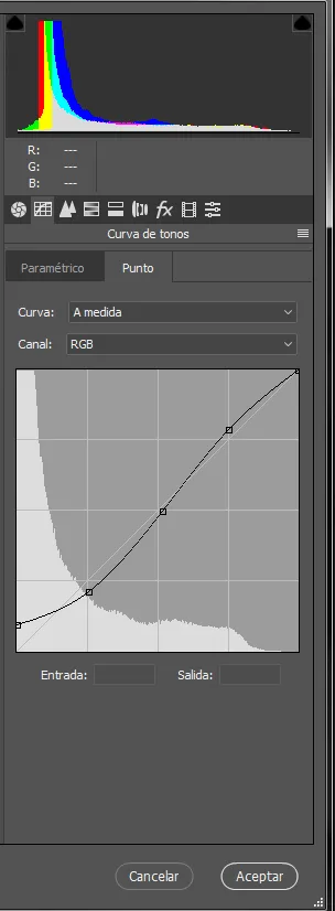
- En el primer apartado llamado curva de tonos no les puedo dar como tal los datos puesto que varía dependiendo de la fotografía, pero es algo más o menos así.
- In the first section called tone curve I cannot give you the data as such since it varies depending on the photograph, but it is something more or less like this.
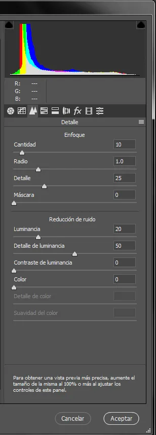
Siguiente apartado detalle
- Cantidad:10
- Radio:1.0
- Detalle:25
- Luminancia:20
- Detalle de luminancia:50
Next section detail
- Quantity: 10
- Radius: 1.0
- Detail: 25
- Luminance: 20
- Luminance detail: 50
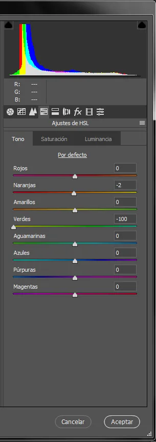
Siguiente apartado ajustes de HSL
Solo bajamos los verdes al -100%
Next section HSL settings
We only lower the green to -100%
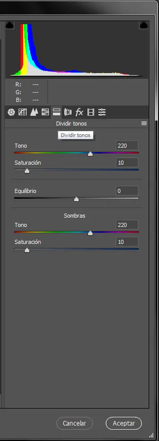
- Siguiente apartado Dividir tonos
-Tono: 220
-Saturación: 10
- Next section Divide tones
- Tone: 220
- Saturation: 10
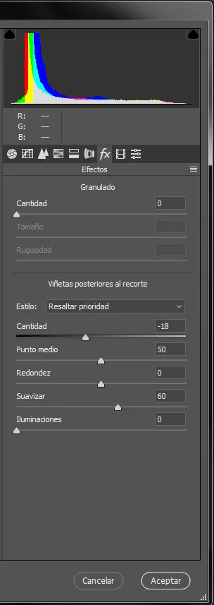
Siguiente apartado Efectos
Cantidad: -18
Punto medio: 50
Suavizar: 60
Iluminaciones: 0
Next section Effects
Amount: -18
Midpoint: 50
Smooth: 60
Illuminations: 0
🔘 Resultado final:
🔘 Final result:
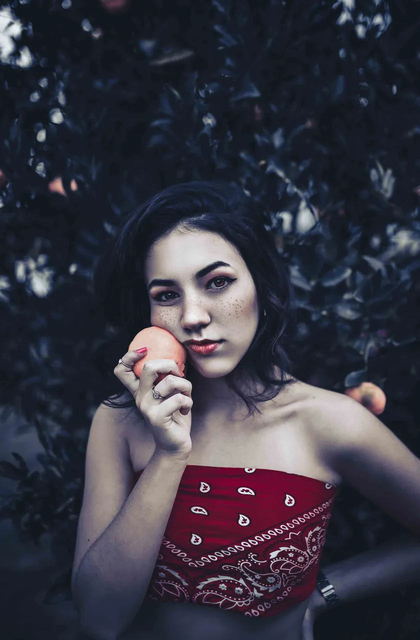
🔘 Y listo amigos como pueden ver el resultado final se ve genial.
🔘 And ready friends as you can see the final result looks great.
➣Y bueno amigos eso es todo por hoy espero te haya gustado si fue así por favor compártelo me ayudarías mucho, nos vemos en unos días con post nuevo, hasta la próxima.
➣Well friends that's all for today I hope you liked it if it was like that please share it, you would help me a lot, see you in a few days with a new post, until next time.
Todas las imágenes mostradas son de mi propiedad. Son capturas tomadas al momento de realizar la explicación.
All the images shown are my property. They are captures taken at the time of the explanation.
Descarga la imagen usada aquí / Download the image used here