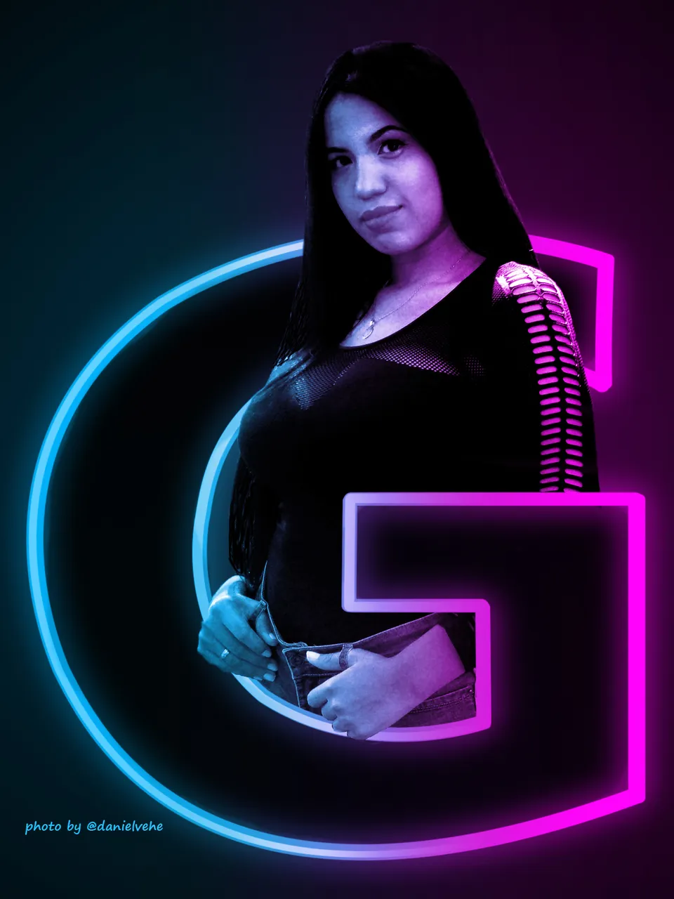
Hola amigos. Hoy regreso con el efecto Cyberpunk pero esta vez con uno más sencillo. Es por eso que le agregué el montaje con la inicial de la modelo, que simplemente queda espectacular y que se puedes usar como imagen en las redes sociales.
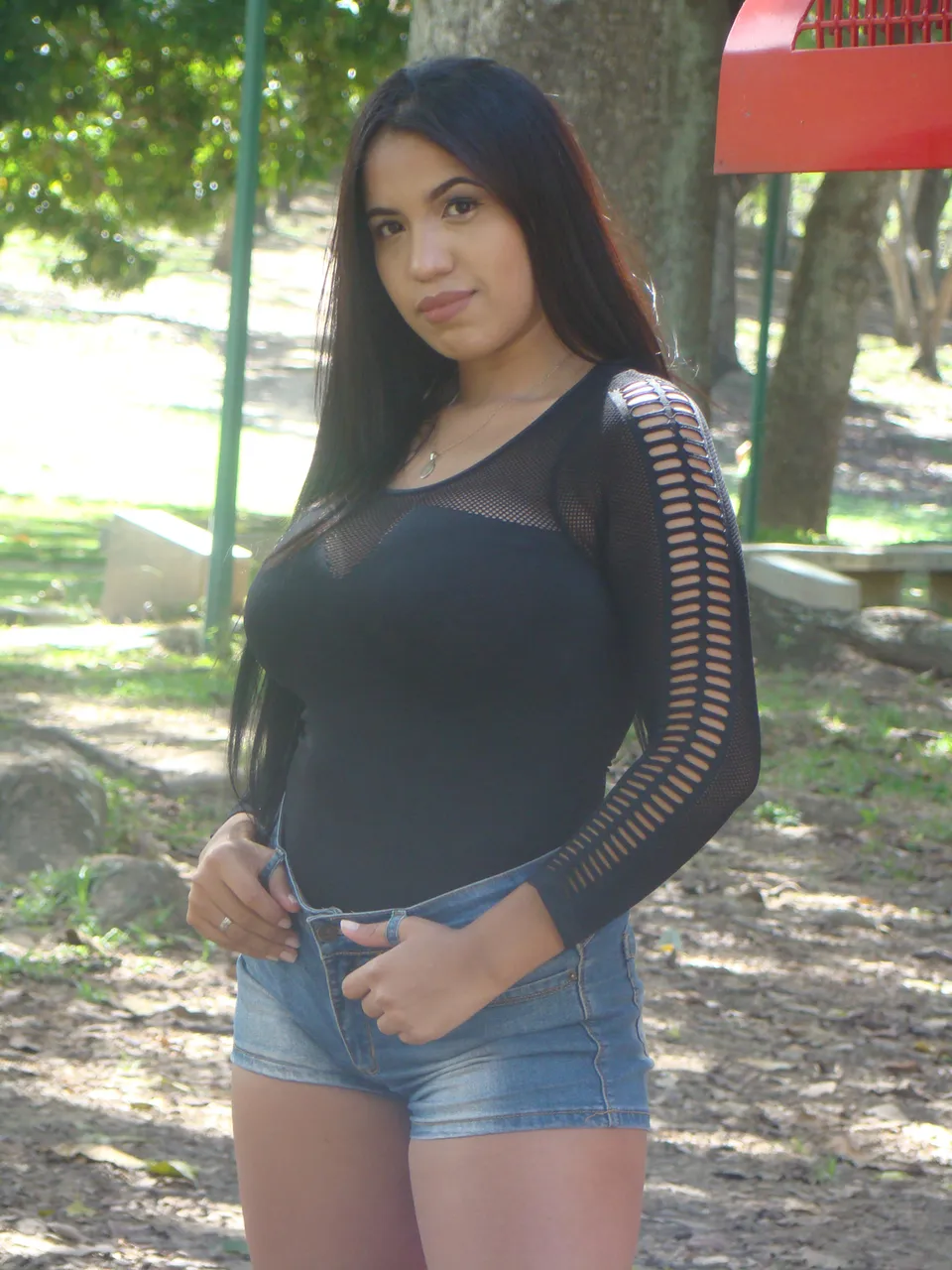
Foto original. Parte de la sesión a @geraldynp
Hello friends. Today I'm back with the Cyberpunk effect but this time with a simpler one. That's why I added the montage with the initial of the model, which simply looks spectacular and can be used as an image in social networks.
Original photo. Part of the session to @geraldynp
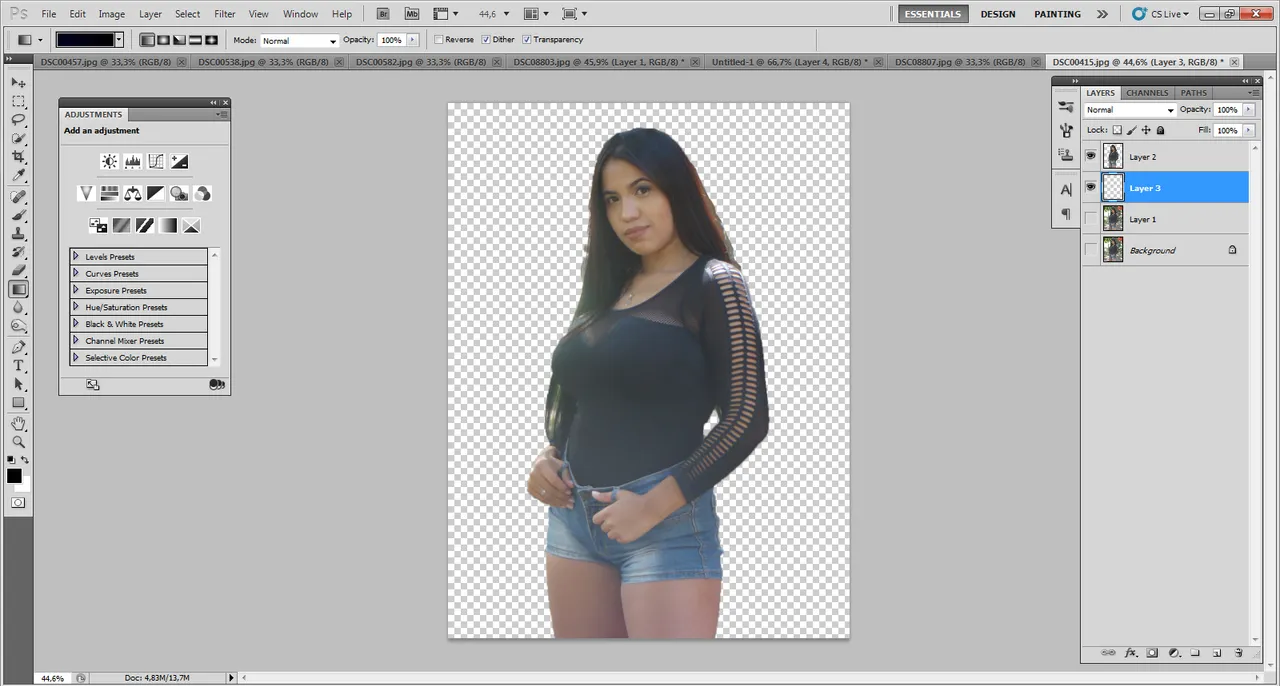
Como siempre lo primero será, siluetear a la modelo para retirarla del fondo. Despues la duplicamos, obteniendo dos capas de la silueta.
As always the first thing to do is to silhouette the model to remove it from the background. Then we duplicate it, obtaining two layers of the silhouette.
Posteriormente añadimos un fondo degradado bien oscuro. A la modelo le ajustamos el contraste para que combine con el fondo oscuro. Esto sobretodo si es una foto clara.
Then we add a very dark gradient background. We adjust the contrast of the model to match the dark background. This is especially important if it is a light photo.

Elegimos el tipo de letra para nuestra G y la colocamos en posición para saber cómo quedará.
We choose the font for our G and place it in position to see how it will look.

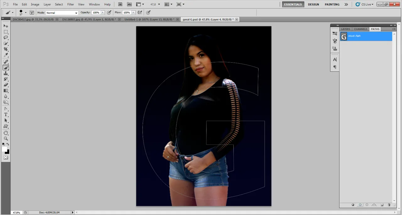
Pasamos a usar la herramienta de pluma para crear una forma de la letra G. Esa la guardaremos para usarla posteriormente.
We move on to using the pen tool to create a G shape. We will save that one for later use.
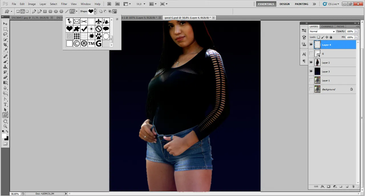
Una vez creada la forma y guardarla, ya podemos conseguirla en la lista de formas libres. Seleccionamos y la usamos sobre el linezo al tamaño deseado.
Once the shape is created and saved, we can get it in the list of free shapes. Select it and use it on the linezo to the desired size.
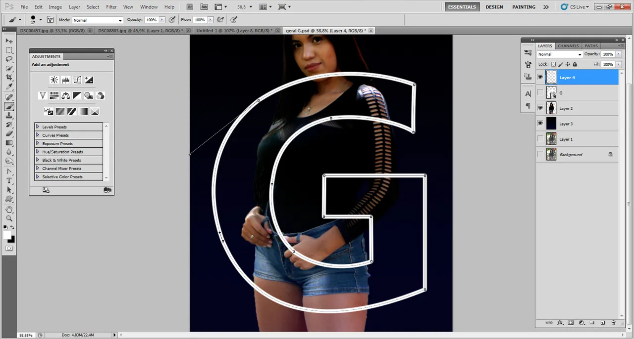
A esa forma le colocamos un borde grueso. Para esto vamos a Paths y con la herrmienta pincel seleccionada y con los valores deseados; marcamos "Stroke path with brush". para esto siempre debes crear la forma en una capa nueva y como contorno.
To this shape we place a thick border. For this we go to Paths and with the brush tool selected and with the desired values; we check "Stroke path with brush". For this you must always create the shape in a new layer and as an outline.
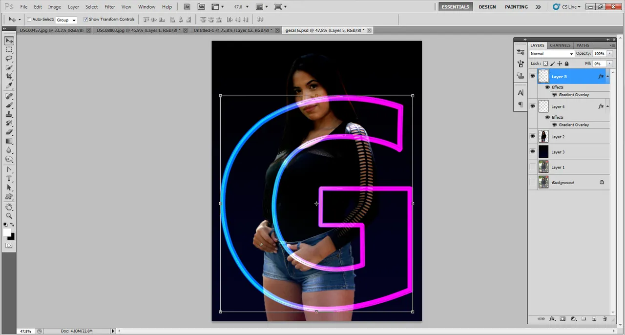
Ahora a esa capa le damos un modo de fusión de degradado, de un color azul a otro magenta. Repetimos el mismo proceso pero le damos un valor mayor al pincel, para que tenga más grosor la nueva G.
Now we give that layer a gradient blend mode, from a blue to a magenta color. We repeat the same process but we give a higher value to the brush, so that the new G is thicker.
A la segunda G le aplicamos un fitro de desenfoque gausiano. También comenzamos en este punto con la iluminación de la modelo. Para eso creamos una capa de ajuste de degradado en modo "color".
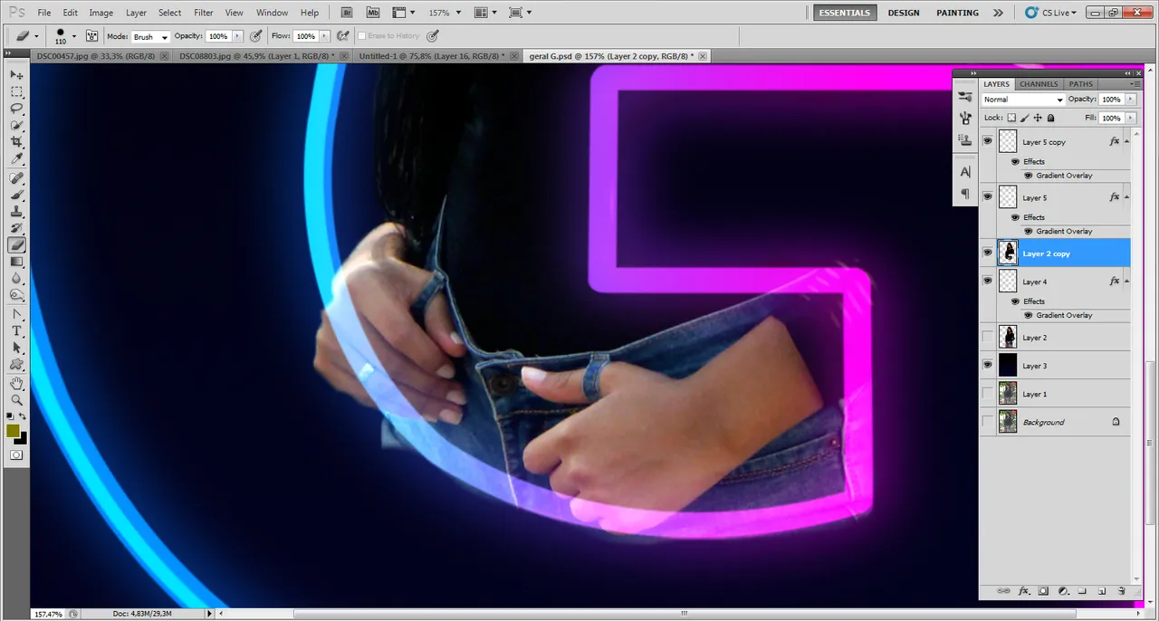
También recoramos partes de la modelo que no queremos que salgan, para que parezca que sale desde la letra.
To the second G we apply a Gaussian blur filter. We also start at this point with the illumination of the model. For that we create a gradient adjustment layer in "color" mode.
We also cut out parts of the model that we don't want to come out, so that it looks like it comes out from the letter.
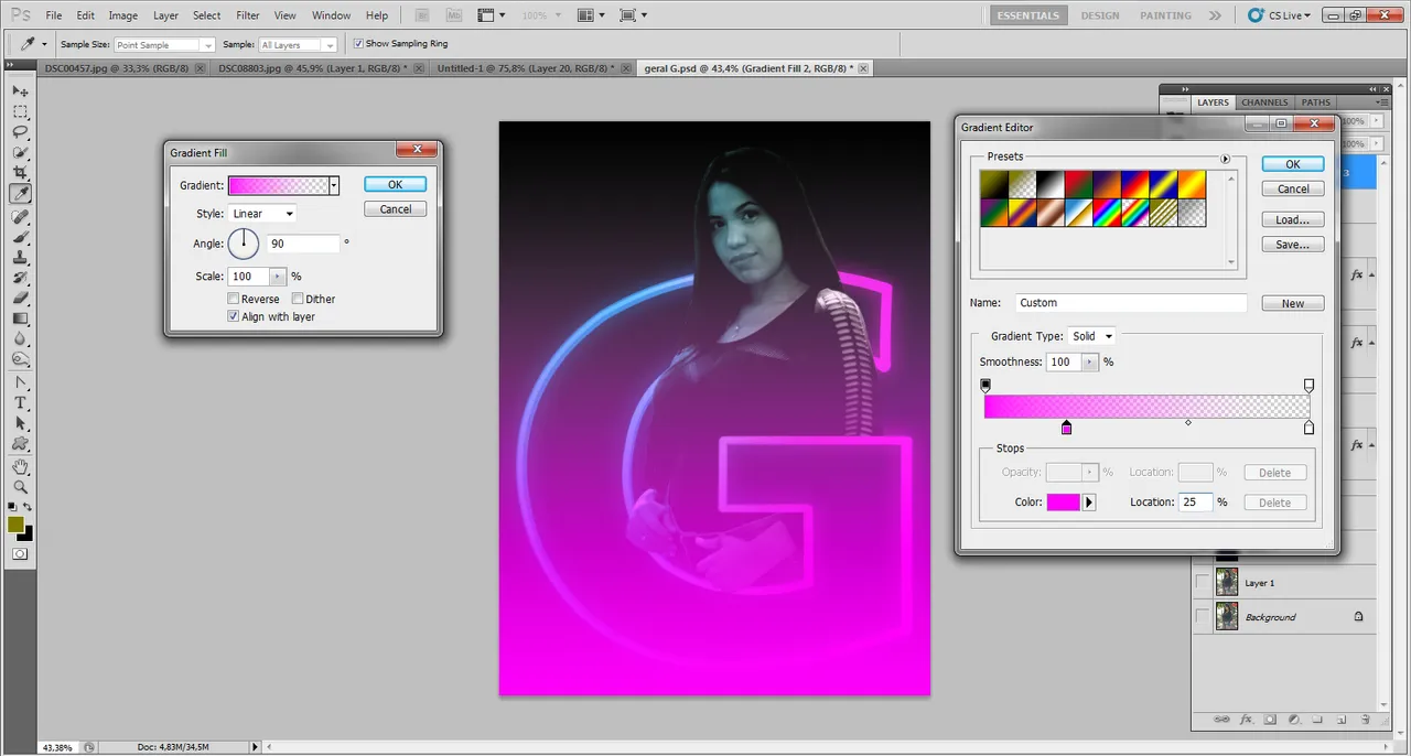
Luego creamos otra capa de ajuste de degradado, pero esta vez de color magenta. Igualmente la colocamos en modo color.
Then we create another gradient adjustment layer, but this time in magenta color. We place it in color mode as well.
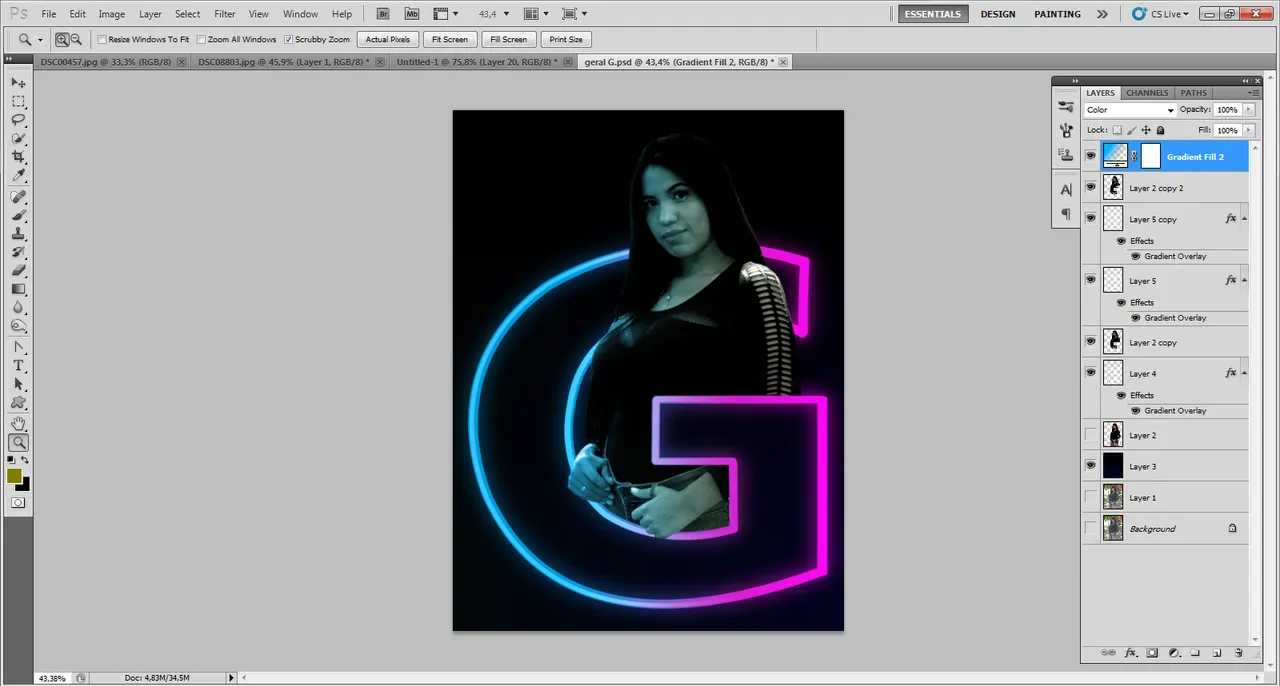
Editamos el fondo para que tenga los colores del arte y listo; el resultado final. 😍
We edit the background to have the colors of the artwork and that's it; the final result. 😍