Hi everyone! 👋 Today, I'm taking part in the Hive Business Card Design Contest. I'm not an expert in making business cards, but I love a good challenge, so I did my best to come up with a design of my own. 😆 To start, I looked at what color palette would best represent Hive. I considered the general vibe it gives and the impression it leaves on a viewer. I chose black, red, and white, which are the standard colors of the browser extension and mobile app, because they give a classy and trustworthy feel and help keep the business card on-brand.
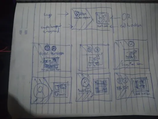
I then started planning the design that I wanted to make. I envisioned a classy, minimalistic, and formal look for the front, so I jotted down some ideas on a napkin sketch in my notebook. I wanted the Hive logo and name on the left and a large QR code on the right side. It didn't take me long to finalize the front design, but the back took more effort. Since the back would have my community or country information, I decided to make it more playful while still keeping the overall aesthetic of the business card consistent.
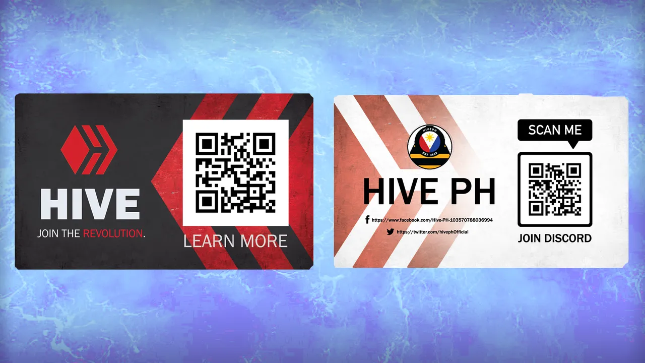
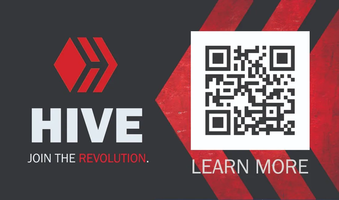
♦️FRONT♦️
I started by creating the background for the front of the business card. I wanted it to have a simple pattern for texture and to create a vignette effect. Initially, I experimented with different colors, but ultimately decided to use black.
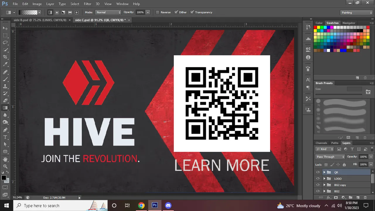
Next, I created the text for the business card. I researched the font used for the Hive logo in order to maintain consistency and brand recognition. I placed the Hive tagline under the logo and made which can be customized if necessary. I made the QR code as large as possible to grab the attention of the viewer. I added a line of text under the QR code as a call to action, encouraging the viewer to scan the code for further information, sending them to HIVE OnBoard. Finally, I carefully considered the placement of the logo on the front of the card to ensure a clean, professional, and aesthetically pleasing design.
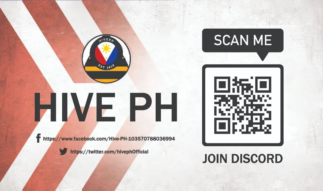
♦️BACK♦️
I then moved on to the back part of the business card. To maximize its versatility and minimize manufacturing costs, I made the back part white. I kept the vignette design consistent with the front to maintain the overall aesthetic, but placed it on the opposite side to create visual interest. I added a soft blur and erased some parts of the design to ensure that the logo and QR code remain the focal point.
Lastly, I redesigned the QR code, making its edges rounded and less edgy, giving it a bubbly and inviting appearance that's less harsh on the eyes of the viewers. I added a call-to-action at the top of the QR code, instructing the viewers to join the Discord server using it. One of the biggest challenges I faced while making this business card was how to customize it for each community or country, while also ensuring it's easy to manufacture. To overcome this, I added the community logo at the top, with its name written below. I kept the logo round to maintain the bubbly look, conveying the impression of a relaxed and open community.
I hope you guys love my design! That is all for me now. 😇
-SHINEKO