I had the good fortune a couple weeks back of having some people playtest Frogs of War for me. I'm still in the early stages of the game and need feedback on rules and gameplay; the feedback I have already received has been terrific.
One of the change that I already knew I was going to make was to re-do the playing cards completely, and change them from hexagonal to standard rectangular. Hexagon shaped cards are neat, but they're difficult to shuffle, hold, and use. From a financial standpoint, they are also more expensive to print.
What I do want to keep is the transparent abilities of the cards, to let one card literally be played on top of another and have both their features visible. These were items that I was already thinking of.
The positive feedback I received revolved around the information that is put onto the cards: in particular, it was a near universal comment that putting more symbols onto the card would make it easier to read and understand. Designing the card, particularly with new features, is becoming easier to do now that I have more surface space to work with. Here is a new sample "animal" card that I've been able to put together:
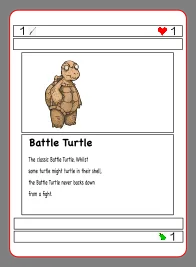
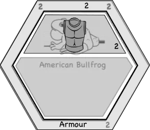
This card is easier to read and easily and quickly shows the attack damage, health, and breeding cost of the animal. I know I'm not a big fan of how the card is comprised of boxes, but I can improve that. There is also still some negative space on the card that the original hex card (shown below for comparison) did not have.
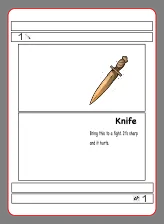
Item cards are likewise improved. I haven't shown it here, but one of the advantages of having card-width rectangles for statistics is that I can print additional information if necessary, without interrupting other important features of the card.
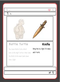
By far the largest improvement is the ability to show the animal and the animal's item in an easy to see-and-read format. Here we see the Battle Turtle armed with a knife: the turtle has a health value of 1, an attack damage of 1, and an additional knife attack damage of 1 for a total of two. As stated, there is also ample room to be able to print additional information if I find the need arises.
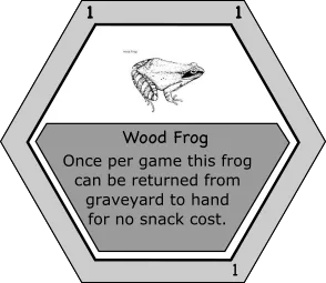
In contrast, here was how the original hex cards would look in such a scenario:
Now, I do like how the hex card looks, and it's possible that with a few edits and the addition of the symbols the hex cards would still work, but I'm also trying to think of the user experience.
So are there any thoughts? Hex cards? Rectangle? Further improvements that need to be made?
(c) All images and photographs, unless otherwise specified, are created and owned by me.
(c) Victor Wiebe
About Me
Amateur photographer. Wannabe author. Game designer. Nerd.
General all around problem-solver and creative type.
My Favourite Tags
| #spaceforce3 | #altphoto | #crappycameraphotos |
| #digitalpinhole | #pinhole | #firehydrant |