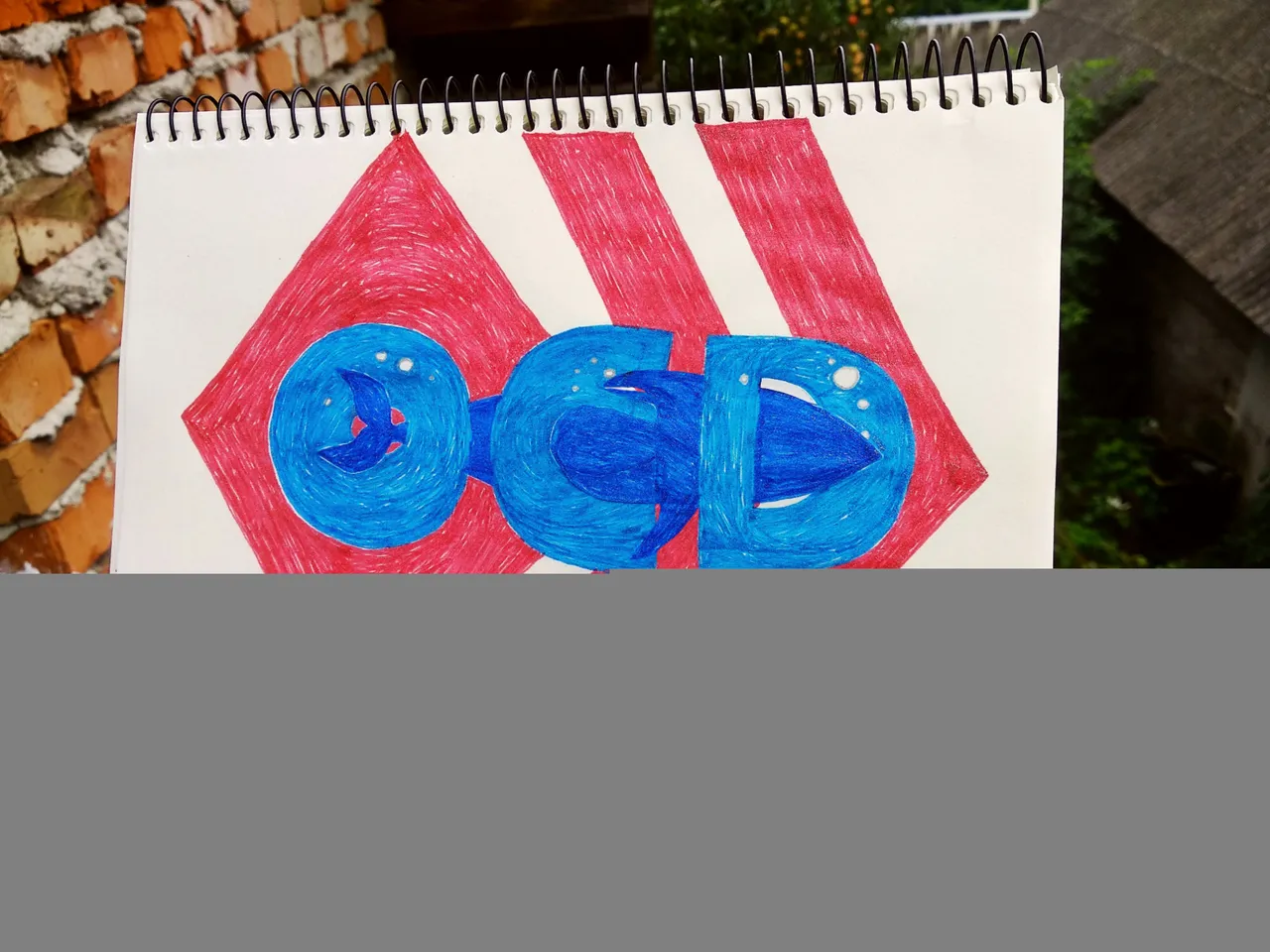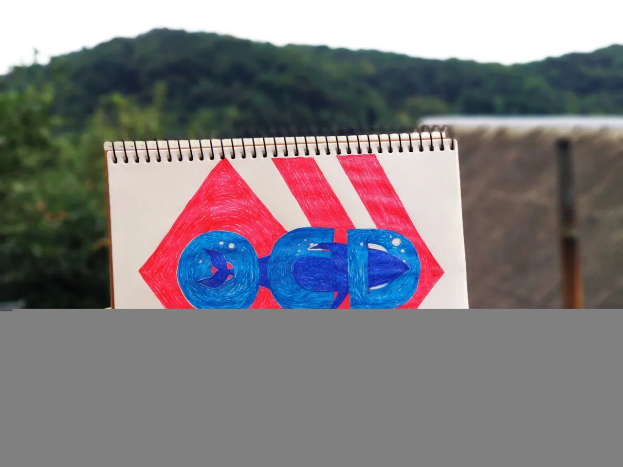
Relatively recently, there was a contest on Hive for new logos for #ocd and #posh. And soon a new beautiful logo was presented for two wonderful communities. So I was inspired and decided to recreate the #ocd logo in my sketchbook with shiny colorful pens. I took a risk and decided to make sketches of the main objects at once with pens. What I later regretted was that I had to translate 3 sheets of notebook before I drew the more or less normal shape of the letter O.
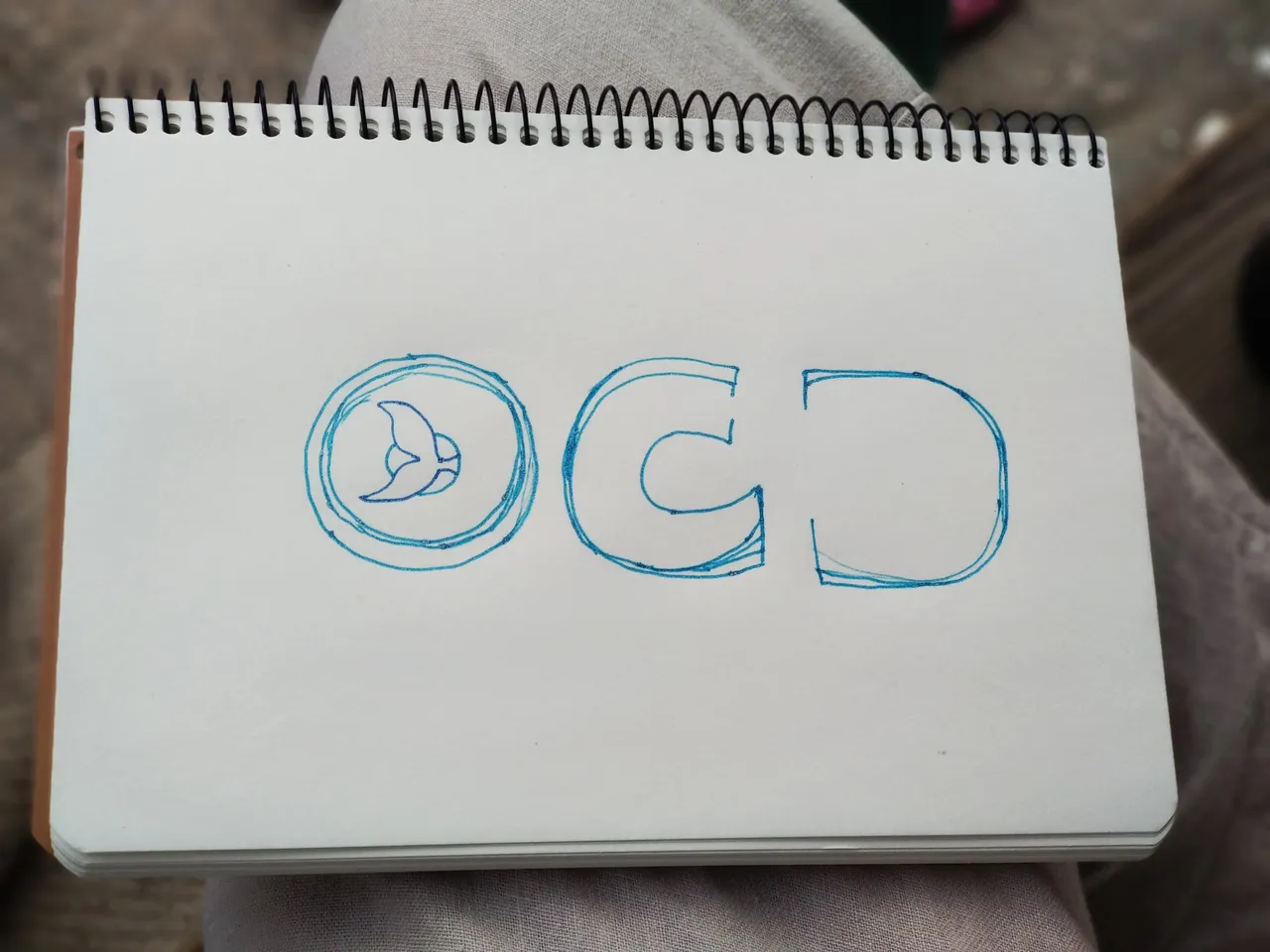
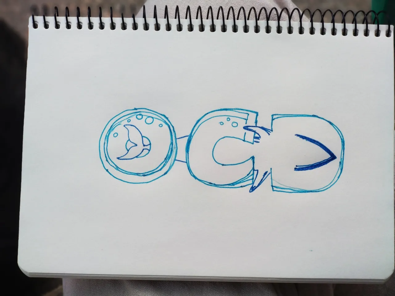
Before completing the lines of the letters, I first drew the whale's tail, which is the main element in the picture, right? Later, of course, the whale's head, because without it it was impossible to prove the line of the letter D.
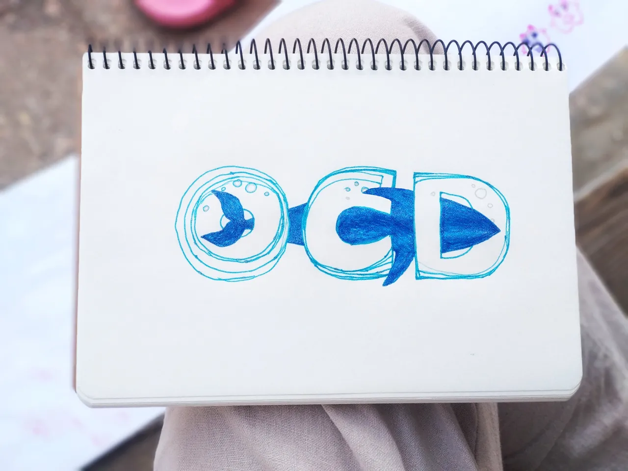
But later I realized that the first letter in relation to others is too small and was forced to increase it in a way not quite pleasant to the zop. But at the final stage these edits will not be visible, so everything is ok.
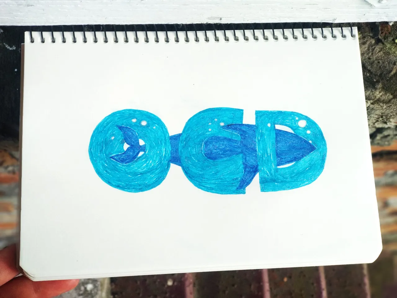
And later the other letters were crooked, so I corrected them too. When the letters were conditionally brought to perfection according to the author, I drew a sketch of a whale. After that, I added important elements - bubbles.
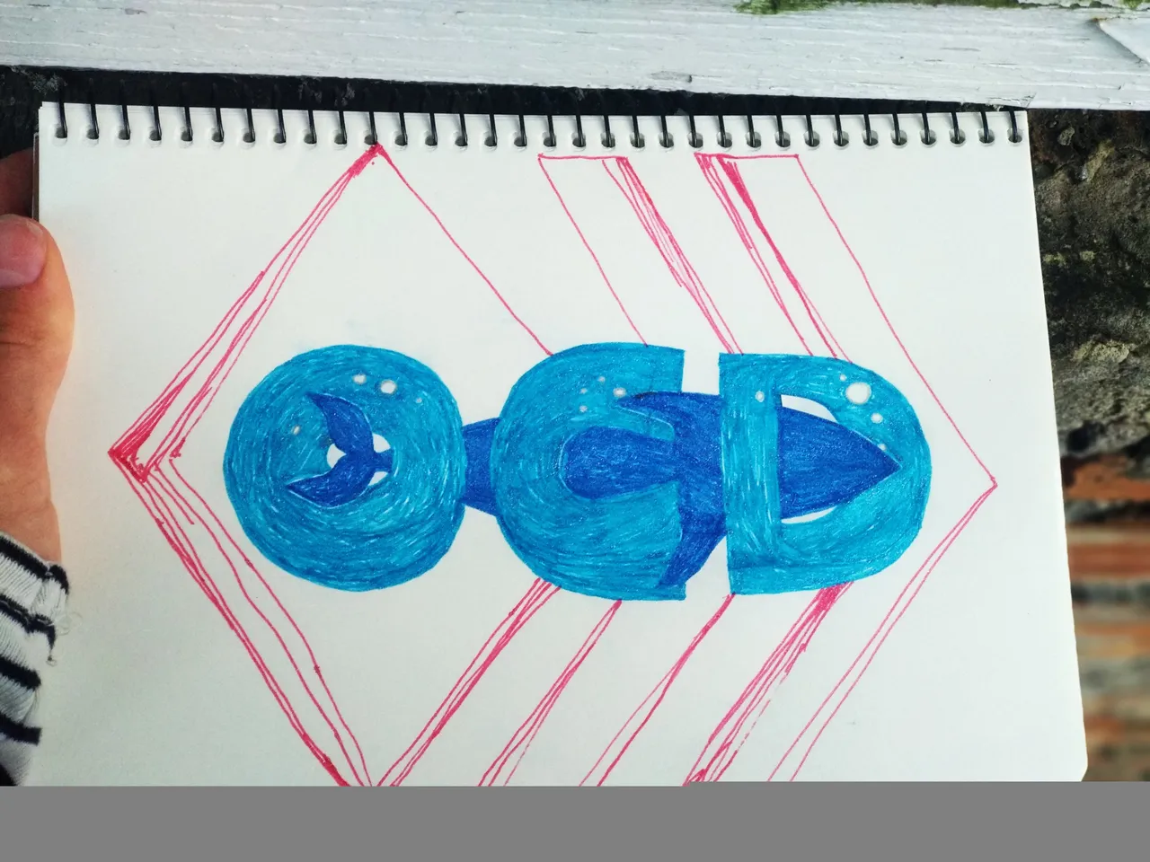
Since it's not digital, I can't make the translucent parts of the whale superimposed on the letters, so it's hidden behind the letters. And after all that we pass to drawings of a logo of a highway. Wow, the logo on the logo. One rhombus and two lines of half a rhombus. When it came to shading the diamond, I was so curious to create an illusion.
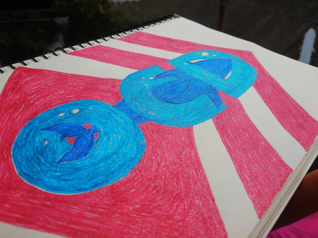
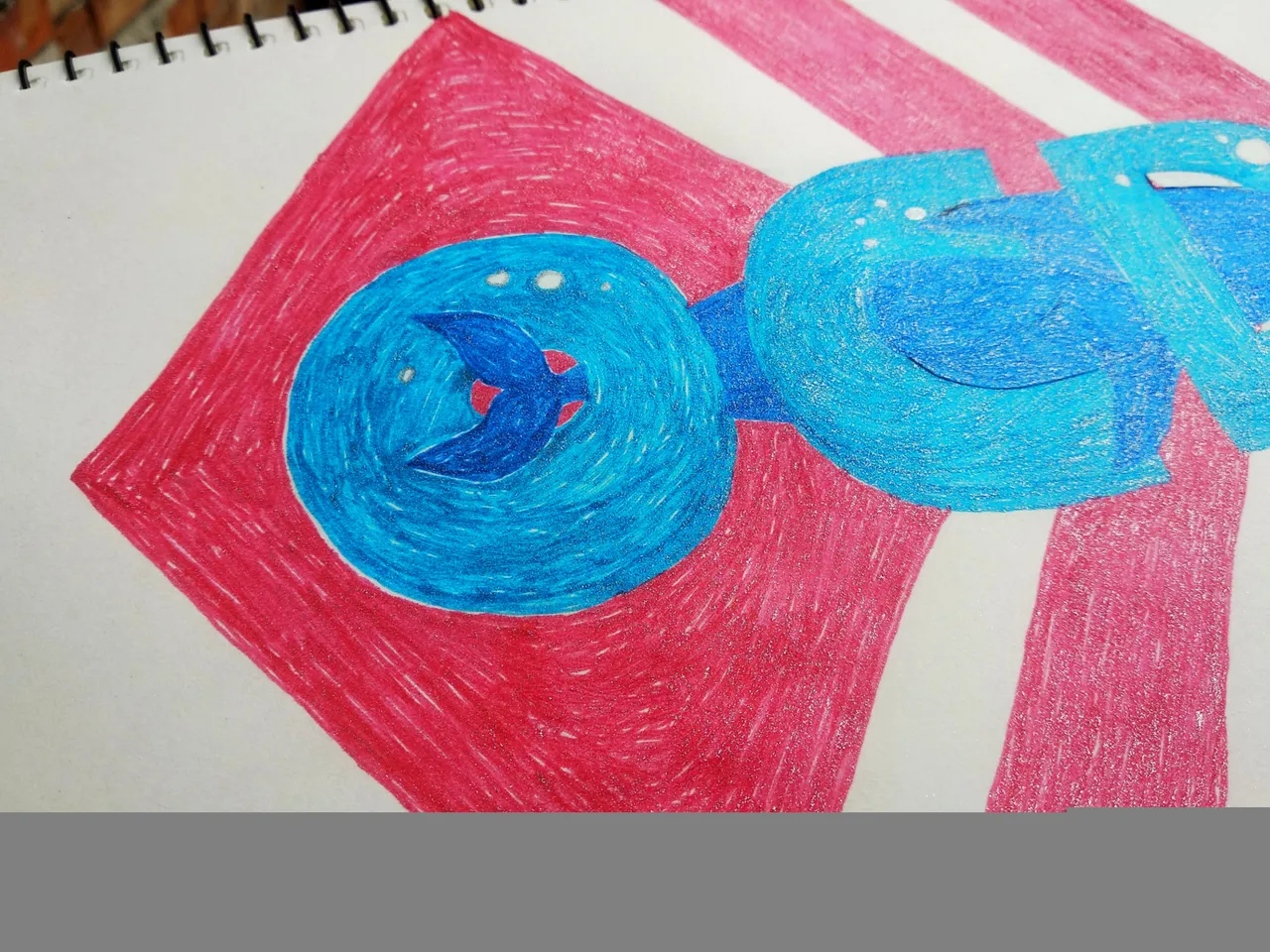
I did a circular shading and it turned out like a hypnotic ring.
And here is my version of the OCD logo ready.
Thank you for visiting!