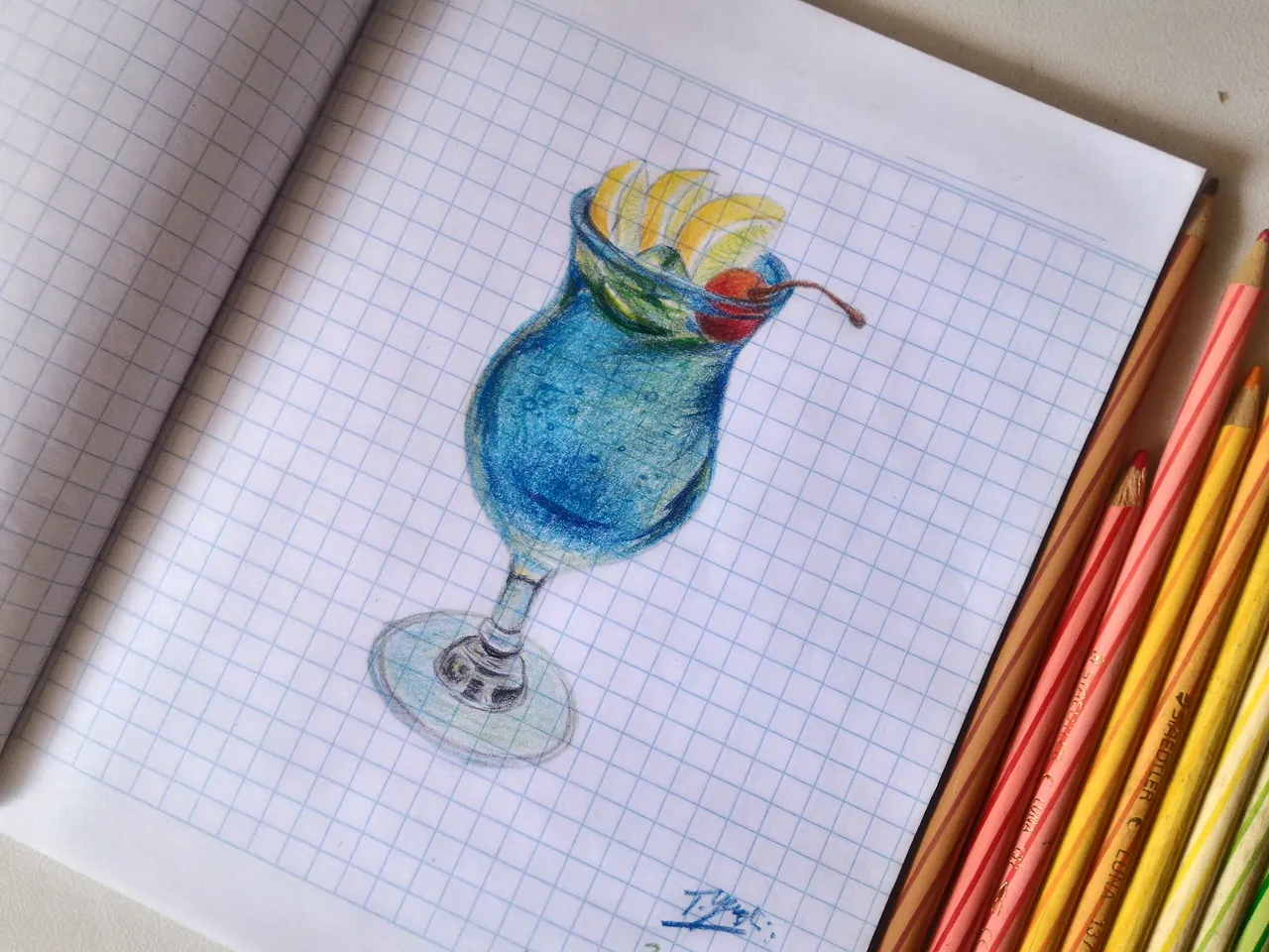
Hello everyone! Today, I am going to share the drawing of a cocktail that I did a few days ago. Recently, I came across a picture of a Blue Lagoon cocktail and I found it to look very pleasant on my eyes. I thought to myself, “Why not draw it then?”. So I did.
Tools and Materials
- Staedler Luna Colour pencils
- HB pencil to draw
- A dust free eraser to correct mistakes
- A simple sketchbook
- A sharpener to keep pencils sharp
Method
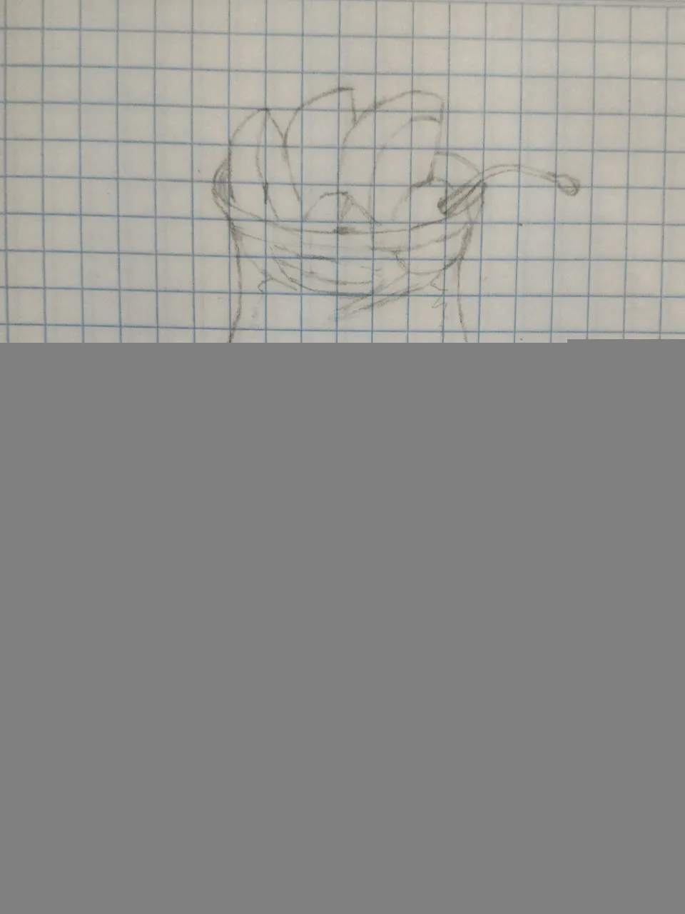
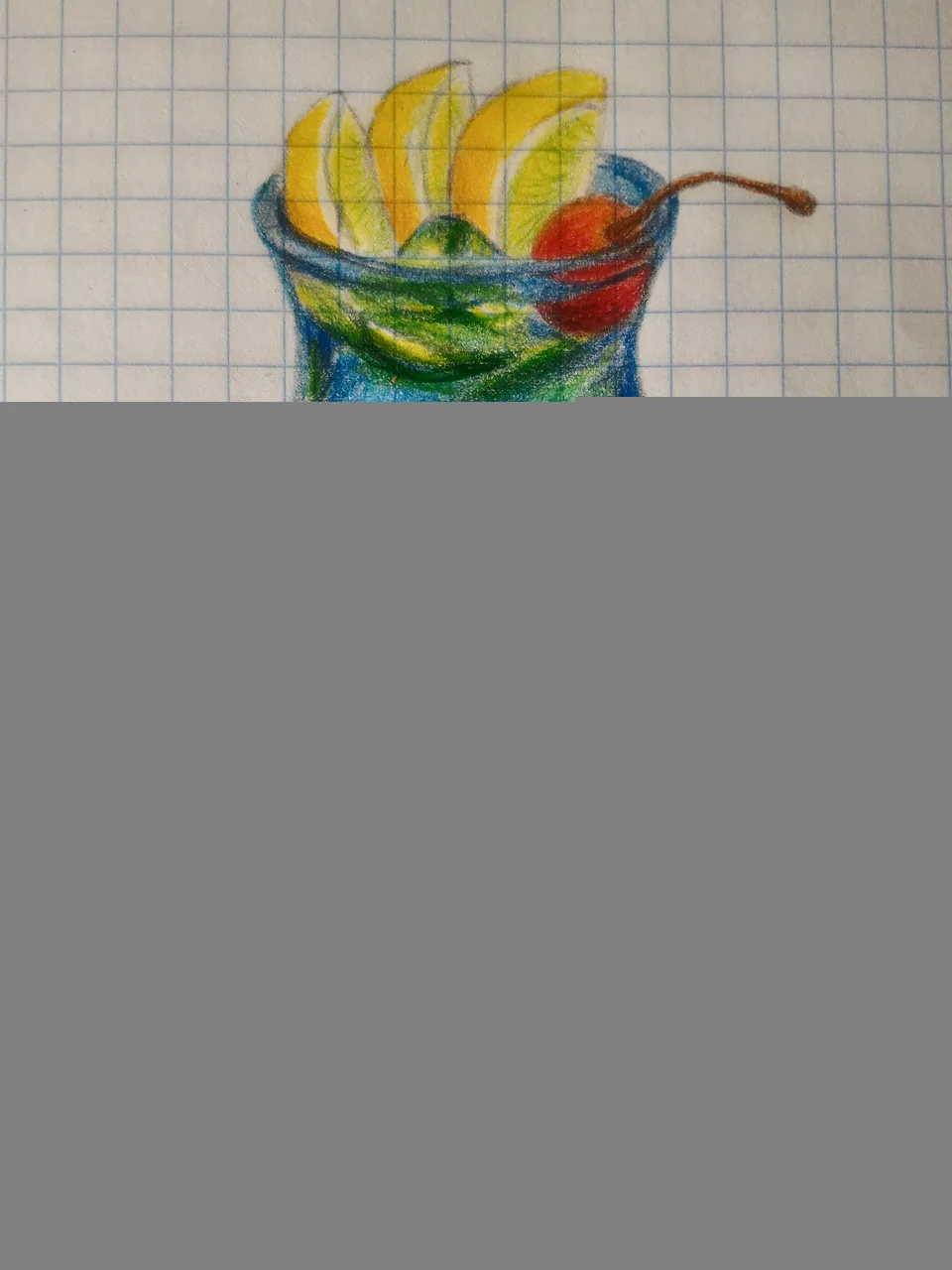
First of all, I drew a glass of Blue Lagoon cocktail. Please forgive me if the grid boxes are not easy on your eyes. This is actually an old notebook that I have and I thought of using it to practise drawings that need gridlines and now I am doubling it for colour pencils drawings as well.
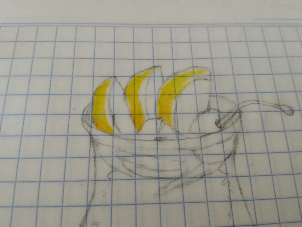
Next, I started colouring with the lightest colour needed which is white for the edges of the lemon skin. Obviously you can’t see it so I went ahead and used the next colour in line which is yellow.
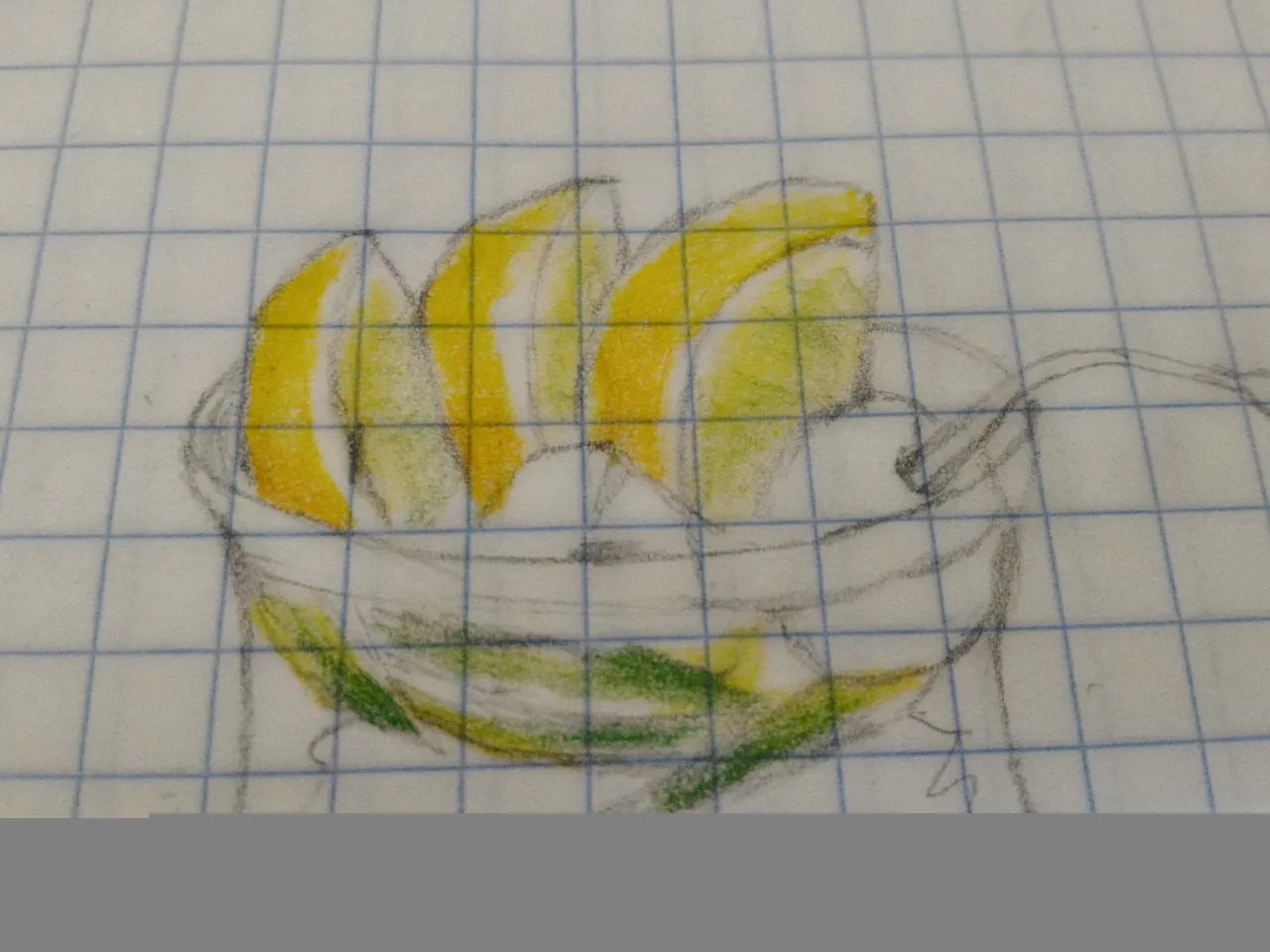
Then, I used a light yellow along with some soft green stroke to create the lemon flesh. It is very subtle but it does make a difference to the light yellow. I also used more green for the skin of lemon immersed in the drink.
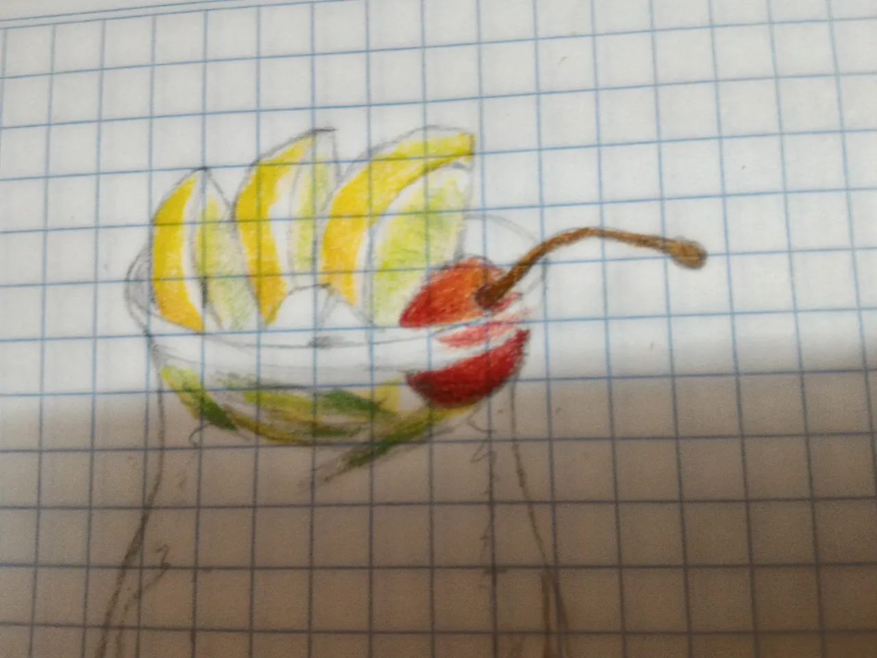
After that, I coloured the cherry. I mixed a few colours like orange, red and brown to create some shadows on it.
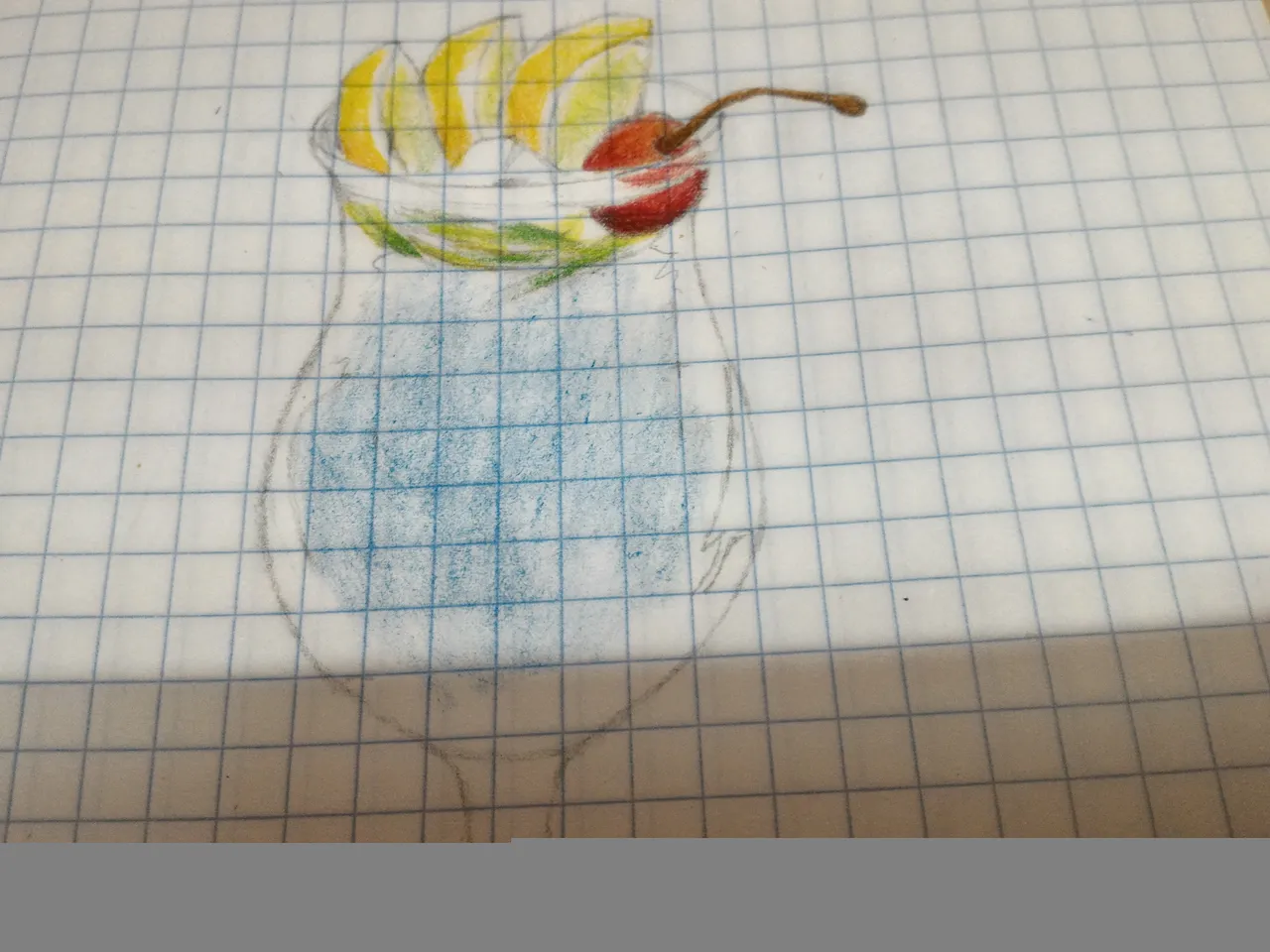
I started with the light blue (though it looks dark here :D).
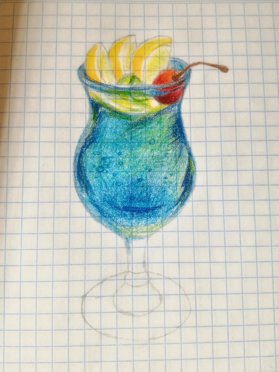
Now my choice of colours was limited. You will be surprised but I am actually still using the colour pencils. So to get a specific shade, I got to mix different colours to create it. I did not have a single colour that I thought would fit the Blue Lagoon cocktail shade, so I decided to try the blues and even greens by subtly mixing them with each other one by one.
Some of the details I included were ice cubes, some bubbles formed in the cocktail and some shadowy effects as well as some glassy effects. By the way, I did not once use the colour of white for these, as I thought that it might end up dulling the glassy effect. Instead of doing that, I just coloured by holding the pencils far from the tip and applied the least amount of pressure and built the colour up gradually.
I also coloured the lower parts of the glass. I mixed a few more colours such as yellow, green and blue to give the greyish tone a little more ‘life’.
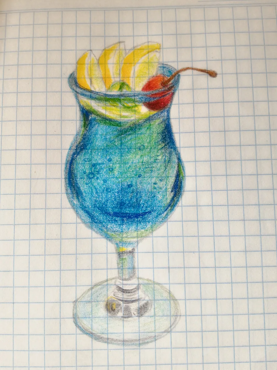
This is the final picture. I did more touch ups to increase the contrast where I added some lighter shades for highlights and darker shades for shadows. I think that makes artworks look better.
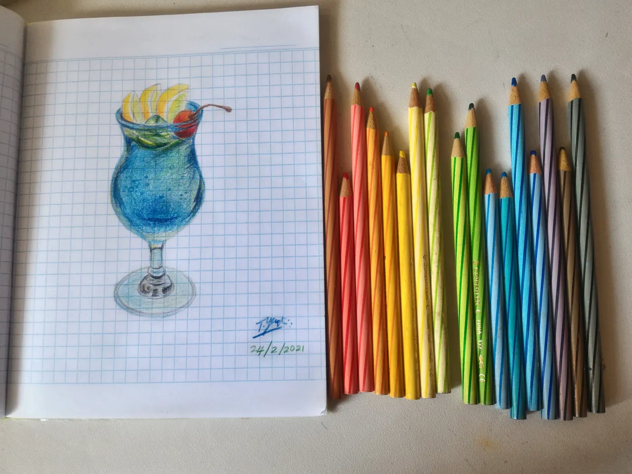
This is completed drawing with all of the colours that I used. I arranged them in a rainbow style. I hope that I didn’t bore you with the entire process of drawing. I typed a lot because I love to listen to the sound of typing :D
By the way, I sent a picture of my drawing to a friend who is a bartender and he said that it looks good. I felt so happy to hear it from a professional like him! Thank you for dropping by and I hope that you have a great day ahead =)