Hola hivers aquí mi participación para el logo de @ragnarok.game ,
nunca había hecho un logo y no soy diseñador pero igual me encanto hacerlo y espero que les guste a continuación les comparto el proceso.
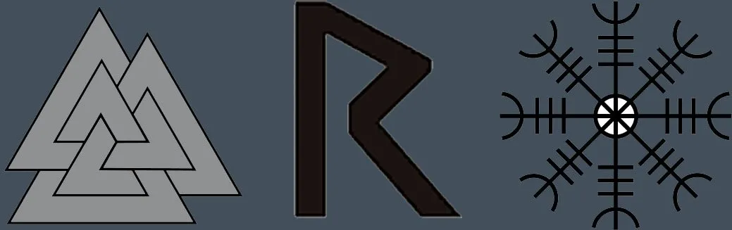
Los materiales que use fueron el símbolo Valknut, la letra Reith y
Aegishjalmur o ægishjálmur clic aquí para saber su significado todos símbolos y letra de la mitología nordica
Hello hivers here my participation for the @ragnarok.game logo,
I had never made a logo and I'm not a designer but I still loved doing it and I hope you like it, I'll share the process with you.
The materials I used were the Valknut symbol, the Reith letter and
Aegishjalmur or ægishjálmur click here to know its meaning, all symbols and lyrics of Norse mythology
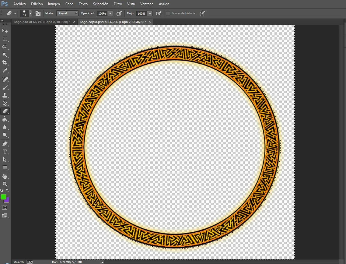
Paso 1
comencé hacer dos círculos paralelos para formar un anillo no ta grueso luego use el símbolo Valknut para hacer un patrón tribal en el anillo, aunque soy fan de la simetría no estaba quedando muy simétrico pero se veía bien.
Step 1
I started by making two parallel circles to form a not thick ring then I used the Valknut symbol to make a tribal pattern on the ring, although I'm a fan of symmetry it wasn't looking very symmetrical but it looked good.
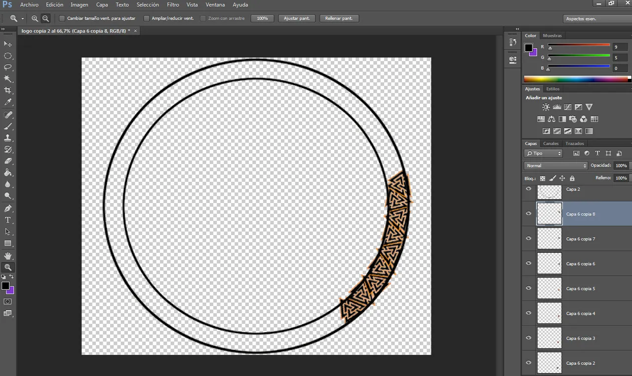
Paso 2
luego de completar el anillo completamente, borro las puntas que sobresalen del circulo trazado para que quede mas limpio y no se note ninguna imperfección.
Step 2
After completing the ring completely, I erase the points that protrude from the traced circle so that it is cleaner and no imperfections are noticed.
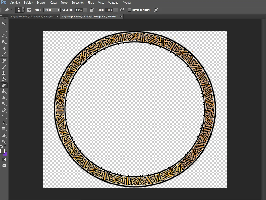
Paso 3
en este paso pinte el anillo con un color naranja y lo degrade para que pareciera un aro de metal caliente para colocarlo de fondo del anillo tribal.
Step 3
In this step I painted the ring orange and faded it to look like a hot metal ring to place as the background of the tribal ring.
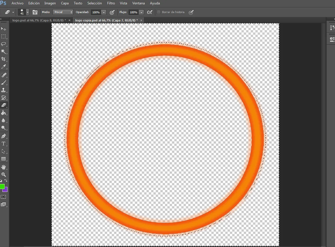
Paso 4
Aquí ya pueden ver el resultado y no quedo tan mal, pensé que quedaría como lava pero un dorado no esta mal.
Step 4
Here you can see the result and it's not so bad, I thought it would look like lava but a gold is not bad.
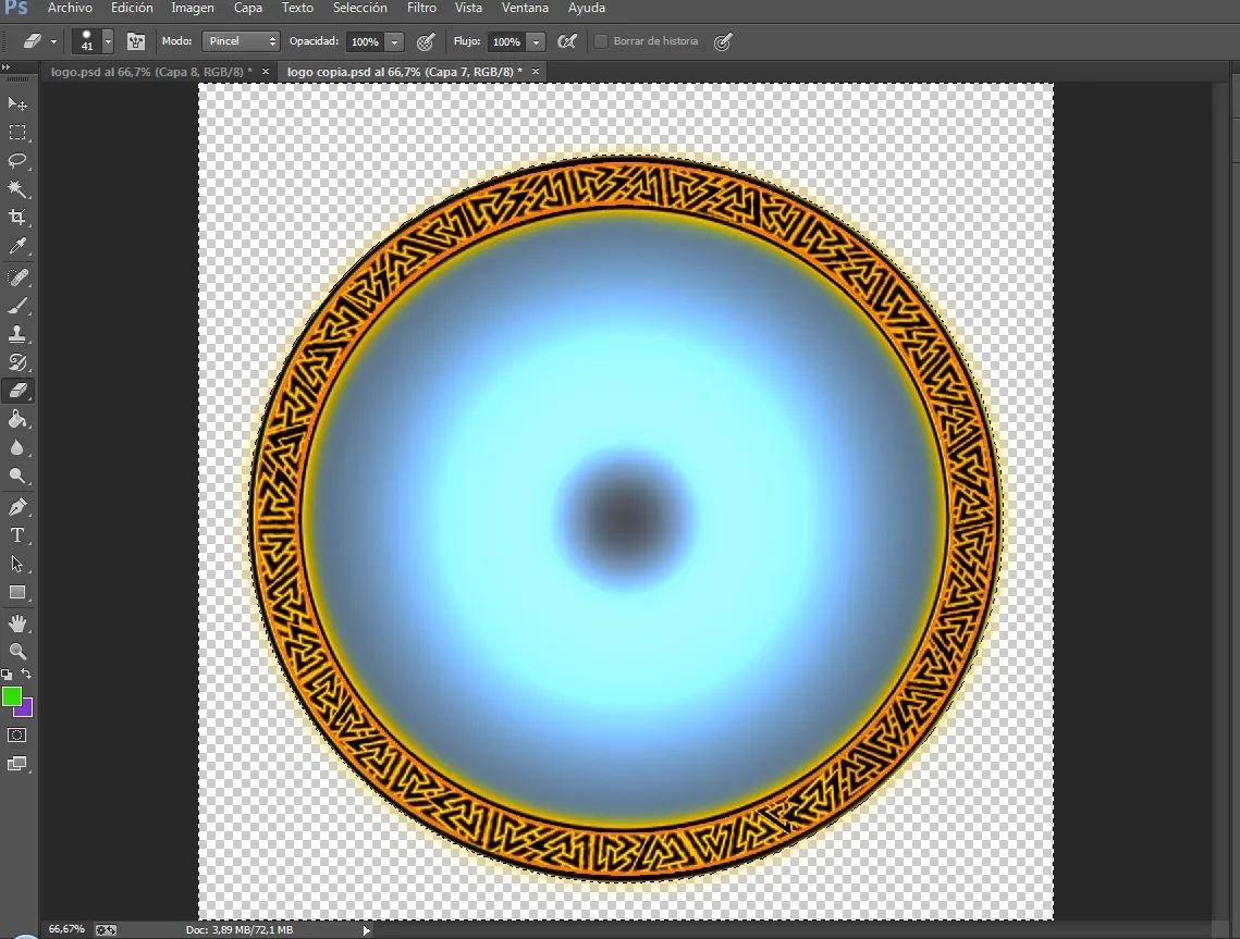
Paso 5
Luego agregue un fondo de color gris al centro del aro y encima de el coloque un degradado en forma circular para dar un efecto de iluminación.
step 5
Then add a gray background to the center of the hoop and place a circular gradient on top of it to give a lighting effect.
Paso 6
agrego el símbolo impronunciable el el centro y encajaba a la perfección y reduje su opacidad.
step 6
I add the unpronounceable symbol in the center and it fit perfectly and I reduced its opacity.
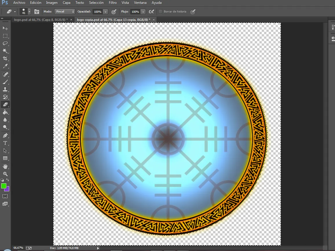
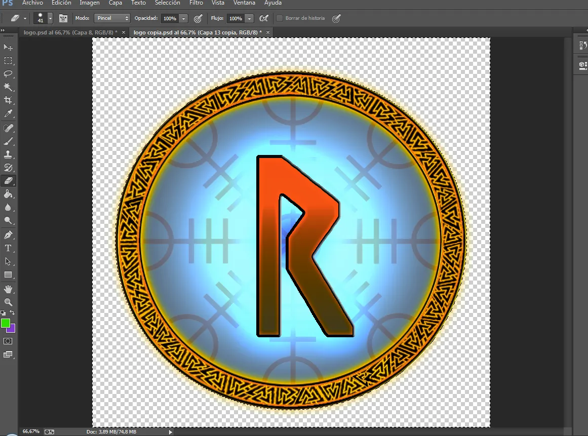
Paso 7
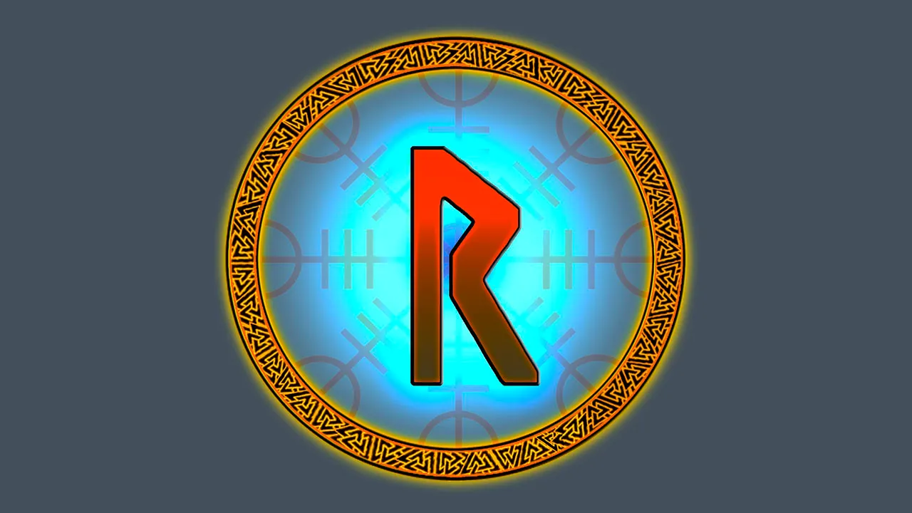
El ultimo paso era colocar la letra o runa nórdica en el centro de todo sin muchos efectos solo un degradado y luminosidad de color azul para que forme parte del fondo un logo simple pero hermoso, pensé en colocarle el nombre pero no me salio la idea que quería.
Step 7
The last step was to place the letter or Nordic rune in the center of everything without many effects, just a gradient and luminosity of blue so that a simple but beautiful logo forms part of the background, I thought of putting the name on it, but I did not get the idea that wanted.
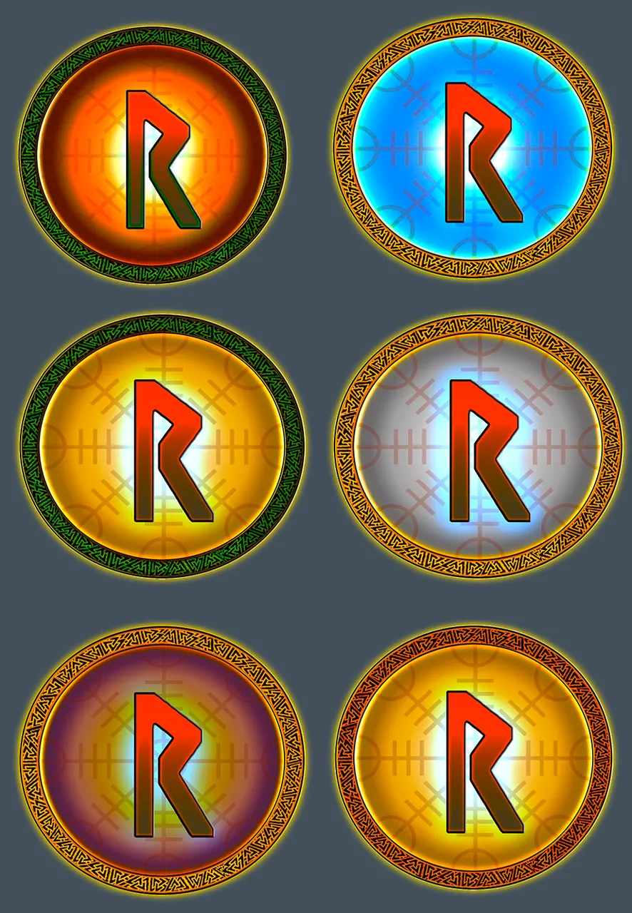
Aquí el mismo logo en diferentes colores por si no te gusto el que elegí, comenta cual esta mejor.
Here the same logo in different colors in case you don't like the one I chose, comment which one is better.
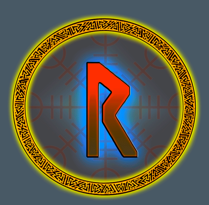
Resultado final / Final score
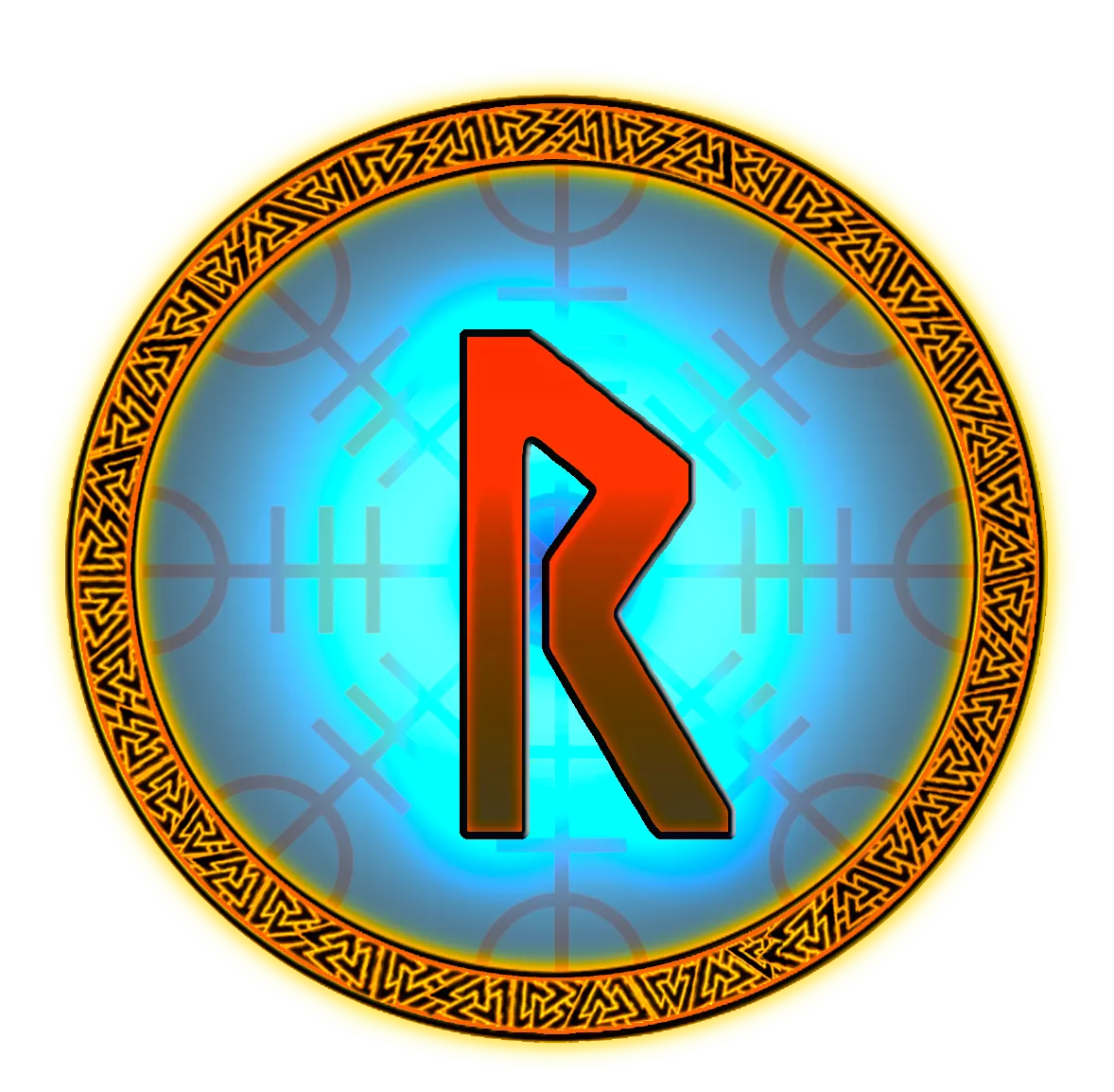
Bueno espero les guste se que pudo haber quedado un poco mejor
pero si gano obvio lo mejorare y suerte a los demás participantes
Well I hope you like it I know it could have been a little better
but if I win obviously I will improve it and good luck to the other participants