Here's my entry for Splinterlands' weekly art contest.
I'm no pro and this is my first time doing digital art, so if you got any tips and tricks or see me do something wrong/the hard way, I'd be more than happy to receive some feedback from the pro artists out there.
Things I used:
- Photoshop
- XP-Pen Deco 01 V2
plus a bit of imagination 😛
I try to summarize what I've done so far to give a rough idea of how made this fanart. Anyone with some basic Photoshop knowledge would understand the steps, so without further ado, let's get right into it.
First
Since it was my first art, I looked around to get a decent idea of what pen to choose. I found this article. To summarize, the brush I used for outlining had the following options:
- 100% Hardness
- 10% Spacing (default might be 5%, but 10 would do just fine and safe RAM)
- Size Jitter set to pen pressure
With that pen, I started outlining the art, I didn't like the idea of doing a pure copypasta, so I improvised a bit.
Second
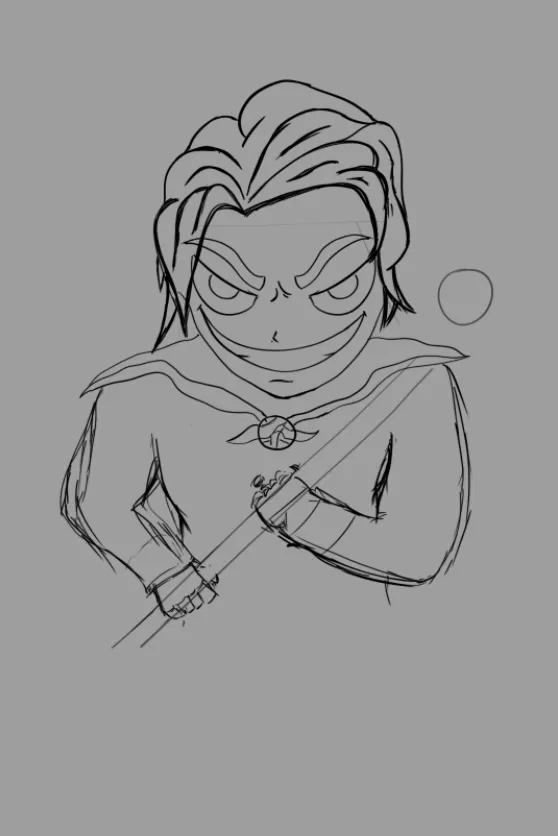
I'm no good with drawing body parts, hence the squiggly lines. They're my insecurity's manifestation since I was not sure which line would look best.
Third
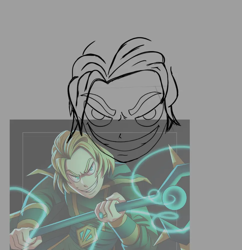
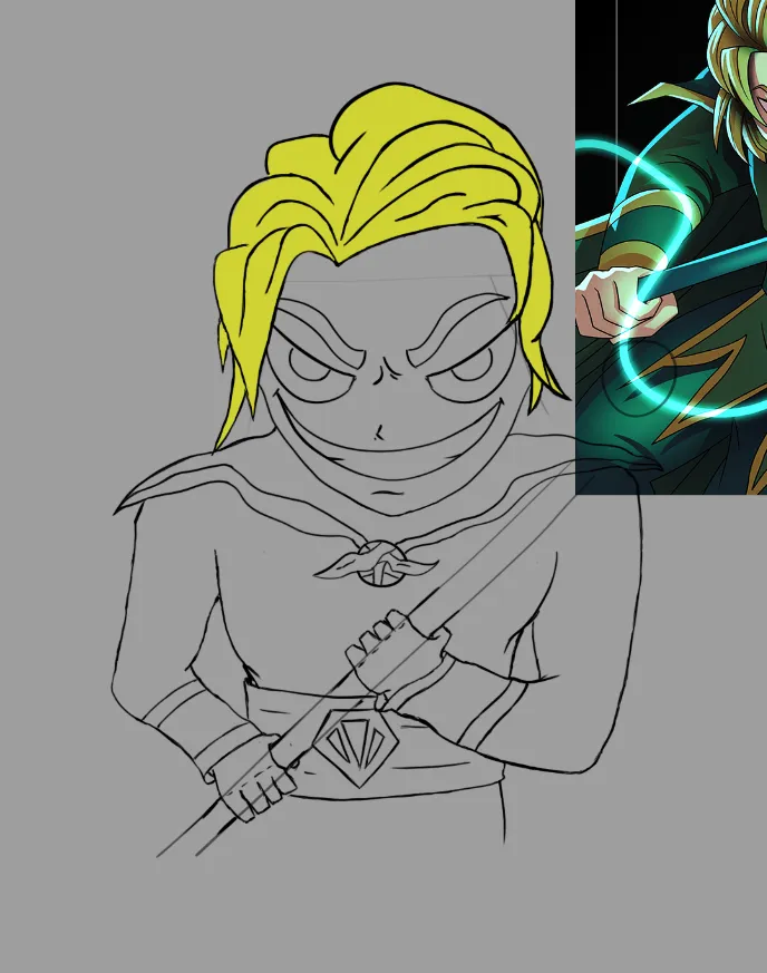
Then I started to erase all the extra wiggly lines and decide on which line looked perfect. Well, not perfect, but I liked the result. That's when I was super tired of all black and gray screen, so I started to give the guy some colors. I couldn't really find the best color for his hair, since the original art is in a dark-ish space illuminated by his magic's light (which is green-ish(?)). That made the whole thing even more complicated, but I stuck with the dark yellow you can see below.
Also, I redesigned his hair (top right) a bit since it looked quite wonky.
Fourth
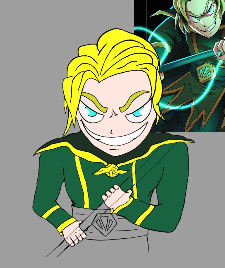
I colored more of the poor guy with flat colors, gave his eye some sort of glow as is in the original work (gives him this devilish look haha).
Fifth
And finally drew this guy's stick. The color selection wasn't all too good so it looks hella flat. Like it's made out of cardboard. Not sure how to give that metallic look or glow, but at least he's got a stick to hold onto now, lol.
Really forgot to take screens every single step, because I had no steps planned and didn't really know what I was doing until I actually did it.
Also, the lines on his teeth looked a bit off, so I modified them a little to look better and added some shadows to his temple with overlay layers so that his face has more depth and life.
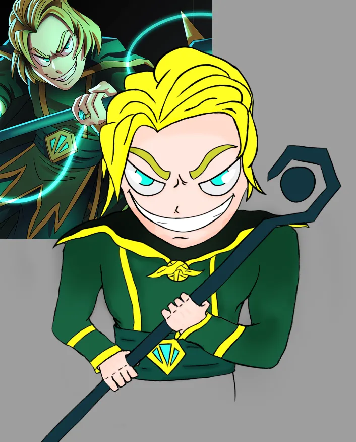
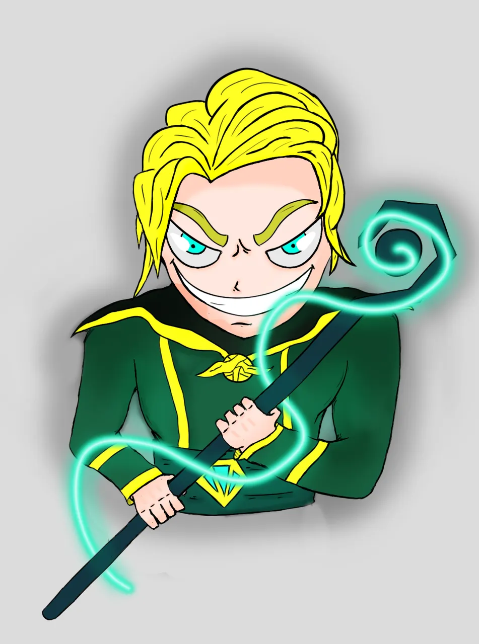
And here's the finished product. Added some black layers set to soft light or something to make his clothes look a bit more real and depth-y. And last, but not least, to make his cardboard stick look more magical, I drew a trace of light, selected it, contracted by a few pixels, filled it with solid white color, and fiddled with opacity and layer type(?) to get the best result. Also, I masked the part in the middle on his stick to give a better spiral look.
And almost forgot, I tried adding black dots to his eyes and it felt kinda good tbh, so I decided to keep them despite the fact that there was nothing wrong with it before. (Maybe red dots would show more bloodlust, I think they look good as well)
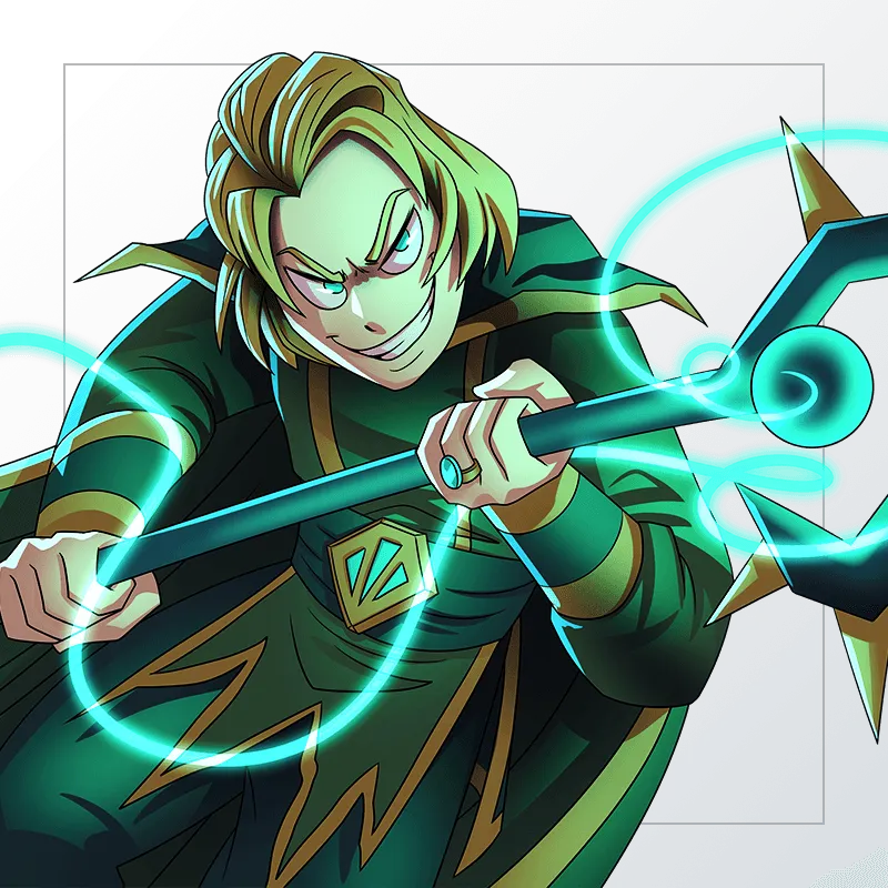
Also, here's the original reference for Magi of Chaos.