I'm posting this in case it helps anyone else. It caused me 4 hours of horrible frustration.
I'm trying draw a quite hideously over complicated set of graphs which I've cobbled together in truly apocalyptically bad spaghetti code in Python. But it kinda works.
And then I added a bar graph that I needed to go behind the lines. This is what happened.
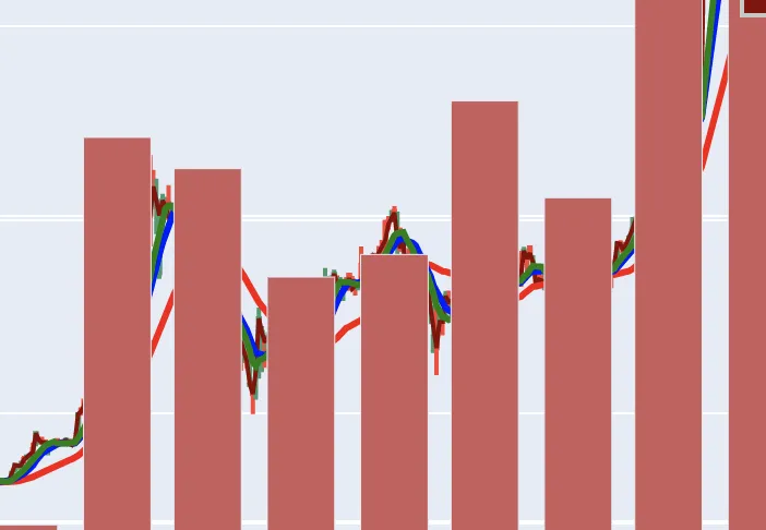
One day I'll share more of the full graphs, suffice it to say they're being prepared for our next #CryptoClassAction court date in March.
This particular graph has two subplots one above the other with 4 y-axis, 2 on each subplot.
I reduced my problem to a much simpler example:
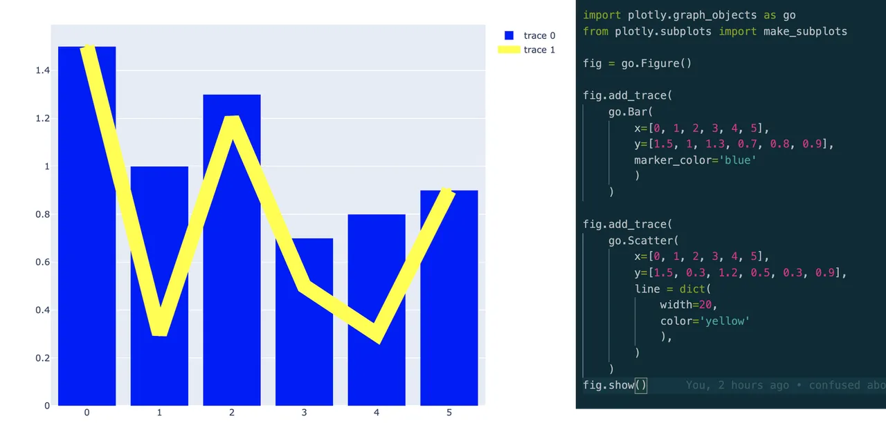
The code for which looks like this:
import plotly.graph_objects as go
from plotly.subplots import make_subplots

fig = go.Figure()

fig.add_trace(
    go.Bar(
        x=[0, 1, 2, 3, 4, 5],
        y=[1.5, 1, 1.3, 0.7, 0.8, 0.9],
        marker_color='blue'
        )
    )

fig.add_trace(
    go.Scatter(
        x=[0, 1, 2, 3, 4, 5],
        y=[1.5, 0.3, 1.2, 0.5, 0.3, 0.9],
        line = dict(
            width=20,
            color='yellow'
            ),
        )
    )
fig.show()
So far so good. Then I converted this to a plot with subplots and separate y-axis and mimicked what I did with my complex plot: I ADDED the bar graph and created a secondary y-axis for it. Here's the graph I got and the code:
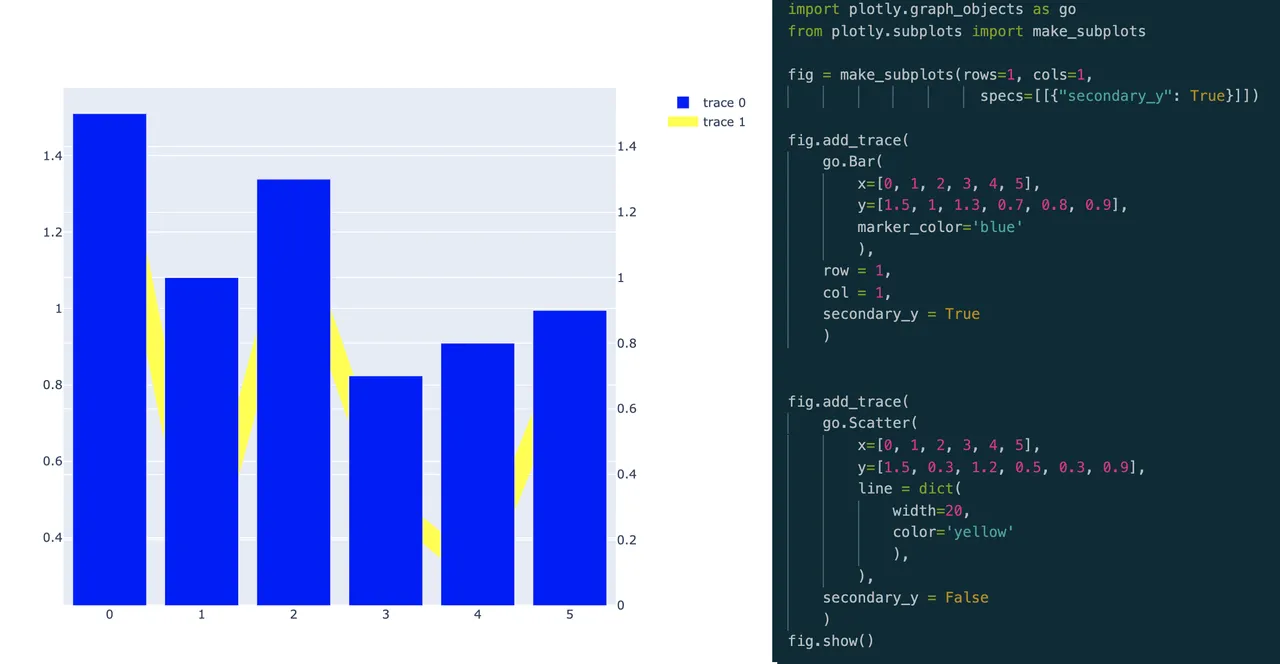
import plotly.graph_objects as go
from plotly.subplots import make_subplots

# fig = go.Figure()
fig = make_subplots(rows=1, cols=1,
                      specs=[[{"secondary_y": True}]])

fig.add_trace(
    go.Bar(
        x=[0, 1, 2, 3, 4, 5],
        y=[1.5, 1, 1.3, 0.7, 0.8, 0.9],
        marker_color='blue'
        ),
    row = 1,
    col = 1,
    secondary_y = True
    )


fig.add_trace(
    go.Scatter(
        x=[0, 1, 2, 3, 4, 5],
        y=[1.5, 0.3, 1.2, 0.5, 0.3, 0.9],
        line = dict(
            width=20,
            color='yellow'
            ),
        ),
    secondary_y = False
    )
fig.show()
And immediately I got the idea... the only thing I needed to do was switch over the secondary_y axis. For some reason I can't figure out in the Plotly system, secondary_y axes items always overwrite the primary. Here's the final graph and the code.
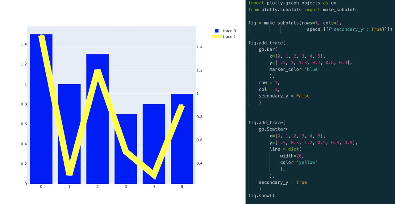
All I had to do was flip the bar graph onto the first y-axis and the lines onto the secondary y-axis. I've done that now on my main graph and voila... it worked.
This isn't a finished product yet, it needs a fair bit of work, but here's the current draft.
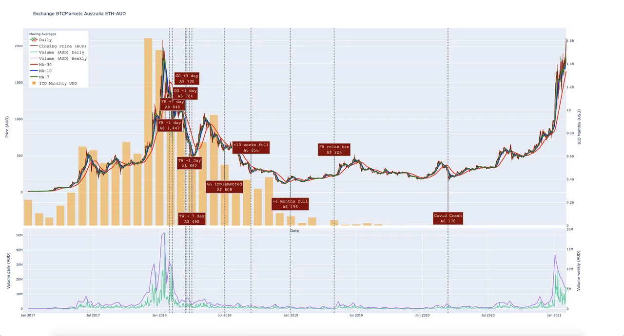
You should be able to play with the interactive HTML version at this link.
Thanks for looking and I hope this helps someone one day!