Yeah you read the title right 😄 !! Coding in 3D with CSS has never been easier. In this tutorial we will be using CSS-3D-lib made by me( obviously 😅).
Step 1
Create a new html file or just go to a web code editor and include the library with:
<link href="https://appukuttan66.github.io/3D-CSS-lib/lib.css" rel="stylesheet" type="text/css">
on your head tag.
Step 2
Add the following lines to the body :
<div class="c">
<div class="s"></div>
<div class="s"></div>
<div class="s"></div>
<div class="s"></div>
<div class="s"></div>
<div class="s"></div>
</div>
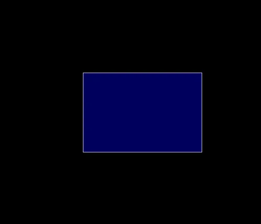
The c stands for cube/cuboid and s stand for side. There are 6 s div inside the cuboid because a cuboid has 6 sides. right?
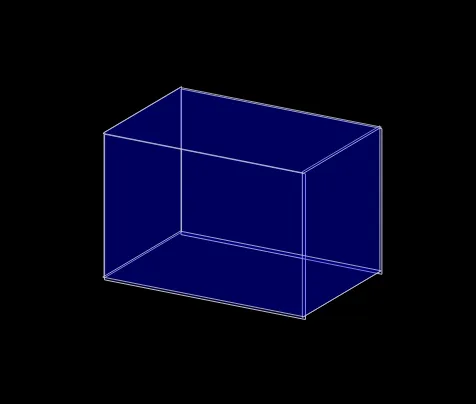
That's it you have cuboid.
Wait.. Cuboid or Rectangle??? 🤔
Add this small line in your CSS :
transform: rotateX(20deg) rotateY(30deg);
and now you have a cuboid.
Changing the height, width and depth
Now that you have your cuboid you probably would like to change it's height , width and depth. Right?
Don't worry all you have to do is change the variables in CSS:
c {
--height: <the height you want>
--width: <the width you want>
--depth: <the depth you want>
}
I will be making a tutorial to make multiple cuboids and make cool things with 3d CSS in my next post.
Have Fun!! and Stay tuned!!
PS: If you have any ideas for the name for the CSS library please add it in the comments below. The name who gets the most votes will be chosen 😃. ( you will be given credit !! don't worry!! )