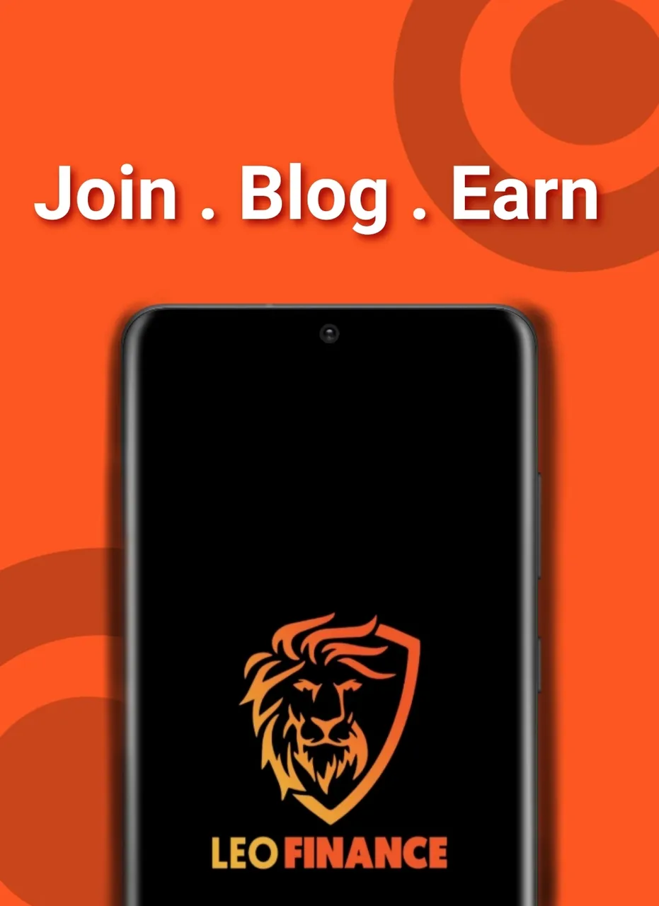
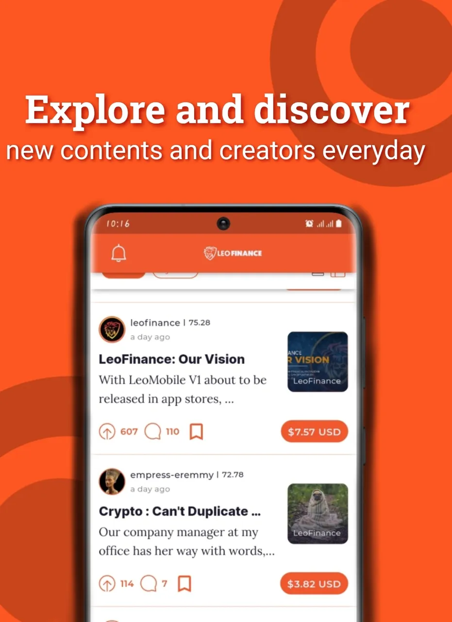
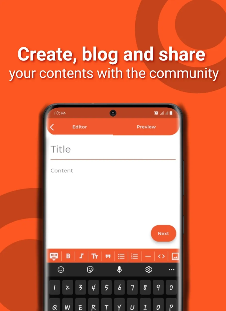
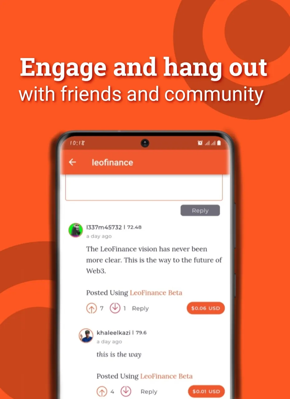
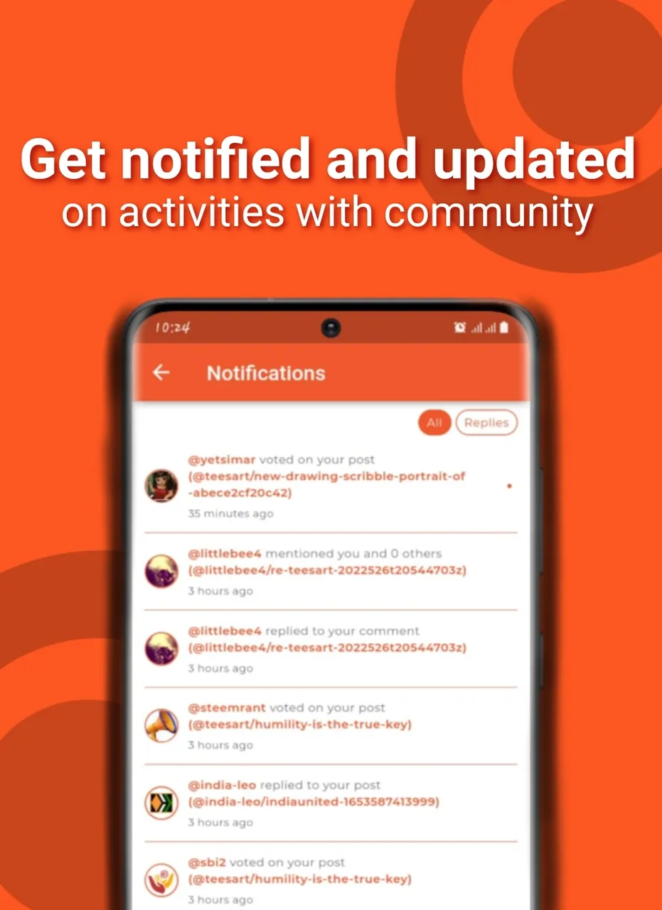
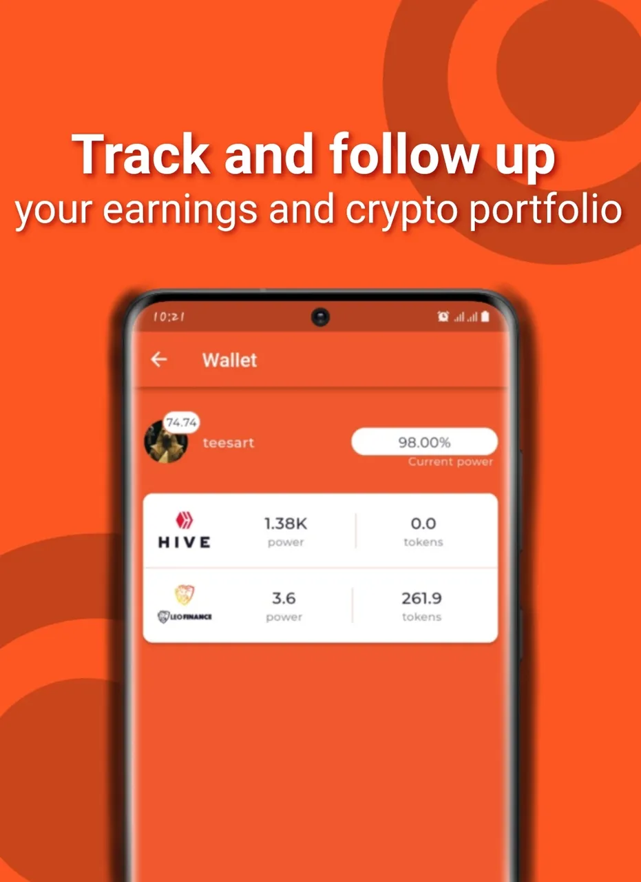
Hopefully this isn't coming in too late, it's been a busy week over here but I took some time today to create these designs as a proposal for the Leomobile App Store layout. For this design, I took note of key features of the app that would instantaneous speak loudly to anyone who views them and would give a alot of details about what Leofinance and what Leomobile is. At the same time, keeping it concise, attractive and straight to the point. Leofinace is mostlyn attributed to the orange colour which is the main theme of the app and so I had to use it as my background and also because it's quite an attractive colour. I used some special effects like shadows on the ,obile phone to give it a realistic and more appealing appearance.This is my first app store layout design and I'm glad I could contribute to the growth of the community in my own little ways.
Here are the designs and they were created with the Picsart app for anyone who would love to take part.

Thank you so much for checking it out. I hope you love it.