Today I am trying to create a pivot table with my Risingstar account data. This is beautiful and infographic. Please take a look at following images.
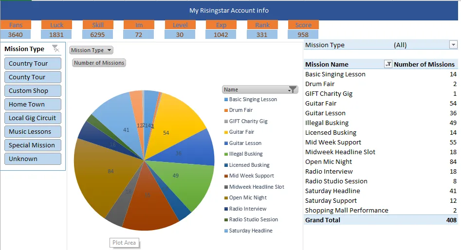
This include all the missions I made so far. It is total of 408 missions. If you look at the left side of the screenshot you will see my slicer choose all Mission types. So I will choose Home Town for next screenshot.
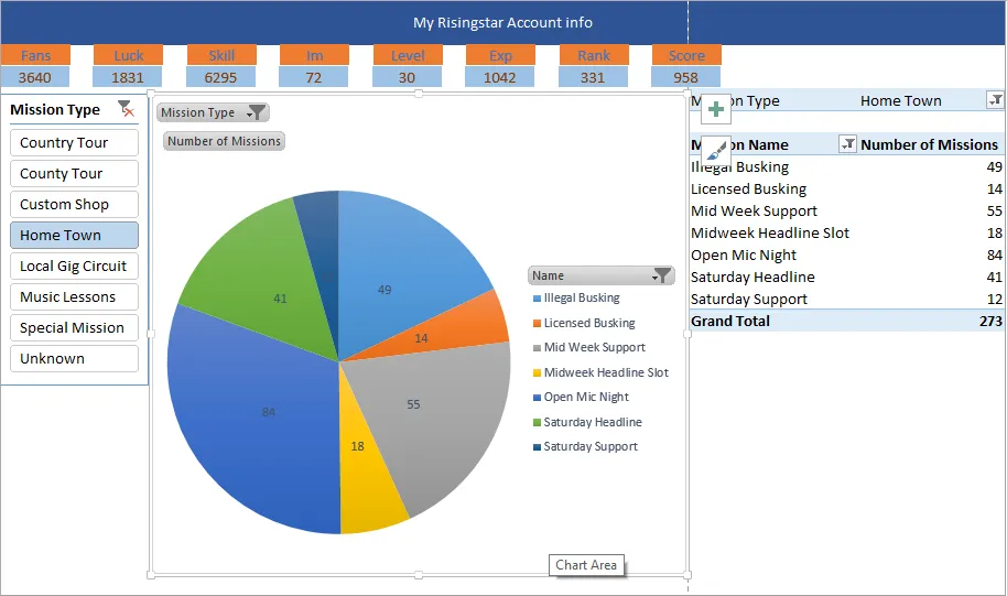
As you see I only choose Home Town this time. There are 7 mission names and I have made 273 in total.
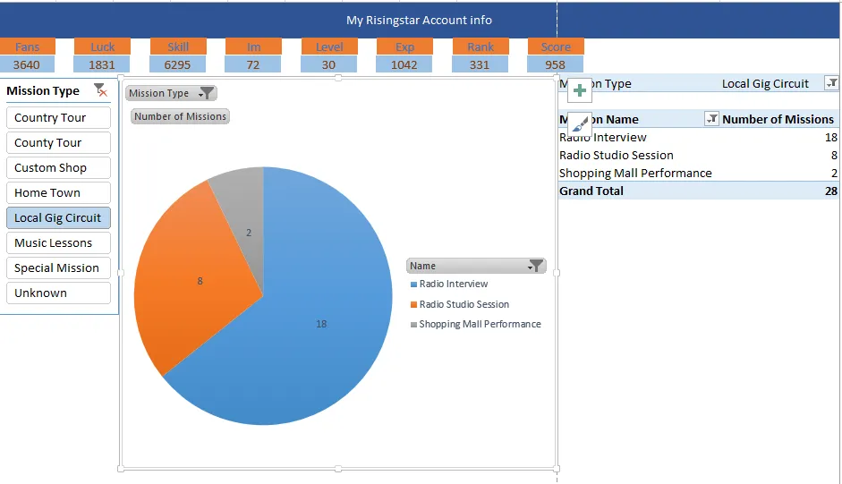
These are the missions I made in Local Gig Circuit. I hide the non-performing missions so it is only showing 3 mission names.
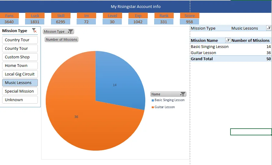
These the music lessons I made. I love guitar so I only did Guitar Lessons.
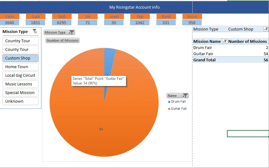
These are the Custom Shop missions I made so far. I solely focused on the Guitar Fair so you will see a lot of Guitar Fairs.
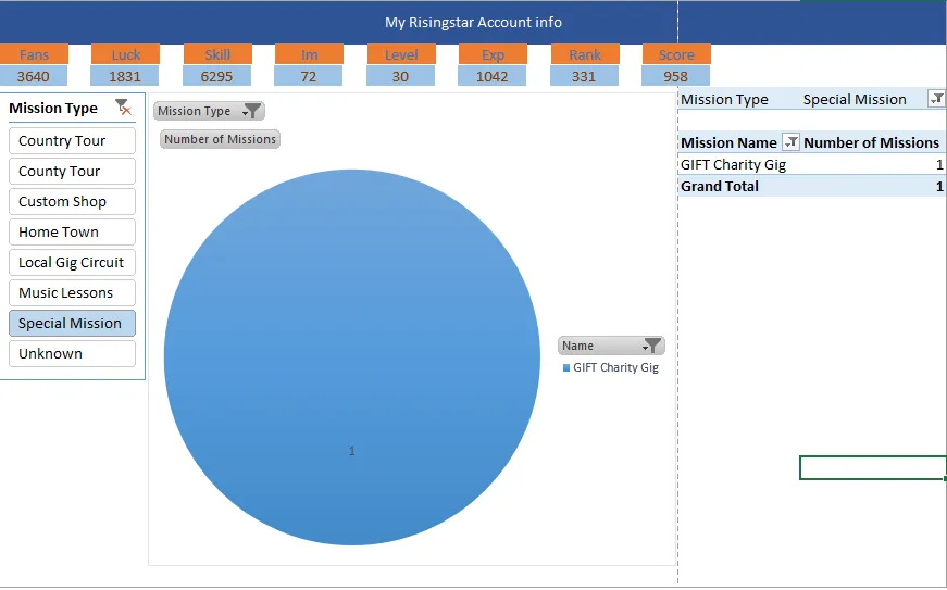
I also did one special mission. So it occiupied the hole chart.
If you want to see all mission again just remove the filter next to Mission Type.
I also added my status on top of the chart and slicer. I need to update all data manually. If someone tells me how to extract this data from website and put it in the excel file, it will be more easier for me.
My rank now is 331 and it is so far away to get within top 100s.

If you want to play risingstar please use the following link:
https://www.risingstargame.com?referrer=beyondhorizonmm