Note: UX is short for user-experience. UI is short for user-interface. It
I love PeakD.
Out of all the front-ends I’ve tried (Ecency, Dapplr, Waivio, ProofOfBrain, LeoFinance, and more,) I gravitate towards PeakD the most.
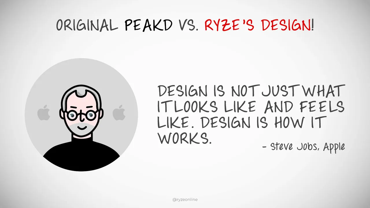
And with my sizable background in art direction, design, and UX/UI, (I ran a graphic & web design company for years, have done UI direction for big clients like Evan Carmichael, and have written 300,000+ words of copy on Hive in the last three months,) what I really love is a smooth, intuitive, fulfilling browsing experience for content. And I believe that’s what users are hungry for as well, though they don’t usually articulate it. For example, I remember the Firefox and Internet Explorer ‘browser wars.’ When Chrome launched with it’s clean, fast, intuitive interface, it quickly claimed dominance in the browser market. It put Firefox and Explorer to shame, because it was just a joy to use.*
*These days Chrome may have departed from this somewhat.
And I see Hive front-ends similarly. Hive is fairly new, as are its front-ends. And there’s room for a newcomer to step in and grab the majority of users, just by being easier and more fun to use. A great tool, like a hammer or a pen, feels great to use. It has just the right amount of features, not too many, not too few. It doesn’t draw too much attention to itself, and instead, focuses on empowering the user.
But even more importantly…
An enjoyable user-interface makes onboarding people much easier.
If something looks intimidating, with tons of buttons and widgets, people go into overwhelm. Yahoo’s search page was absolute chaos, then Google came along with the simplest, cleanest, most minimal search interface around, and blew Yahoo out of the water. Google had no problem onboarding new users because it was simply a joy to interact with. Visit a beautiful page with negative space, type in phrase, get clean search results. Voila.
*Again, these days Google may have departed from this somewhat.
The point is, I’ve spent a lot of time thinking about the power of UX, UI, and front-ends, as well as their power to attract and fulfill users who interact with them.
So I’ve taken the time to turn my thoughts into a partial redesign of PeakD.
Please keep in mind these are just some ideas and suggestions. Nothing is set in stone, and I’ve not discussed any of this with @jarvie or @asgarth. I haven’t even discussed it with @sjarvie5 , lol. This is not an official proposal. It’s not a command of what must be done. It’s just a dude, sharing some ideas, and hopefully it can be seen in a friendly, helpful, positive light. I just have a knack for UX/UI and a passion for improving things, and I hope it sparks something in someone.
So without further adieu, let’s dive in.
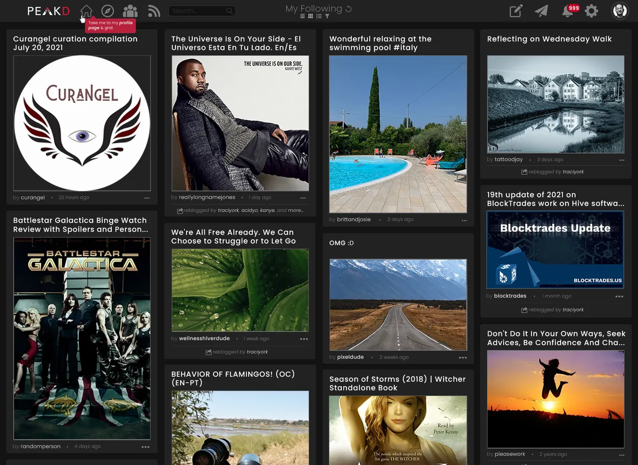
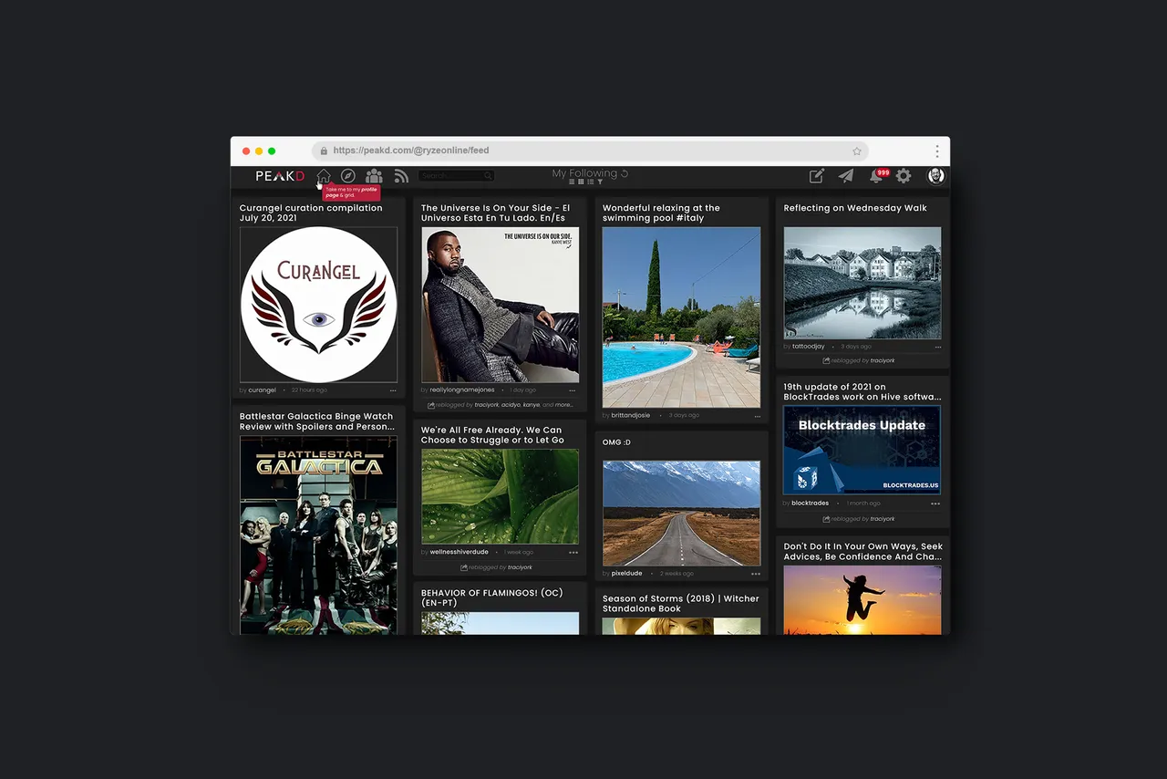
PeakD - MAIN FEED Redesign
Focus: A sleek, uncluttered, focus on serving up content to users.
Secondary Focus: Encouraging users to engage with content rather than blind-vote them.
Sleek Interface
To me, a great app empowers users well, while also being unobtrusive and out of the way. With my design here, PeakD’s tools take up minimal screen real-estate while giving the user access to all key features. This is done through a clean navbar at the top of the screen. Icons for user’s Home page, Explore, Communities, Feeds, are followed by an ever-present search-bar and a ‘breadcrumbs’ & filters section. Icons for Create, Messages, Notifications, PeakD Settings, are on the far right, and lastly... Profile settings are accessible by clicking the user’s avatar. These conventions are very similar to other apps, and will likely feel ‘at home’ with users. This minimal navigation puts all the focus on the content and feeds.
Clean Grid
Each ‘card’ on the main feed now has a larger headline & thumbnail. Much of the ‘clutter’ was removed, leaving only a byline, date posted, action-menu, and an optional spot for reblogs / cross-posts. (I also chose a ‘pure’ grey scheme instead of PeakD’s original blue-grey, as it helps colors pop more, especially ‘blue’ links.) All other details are displayed once a user clicks through to the post. This encourages exploration of content on its merits, not it’s vote-counts, and discourages blind-voting.
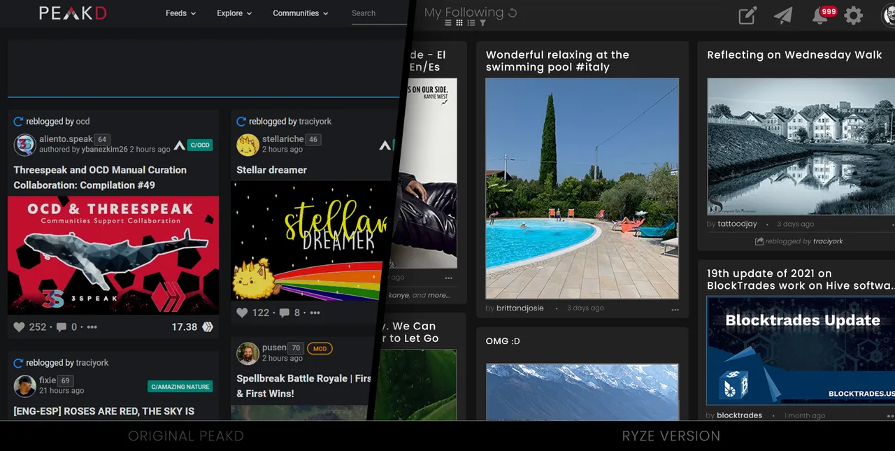
Engagement Encouraged
In my design, vote counts are still shown on user’s profile pages, search results, and other potential grids & feeds, but I believe the main feed is best judged on the merit of its content, not on huge vote-trail numbers or Hive earnings. If people want to see those stats, it’s best if they take the time to check out the content first, then be shown those stats after clicking through. This encourages users to click through on headlines, topics, and thumbnails that speak to them, rather than simply glancing at data, blind-voting, and moving on. YouTube’s main feed doesn't show like-counts and I feel Hive would benefit from modeling this. If encouraging people to actually click through and explore content to assess it’s value bothers people, we could instead show ‘views’ only, or the stats & numbers can always be added back to cards, as you’ll see in a screenshot lower-down this page.
PeakD - PROFILE PAGE Redesign
Focus: Highlighting the author’s content by condensing the box of biographical info.
Secondary Focus: More emphasis on author personalization with more space for the banner, avatar (profile photo), and grid.
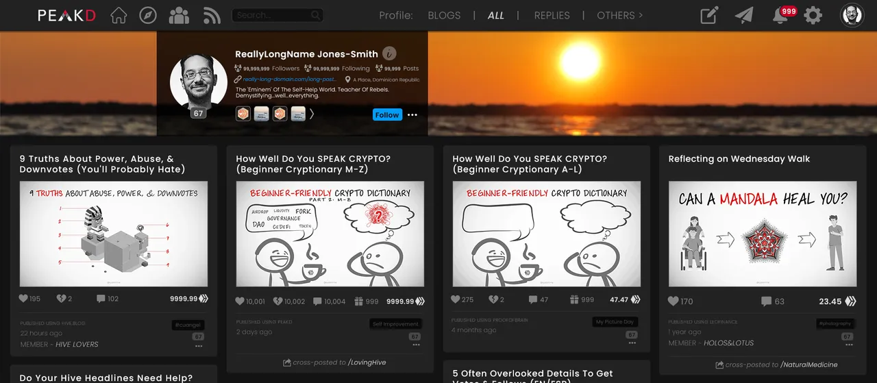
Compact Bio Box
Name, photo, follower/post count, website, location, bio, badges, follow button, and action menu... all in a beautifully compact, translucent black box. This allows people’s cover images to be far more impactful and easier to create, as well as letting their profile photo be bigger. Any missing features from the original PeakD have been moved to the two menus in the top-right (Settings Gear and Account Actions accessible by clicking the avatar in the top-right.)
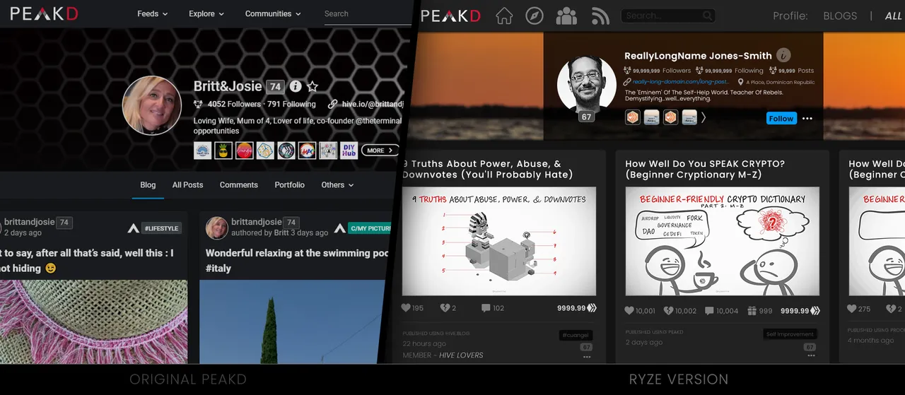
Decluttered Data
Unlike the main feed above, the cards here show all the data from the old PeakD design (upvotes, downvotes, tips, comments, rewards, front-end, post-age, member-of, community/tag, reputation, cross-posts, reblogs, and action-menu... but it’s done extremely cleanly, with hierarchical font-weights and minimal flashy colors, making it easy on the eyes, and easy to know what is clickable.
PeakD - WALLET Redesign
Focus: Vital cryptocurrency info and account status at a glance.
Secondary Focus: A brief, simple education on what each currency is.
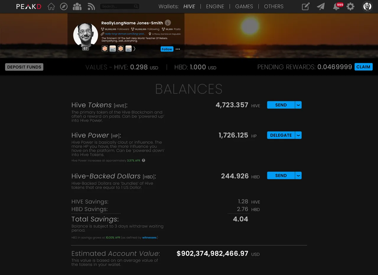
Intuitive Navigation
The same way drivers are comfortable with how brake- & gas-pedals are set up, users are comfortable with an application’s navbar at the top of the screen. They’re used to looking there for important information and actions. So I moved the various Hive Wallets to a menu at the top of the screen wallet screen. I also moved the stock ticker prices and deposit button away from the ‘right’ column on the original PeakD to a secondary bar just under the cover image. (The cover image has also been ‘dimmed’ slightly on this page, because the emphasis here is on the author’s account & crypto, not their personality or follower counts.)
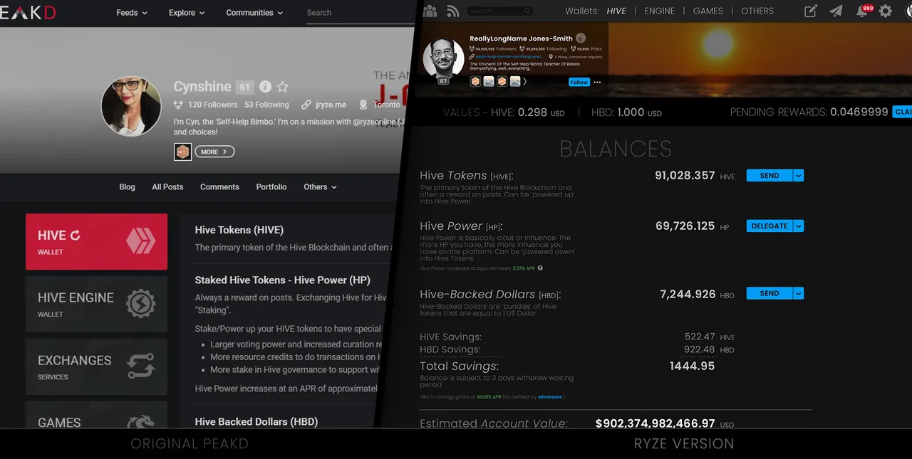
Organized Balances
I wanted to see my balances clearly and have an understanding of my account at a glance, so the PeakD wallet screen has been completely overhauled to be neat, organized, and aligned. This is a friendly screen that would be a pleasure to see and navigate, in my opinion, and a similar approach could be taken towards ‘Crypto Transaction History’ if one scrolled further down the Wallet page.
PeakD - POST Redesign
Focus: A pleasurable read and easy consumption.
Secondary Focus: Intuitive interaction and navigation of the content, author, and stats.
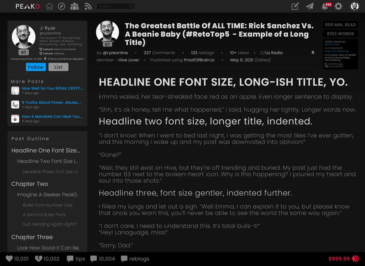
Two Columns
The post page is where a lot of PeakD’s value lives. This, presumably, is what people are here for. The precious, valuable, authored content. This content (hopefully produced by talented content-creators) is what people are using PeakD to see. So I gave the ‘body’ of the post the bulk of the screen real-estate. This lets the words be much bigger and more legible. It also makes the left-side of the screen a place for interacting with the author or article, which is a common design-convention that users are comfortable with. Plus, the footer has ample room for stats & voting, as well as a nicely ‘PeakD-colored’ rewards-value.
Visual Hierarchy
Headline 1 is bigger, brighter, and bolder.
Headline 2 is medium size, intensity, and weight.
Headline 3 is smallish font-size, brightness, and weight.
Etc.
This is mirrored in the post outline, with the addition of indentation for each headline-status, and clickable links are either bright white (ie: headlines) or blue.
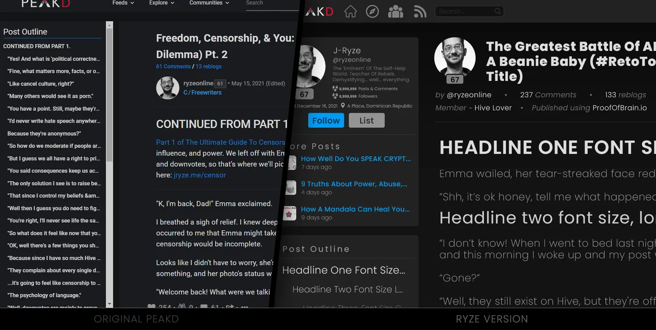
Easy To Read
All the above was done to draw the reader’s focus where it’s meant to be... the post, while giving them easy access to the other myriad information PeakD provides in a clean, efficient way.
PeakD - ACCOUNT MENU Redesign
Focus: A friendly central location for common account or profile-related tasks.
Secondary Focus: Intuitively encourage users to explore personal aspects of Hive’s blockchain.
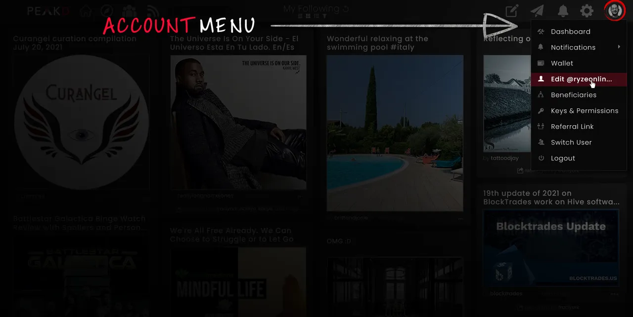
Friendlier
The Account Menu (or Profile Menu) pops up when a user clicks on their small ‘profile’ photo (or avatar) in the main PeakD navbar.
This menu has 8 options all focused on dealing with a user's account. Everything from their dashboard & wallet, all the way to their beneficiaries & keys. They’re written in a friendly font with icons featuring plenty of negative space. Highlighted options get a subtle ‘PeakD-colored’ bar with a bold white text.
PeakD - SETTINGS MENU Redesign
Focus: A friendly central location for PeakD & far-reaching blockchain settings.
Secondary Focus: Intuitively encourage users to explore far-reaching aspects of Hive’s blockchain such as Witnesses, Proposals, and other governance.
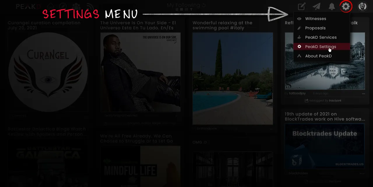
Separated
The Settings Menu (or Hive / PeakD / Governance Menu) pops up when a user clicks on the ‘gear’ icon in the navbar.
It has 5 options (so far) focused on overall Hive / PeakD functions. Things like Witnesses & Proposals on the governance side, and things like Services & Settings on the PeakD side. Most users will likely focus on the Profile Menu, but they’re likely to explore the ‘gear’ icon and dive into the Settings Menu at their leisure as well.
My redesign isn’t perfect.
It’s what I was able to whip up in a couple days' work. Proper UX design would involve split-testing, rolled out over weeks, for example. I also didn’t do anything for mobile design, which has quite different features and conventions (such as ‘hamburger menus’, and so on.) On top of that, I did ‘dark-mode’ only, because that’s how I personally use PeakD. But these details aren’t exactly rocket science to figure out. Any decent coder can play with the colors and CSS to swap the changes I’ve made into light-mode. A mobile UI designer worth their salt could be shown the desktop mockups I’ve made here and adapt it for mobile. There’s many pages I’d love to address, like Notifications and the Post-Editor. But the real issue isn’t the details of how 'perfect' my rough mockups are, the real issue is… is there a clear, tangible focus on making Hive a fun, easy, enjoyable experience with every click a user makes? And whether yes or no, can we do better?
Because the majority of posts I’ve written here on Hive have this theme running through them. How can we be better? How can we create better? How can we ryze up?
That was the message in my 9 truths about hive post. That was the message in my ultimate censorship guide post. That was the message in my hive kindness post. And it’s my message here. Like I said in my first line of this post. I love PeakD. I love the incredible, stunning, mind-blowing work the PeakD team have done. I can’t imagine the time, energy, effort, and lines of code that have gone into making it run so smoothly. I also feel that I’d love it even more if some talented UX/UI people gave it a design upgrade. A design upgrade won’t magically solve the massive marketing issues I’ve covered in-depth before , but I believe upgrading it to a friendlier, more intuitive design would go a good distance towards easier onboarding of newcomers to Hive.
Some may say, if it ain’t broke, don’t fix it.
And I get that. It’s a valid point. But it’s also a mindset that stifles growth and innovation. With a mindset like that, we wouldn’t have gotten iPods or Netflix, because CDs weren’t ‘broken’, and neither was ‘television.’ But taking the time to upgrade and elevate something often ushers in huge growth for it. Polish and detail are what set aside the average from the excellent, the good from the great. Regardless, like I said at the beginning, these are just ideas, meant to get people thinking about user’s experience here on Hive.
And even if PeakD isn’t feeling my ideas at this time, maybe @waivio , @leofinance , @ecency , or @proofofbrain will get some value from what I’ve posted, level-up their design, and impress us all with an improved Hive browsing experience!
What do you think?
Which version do you like best? The current PeakD, or the upgraded UX/UI I designed?
Anyway, thanks so much for reading, commenting, sharing, or even skimming. I appreciate you and wish you a fantastic day.
~J-Ryze
P.S. Tagging some Hivers who may be interested in this: @wil.metcalfe , @thoughts-in-time , @meesterboom , @nonameslefttouse , @crosheille , @phage93 , @mattclarke , @theycallmedan , @vikisecrets , @ybanezkim26 , @brittandjosie , and @sn0n . I’m also tagging a few artists, designers, and gamers as well: @enrique89 , @danielvehe , @charsdesign, @pusen , @trippymane. I’d love to know your thoughts and feelings on this, if you’re inspired to share.
P.P.S. All images (barring screenshots) created by me, with a bit of help from the amazing sites flaticon.com and envato.com.