Splinterlands Art Contest Week 212

English
For that reason I decided to take it easy and correct many things in my initial drawing, I'm really happy about that, because I think the change was very good.
Something that several friends recommended me is to use stronger shadows and a better fusion of colors.
Taking those tips into account, I worked a little more on my drawing, leaving for this week 212.
Without further ado, let's get started!
Español
Por ese motivo decidí tomarme todo con calma y corregir muchas cosas en mi dibujo inicia, realmente estoy feliz por eso, pues creo que el cambio fue muy bueno.
Algo que varios amigos me recomiendan es usar sombras más fuertes y una mejor fusión de los colores.
Tomando en cuenta esos consejos trabajé un poco más en mi dibujo, quedando para esta semana 212.
¡Sin más que decir, empecemos!
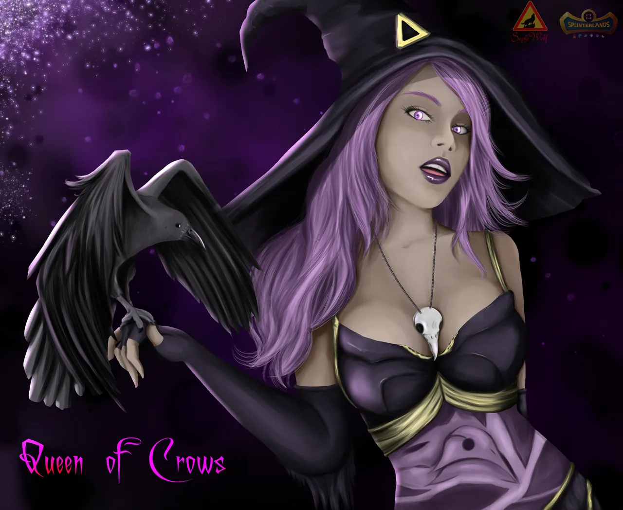
Reference
Reference & lore
First steps
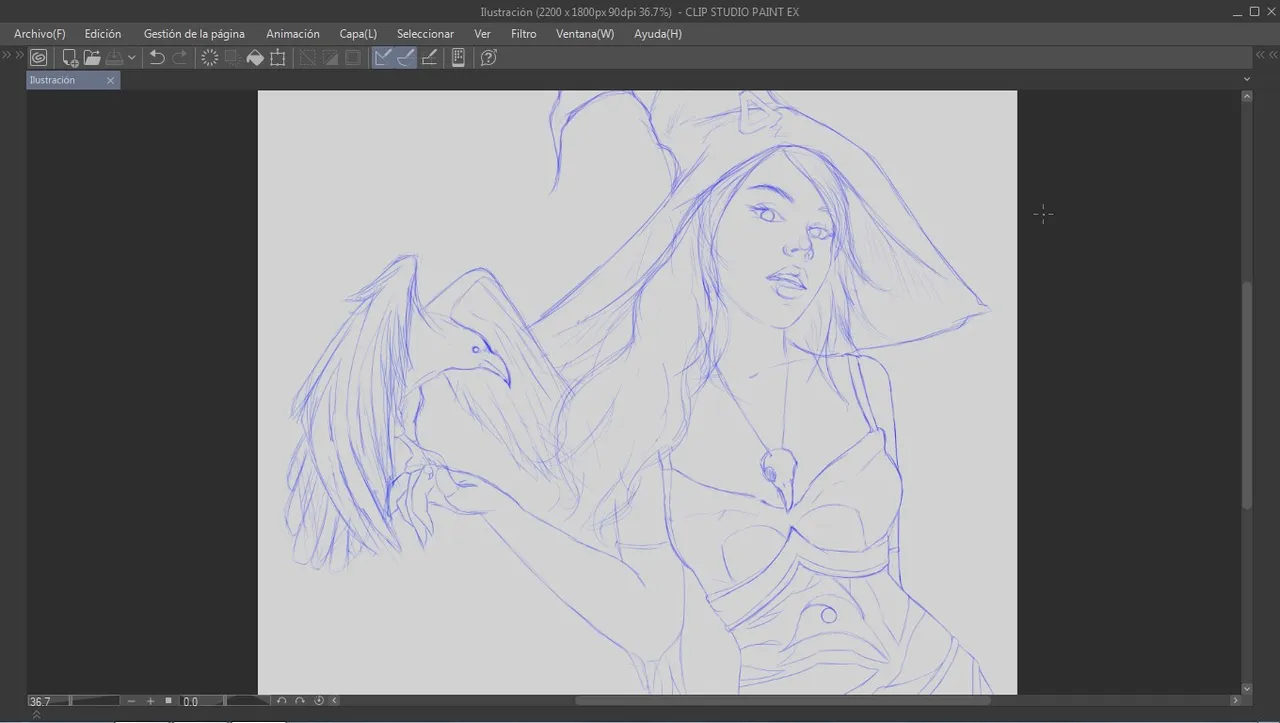
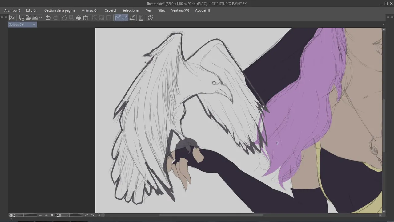
We started with the sketch in blue color, this is already a habit, because in the end I always end up changing the color of the cape to a dark tone.
I wanted to make the character next to the raven in a discarded sketch this was on his shoulder, but next to the hat it was not going to look good.
That's why I ended up making the raven on his right hand.
Empezamos con el boceto en color azul, esto ya es costumbre, pues al final siempre termino cambiando el color de la capa a un tono oscuro.
Quise hacer el personaje junto al cuervo en un boceto descartado este estaba sobre su hombro, pero junto al sombrero no se iba a ver bien.
Por eso terminé haciendo al cuervo en su mano derecha.
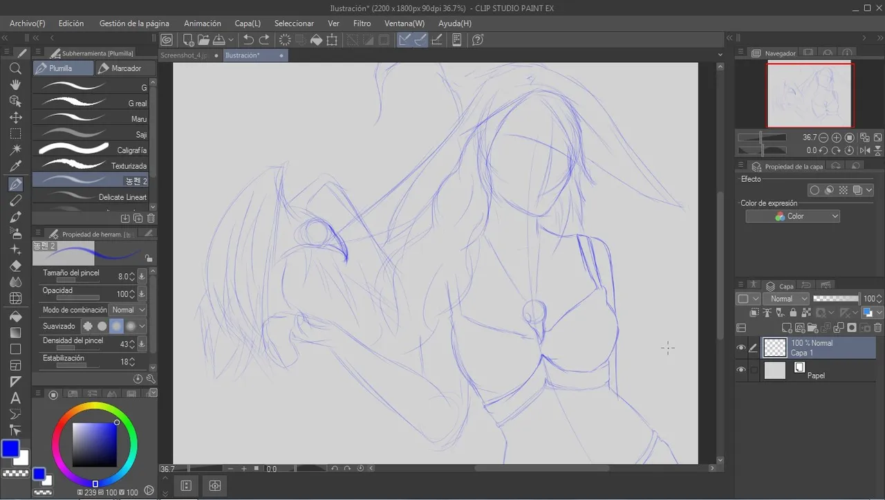


Although it was a sketch, I added all the details until I had a result that I was happy with.
A pesar de ser un boceto, agregue todos los detalles hasta tener un resultado con el cual me sintiera conforme.
Color and shades
For some time now I have been trying to avoid very saturated colors in my drawings, although I still think they look good, for this drawing I will apply low saturated colors but similar to the one in the reference.
Desde hace un tiempo estoy tratando de evitar los colores muy saturados en mis dibujos, aunque sigo pensando que se ven bien, para este dibujo aplicaré colores poco saturados pero similares al de la referencia
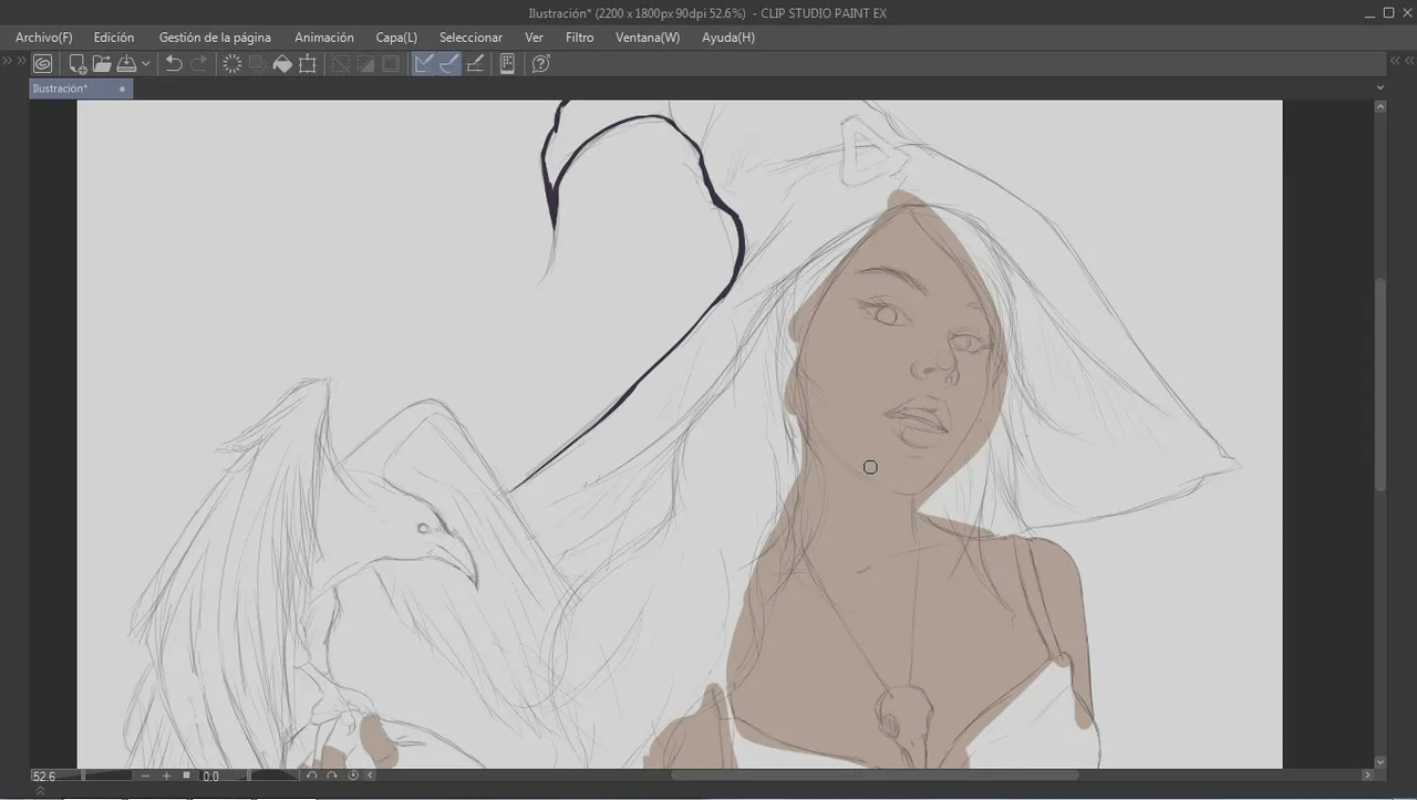
Depending on the base color I am applying, I can change the color of the sketch and background to make it easier to apply.
Dependiendo el color base que esté aplicando, puedo cambiar el color del boceto y del fondo para facilitar la aplicación del mismo.
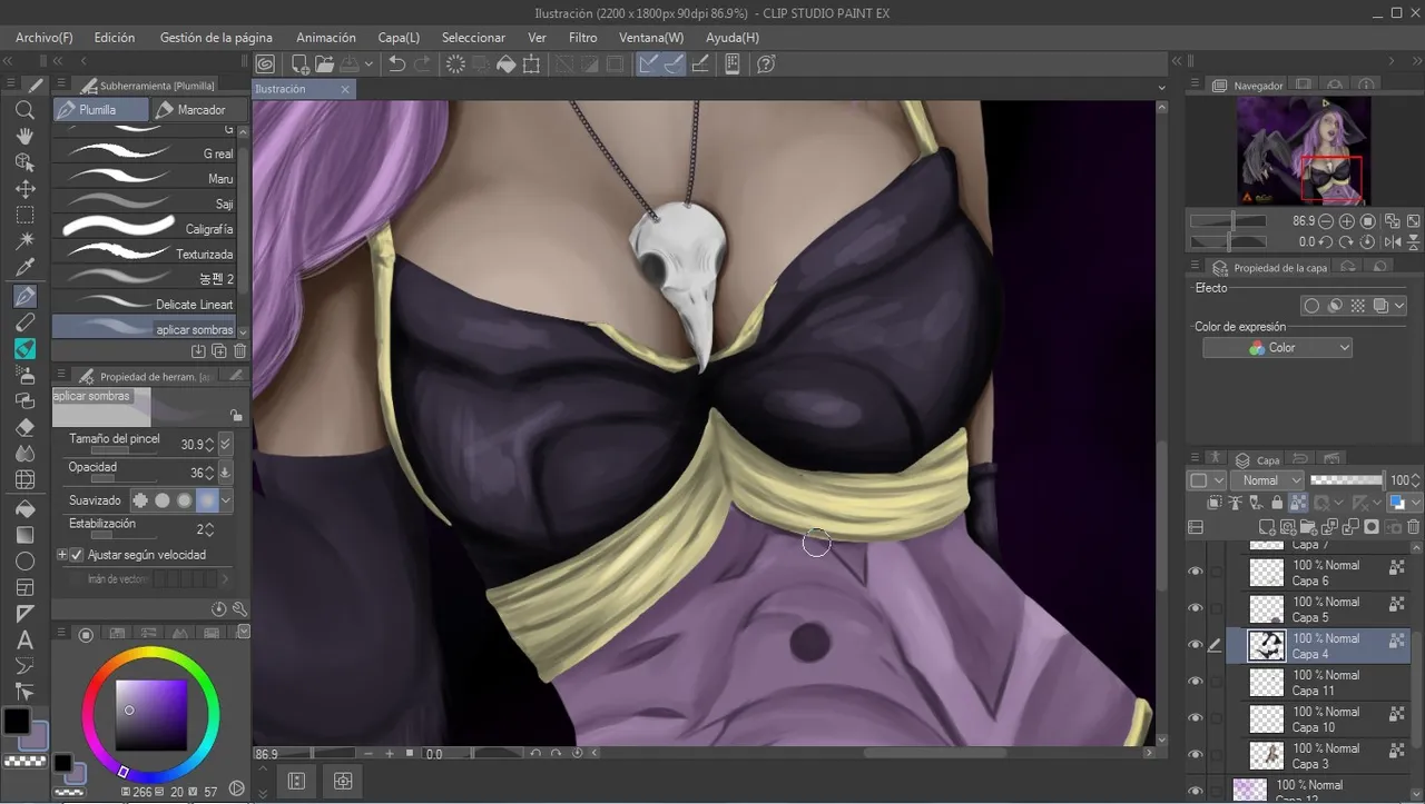
When I finished applying all the base color, I can continue with the application of the shadows and then blend them, I did this in parts, that is to say first the skin, then the clothes to finish everything.
Al terminar de aplicar todo el color base, puedo continuar con la aplicación de las sombras para luego difuminarlas, esto lo hice por partes, es decir primero la piel, luego la ropa hasta terminar todo.
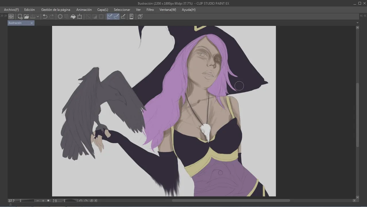

After applying shadows I add a bit of gloss, this is repeated on all parts, skin, clothes, etc.
Después de aplicar sombras agrego un poco de brillo, esto se repite en todas las partes, piel, ropa, etc


Well I did the background, and was quickly getting ready to create my post, when I remember that the deadline is Saturday at 5 pm CST, I'm not very fast creating the post, so I thought I would not have time.
Suddenly I said "Hey, I'd better submit it by week 212".
Bien hice el fondo, y rápidamente me disponía crear mi post, cuando recuerdo que la hora limite de entregar es Sábado a las 5 pm CST, yo no soy muy rápido creando el post, asi que pensé que no me iba a dar tiempo.
De pronto dije "Hey, mejor lo entrego para la semana 212".
A happy accident
Gotta have opposites, light and dark and dark and light, in painting...
I can't expect better results if I always do the same thing, so we'll apply shadows and lights, really.
Hay que tener opuestos, luz y oscuridad...
No puedo esperar mejores resultados si siempre hago lo mismo, así que nos aplicaremos sombras y luces realmente
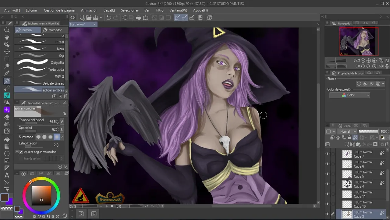
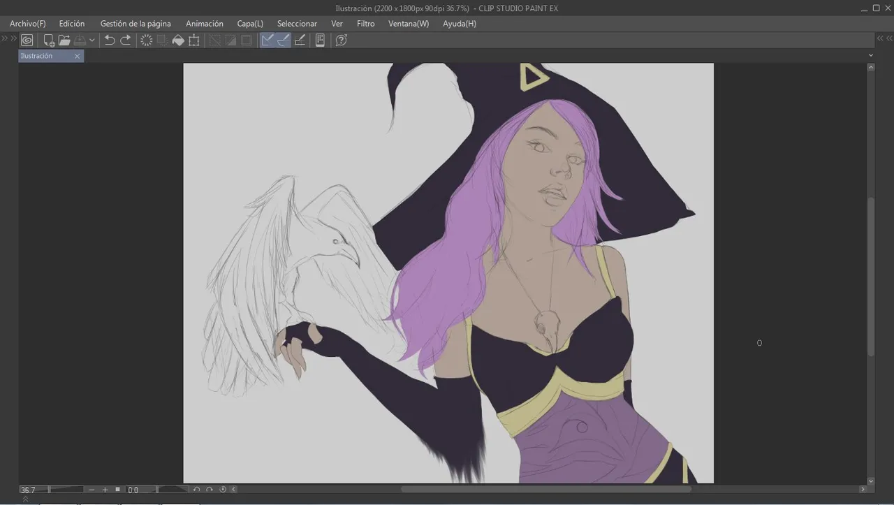
I started with the skin with a darker and more saturated tone and when I mixed it I really liked the result. So much that I decided to retouch the whole drawing.
Empece por la piel con un tono más oscuro y saturado al mezclarlo me gusto muchísimo el resultado. Tanto que decidí retocar todo el dibujo.
I am out of my comfort zone, so I decide to compare the result.
At this point I end up convinced that the new shades give a better result.
Estoy fuera de mi zona de confort, así que decido comparar el resultado.
En este punto termino convencido que las nuevas sombras le dan un mejor resultado.
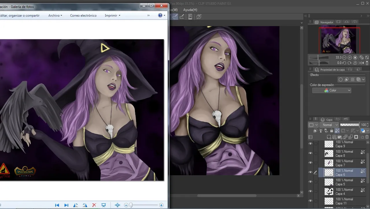
A considerably noticeable change.
Un cambio considerablemente notable.
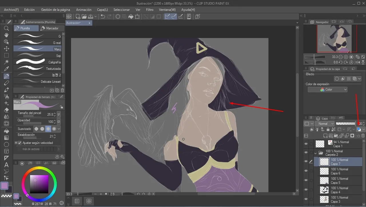
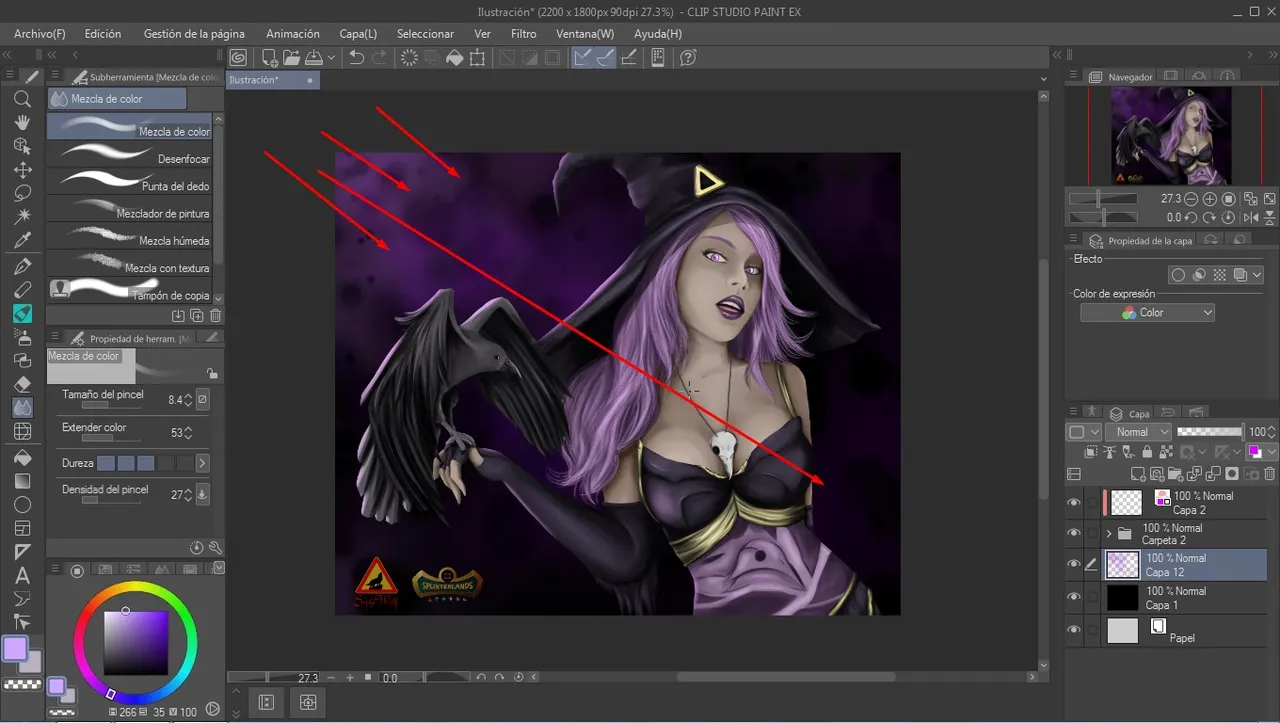
After applying the new shades, I see no reason to stop.
A light source in this direction would make the character blend in much better with the background.
Después de aplicar las nuevas sombras, no veo motivos por el cual detenerme.
Una fuente de luz en esta dirección haría que el personaje se integre mucho mejor con el fondo.
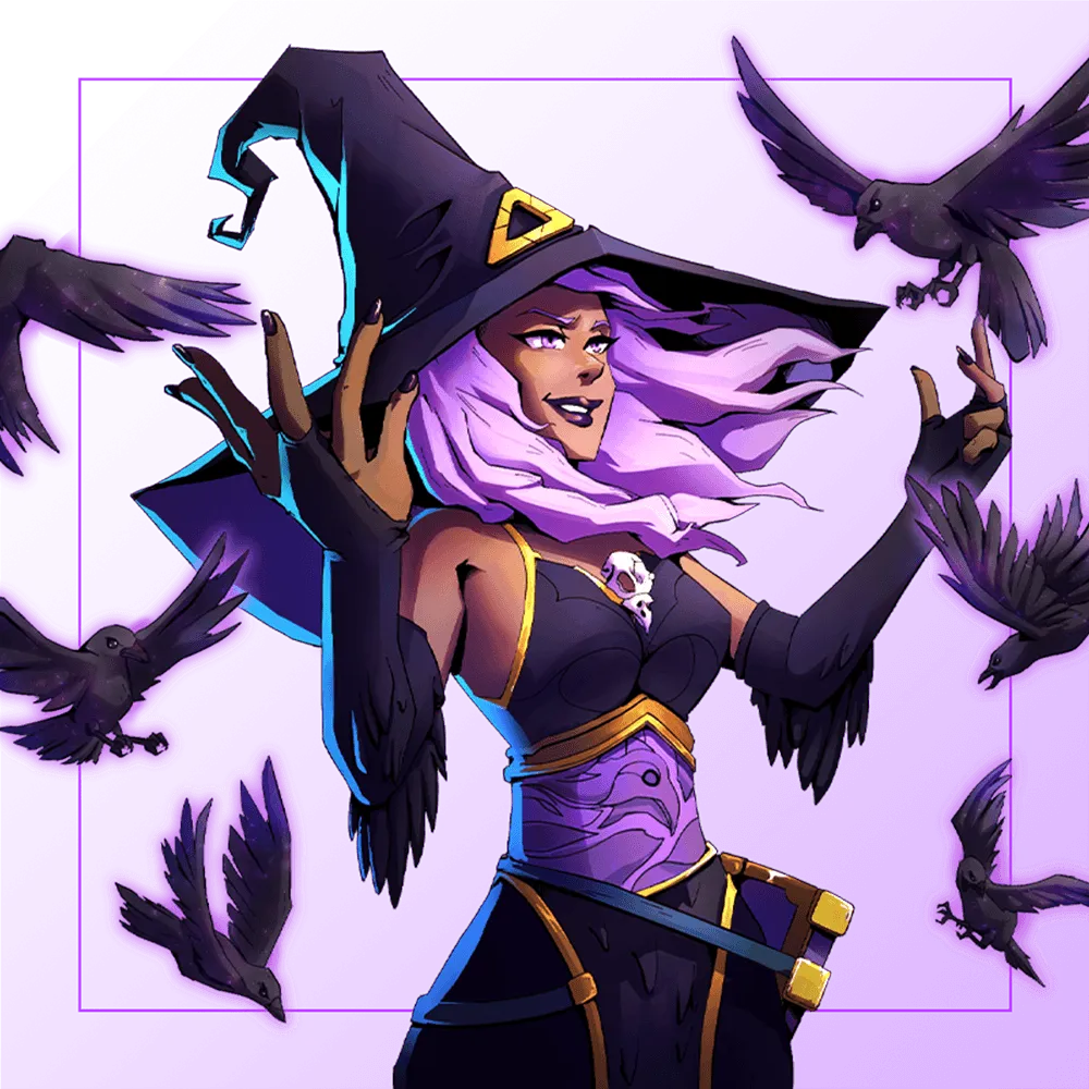
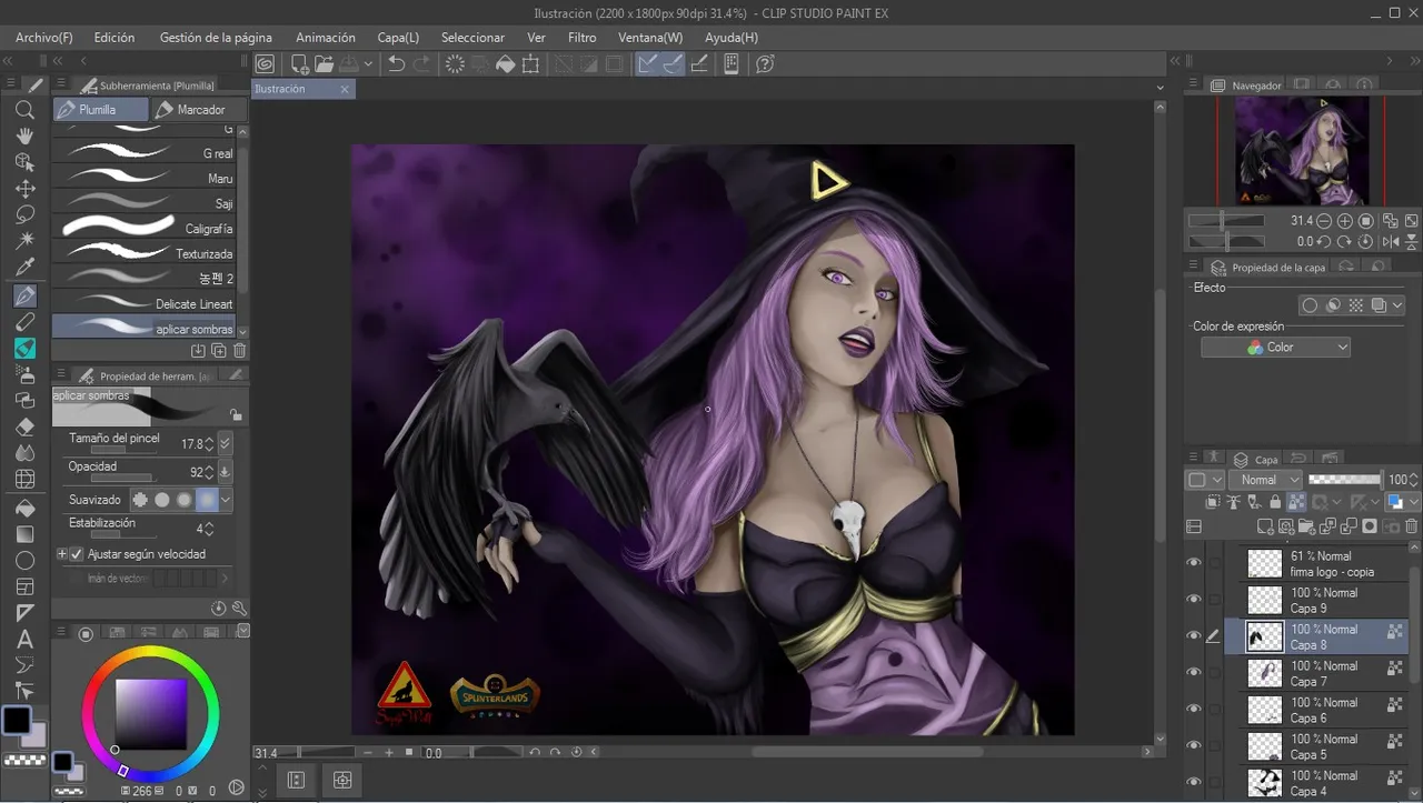
Here we can compare the big change, I am very happy to have taken that extra time to modify it, I think it is now a drawing worthy to share with friends.
Aquí podemos comparar el gran cambio, estoy muy feliz de haberme tomado ese tiempo extra para modificarlo, creo que ahora si es un dibujo digno de compartir amigos.
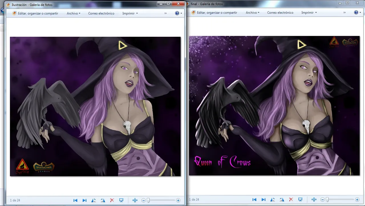
Finally, this was the result!
¡Finalmente, Este fue el resultado!
If you don't play splinterlands yet you can join here!
Si aún no juegas splinterlands puedes unirte aquí!

Join here // Unete aqui
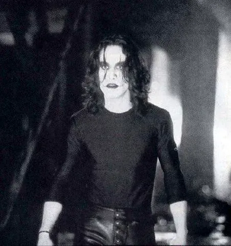
I would like to dedicate this illustration to the memory of Brandon Bruce Lee "The Crow".
Quiero dedicar esta ilustración a la memoria de Brandon Bruce Lee "El cuervo"