Hi all 😊

I wanted to show you today one of my earlier airbrush works and first painting with the normal brush with the title: “BURNING DESIRE” I created in 2011 and its steps of creating it.
It’s a mixed technique artwork.
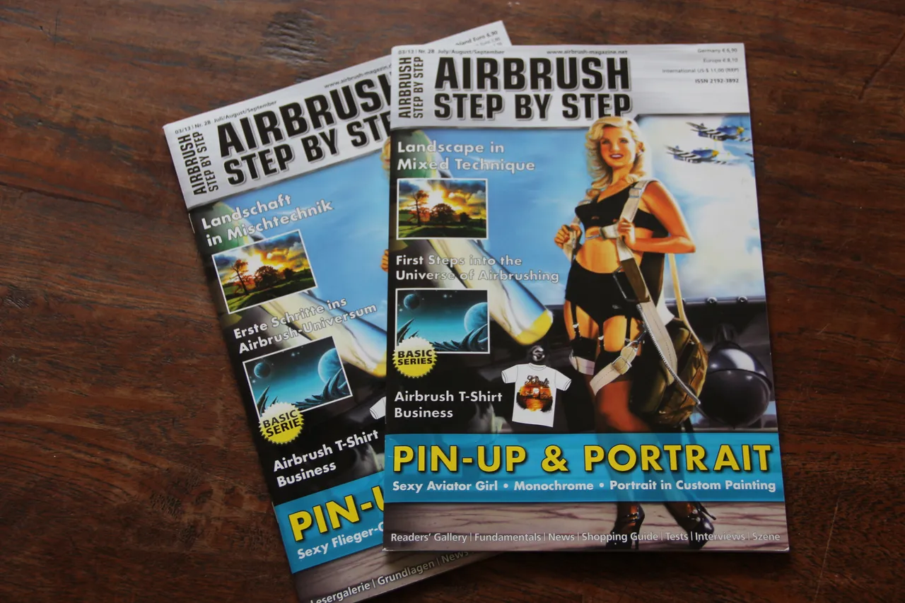
It (a step by step that I wrote) was Published in the Airbrush Step by Step magazine in German and English. 03-2013
I modified this step by step for HIVE and I have rewritten most of it today to show you.
This original artwork is still for sale, framed and unframed, and all kind of prints from this work, on different objects, are available at My Pixels Print Shop!
Equipment I used
Airbrush gun: Harder & Steenbeck Infinity 0.15mm
Paint: Schmincke Aero Color Airbrush colors.
Underground: Schoellershammer 4G thick illustration board - format 50 x 35 cm
Additional materials: eraser, graphite pencil 6B and 2B, brushes.
Working time: about 40 hours
Reference photo used with permission from Dana Mallon.
Sky is AIRBRUSH
Landscape is PAINTED WITH THE NORMAL BRUSH
Before I start, I first printed out a template from the reference image. I make the template black on the back with a 6B graphite pencil. Then I place the template on my background and just trace any important lines I need with a 2B graphite pencil. This creates a basic sketch on my surface, just the main lines I need. No details. To have some guidelines for my airbrush work.
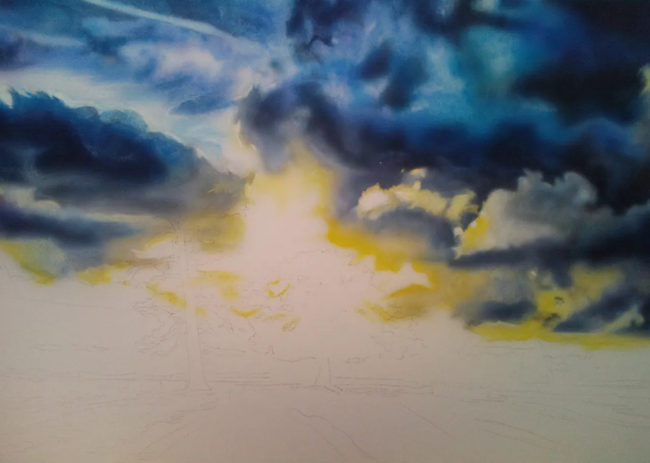
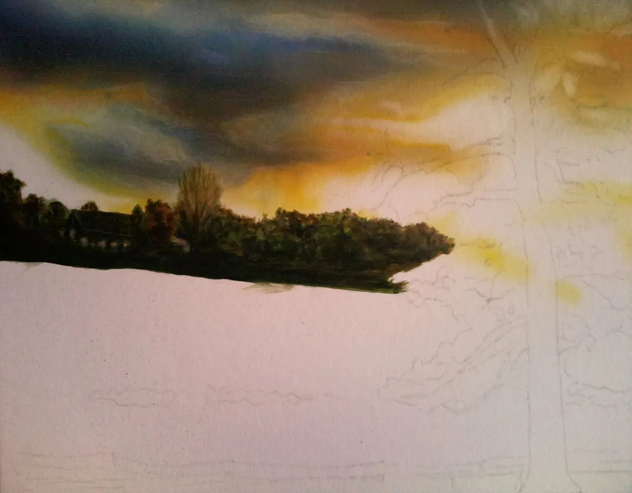
Step 1
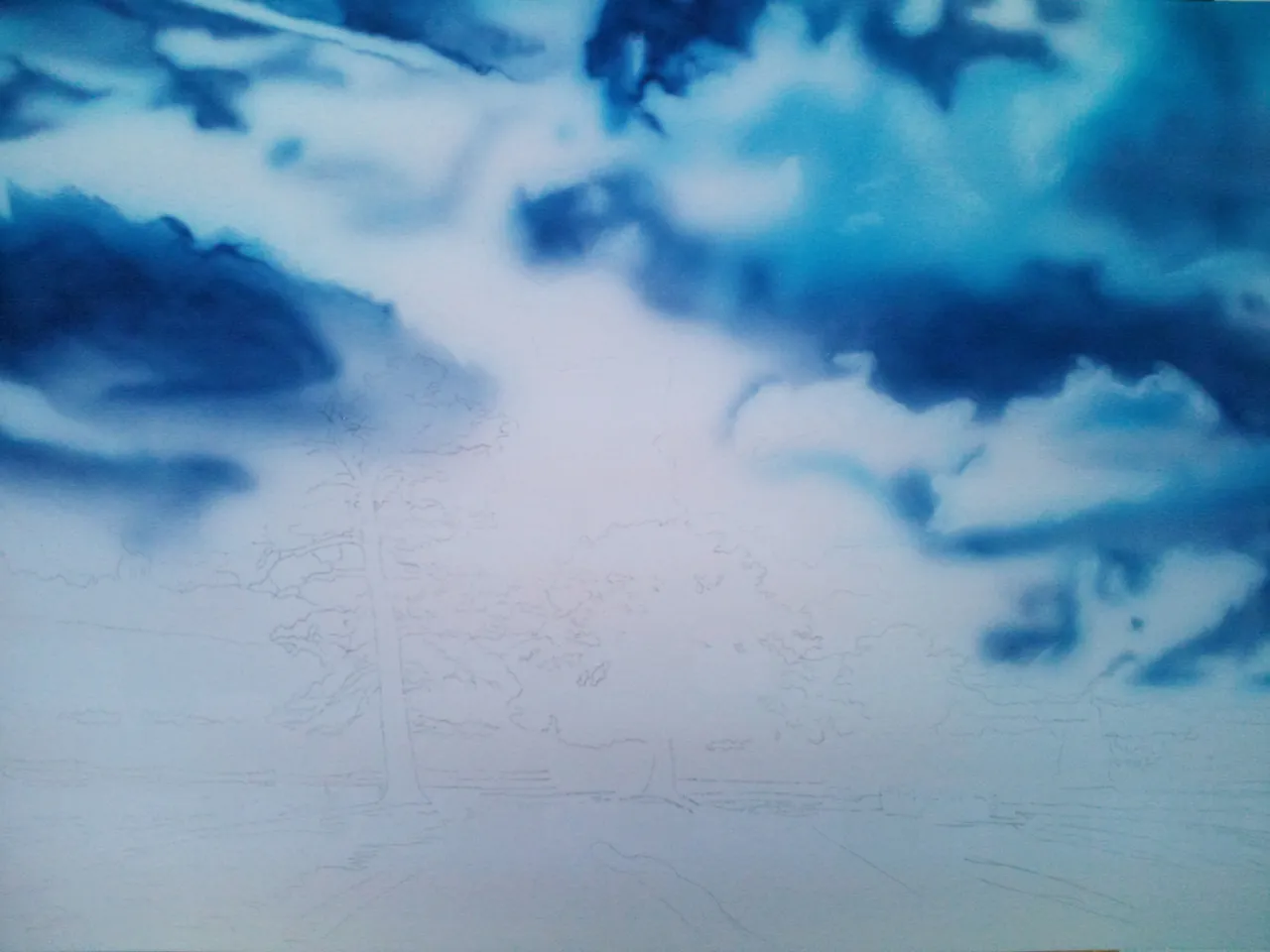
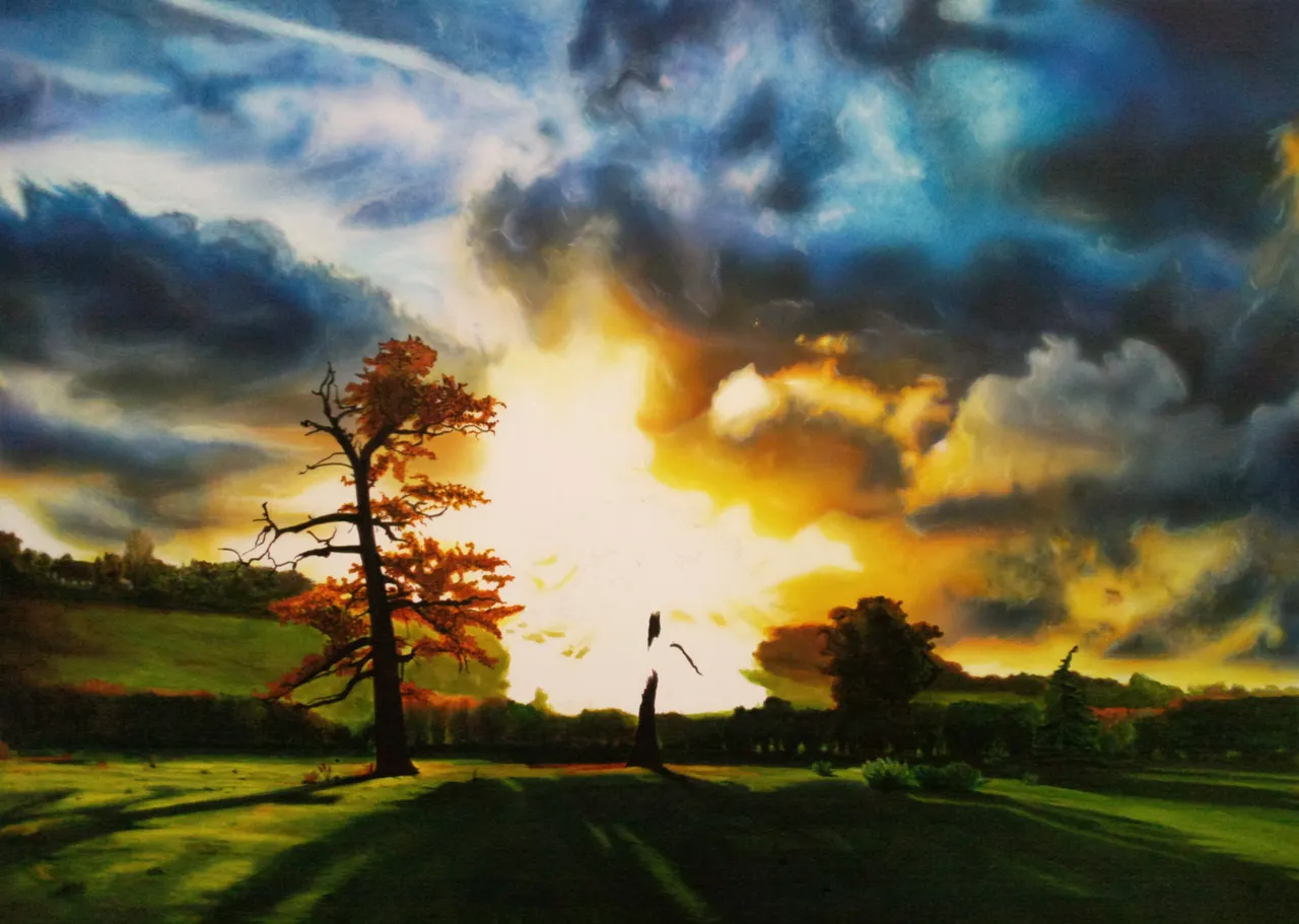
You can see on the first step the sketch with the main lines of the landscape.
For the sky, I airbrushed the clouds without having a sketch. I work in it with transparent colors and so I build up the entire sky. Because of the transparent colors, I airbrush from dark to light. I first take a dark blue color - Prussian blue and use it to indicate all the shadow and dark spots in the clouds. While doing this I make sure that structures are created in the clouds at the same time. I do that by not spraying evenly. I make small circles, lines and trembling lines, as can be seen on the left side. I spray more paint here and there for dark areas and very lightly on other areas. Then I take a lighter color like cobalt blue and specify some lighter clouds. When I've done that, I take an eraser and erase some textures into the clouds by making twisting motions.
Step 2
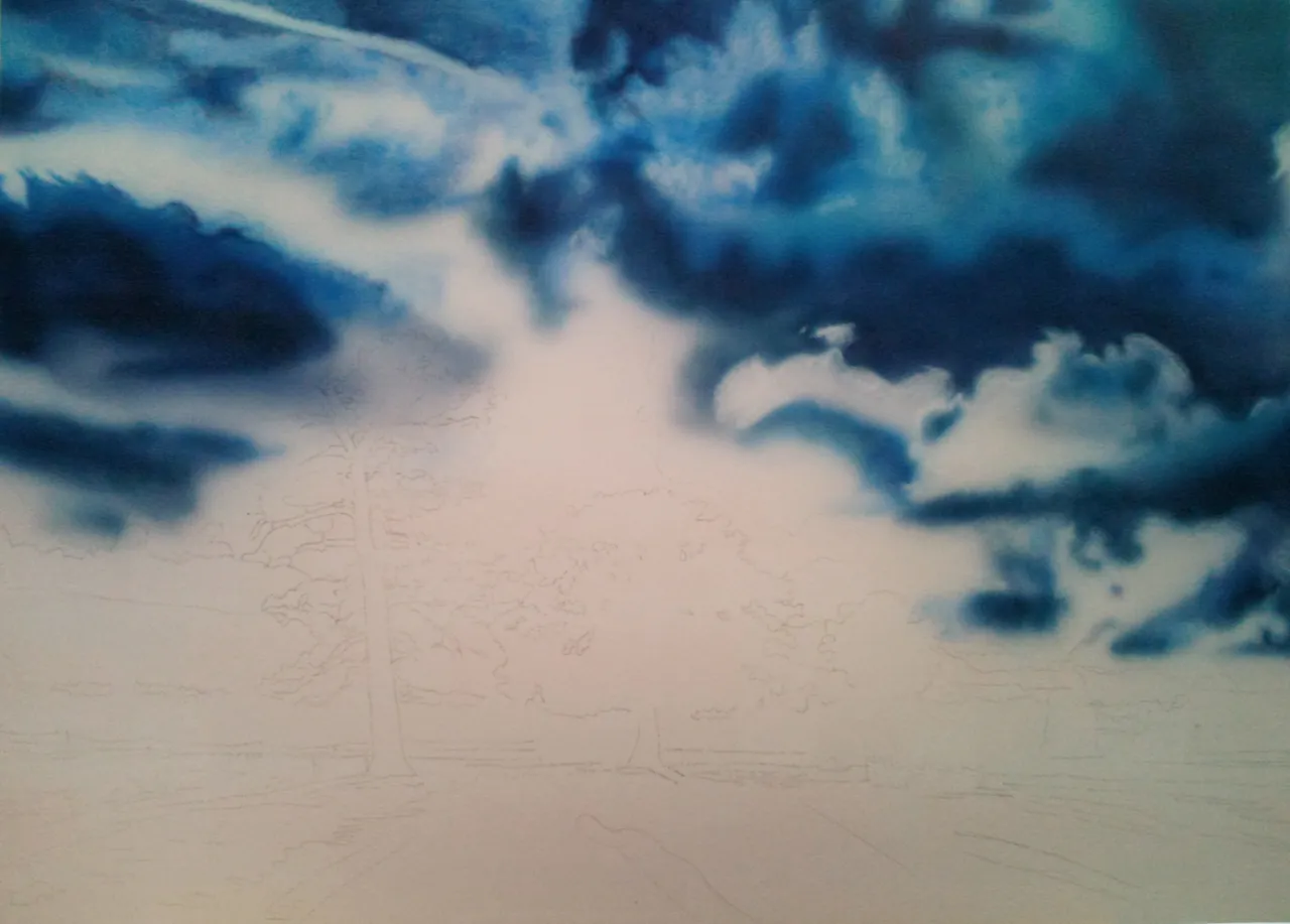
In the second step I airbrushed more dark paint in the shadow areas of the clouds and I airbrushed cyan very lightly to create more clouds on the areas where there weren't any clouds yet. Now I'm going to give the clouds more body/volume, I did that by spraying some gray on the underside of various clouds. Just a little bit. Then I took an eraser (eraser with a hard and soft sides) and started erasing on the top left, making very small circles with the eraser on the spots where I sprayed light paint. (I use the soft side of the eraser here) This is how the cloud structure is created. With this I continue across the top of the image where it is brightest. Until I like the results.
Step 3
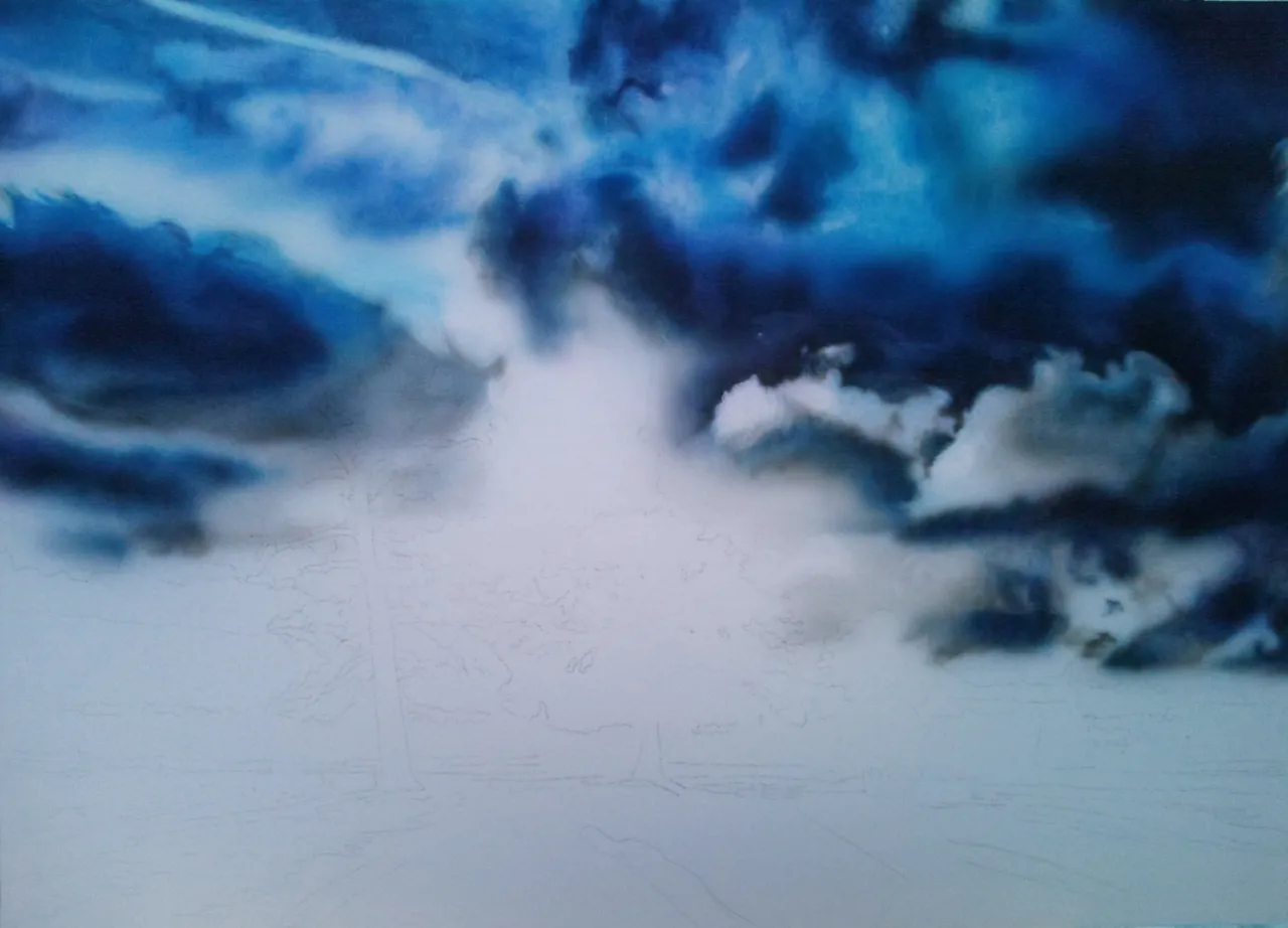
I airbrushed more gray to give the largest clouds their definitive volume. I've now also airbrushed the gray where no clouds were created (in the middle), because I know that I want a lot of color there. This area should really stand out in the sky when the artwork is finished. I then applied indigo to various spots, very heavily diluted with water, in the shadows/ the underside of the clouds. This creates even more volume in the clouds. Then I created in the different layers of the clouds more textures with the eraser, mostly on the top and a bit into the gray that I sprayed.
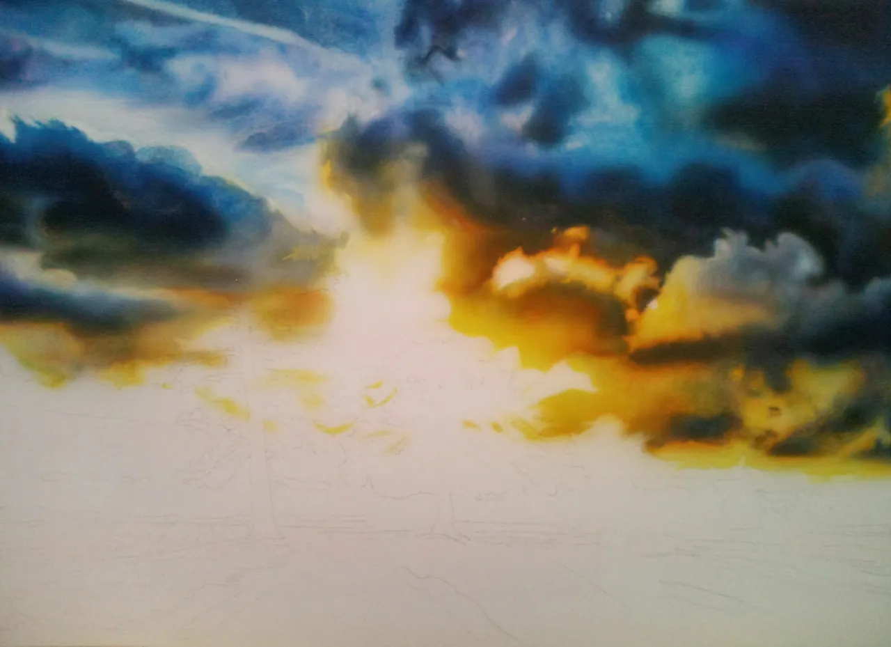
Step 4
In the middle of the picture it will be so bright that only the white background is needed/will be visible. Keeping this in mind, I now airbrush the lightest colors around the white - yellow heavily diluted with water. I will apply the color where there is no other color and then diffuse it into the other clouds - I mean into the gray. You have to be careful not to get too much overspray. The blue of the clouds will turn green when the yellow goes over it. tip: I usually use my hand to help a bit so I don't have too much overspray where I don't want it. Be careful not to get unwanted lines from your hand, don't put your hand firmly on the underground (Or I spray with a smaller distance to the underground and thus also reduce the overspray) Now I take an eraser again and lightly erase (in the yellow and gray area) the highlights of the clouds, where the light of the sun makes the clouds brighter.
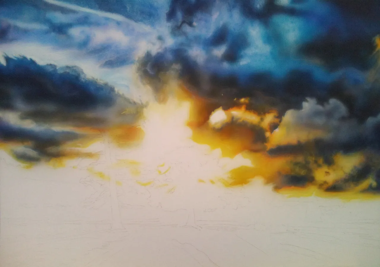
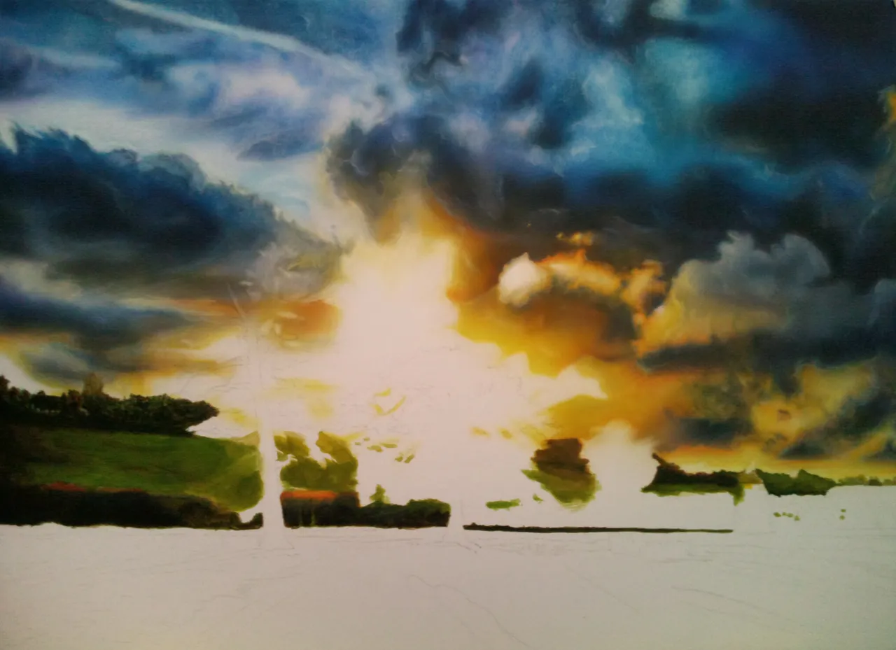
Step 5
In the previous step I erased the highlights, now in this next step I airbrush the next color: orange (mixed out of yellow and red) as a transition going from yellow over to the gray. The underside of most of the clouds. I airbrush on some areas more than others. This is how I make the clouds warmer and they will pop out of my artwork even more. Now I take a heavily diluted red and accentuate a couple of small areas where the cloud is the widest. In this way I get more volume in some areas I have just changed and the colors almost jump out of the artwork.
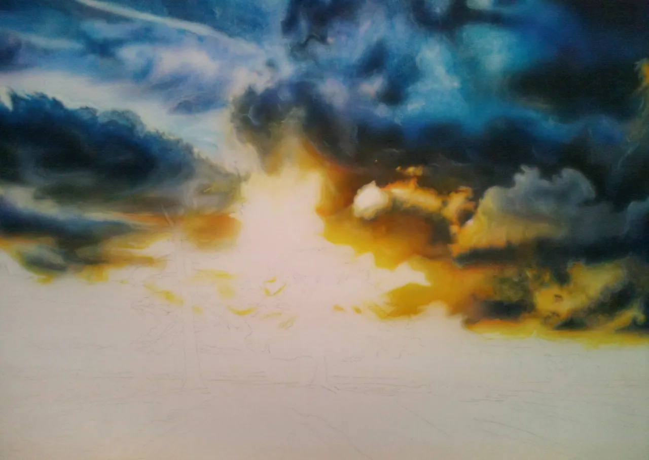
Step 6
Next, I firstly changed some clouds with a blue color, I wanted to bring some more to the background, I wanted to soften them. See left in the middle of the clouds. Then, using an eraser, I recreated all the highlights and different shapes of the clouds again. Where I just airbrushed new paint.
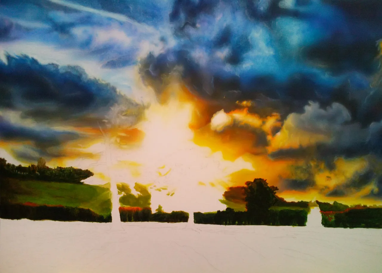
Step 7
In this step, I emphasized the different shapes of the individual clouds more with an eraser pen (the hard side). Using the eraser pencil, I outlined the clouds where the lighter highlights go. Now I went over it until I was satisfied with the individual clouds, their volume and shape. If you have erased too much, you can always airbrush new colors over that area, with heavily diluted colors. Build them up again. You can use this process back and forth until you are satisfied. Then keep in mind which color to mix and where to use it. In my sky there are many different colors/ shades of blue. The sky is now ready.
Little additional information when painting the landscape: picture 8 to 12.
I can now tell you to use this or that brush number. As this was my first painting with normal brushes and I only had 2 different old brushes at home. That's why I will now describe how I painted it and not how it can be done with other brushes, or how it will definitely be easier. hahaha
(Of course you can use brushes in the size from No. 00 to No. 8 in such a picture)
I used here: a flat brush No. 4 and a round brush No. 1 both were not perfect anymore.
And the paint I used was my Schmincke airbrush paint that was diluted with water. As I had no other acrylic paints.
I mixed the different colors on a dinner plate. Only a little bit at a time, otherwise it will dry out too quickly and you can no longer use them to paint.
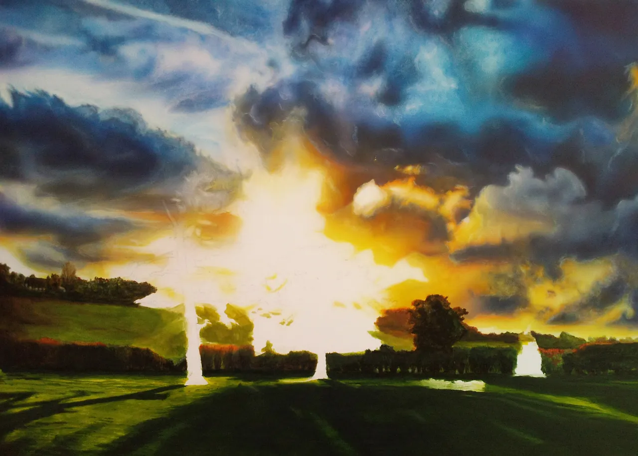
Step 8 details
Then it's now time to create the landscape.
I started at the top left with the trees and the house. I painted this with brush No 1.
After I mixed the right color from my airbrush paint on the plate. When mixing, I first started with the middle green color, where I always added a little lighter and darker color on the side to get all the colors that were needed for this small piece of land. I used a lot of different colors for this bottom part of my artwork/landscape. I also used brown and yellow for the trees. First I paint the dark colors and build them up to the light colors. So that there is a lot of contrast and it looks more realistic. As you can see, I always paint one bit at a time. This is how the whole picture emerges later.
Step 8
After that I painted the little willow with brush No 4. Here I applied a base color (green) after which I painted a couple of other colors (red, brown, yellow and olive green separately in other places) over it for different tones and to get colors (I diluted the colors a lot so that the base color will still show through, just as it can be done with an airbrush but here it was painted with a brush). I have already used the color green further into the picture to the right, where the pasture continues into the landscape.
Step 9
Notice that I paint around the big trees, otherwise I lose the main sketch lines of the trees I drew. Now I leave them out, and then it's easier to find them later when I want to paint them.
In this step I continue to paint on the hedge and also add warm colors (red, yellow, orange) here and there where the sun shines on them and illuminates them. One of the trees on the right emerges. Now I'm using brush No 1 again. I'm trying to give the tree a lot of volume by using different colors in the foliage and adding detail to each color. I paint the contours on the left side of the tree lighter and warmer, as well as a little on the right side, the middle is painted with darker color. I'm watching carefully where I paint the colors now because the sun is shining behind the 3 big trees and illuminating all 3 in a different way.
Step 10
Next I paint the willow tree at the bottom of the picture. Here I use brush No 4.
I mixed a dark green color to paint the shadows. I applied the paint very quickly (horizontal and vertical brush strokes) where the shadows from the trees belong. Note where the light source is - the sun, and where the shadows are created by it. The color is heavily diluted, and when I'm satisfied with where the shadows are, I paint again a few layers on top. Now I'll take a lighter green and indicate the lighter parts of the grass. With the lighter green, I mixed in orange to make the green tone warmer. Again heavily diluted, and several layers.
Here and there I added highlights with diluted yellow. And with a medium green the small shadows. You can see that there are high and flat spots in the pasture. The play of lines in the shadows creates a great depth effect in the whole artwork.
Step 11
I paint some bushes with red and orange, which got very warm colors from the sun. Now I want to soften the willow, by that I mean I want all the lines created by the brush strokes to be softer. For this I need a bright yellow/green that has been very heavily diluted. I simply painted a very thin layer of paint over the entire pasture very quickly. And repeated here and there. Everything became softer as a result; the color tones now blend better together. This only works if the paint underneath is not yet dry and has just been applied.
With brush No 1 I painted the tree on the left, some bushes and a small tree on the right.
For the trunk of the tree on the left I use a dark brown. I've also added details in the trunk by painting vertical lines. (Unfortunately, you can't see it in the photo) I painted the branches by drawing a line from the trunk to the side, with the lines becoming narrower and narrower. The sun ensures that all the leaves have a warm bright color. On the contours of the branches with leaves: yellow, orange, red and that runs towards the middle towards a warm dark color... like a brown and warm green.
Step 12
In the last step I paint the middle tree, also here I use brush No 1.
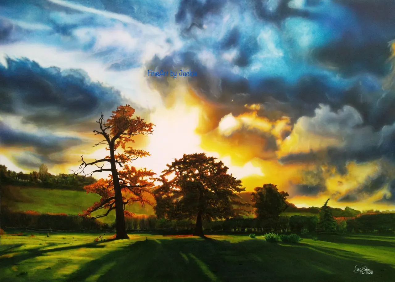
I start with a dark green in the middle. I now observe quite well where the sun shines through the branches. I will keep the white of the background and apply light colors around it. I continue to mix my green with brown and build up my foliage. Yellow and orange are applied to the contours of the tree, including around the white areas. To give the tree more volume, I paint thick foliage in the middle with a cold green/brown. I look over the whole picture and add more highlights, shadows or additional details where necessary.
Now the landscape is ready!
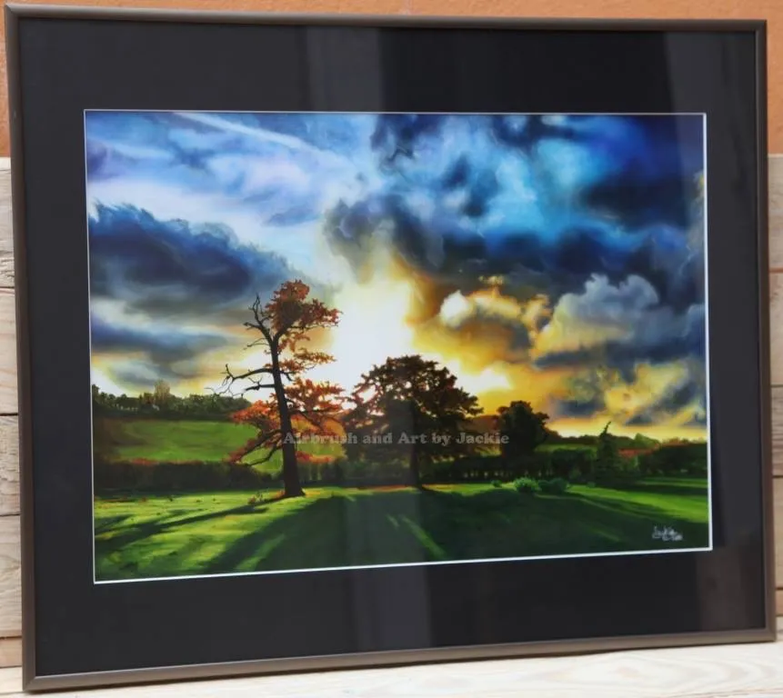
Title “Burning Desire” (12-2011)
Framed:
Thank you for looking and reading. I hope you enjoyed my Step by Step of this earlier artwork of a landscape. 😊
Any questions or comments, let me know. Always happy to help.😊 And talk about art.
Have a great day all 😎👋🏻
Grtz Jackie
The divider is Created by SilverFish / @ mondoshawan
Unless stated otherwise: All art and photos used in my posts are taken, created and owned by me. If you wish to use any of my photographs, please contact me first. As I have used some commercially myself. We don’t want that you or somebody else gets into trouble 😉 So please don’t use them without my consent.