▷ Hola de nuevo queridos amigos de Hive, hoy quiero enseñarles a como diseñar un logotipo con perspectiva isométrica, el resultado final quedó excelente y es muy fácil de hacer, así que sin más preámbulos comencemos con este tutorial.
▷ Hello again dear friends of Hive, today I want to teach you how to design a logo with isometric perspective, the final result was excellent and it is very easy to do, so without further ado let's start with this tutorial.
🔘 Para empezar a diseñar este logotipo, lo primero será abrir ilustrator ya que será en este programa que lo haremos.
🔘 To start designing this logo, the first thing will be to open illustrator since it will be in this program that we will do it.
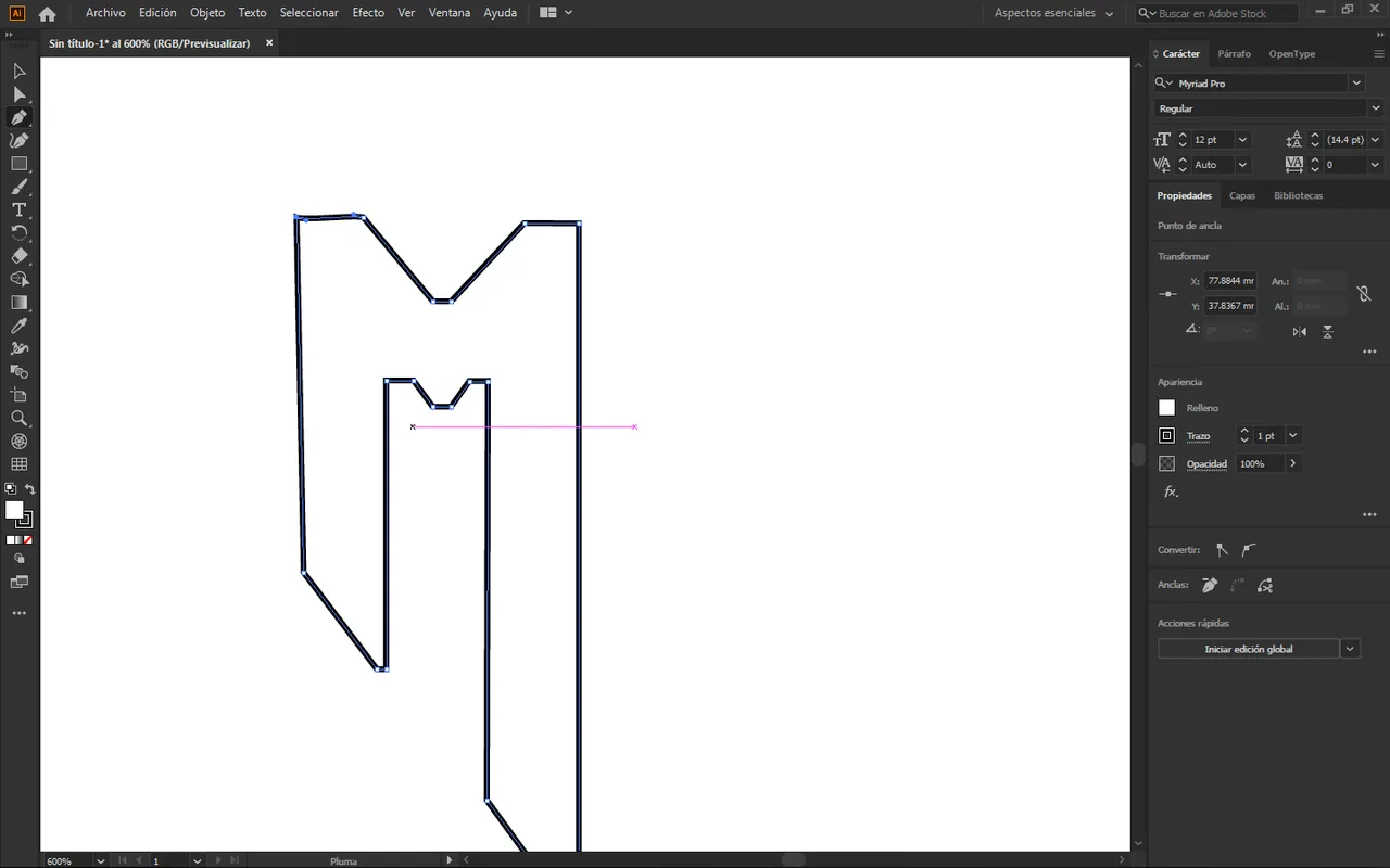
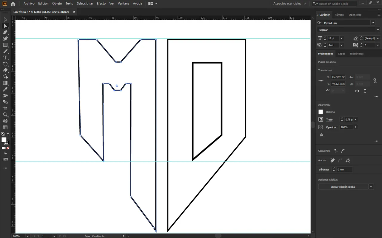
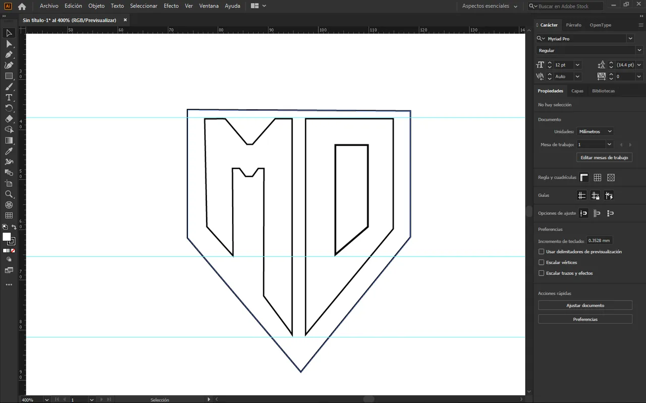
🔘 Una vez adentro del programa que usaremos, lo siguiente que hice fue hacer el diseño de la M como este logotipo tendrá una vista isométrica es importante que hagamos un lado más grande que el otro, tal como te muestro en la siguiente imagen.
🔘 Once inside the program that we will use, the next thing I did was make the design of the M as this logo will have an isometric view it is important that we make one side bigger than the other, as I show you in the next image.
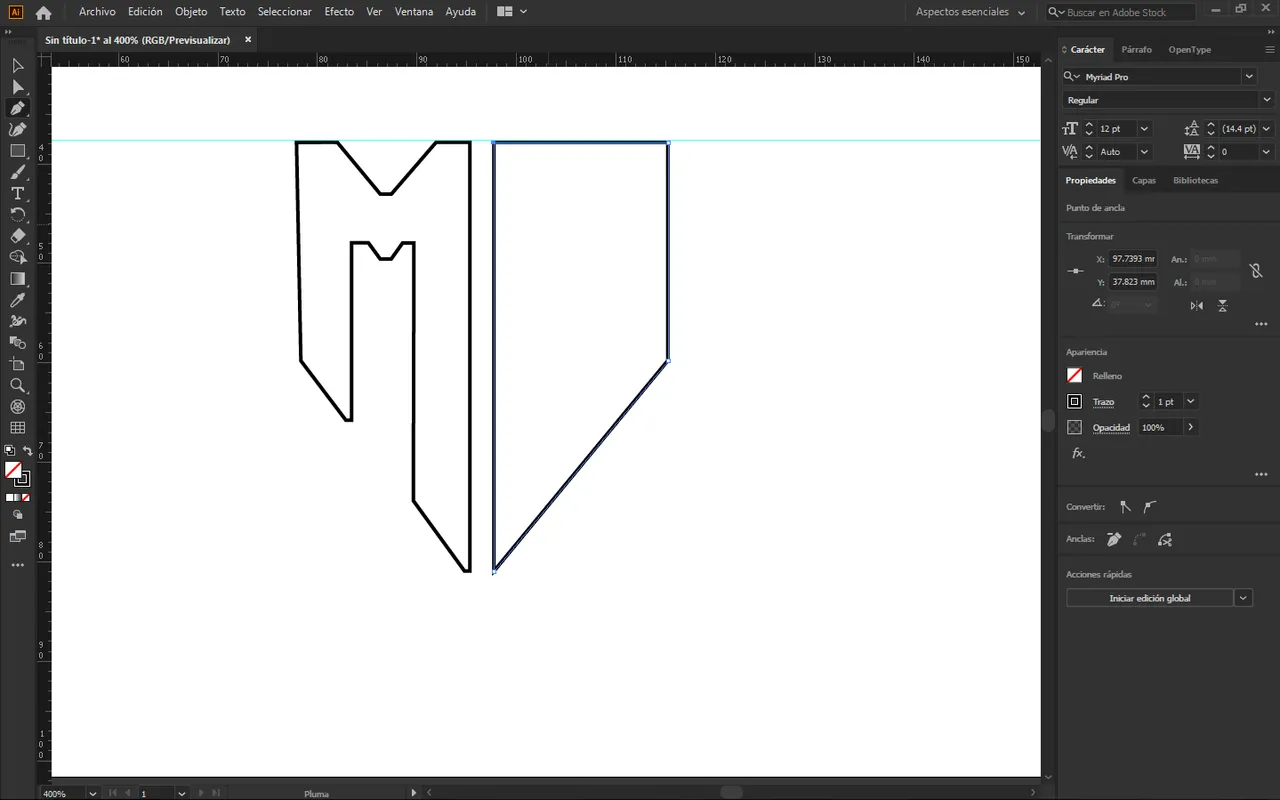
🔘 Ahora pasaré a hacer la letra D lo haré como la primera letra un lado más grande que el otro para dar ese efecto, tal como te muestro en las siguientes imágenes.
🔘 Now I will make the letter D I will do it as the first letter, one side larger than the other to give that effect, as I show you in the following images.
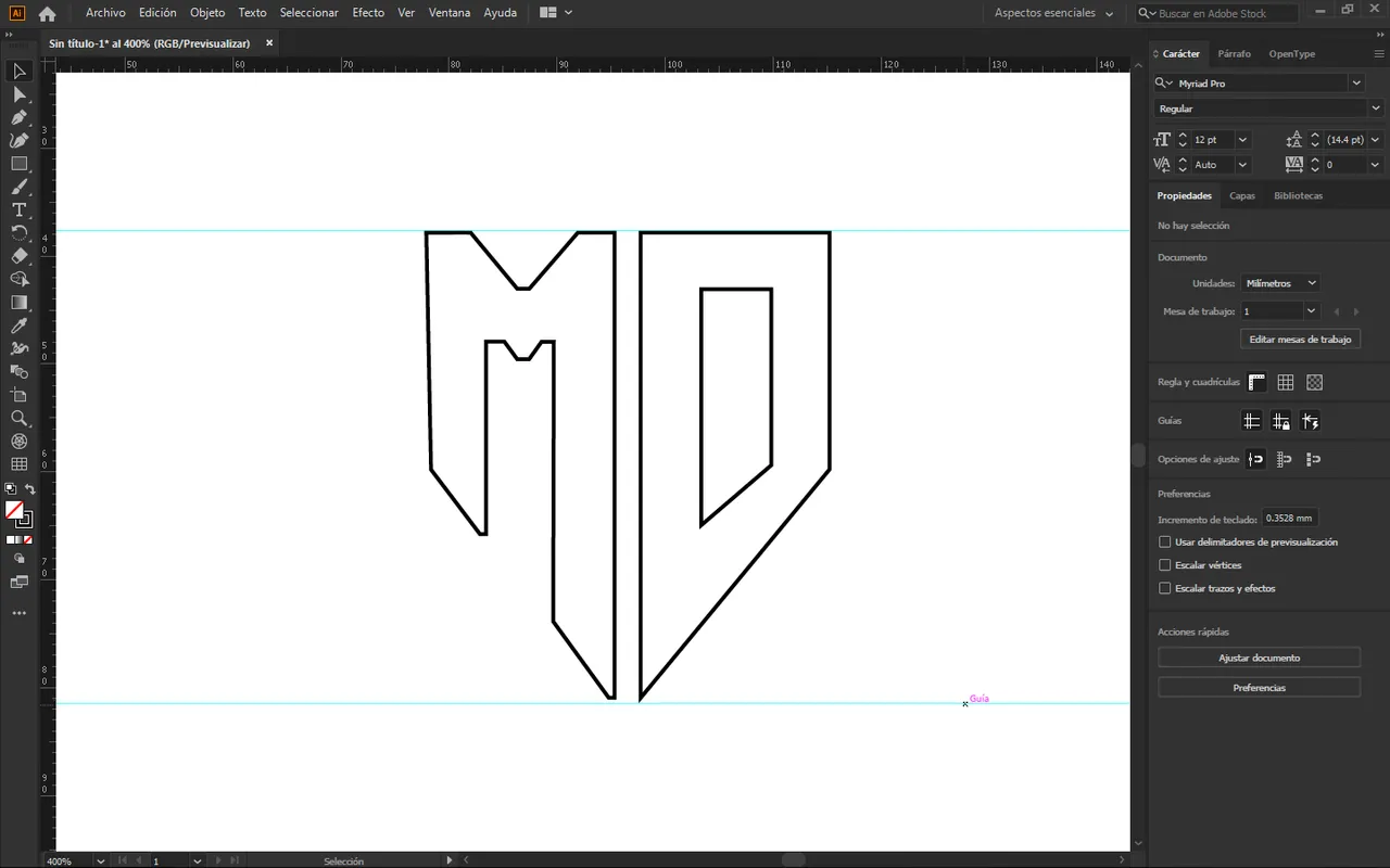
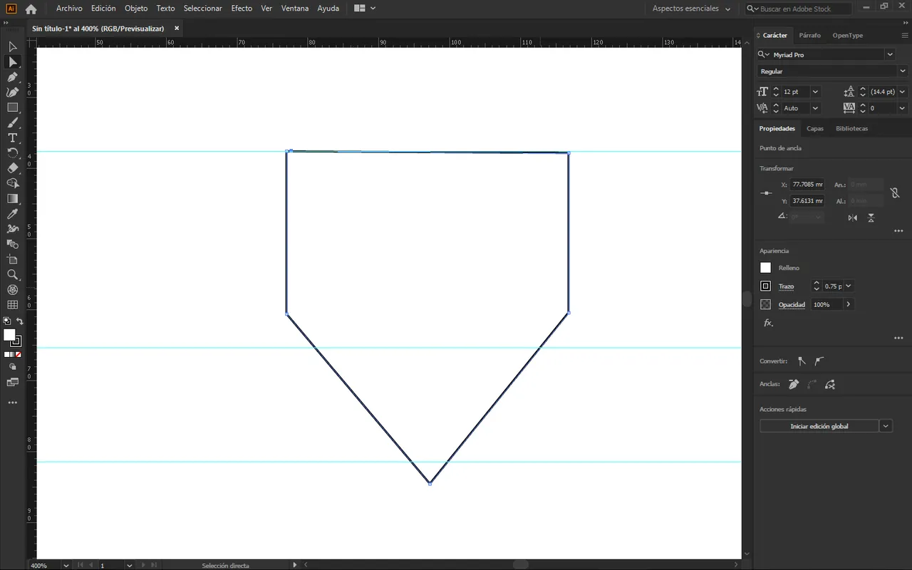
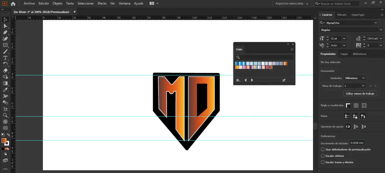
🔘 Luego de eso haré una silueta en forma de escudo para poder hacer el contraste de mi logotipo.
🔘 After that I will make a silhouette in the form of a shield to be able to contrast my logo.
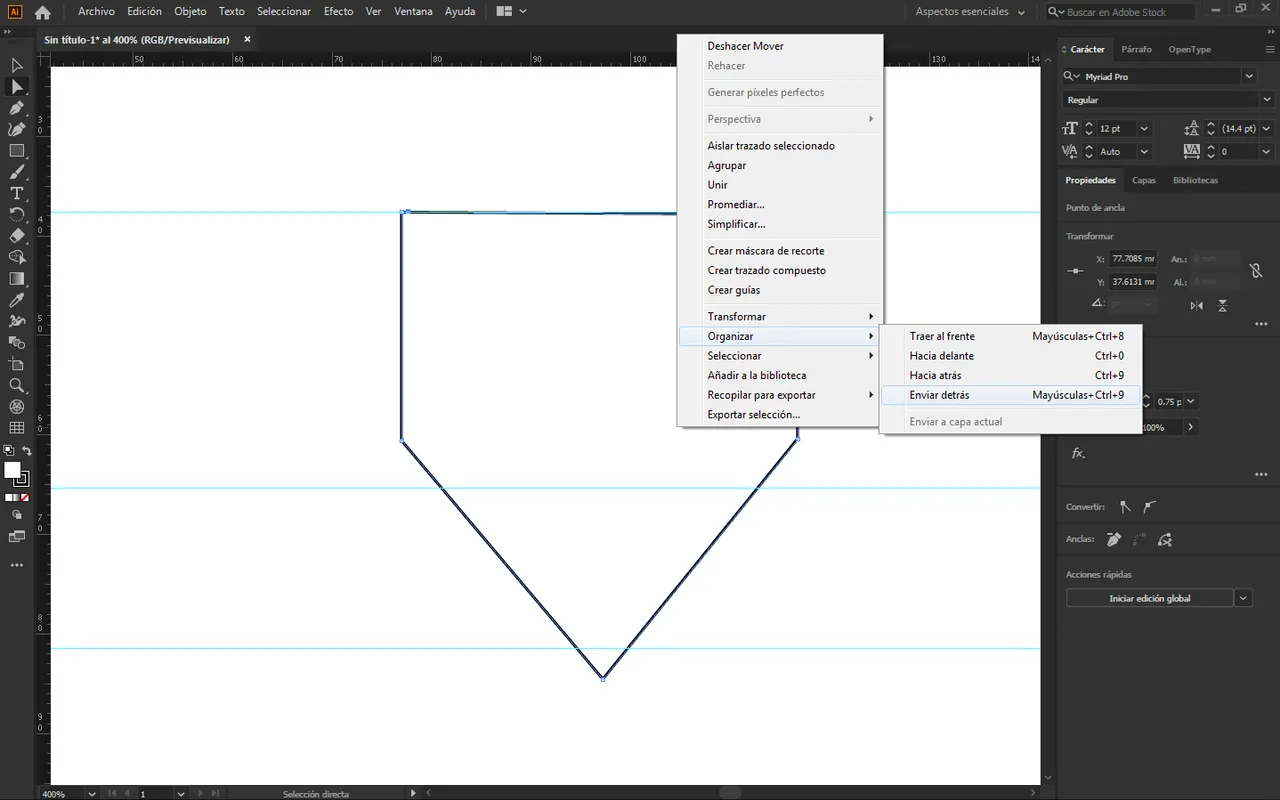
🔘 Una vez hecho eso, daré clic derecho en enviar hacia atrás, tal como te muestro en la siguiente imagen.
🔘 Once that's done, I'll right click on send back, as I show you in the following image.
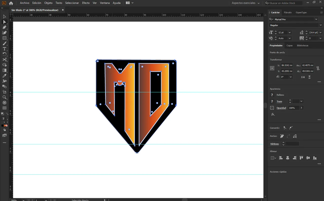
🔘 Ahora para adelantar un poco pondré color, el fondo será negro y para las letras usaré degradados de naranjas, tal como te muestro en la siguiente imagen.
🔘 Now to advance a little I will put color, the background will be black and for the letters I will use orange gradients, as I show you in the following image.
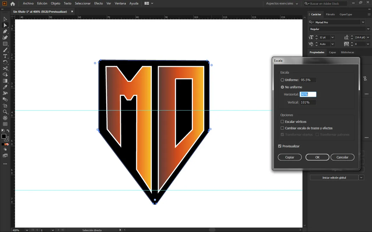
🔘 Una vez que hayamos definido nuestra paleta de colores, tenemos que darle clic derecho en escala y ponerlo al 90%, tal como te muestro en la siguiente imagen.
🔘 Once we have defined our color palette, we have to right click on the scale and set it to 90%, as I show you in the following image.
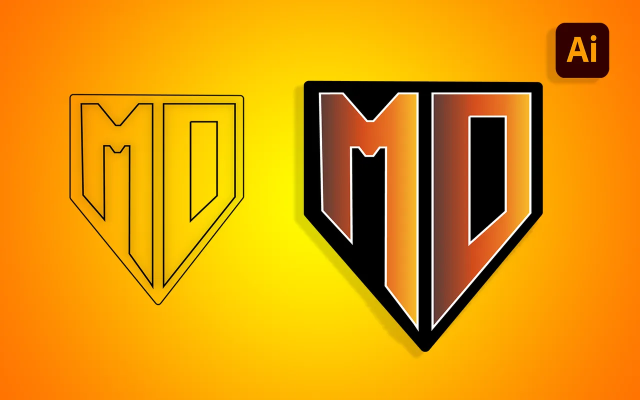
🔘 Diseño final:
🔘 Final design:

🔘 Y así damos por finalizado nuestro logotipo con perspectiva amigos, como pueden ver es un logotipo que se ve muy bonito visualmente, si te ha gustado este tutorial por favor déjamelo saber, nos vemos en el siguiente, hasta luego.
🔘 And so we end our logo with perspective friends, as you can see it is a logo that looks very nice visually, if you liked this tutorial please let me know, see you in the next one, see you later.
Todas las imágenes mostradas son de mi propiedad, son capturas al momento de realizar ese post.
all the images shown are my property, they are captured at the time of making that post.