Although a ton of designs that I made have been posted here, some do not make the cut or I did without taking some pictures of the process. So I have decided to make a post quickly summarizing some of those things.
In addition to that, I have had some talks with one of my friends about possibly creating an LLC and doing some lines of clothing. He is the ambitious one, and I tend to be the realistic one, so with that being said I don't know exactly what will come out of it just yet. But hopefully I will be able to showcase some of our thoughts and "lines" that we could do and get some much needed criticism on that. If you have any graphic themes or ideas that would get you to purchase our apparel, or isolate us from the competition, please feel free to comment and give us some of your thoughts.

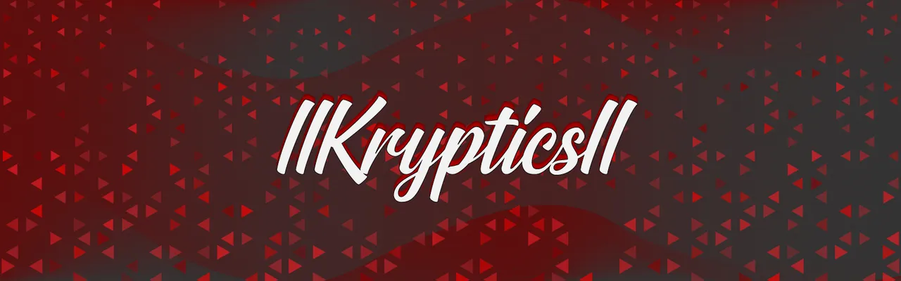
To begin, I created this as my friend @biggie-bear had a years old wallpaper I made for his PC that looked horrid. I am very critical on my own designs and tend to hate them within a week after making them, but I think that is what creates my drive to keep working and learning new things to make it better.
The background was not made by me, I found it on PixaBay here and edited to my liking. My reasoning behind this decision is that he loves Japanese culture and wants to move their one day, and honestly I'm not good enough yet to make something as detailed as this mountain-scape that gives the Japan vibe.
However, the coloring and texture is a bit different. I did take the picture but I would not be happy if I left it the way it was, so I added a geometric texture that overlays the whole background and if you look hard enough you might see the outlines of the geometry. I felt the slight sight of the overlay would add a ton to it even as un-noticeable it is.
Furthermore, I took 5 rectangles with different pastel colors and blended them across the whole background. This was all testing and experimenting in which I ended up loving and left it, of course rotating the whole blend a little so the color lines didn't go straight up and that's all.
While searching through commercial free fonts, as I do, I found this hieroglyphic looking font and chose that to write out his name and it adds something I cannot really pin-point on.
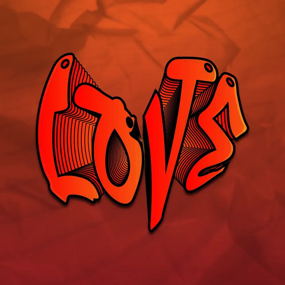
I call this design "Love." because that's exactly what it is. I just hopped on yesterday morning and experimented and this is what came of it. I wish I had a more meaningful reason behind it but I do not Unfortunately.

I did a ton of things to this and it honestly could warrant its' own post but I will keep things simple and post a tutorial of doing something like this instead.
In short, I took a heart vector and had the text wrap into it... didn't work too well though. I'm 99% positive nobody looked at that design and immediately said the text looked like a heart. But anyway, I liked where things were going so far so I kept going with it. Experimenting is Key
Once that was done, I made a tunnel-blend to create the depth and made the closest text have a red-orange gradient. I then duplicated just the closest text and shifted it over a bit with the attribute as overlay. (The abrupt color shift on right side of "V" and "E")
There were some shape issues with the blend so I had to go around and fix that, just small things like the layers in the back popping up but that was no problem. My biggest decision that I had to make while designing was to keep the background transparent or create something. As you can tell I chose to experiment with a background and I really like it, gives the design some meanings depending on the person, which I will leave the deciphering up to you. The seen texture is some crumpled paper and sand, but the sand shouldn't be too noticeable.
Thank you for checking out my post!