My satisfaction and passion as a designer is to make sure I get to the origin of my client’s problem and get it solved.
As a brand identity designer, I have learned to always, firstly, get to know about my client’s business, and what kind of products, services, or offers they deal with. I proceed to get to know why they need me. What problem do they have? How long they have had this problem? What the problem has cost them. Getting to know all of these will lead me to know how I can get their problems solved.
I worked with Crowns as a Brand Identity Designer. The brand, being a startup, I was able to help create a simple logo depiction of the brand personality coupled with other guidelines in creating a cohesive and consistent look for the brand over time.
HOW DID THE PROCESS GO?
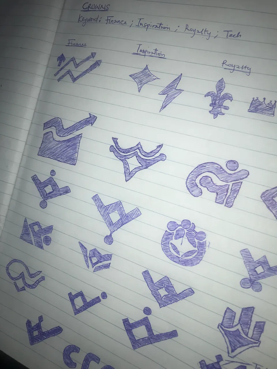
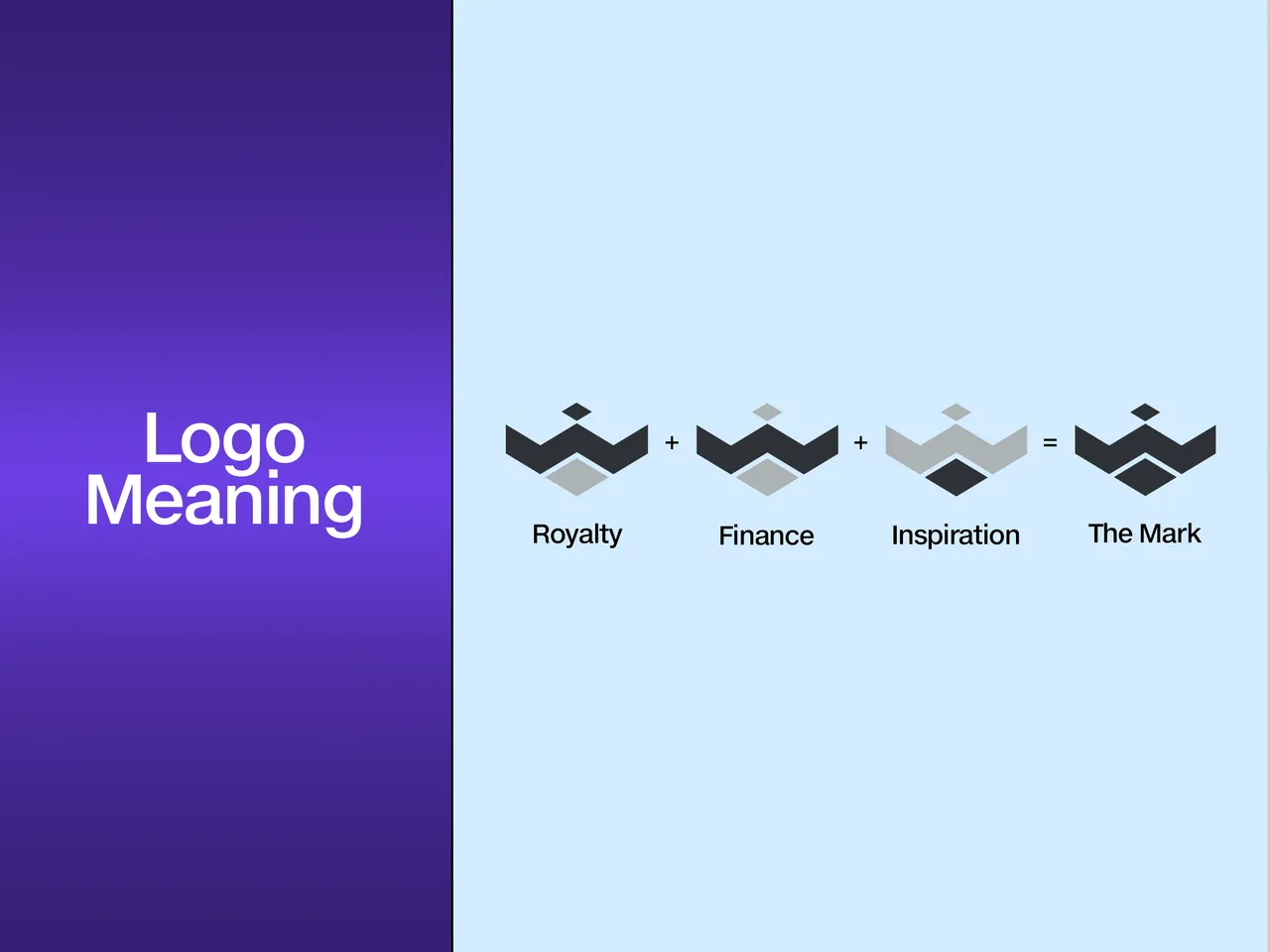
- Logo Sketching: This part is the hardest and most time-consuming part of creating a brand identity design for a business, especially startups. It took me over a week to get this logo mark drafted out. Keywords for this project were Finance, Royalty, and Inspiration. To get all of these illustrated into a simple symbol was quite tasking. I had over 20 drafts of logo sketches before the final one which was finally approved by the client.

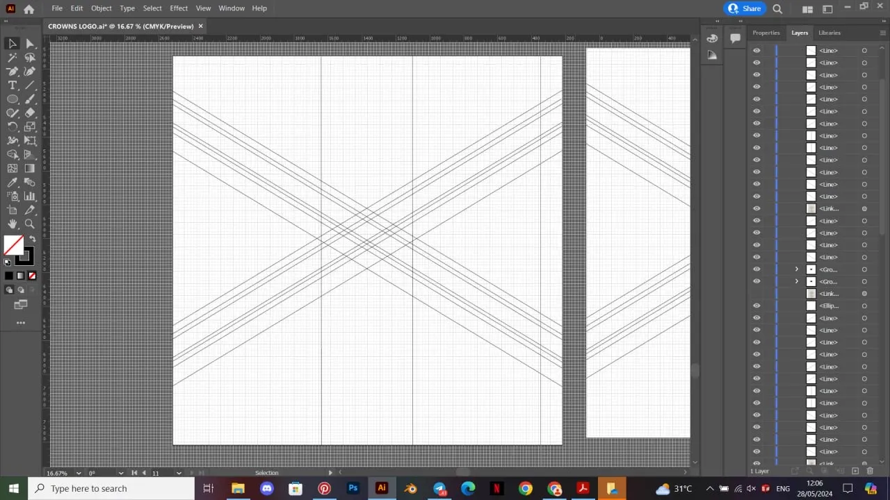
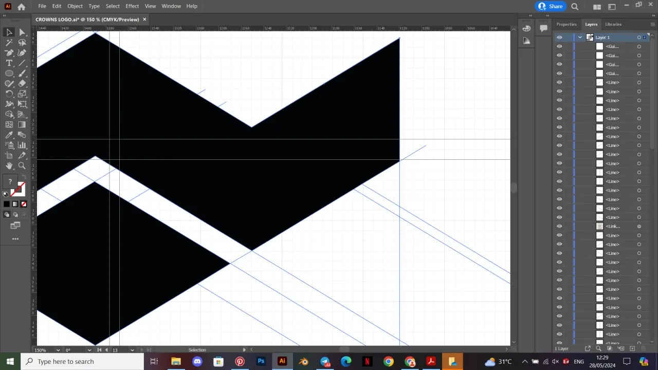
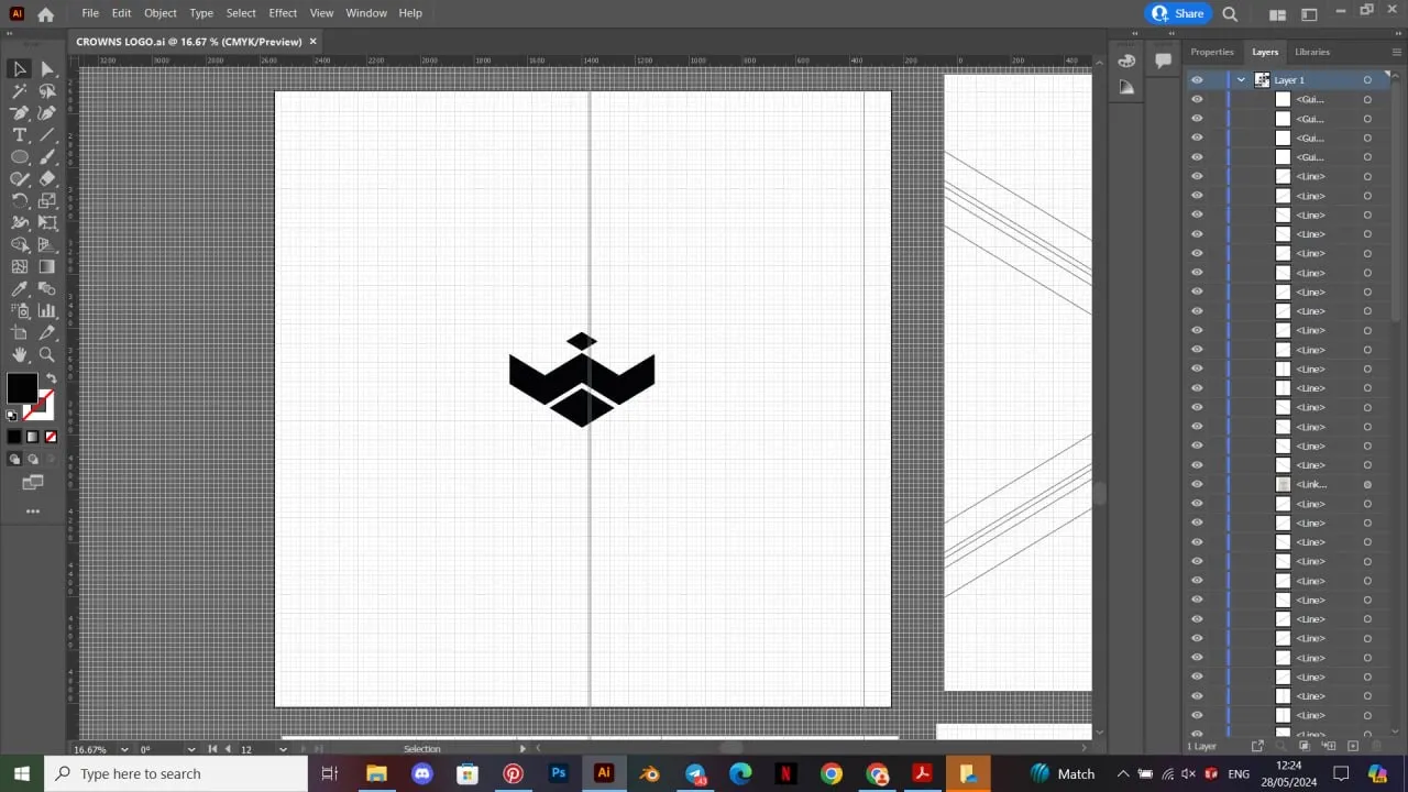
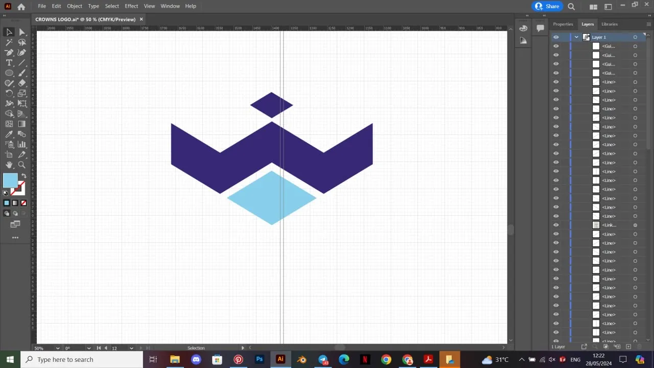
- Mark Construction: I proceeded to design the logo sketch in Adobe Illustrator. I started by creating my grid lines and working my way around the grid lines using my shape tool to bring out the logo mark.
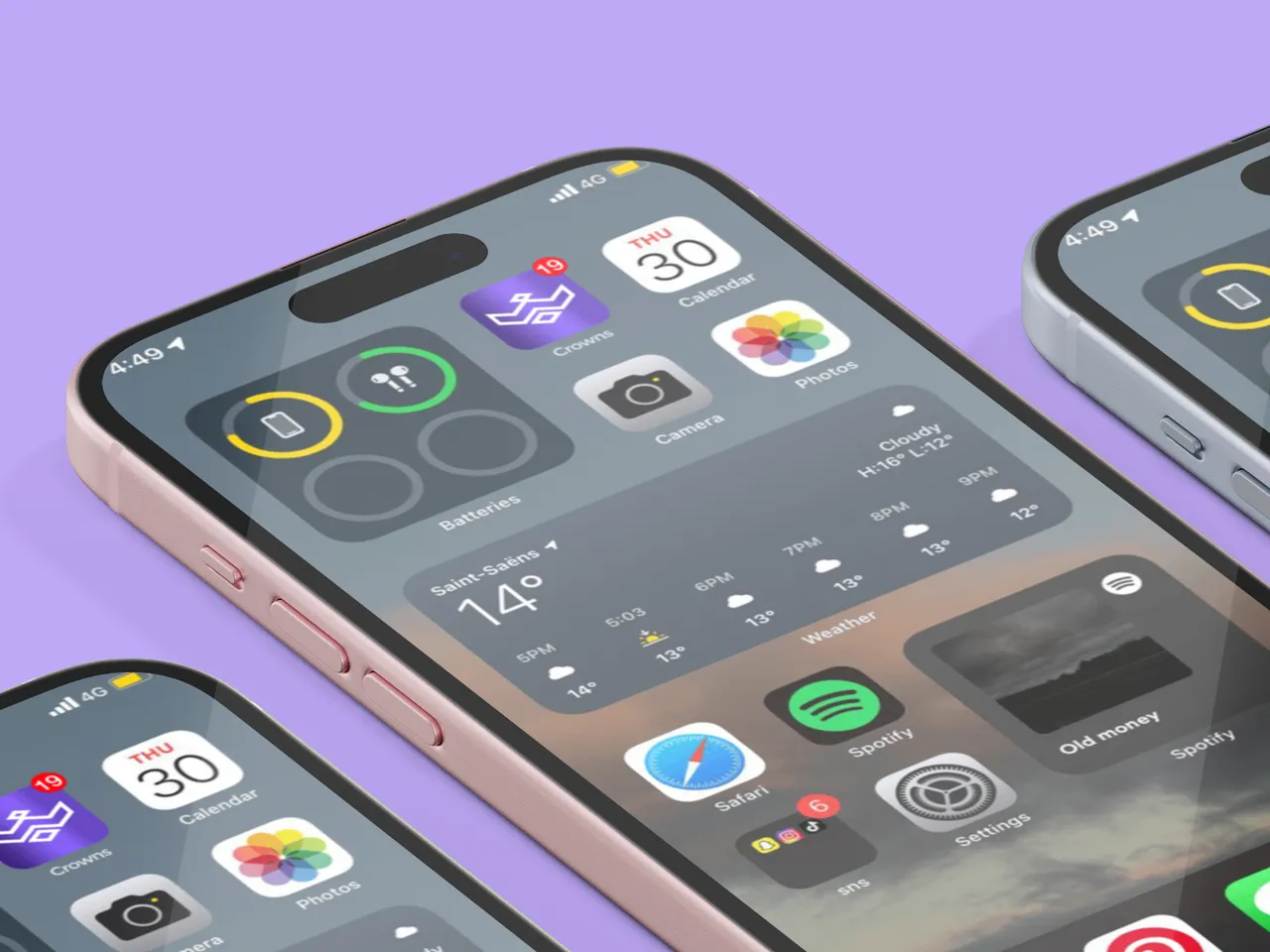
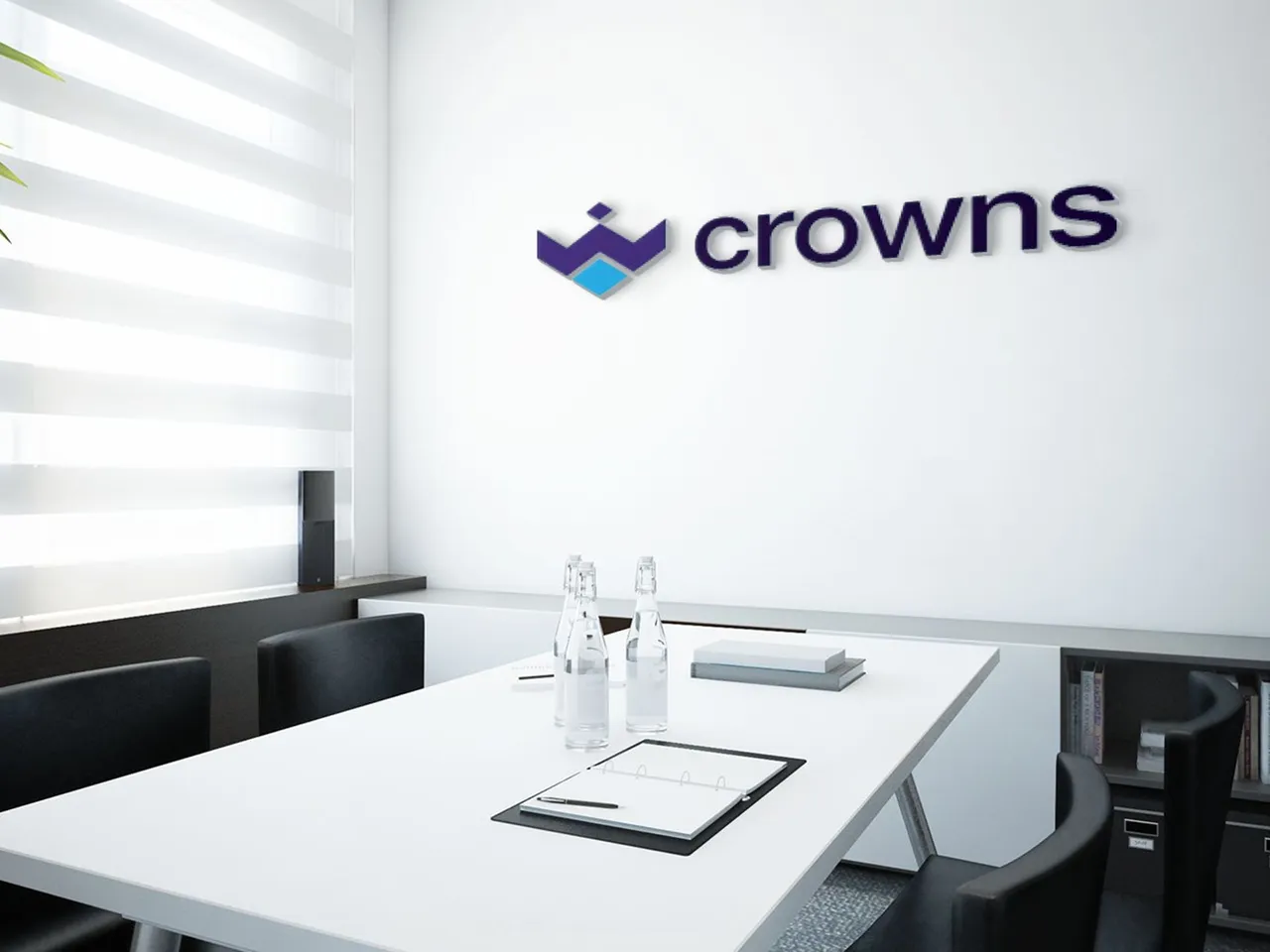
- Mock-ups: I had issues getting so many mock-up templates familiar to the brand. I had surfed different sites I know in hopes of getting these templates but sadly the good ones were paid and highly-priced. Eventually, I had to create my mock-up designs myself. I love this part so much because it allows me to bring my designs to life. It helps to see how they will look like in live objects.
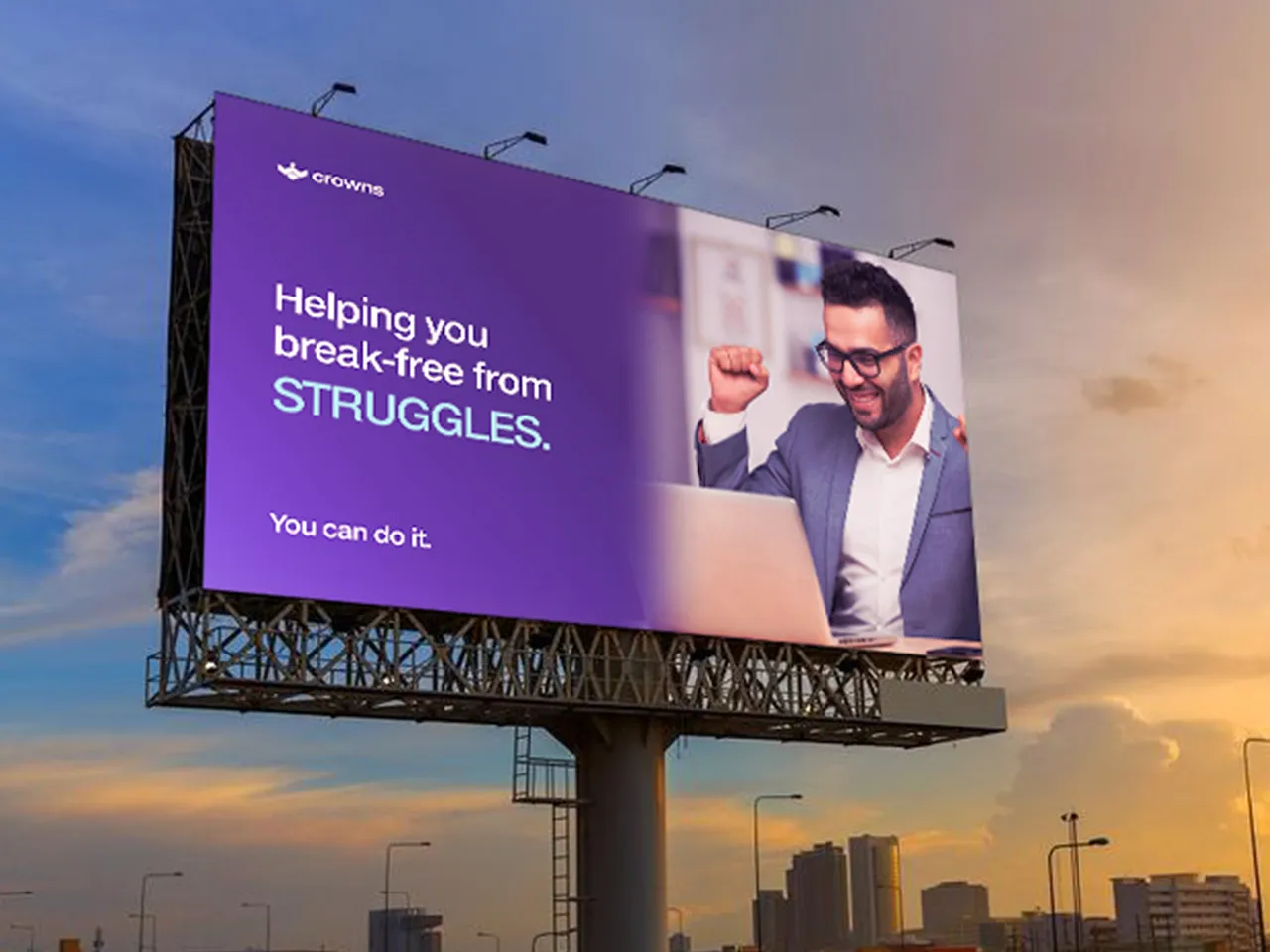
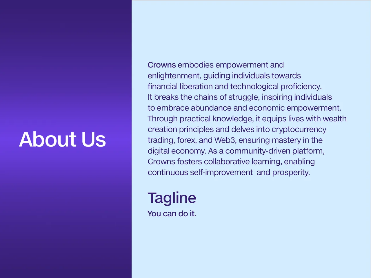
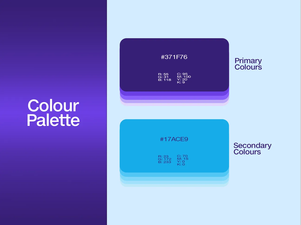
- Visual Presentation: Yes! The Real Deal. Without this, the brand has no visual recognition. I put my all into this part. Every business startup should have this. The colours, fonts, styles, and many other things you see a brand visually represent were picked from their brand visual presentation. I went on to design the visual presentation in Adobe Photoshop. Choice of colours was selected according to their personalities in resonance with the brand’s ideas and values.
Fonts! Every designer knows we can spend several minutes looking for the right one but yeah, I came up with one.

I helped Crowns create a colour palette depicting the keywords of this project.
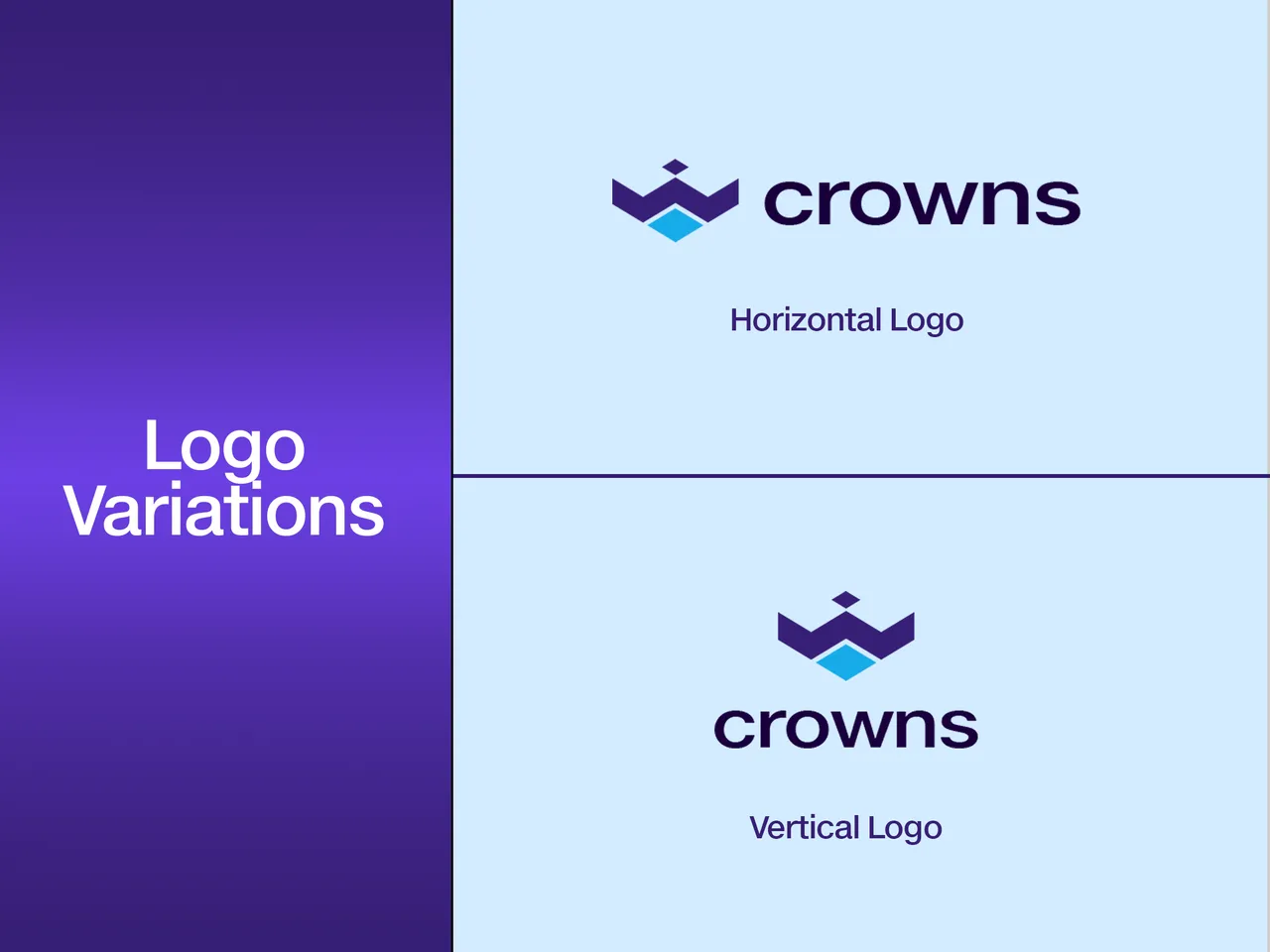
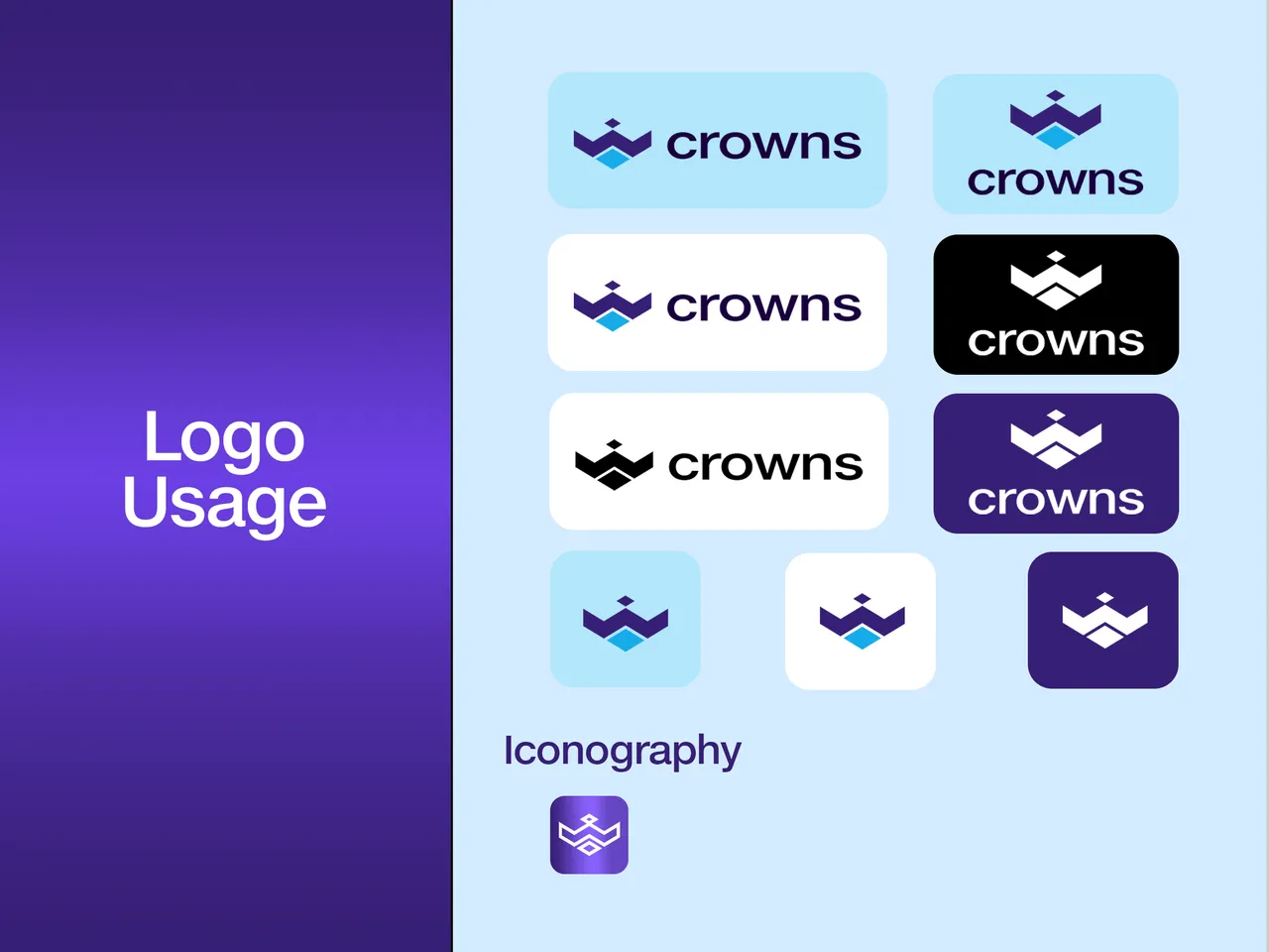
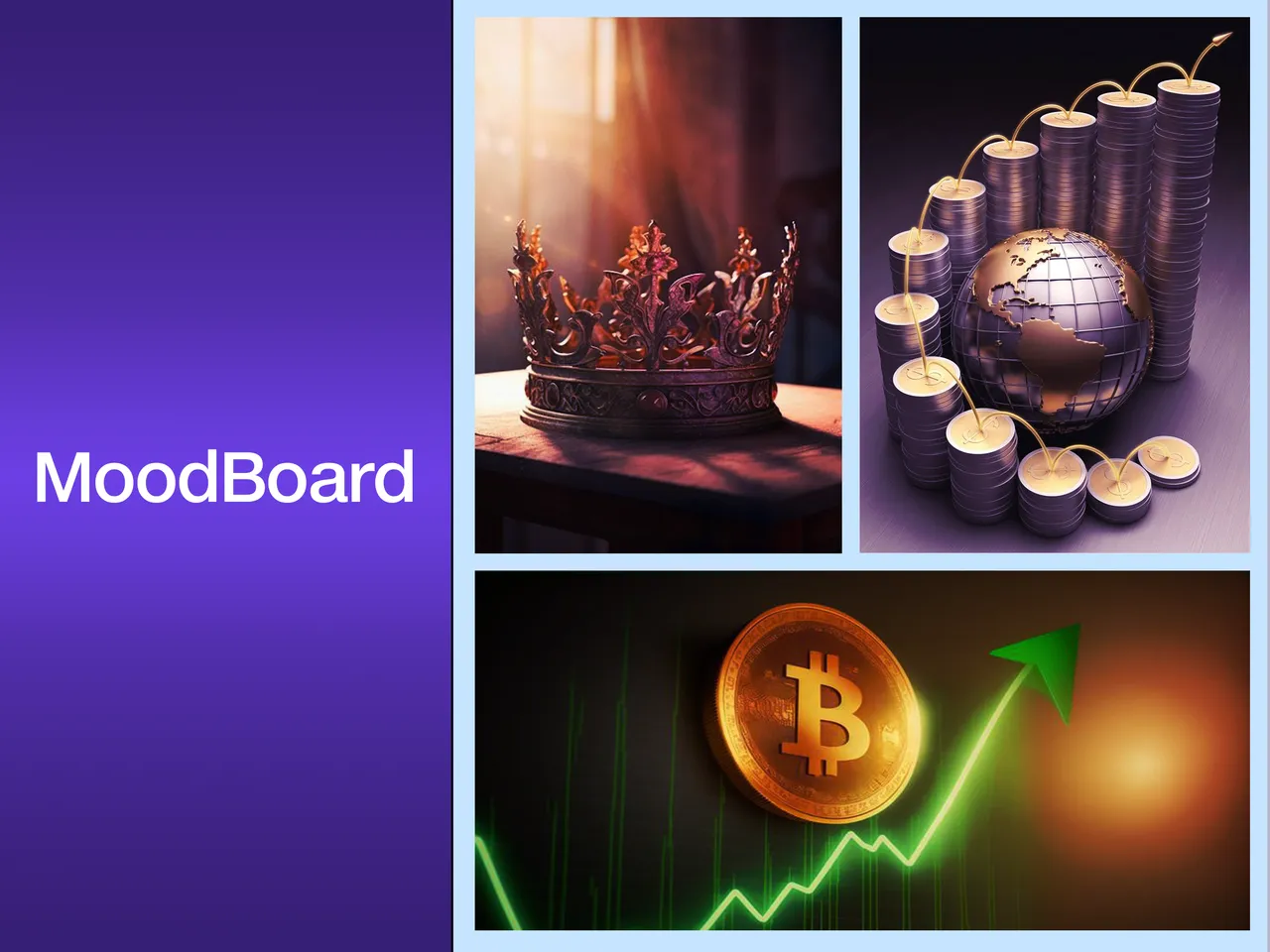
In this presentation, I displayed how I designed the mark with grid lines isolating each element in the logo. I displayed the Logo Meaning, Variations and usage, Iconography, The MoodBoard (To give my client an understanding of how and where I got my inspiration for the design), and Mock-ups (To show my client, how the logo and other brand identities will look like in live objects).

I enjoyed doing this project. Every project I have done has opened my understanding to another learning.
LET’S GROW 1% DAILY.
PS: My client has approved sharing this on the internet.