A couple days ago I shared a look at my upgraded studio setup and it's about time to show a little bit of the upgraded artwork I've been producing in that space!
I tend to skip around a lot as I work, moving between different pages and different parts of the process as the mood strikes. This method of "rotating procrastinations" at least keeps me with a bare minimum of productivity. The past few days I jumped back into a bit of coloring, one of my more prominent weaknesses in the comic creation process. I wanted to get motivated by starting to get a better idea of just what the finished product might look like given the right amount of time and effort on my part! Thankfully, I'm pretty happy with the result. That's rare for me!
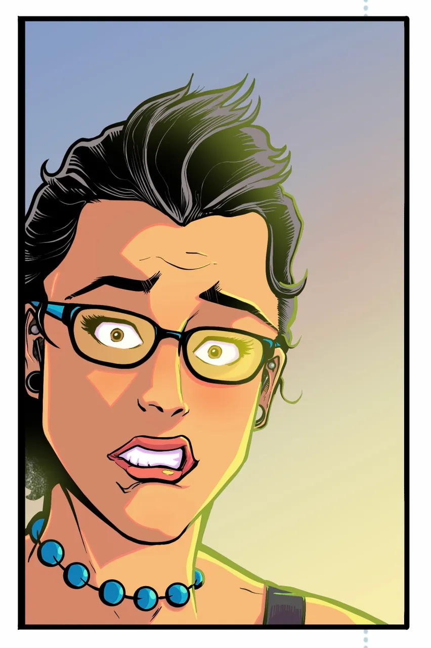
This shows one panel from the first issue of my comic "I Thought It Would Be Zombies..." Aside from the coloring, I've also managed to up my game a bit in every aspect including the overall anatomy and ink rendering when compared to earlier iterations. This is what I'm striving to do on every page of the first issue and then I'll be happy to keep my artistic journey and improvement continuing on into issues 2, 3 and beyond!
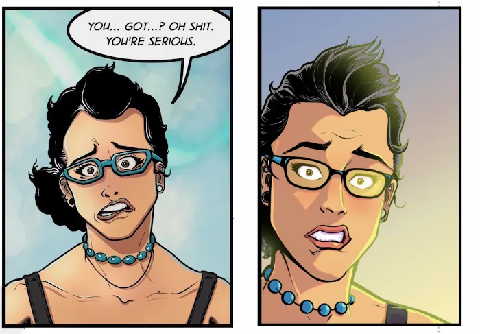
Since I have a penchant for lengthy posts, I'll give you a little behind the scenes look at the making of this image which features a rather worried Sarah!
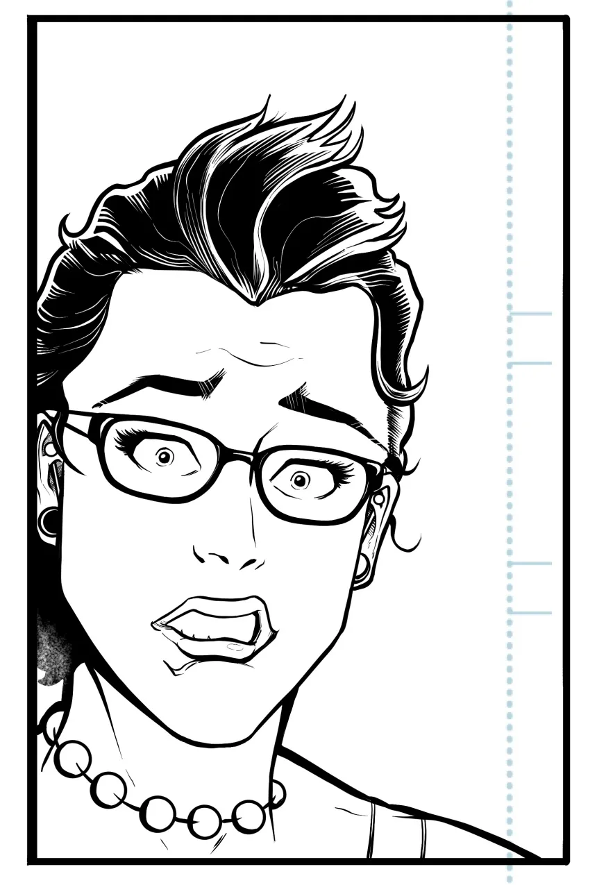
Here's what it looks like at the ink stage. Pretty clean and simple. I'm trying to develop a good mix of realism and "cartoony" to fit the tone of the book which needs to range from lighthearted magical adventure to dark horror.
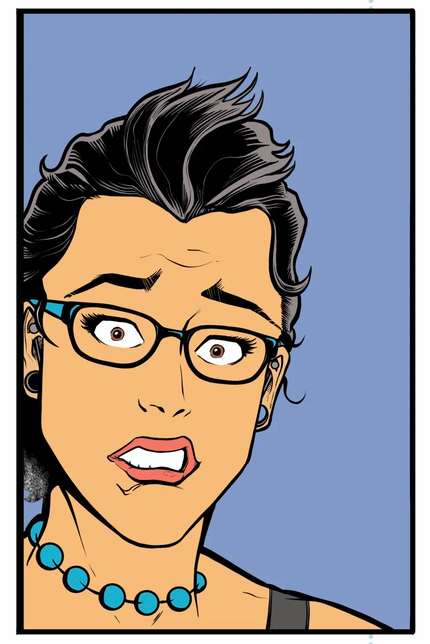
This stage above is known as "flats." It's aptly named because you're just putting down flat base colors in the various areas of the image. It's your basic but time consuming adult coloring book!
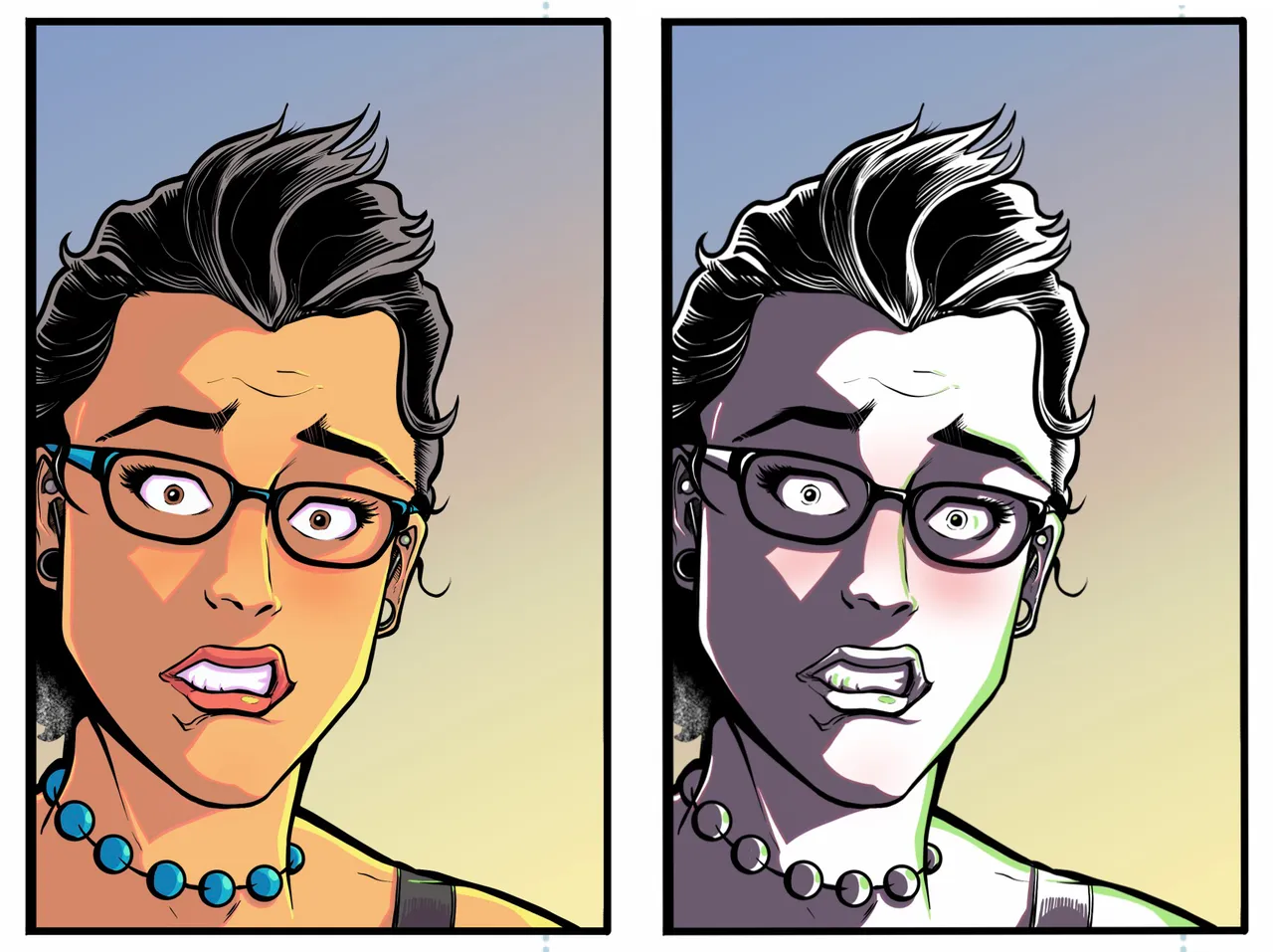
There's where the magic starts to happen... This is the rendering. The image on the right shows the rendering layer without the flat base colors behind it. That layer is then set to a mode known as "Hard Light" which mixes the color in a certain way and combined with the base colors produces the result you see on the left. There are many different ways to accomplish similar effects, but this is one of the most useful methods I've learned in my studies! It allows plenty of ways to edit later on should a change in tone be required.
Along with the overall drawing and linework style, I feel like I'm continuing to hone in on the "look" of the book with this color style as well. It's very hard edged creating an animated feel like cel shading. It's something I feel is within my skill to accomplish and I'm kinda digging the look... what do you think?
Some final layers add on effects that occur on top of the ink layer. Some of these effects are known as "color holds" and involve changing the colors of the inked lines. I've used these techniques to add a bit of a glow from the primary light source and create a bit of glare on Sarah's glasses lenses.
Below you can see the comparison between the earlier iteration of this panel and the current one. I like the new one so much better.
I'm going to keep this standard of quality going to my utmost, and eventually... finally release the first issue of "I Thought It Would Be Zombies..." to the world! I really appreciate everyone who follows my journey as I share it here on Hive. It's a huge undertaking and your support makes a very real impact.
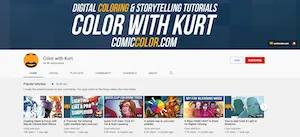
As I've been studying comic coloring, my greatest resource has been a gentleman by the name of Kurt Michael Russell. His YouTube channel has a wealth of knowledge and he offers more in depth courses for purchase as well. I've grabbed a couple from Udemy when they run their frequent sales. I've barely scratched the surface of his teachings and resources... so anything good you see is all credit to him and anything bad is just my bad! 😬
The image below links direct to K. Michael Russell's YouTube channel and you can find more about his work at https://www.comiccolor.com/ If you have an interest in the art yourself, I highly recommend checking him out!
Thanks for reading! I hope you enjoyed this little look behind the scenes, it's been a long time since I shared an "I Thought It Would Be Zombies..." update. As always, I'd love to hear your thoughts and feedback in the comments section. I'll see you there!
-Bryan "the Imp" Imhoff
Follow me for more behind the scenes looks at the creation of "I Thought It Would Be Zombies..." Your votes help support its production! Also look for limited edition digital artwork for sale on NFTShowroom.com