I've been playing around with a new logo for my natural deodorant and herbal teas that I make, because I hated the logo I had before. It's mainly for fun, but I do want something that speaks from my heart and also looks good on a sticker, right? I'm not a graphic designer, but I do love to play around with these things. Using CANVA, I came up with the following logo, and would love your advice and help!
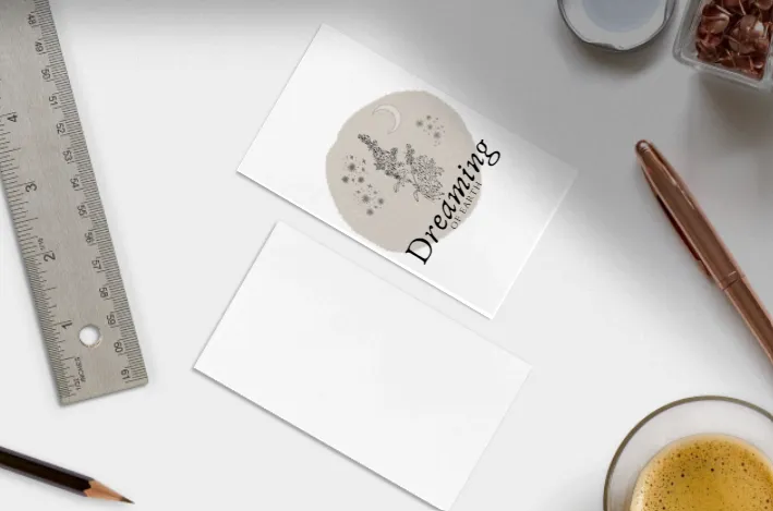
The name itself is a word I often play around with - to me, a 'dreaming' is not just a night dream but something one actively does, like imagining a story, a life, an entire history or future. Dreaming of earth to me is creating a world into existence, of making a garden from the soil, creating possibilities through meditation, play and creativity, but it's also that feeling of seeing the entire picture - the worms, the mountains, the oceans, the animals, the plants, the people, all as one. In the centre of the logo is mugwort, a plant known to help with sleep and dreams but also is a plant of the moon, and an ally of woman. The moon of course influences all. I like the name - I've been playing around with words for this for a long time and this came to me today.
What I'm unsure of is the colour, the lettering, and the way the letters hang over the edge - that wouldn't work in dark mode. On balance, I do like the long as it is, but the overhang is bothering me. What am I missing? How could I alter it?
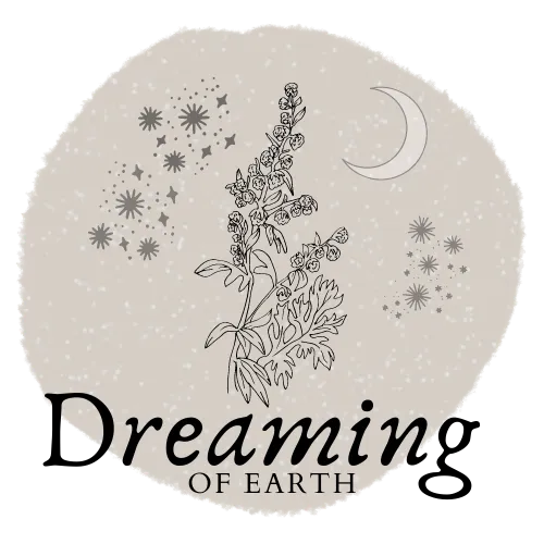
Image 1
If you're viewing this post in dark mode, you'd see my concern.
And is the colour okay - or is too wishy washy? The colours for this particular circle are muted - cold blues and steel greys.
Here's the image again with a blue tinge, and the letters in a slightly different arrangement. Again, I have a dark mode issue. But that's irrelevant on a label.
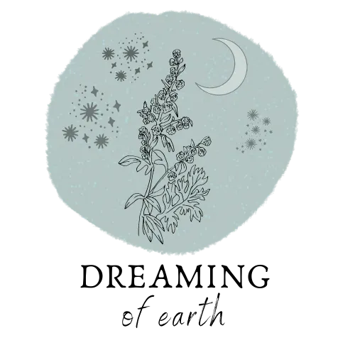
Image 2
As I'm writing this post, my husband is talking to me about sleeping bags and tents again. I pretended to listen to him last night. He's now pretending to be interested in fonts. This is EXACTLY why I'm asking HIVE. At least I might upvote your feedback, which is more than my husband gets for pretending to be interested in my logo...
Of course, if I was worried about dark mode, I could just have a different version of the logo, right?
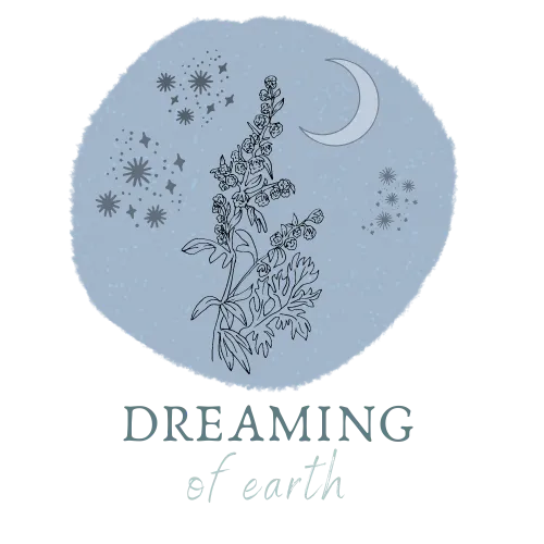
Image 3
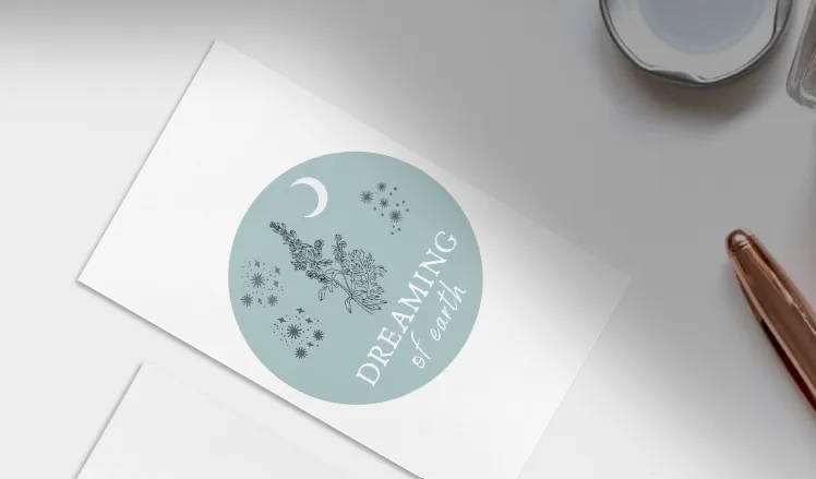
Funny how you play around with these things and you end up with the image you like the best anyway. But now I'm worried about how it'll work on a sticker! As in, fitting it on a circle tin, which I put my deodorant in.
So maybe I should do a more circle circle so it aligns better, and put the text within the circle?
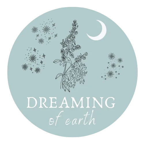
Image 4
Ah! Help! I need your advice!
Be so grateful for your assistance!
With Love,

Are you on HIVE yet? Earn for writing! Referral link for FREE account here
