
I have been extensively researching technical analysis subjects for several months. During my research, I encountered trader opinions that drew attention to various aspects of the subject. As far as I can see, those interested in the technical analysis approach the issue from different angles. I believe that the opinions of all instructors belonging to different schools are valuable. Other than being rivals, they complement each other. In this article, I intend to show the big picture in technical analysis. I will list the different technical analysis methods and approaches and make short comments for each.
I will make my comments assuming that all analyses are done on daily charts. As you know technical analysis can be done for hourly, daily, weekly, etc. periods according to the maturity of the targeted trade.
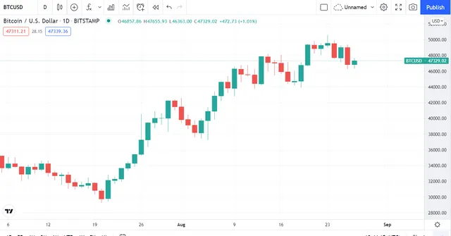
Candlestick Patterns
I wanted to start my listing with candlesticks, an ingenious way to visualize price movements because there is almost no trading strategy where this method is not used. Candlesticks show prices by outlining the daily price movements. If the price has increased during the day, the candlestick chart becomes green, if it has decreased, it becomes red. Prices that occurred below and above the opening and closing prices are shown as wicks at the end of the candles. Though there is a long list of candle patterns including one or more candles, the most important patterns are the ones with long candles or wicks.
Main Trend
The price of an asset can be in an uptrend, downtrend, or range at a given moment. Ascending and descending trends, by definition, have to contain zigzags seen in the above candlestick chart. Trading professionals note that we should not take action in the opposite direction of the main trend.
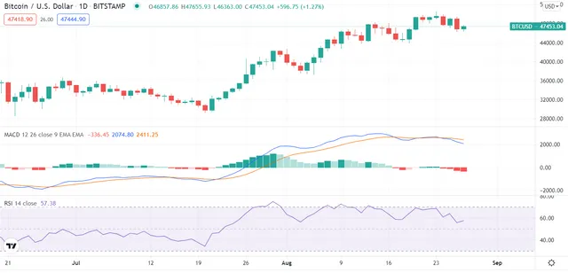
Momentum
Development of the price in the last two to three week period is measured by oscillators such as MACD and RSI shown above. A rise in momentum indicates that prices are likely to increase, while a fall indicates that prices are likely to decrease. In cases where momentum reaches extremes, the market is expected to react in the opposite direction.
Support and Resistance Levels
It refers to levels where the price is expected to find support and return up or resist and retreat. Support and resistance levels are determined by looking at the points at which the price turned in historic price movements. Support and resistance levels are often defined as bands, not a single line. Recently formed and tested multiple times levels are considered more robust.
Multiple Time Frames
It is assumed that support and resistance areas, which appear in the daily as well as the weekly chart, are more important. In interpreting daily price movements, trend confirmation is made by looking at hourly charts.
Divergences
It is assumed that the trend is likely to change when the trend in the chart and the trends in the indicators are incompatible. For example, the price is rising but the volume is falling. Or the price is on an upward trend, but the MACD or RSI indicators are on a downward trend.
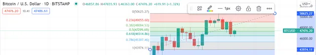
Fibonacci Levels
At the price levels seen for the first time, support and resistance areas cannot be determined by looking at historical data. In such cases, Fibonacci levels are used to predict how much the price can retreat from the level it reaches. The distance from the beginning to the end of the recent trend is measured and it is assumed that the price can be retracted by 50% to 61.8%.
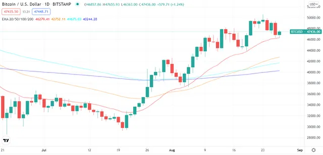
Moving Averages
Because prices in the market are extremely dynamic, the “fair” value of an asset is obtained by averaging prices over a given period. When this process is repeated, the average becomes a line. There are two types of averages: simple and exponential. When calculating the exponential moving average(EMA), more weight is given to recent price movements and it is more preferred in the analysis compared to the simple average. The most popular moving averages are 20, 50, 100, and 200 which are shown in the above chart. When the price rises above or falls below these averages, it is considered to be an important signal. Moving averages sometimes act as support as seen in the above chart. Bitcoin price has turned from the red 20 days EMA several times.
Chart Patterns
Some patterns formed on the chart have special meanings. For example, the fact that the price has returned from the same level twice means that this level cannot be easily passed. If the price has returned from the same level three times, this is considered a much more robust indicator. A chart pattern with a triple peak, higher in the middle, is known as a shoulder-head-shoulder formation and refers to a trend return. The upside-down shoulder-head-shoulder formation indicates that the downward trend is coming to an and.
Correlations
It is not enough to analyze financial assets that correlate with each other alone. For example, in the crypto market, the price movements of Bitcoin and Ethereum are very decisive for other alt-coins.
Trading Volume
An asset's trading volume, which shows the total trading of an asset during the day, is an indicator that needs to be carefully monitored. There are even traders who are trading based only on the volume. It is desirable that the transaction volume is high. The volume that took place at that time is taken into account to determine whether the rises and falls are permanent. If the movement is accompanied by high volume, it is likely to continue.

Conclusion
In this article, I tried to outline the big picture in technical analysis. Trades signaled by more than one indicator or method are more likely to be successful.
Thank you for reading.
Image Sources:
https://www.tradingview.com/ and https://giphy.com/ and https://unsplash.com/photos/Wb63zqJ5gnE