For the last few months, I have been working hard to update my knowledge of the crypto world. In the meantime, I have invested in many cryptocurrencies, especially Hive and Steem. I don't trade daily as I approach the issue as medium and long term. On the other hand, I have learned - by bitter experiences - the importance of buying and selling cryptocurrencies at the right time.
When it comes to when to buy and sell an asset, technical analysis comes to mind. I've been trying to improve myself in technical analysis for a few months. When I reached a certain level of maturity, I wanted to write down the information I learned on this subject.
Technical analysis is a discipline that focuses on the change in an asset's price over time. Therefore, it proceeds from the fact that past prices are an indicator of future prices. And it is based on the assumption that certain patterns are constantly repeated for psychological reasons. When traders trading according to the known technical analysis patterns are added, the importance of the method increases even more.
Candlestick Charts
Candlestick charts, which visualize price movements based on a specific time frame, were invented in the 18th century by rice trader Munehise Honma. While examining the records, Honma noticed the repetition of certain candle patterns and successfully used this information to trade rice. In the image below, you can see the daily Bitcoin candlestick charts from July 10 until today.
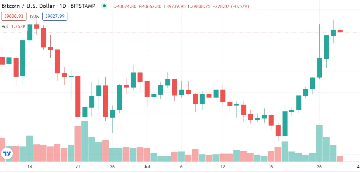
There are red and green candles in the image. The green candle indicates that the price has increased within that day. The red candle indicates that the price has decreased within that day. The lines above and below the candles show the highest and lowest price levels seen that day.
It would be beyond the scope of this article to talk about all the strategies based on candlestick charts. However, I would like to give a few examples. A long green candle could signal the start of a price uptrend. A long red candle may indicate the start of a reverse price downtrend. I used the word 'could' because long candles need to be confirmed by candles of the same color that will form the next day.
The long lines at the ends of the candles show that the price has gone to a certain extreme during the day and returned from there. It is necessary to pay attention to long lines, such as long candles.
Of course, meaningful candlestick patterns are not limited to the examples I have given. In addition to using them daily, it is also possible to use them hourly, 4-hourly, or weekly. The time period to be used is determined by the maturity of the trade to be made.
Oscillators
Candlestick charts are an ingenious way to summarize and visualize price movements. Over time, technical indicators have been produced for the same target. There are dozens of these technical indicators, also called oscillators. In the picture below, you can see the current values of the oscillators for Bitcoin, which you can access for free via the link https://tradingview.com/symbols/BTCUSD/technicals/.
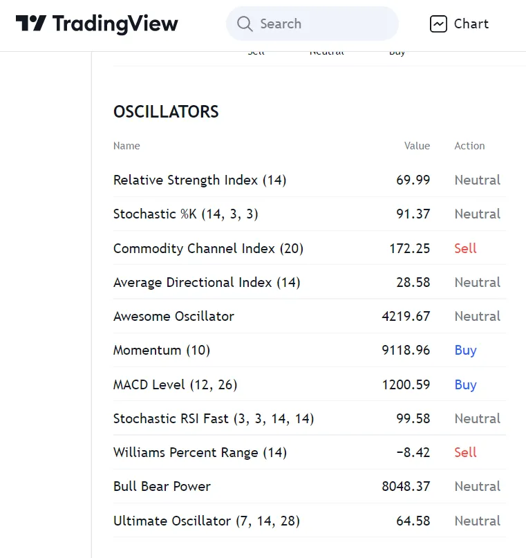
The question comes to mind, which of these indicators is more valid. It is possible to consider the indicators in the list in two groups: oscillators that measure momentum and oscillators that determine overbought/sold levels. When a downward or upward momentum begins, it is assumed to continue for a while. Indicators such as the MACD, which measures momentum, guide those who want to catch the rising or falling wave and benefit from it. Oscillators that determine overbought/sold are used to detect trend reversals. Examples of these oscillators are the Relative Strength Index (RSI) and the Commodity Channel Index.
Do these indicators really work? Which ones allow for more accurate predictions about the direction of the market?
It is possible to determine whether an indicator or strategy is working with a method called back-testing. My observations based on historical data on Ethereum and Bitcoin prices came out to support the opinion of the experts. The MACD works well in catching the emerging price trends and the RSI in catching the overbought zones. These two indicators are my favorites.
The MACD compares the price's 12-day average to its 26-day average and signals a buy when the 12-day average crosses the 26-day average. Otherwise, it creates a sell signal.
RSI takes the market's pulse by taking into account the price increases and decreases of the last 14 days. An RSI above 70 is considered overbought, and an RSI below 30 is oversold.
What I said for candlesticks also applies to oscillators. Oscillators tell us levels to watch out for. Confirmation by extra knowledge is needed to use them properly.
Support/Resistance Levels and Trends
Sometimes an uptrend or downtrend becomes visible on price charts. Sometimes the price can move horizontally. When the uptrend continues for a long time, the asset is considered to be in the bull run, and when the downtrend continues for a long time, the bear market is valid.
The support level represents the point where the decline is expected to stop, and the resistance level represents the point where the rise is expected to stop. It is assumed that the recent lows and highs could be support and resistance points. If the price has rebounded from a level more than once, this indicates that the level is the support line. The point where the price turns down more than once is considered to be the resistance. Especially if the price has returned from this level three times, this is considered a solid price return sign.
Moving Averages
The averages of the prices for a certain number of days are important in technical analysis. The most popular moving averages are 20, 50, and 200 days. A short-term average crossing a longer-term average is seen as a positive signal. The opposite situation is interpreted as negative.
There are two types of averages, simple and exponential. Exponential averages are more popular as they prioritize recent price movements.
The upward crossing of the 50-day average from the 200-day average is called the "Golden Cross" and is seen as an important uptrend sign. The opposite situation is called "Death Cross" and is seen as negative.

CONCLUSION
In this article, I have made a general introduction to technical analysis. It is possible to construct strategies in which the above-mentioned methods are used in combination.
Fundamental analysis, which includes information about the nature of the asset, should not be neglected. If we've done our homework on fundamental analysis and technical analysis, it's easy to make money in a mostly upward market like crypto. Of course, we should be cautious in such matters.
I want to note that I am neither a financial adviser nor a trader. I am a crypto enthusiast and a former banker :)
Thank you for reading.
Image Sources: https://giphy.com/ and https://unsplash.com/