All the images contained in this post - except for the Hive GIF - are created and modified by me. All the images in this post are copyright-protected. All the uses of the images and their derivatives are strictly prohibited without the explicit consent of the author.
Hello Dears!
I don't know if many of you have read about my recent project, the launch of a service focused on the creation of graphics and logos - Digitall - which I have not yet given official start. In recent days, I came across an initiative of a crypto company included in the Defi. This company has launched a graphic contest, placing as a prize a consideration paid in its token. Their site is very particular, I can't even tell you if it's a scam or not because so far I haven't had any experience about it. But I decided to get involved and - why not? - try to create a logo.
SKETCH & TRACE
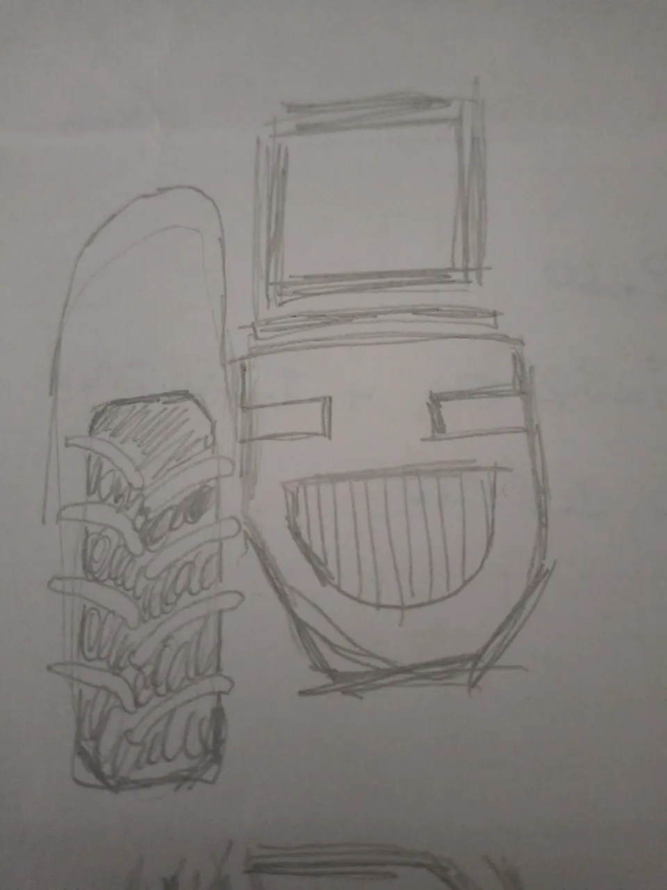
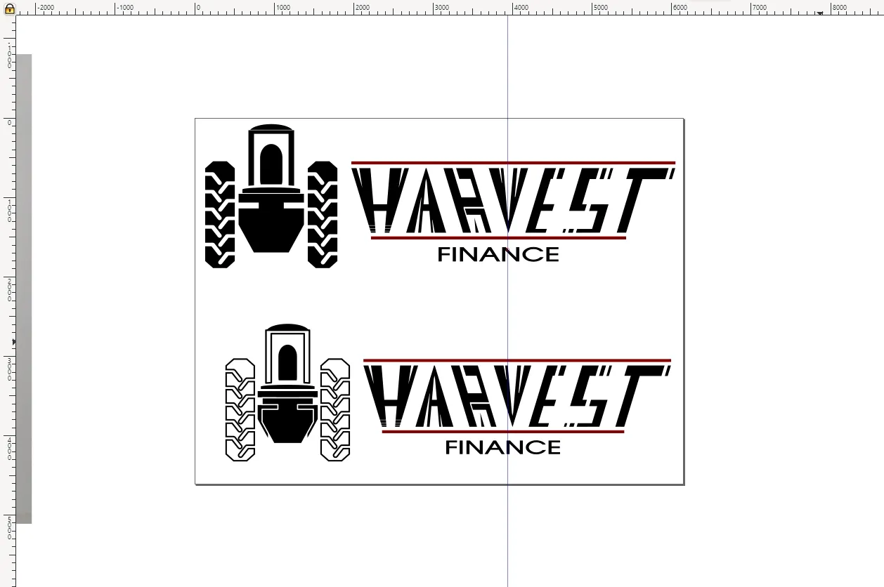
First of all I tried to put on paper the outlines of an object that distinguishes their site today, a common tractor. They use it both as an icon and as a central graphic theme in the visual experience that their platform offers. I drew the outlines of two wheels, the lines on which I should have gone to separate the shapes and a few other little things. At this point I took a picture of the sheet and I brought the image to the graphics software I use - a very common and open-source Inkscape - to recreate the tractor in digital format.
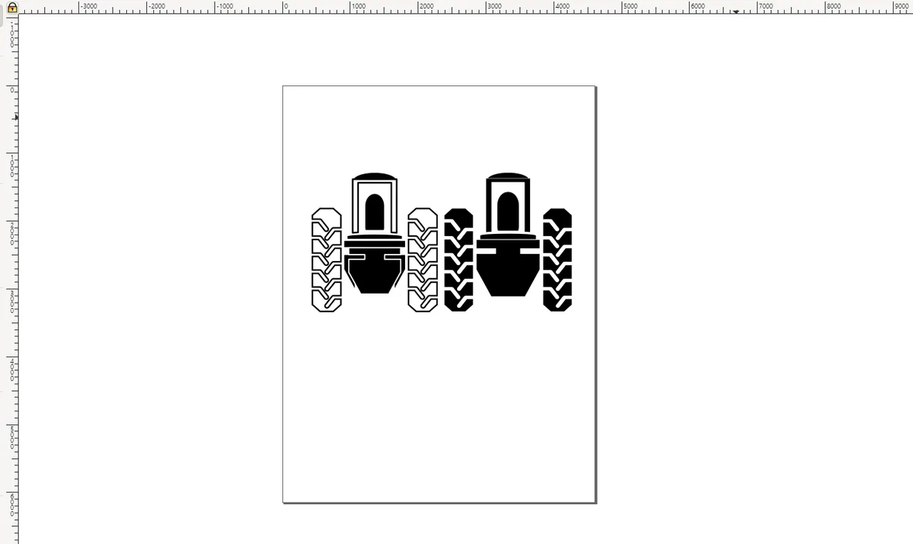
After creating a full version tractor, I created a slimmer one, where contours prevail at the expense of filled figures. And here, step 1 finished.
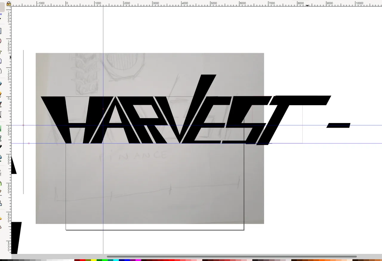
The second step was to work on the writing, the so-called Logotype. I did not use fonts, also in this case I had the idea of creating the entire graphics independently, first tracing the lines of the characters on paper and recreating them on the PC a little later.
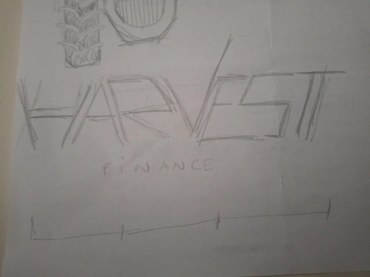
The image shows an interlude of the work, obtained through a screenshot. For the creation of the individual characters I wanted to create an asymmetry between the upper and lower halves of the letters, inserting the so-called horizontal rods further down, in particular respecting - in a very approximate way - the famous golden ratio, the proportion 1: 1.618. I did not respect this proportion to the thousandth by proceeding with the work but it was useful in the initial phase.
ASSEMBLYING & COLOR!
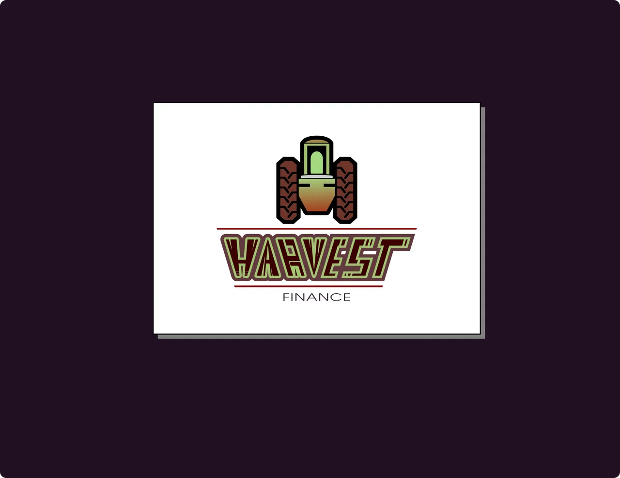
Once both pictograms and logos were created, I started assembling them trying to get the best visual result. Secondly, I moved on to colors: the first creations were entirely in monochrome, being vector shapes and not raster figures. I started adding a color, then another, then a gradient, then an outline, then removing it; I continued smoothing above, then below, then a touch of color on one side and an enlargement on the other; finally adding new colors and new contours .... in short, a big job.
One of the results I got is what you find as the cover of the post, the color version of the full logo. I have to admit that the biggest flaw is the legibility of the logo, but overall I am satisfied with the result.
If you want more info on the Digitall project, you can search here on hive under the #digitall tag, or visit the various pages under construction. Between all:
Digitall Life on Publish0x
Digitall Project on Medium
An official Facebook page and an Instagram page are currently under construction.
That's all for now.
Greetings from me and Digitall!