
Hello dear Hive friends! Taking advantage of the opportunity of the extension of the term that @yonnathang has given for the creation of the logo for the @hispapro community, I have encouraged myself to participate and share with you a little of my creativity.
I must confess that in this aspect of design I am a bit self-taught, I have learned a lot from videos watching tutorials on YouTube to use a tool as good as Photoshop for creating logos.
¡Hola queridos amigos de Hive! Aprovechando la oportunidad de la extensión del plazo que ha dado @yonnathang para la creación del logo para la comunidad de @hispapro, me he animado a participar y compartir con ustedes un poco de mi creatividad.
Debo confesar que en este aspecto del diseño soy un poco autodidacta, he aprendido mucho con videos viendo tutoriales en Youtube para utilizar una herramienta tan buena como lo es el Photoshop para la creación de logos.

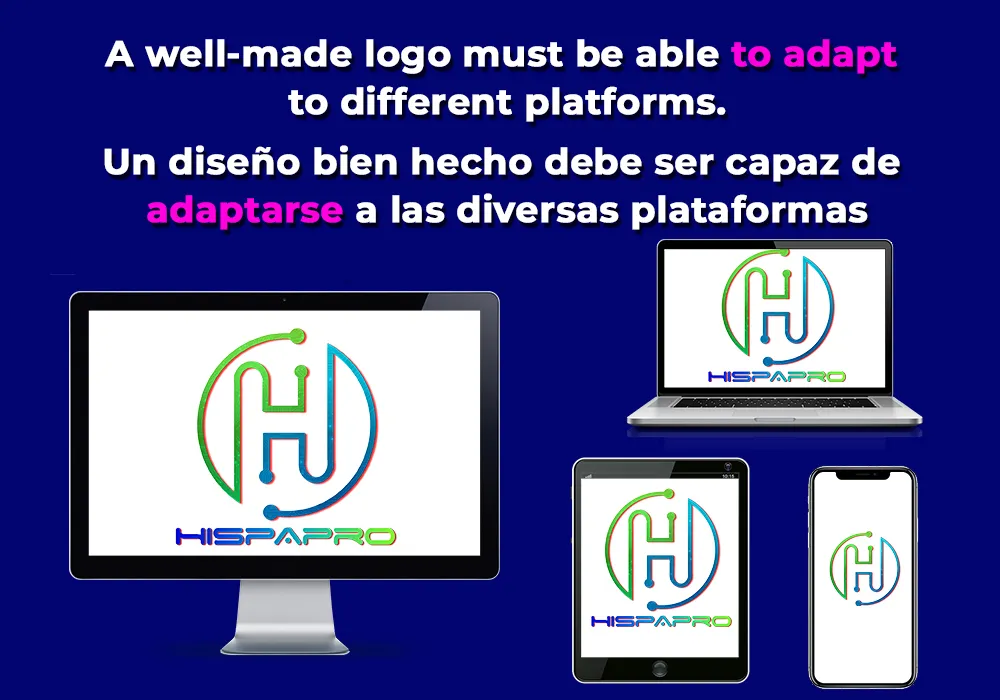
When I thought about creating this community's badge, the new trend in minimalist logos came to mind. There are many brands that have opted for the simplicity of both the design and the typography and the uniformity of the colors, it is also a plus that logos with minimalist styles can be easily adapted to different communication formats.
Cuando pensé en la creación de la insignia de esta comunidad se me vino a la mente la nueva tendencia en logos minimalistas. Son muchas las marcas que han optado por la simplicidad tanto del diseño como de la tipografía y la uniformidad de los colores, además es un plus que los logos con estilos minimalistas pueden ser fácilmente adaptados a diferentes formatos comunicacionales.
Ahora acompáñenme a ver el proceso de creación de este logo paso por paso.
In the first instance I wanted to include a circle in the design that would inspire community, friendship, love, relationships and unity, because basically that is what Hive is all about and it is in this blockchain where the @hispapro community develops its excellent work. I always wanted the logo to reflect modernity, which is why I wanted to resemble a set of circuits.
En primera instancia quise incluir un circulo en el diseño que inspirara comunidad, amistad, amor, relaciones y unidad, pues básicamente de eso se trata Hive y es en esta blockchain donde la comunidad de @hispapro desarrolla su excelente trabajo. Desde siempre tuve la intención que el logo reflejara modernidad, por lo cual, en él quise asemejar un conjunto de circuitos.
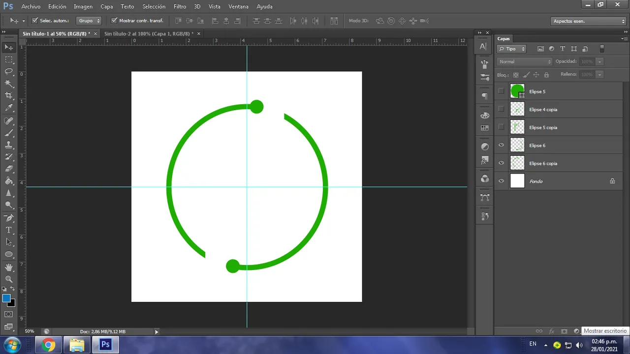
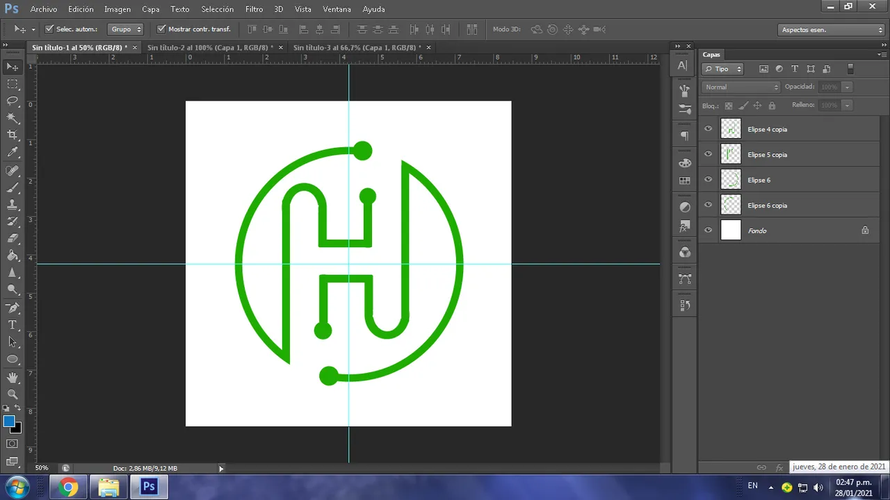
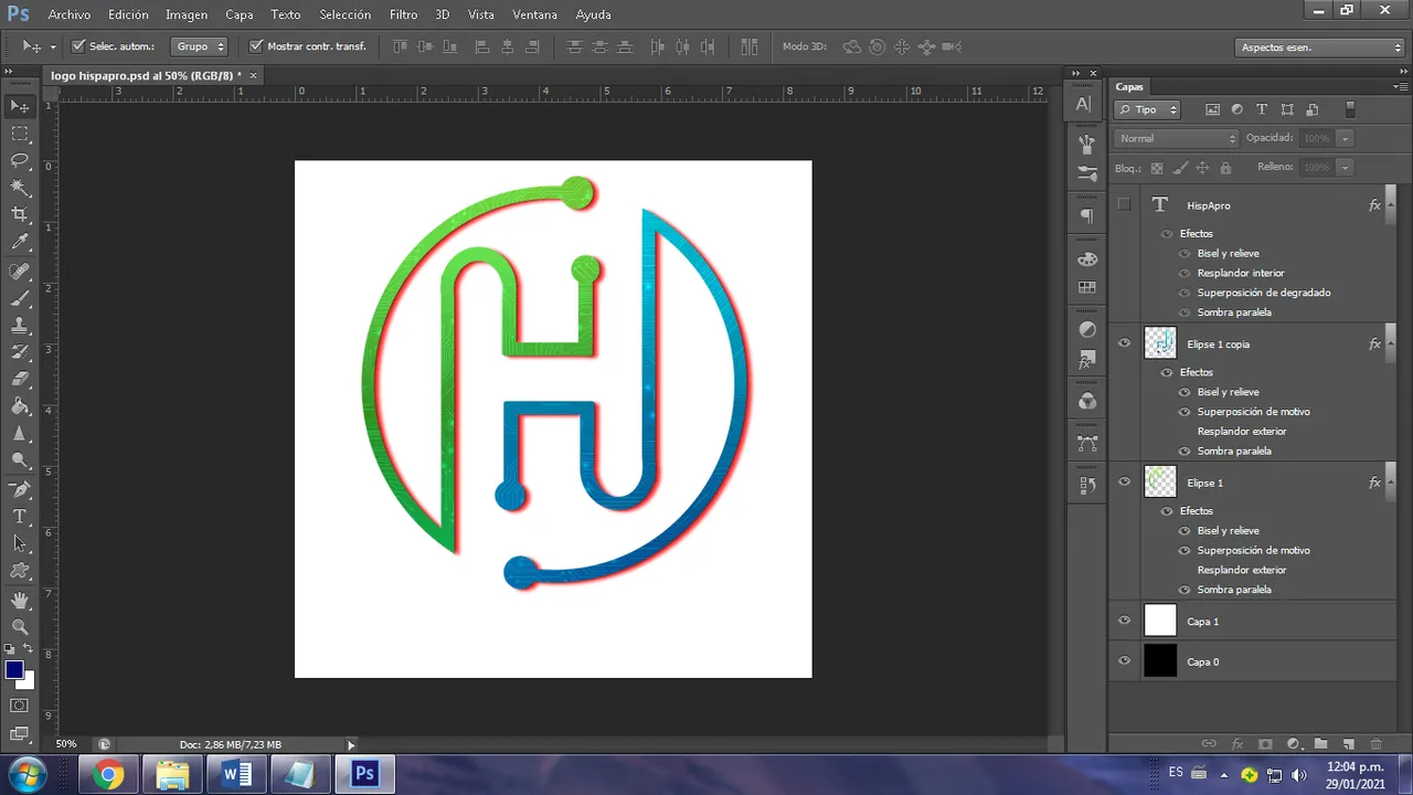
Once the circle was created, I proceeded with the central image, which would be the letter H, respecting the idea of the original design a bit.
Una vez creado el circulo, procedí con la imagen central, que sería la letra H, respetando un poco la idea del diseño original.
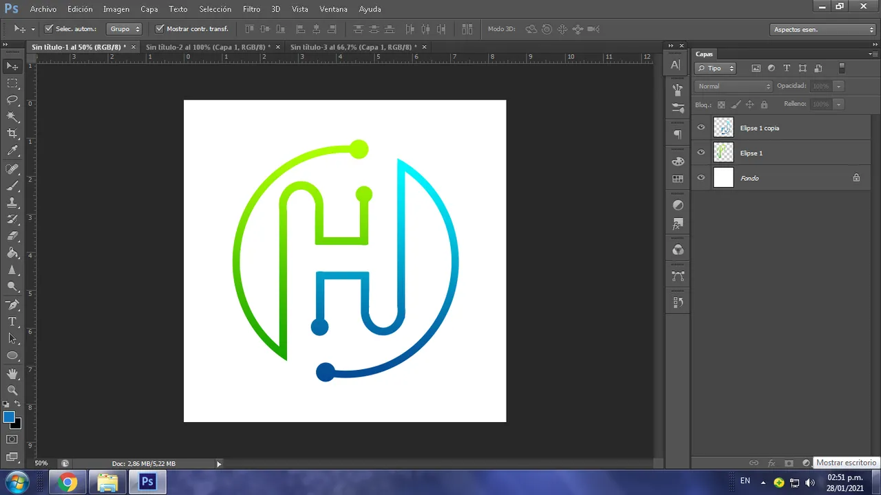
Once this was done, it was time to color the design, for this moment I wanted the colors to be in harmony, to generate a pleasant sensation to the eye, therefore also respecting the wishes of the community administrator to maintain the original color of the logo What I did was combine it in a gradient, with a green color, which also gives the feeling of technology and modernity.
Una vez hecho esto era hora de darle color al diseño, para este momento buscaba que los colores estuvieran en armonía, que generaran una sensación agradable a la vista, por eso respetando también los deseos del administrador de la comunidad de mantener el color original del logo, lo que hice fue combinarlo en un degradado, con un color verde, que además da la sensación de tecnología y modernidad.
With the colors that I wanted for the design, it was time to add small details that would give the product originality, so I added an electrical circuit motif and lowered the opacity so that it would retain the colors that I had previously chosen. Then it was just a matter of playing with the shade of the shadow, looking for a mediating tone that would act as a conciliator and help the transition to the previous two and that color was red.
Ya con los colores que deseaba para el diseño, era hora de agregar pequeños detalles que le confirieran originalidad al producto, por lo cual agregué un motivo de circuito eléctrico y bajé la opacidad para que conservara los colores que había escogido anteriormente. Después fue solo cuestión de jugar con el tono de la sombra, buscar un tono de mediación que actuara como conciliador y ayudara a la transición ante los dos anteriores y ese color fue el rojo.
To place the name of the project, I was looking for a letter that offered me modernity and I also wanted it with curved edges and the chosen one was the Space Age font. The effects I added were a gradient with the same blue and green color scheme and a red drop shadow to maintain the harmony of the design.
Para colocar el nombre del proyecto, estaba buscando una letra que me ofreciera modernidad y también la quería con bordes curvados y la escogida fue la fuente Space Age. Los efectos que le agregué fue un degradado con la misma combinación de colores azules y verdes y una sombra paralela en color rojo para mantener la armonía del diseño.
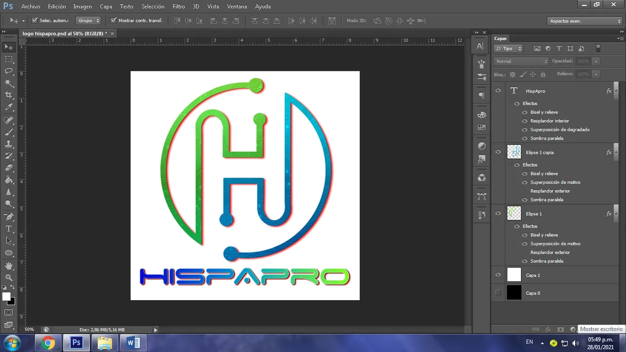
Here I present the finished logo in two modes, with a white background and a black background.
Acá les presento el logo ya terminado en dos modalidades, con fondo blanco y con fondo negro.

I've seen some great designs over the course of this contest and I know there are some really talented people on the platform, so I'm looking forward to your feedback on what you think of my logo. It was really fun participating in this initiative.
He visto muy buenos diseños en el transcurso de este concurso y sé que hay personas realmente talentosas en la plataforma, así que espero sus comentarios sobre qué les pareció mi logo. Fue realmente divertido participar en esta iniciativa.