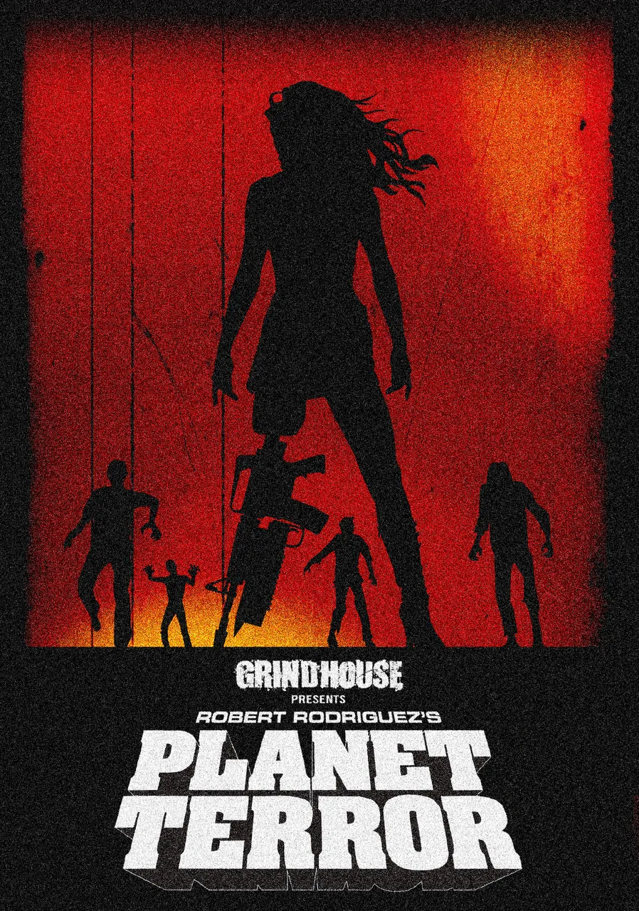
Illustration created by Astrocreator
Hello everyone, the artwork that I present to you today is meant to be my hypothetical promotional poster of the 2007 film "Grindhouse - Planet Terror" signed by Robert Rodriguez. The film in question is a huge tribute to the horror "B movies" of the 70s / 80s, in my opinion it is an exceptional film, visually very particular, a crazy and deliberately exaggerated film, but you can see that it is a film made with passion, a film made to pay homage to a genre.
I wanted to create a work that contained within it the true essence of the film, therefore the zombies, the predominant red color, a very particular heroine, the ruined film effect. After putting my ideas in order, I immediately started working. Making this work was amazing.
Below you can see one of the original movie posters.
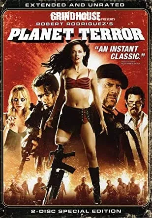
Image from Google Images
I wanted to create a simple work, with few elements but of impact. I immediately decided that I would only use 2 colors, red for the background and black for the subjects. First I drew the protagonist of the film, in the center of the drawing, then I drew 4 zombies and positioned them at the bottom as if they were approaching the main subject.
Below you can see the various elements that make up the work.
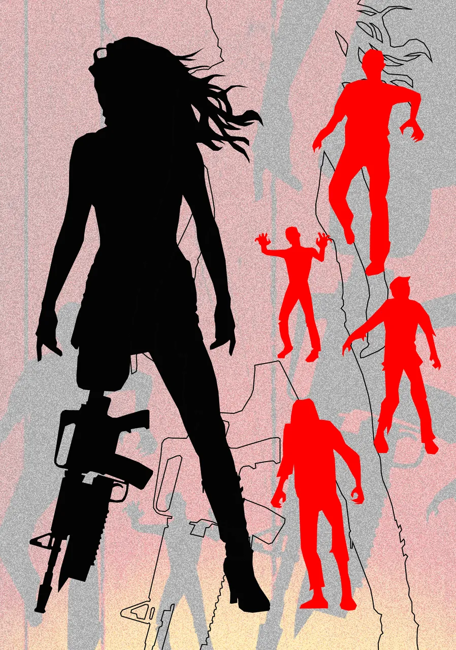
Illustration created by Astrocreator
Made all the elements and positioned in their place, I looked for the original logo of the film containing the title of the film and inserted it in the lower part of the work. Finally I added some orange halos in some places, these manage to convey the particular atmosphere of the film very well. I wanted to "dirty" the image to give a ruined cinematic film effect, then I also added a grain effect to increase the 70s / 80s effect.
I also wanted to do an alternate version, with a completely different color. I have to admit that I really like this version, and even though it's totally different it still manages to evoke the atmosphere of the film. Below you can see the color variant.
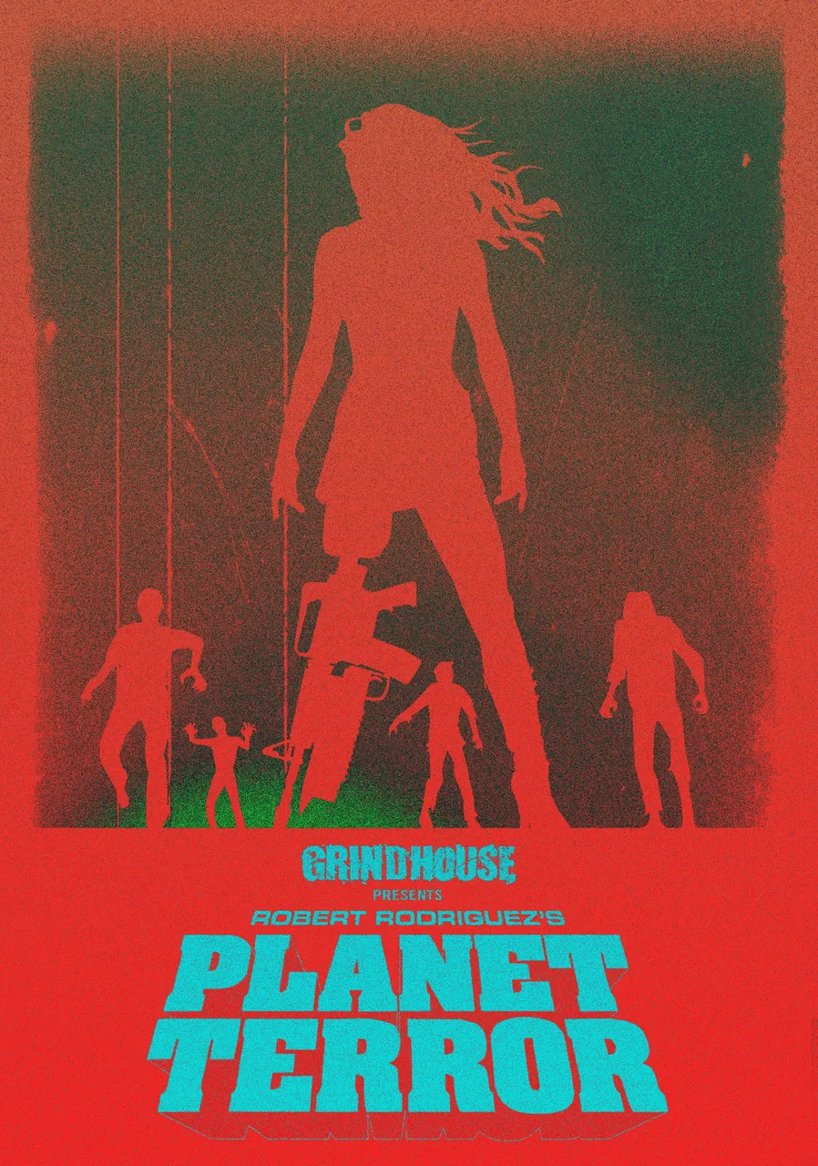
Illustration created by Astrocreator
Before concluding I want to recommend this film to all lovers of the genre, keep in mind that it is a deliberately exaggerated horror film.
I hope you like this work, I invite you to let me know what you think of the drawing and the film (for those who have seen it) below in the comments.
VERSIONE ITALIANA
Illustrazione realizzata da Astrocreator
Ciao a tutti, l'artwork che vi presento oggi vuole essere un mio ipotetico poster / locandina promozionale del film del 2007 "Grindhouse - Planet Terror" firmato da Robert Rodriguez. Il film in questione è un enorme omaggio ai "B movie" horror degli anni 70/80, a mio parere è un film eccezionale, visivamente molto particolare, un film pazzo e volutamente esagerato, ma si vede che è un film fatto con passione, un film fatto per omaggiare un genere.
Ho voluto creare un'opera che racchiuda al suo interno la vera essenza del film, quindi gli zombi, il colore rosso predominante, un'eroina molto particolare, l'effetto pellicola da film rovinata,. Messe in ordine le idee ho iniziato subito il lavoro. Realizzare questa opera è stato fantastico.
Qui di seguito puoi vedere una delle locandine originali del film.
Immagine proveniente da Google Immagini
Volevo realizzare un'opera semplice, con pochi elementi ma di impatto. Ho deciso subito che avrei utilizzato solo 2 colori il rosso per il fondo e il nero per i soggetti. Come prima cosa ho disegnato la protagonista del film, al centro del disegno, successivamente ho disegnato 4 zombi e li ho posizionati in basso come se si stessero avvicinando al soggetto principale.
Qui di seguito puoi vedere i vari elementi che compongono l'opera.
Illustrazione realizzata da Astrocreator
Realizzati tutti gli elementi e posizionati al loro posto, ho cercato il logo originale del film contenente il titolo della pellicola e lo ho inserito nella parte bassa dell'opera. Infine ho aggiunto degli aloni arancioni in alcuni punti, questi riescono a trasmettere molto bene l'atmosfera particolare del film. Ho voluto "sporcare" l'immagine per conferire un effetto pellicola cinematografica rovinata, poi ho inserito anche un effetto grana per aumentare l'effetto anni 70/80.
Ho voluto anche realizzare una versione alternativa, con una colorazione totalmente differente. Devo ammettere che questa versione mi piace moltissimo, e anche se totalmente differente riesce ad evocare ugualmente le atmosfere del film. Qui di seguito puoi vedere la variante colore.
Illustrazione realizzata da Astrocreator
Prima di concludere voglio consigliare questo film a tutti gli amanti del genere, tenete conto che è un film horror volutamente esagerato.
Spero che questo lavoro vi piaccia, vi invito a farmi sapere cosa pensate del disegno e del film (per chi lo ha visto) qua sotto nei commenti.