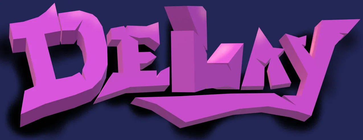
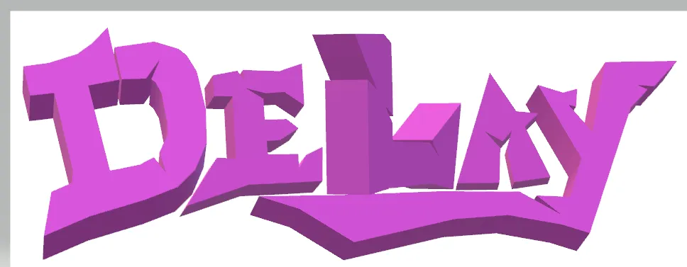
Hello community and hello to all the graffiti and street art enthusiasts, I am happy to participate once again in the Graffiti Lettering Contest of @trippymane and show you what I had made as my entry to this contest. If you had been following the contest you may already know that we are to work on a given word and for this round it is DELAY. So that explains why you are seeing that on my graffiti art. If you want to know more about the contest please read all the details on this contest post
Take a look at my entry below:
I tried to do my best to create my own style. That is the beauty of this kind of art or contest. You can express your creativity and discover more about what you can create as an artist. I will give more details about the thought and the process as you read along.
Here is how I made my entry:
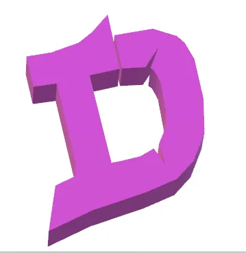
I had some sketches of the first letter of the word which is D. Getting it right is very crucial as this would determine the whole look of my graffiti later on. I must say this is very challenging for me and I was holding my breath until the desired style came out.
I was thinking about sharp edges or corners and some unexpected cut here and there and a bit of asymmetry if possible. These three images above do not quite reflect my vision so I had to edit and rethink. Now, the look below is the one that best represents my ideas.
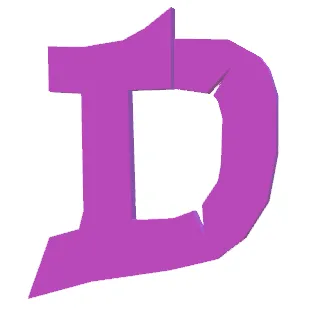
To highlight those cuts and details I had to find the right angle of the letter by twisting it turning it up and down. This is the final angle and size of the image. This is going to be my guide for the rest of the letters moving forward. It is now tilted a bit to show those nice details and color.
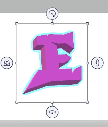
Designing the next letter which is E is now easier because I already had set my guide. Those sharp edges and cuts must be consistent with all the remaining letters if possible. The tool I am using is very helpful as you can see here. You can click on those points to move it forward and back, twist, turn and so on.
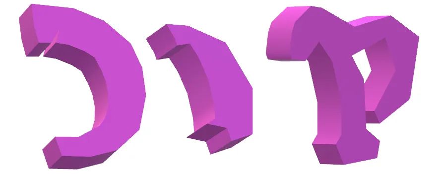
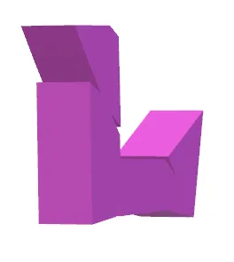
Can you tell that this letter is the L? I had to turn the image around going to the right to give it some interesting view as the previous two letters are starting to bore me. The image takes on different light and shadow as you turn it around. It is a matter of selecting which ones give the most impact.
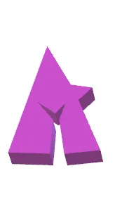
The smallest and easiest letter for me to create is the letter A. Cute and making a statement on its own.
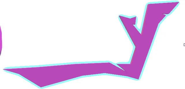
Finally to tie everything together, the Letter Y has to make it happen. It has to extend its long tail to give the graffiti some cohesion. On my final edit all the letters must avoid looking flat.
This is how the letters look together to complete the word DELAY
Choosing the background color is another struggle. Tried a few and the light colors are not my best choice. I just realized how tricky it is to work with the violet color.
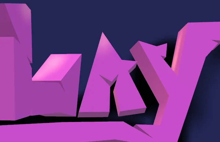
My choice is deep blue to contrast well with the lighter shade of violet. I then added a black shadow behind all the letters using the spray paint brush effect. I think there should be some light source or highlights on my drawing and so I added some as my finishing touches.
Hope you enjoyed reading and like my graffiti art. Thank you for your support and for dropping by.