SOBRE LA LUZ Y COLOR: El círculo Cromático
- At the beginning it is always a challenge for many, to begin to apply some pictorial technique to their work itself, such as changing from dry (crayons, etc ...) to the use of wet media applied with brushes, etc., such as aqueous or oily paints like oil ... We will be using this time tempera, for this you must first know about the basics of fine arts.
Also relevant aspects such as; - What do you want to represent with this or that work
- What is the purpose of the work
- Different pictorial techniques
Etc.
So, we must know about certain notions that serve as a foundation to start making the first strokes based on the above.
The materials to use, and about geometry and mathematics, if we are looking for a better result, more academic or not, because to be faithful to something existing in nature, these laws are always in force, whether we like it or not... if not, it is nothing more than a simple sketch or amateur attempt, because the first thing is to document correctly, study, and then apply what we have learned in the medium to be captured.
- Al principio siempre resulta un reto para muchos, el comenzar a aplicar alguna técnica pictórica a su obra en sí, como cambiar del seco(lápices de colores, et…) al uso de medios húmedos aplicados con pinceles, etc, como pinturas acuosas o aceitosas como el oleo … Estaremos usando esta vez temperas, para ello primero deberá saber sobre los fundamentos de las bellas artes
Aspectos también relevantes como;- Qué busca representar con tal o cual obra
- cuál es sin fin con la misma
- Diversas técnicas pictóricas
Etc.Así pues, debemos saber sobre ciertas nociones que sirven de fundamento para empezar a hacer los primeros trazos en base a lo señalado anteriormente.
Los materiales a usar, y sobre geometría y matemáticas, si es que se busca un resultado mejor, más académico o no, pues para serle fiel a algo existente en la naturaleza, siempre están vigentes estás leyes, nos guste o no… si no, no pasa de ser un simple boceto o intento amateur, pues lo primero es documentarse correctamente, estudiar, lara luego si aplicar lo aprendido en el medio a plasmar.
Imagenes tomadas de diversas fuentes, Nos sirvió de inspiración.
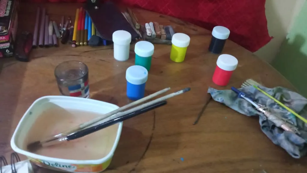
● TEMPERAS.
● WATERCOLOR/TEMPERA BRUSHES OR WHATEVER IS AVAILABLE, VARIOUS SIZES, USE ROUNDED 3, 5,6, 8.
● FLAT BRUSH SIZE 8
● AN ABSORBENT PAPER OF CONSIDERABLE WEIGHT, 300 GSP FOR EXAMPLE, OR THICK CARD STOCK.
● A PLATE OR PALETTE FOR MIXING COLORS
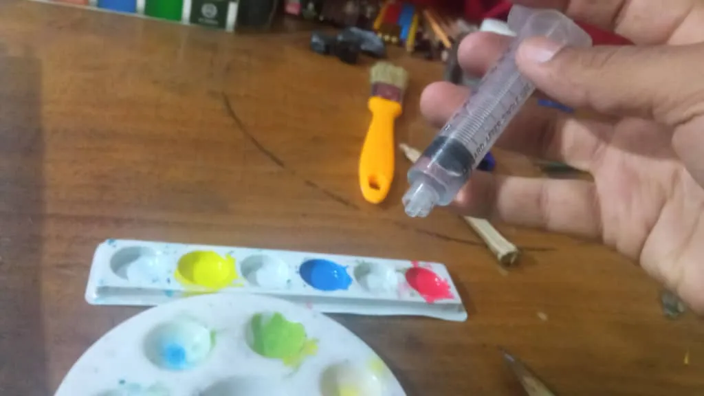
● WATER, SEVERAL CUPS AND/OR SYRINGE TO MEASURE WATER, OR AN EYEDROPPER (OPTIONAL)
Materiales:
● TEMPERAS
● PINCELES PARA ACUARELA/TEMPERA O EL QUE SE DISPONGA, DE DIVERSOS TAMAÑOS, UTILICE REDONDEADO 3, 5,6, 8.
● PINCEL PLANO TAMAÑO 8
● UN PAPEL ABSORBENTE DE GRAMAJE CONSIDERABLE, 300 GSP POR EJEMPLO, O CARTULINA GRUESA
● UN PLATO O PALETA PQRA MEZCLAR COLORES
● AGUA, VARIOS VASOS Y/O JERINGA PARA CALCULAR EL AGUA, O UN GOTERO (OPCIONAL)
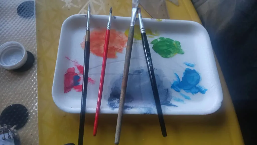
Realmente con tres pinceles basta
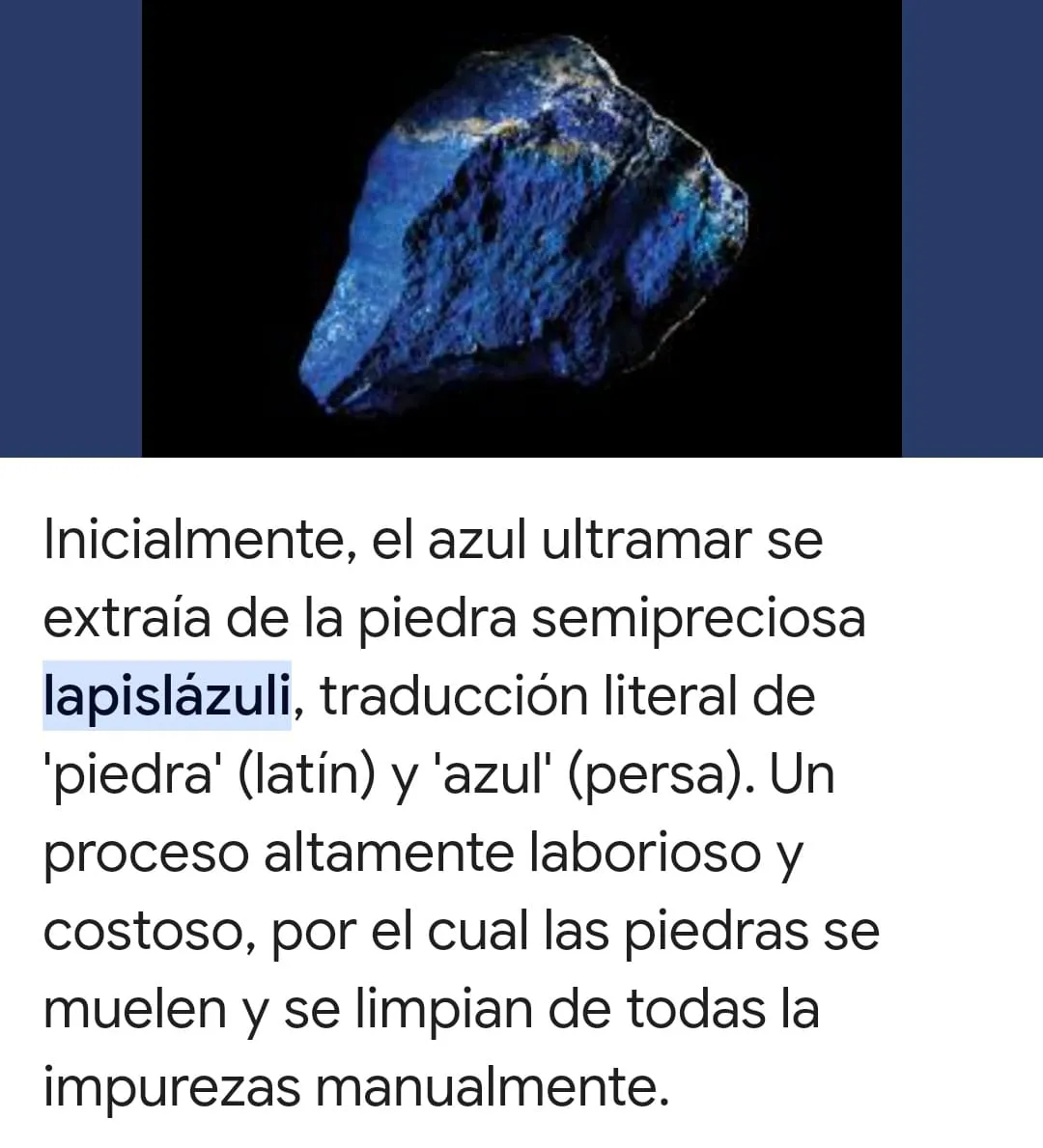
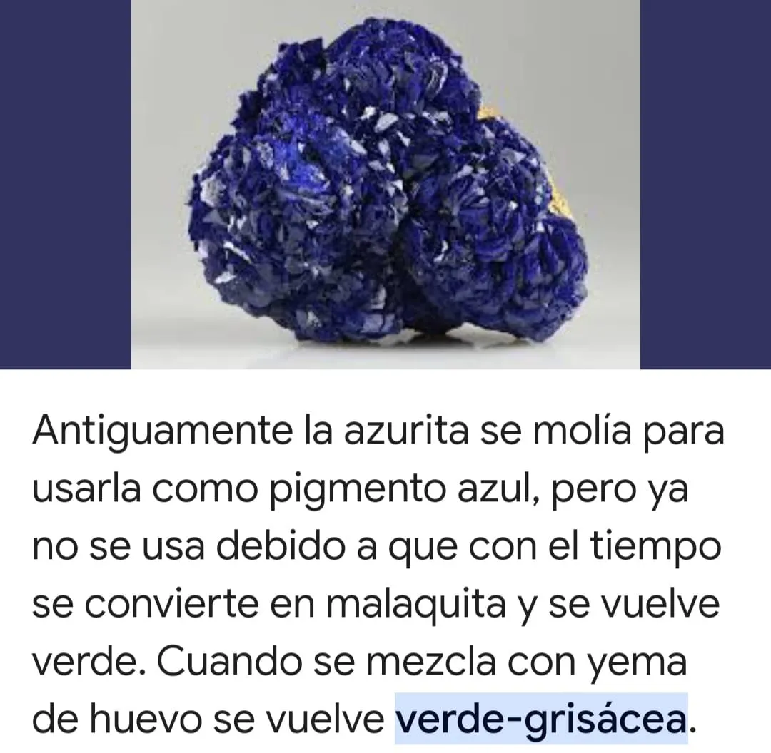
Recordemos que tempera, viene de temperare, diversas técnicas o medios de expresión en las artes visuales para representar algún símbolo o idea de forma característica al mismo. Antes era una mezcla de yema de huevo que se le añadía algo de goma arábiga o miel dependiendo ara hacer témperas o acuarelas, que sin técnicas aguadas, a base de agua, y el suficiente pigmento de calidad hecho de forma artesanal, siendo este último lo más difícil laborioso y caro en aquellos tiempos idos, hechos desde rocas, tierras de diversos entornos alcalinos etc, hasta minerales preciosos o semi preciosos como el oro, azurita, carmín, lápiz lazuli para el azul ultramar etc, o plantas como el índigo para el azul maya etc.
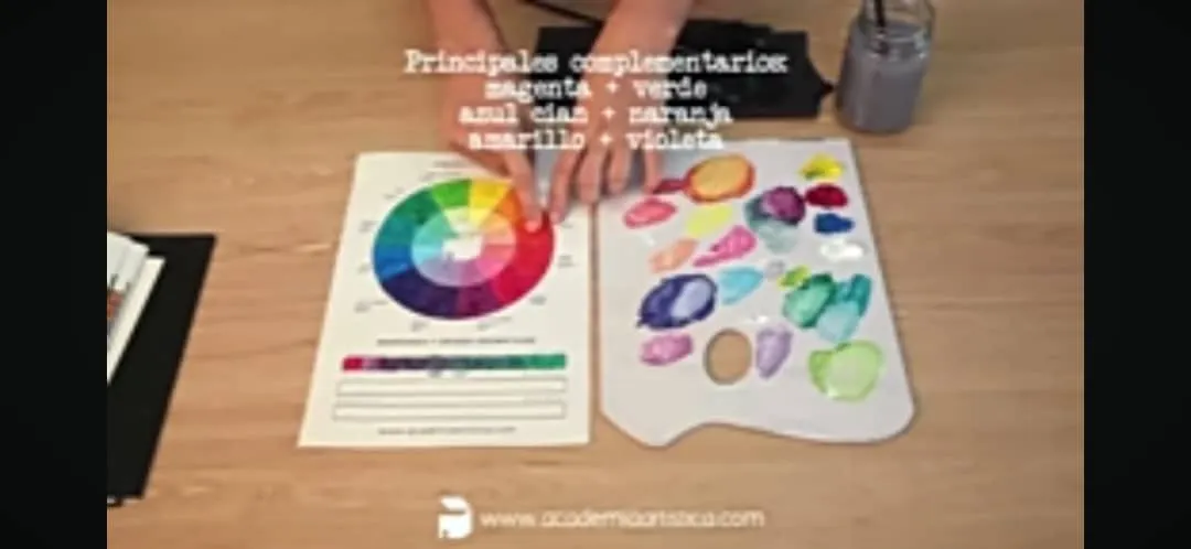
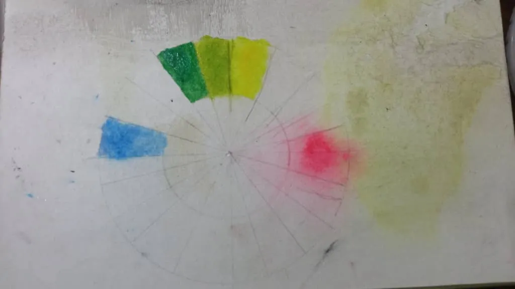
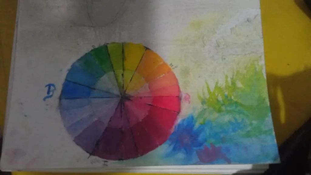
In this case it is a simple test of how to mix the basic colors, LEMON YELLOW, CYAN AND/OR BLUE, AND RED AND/OR MAGENTA.
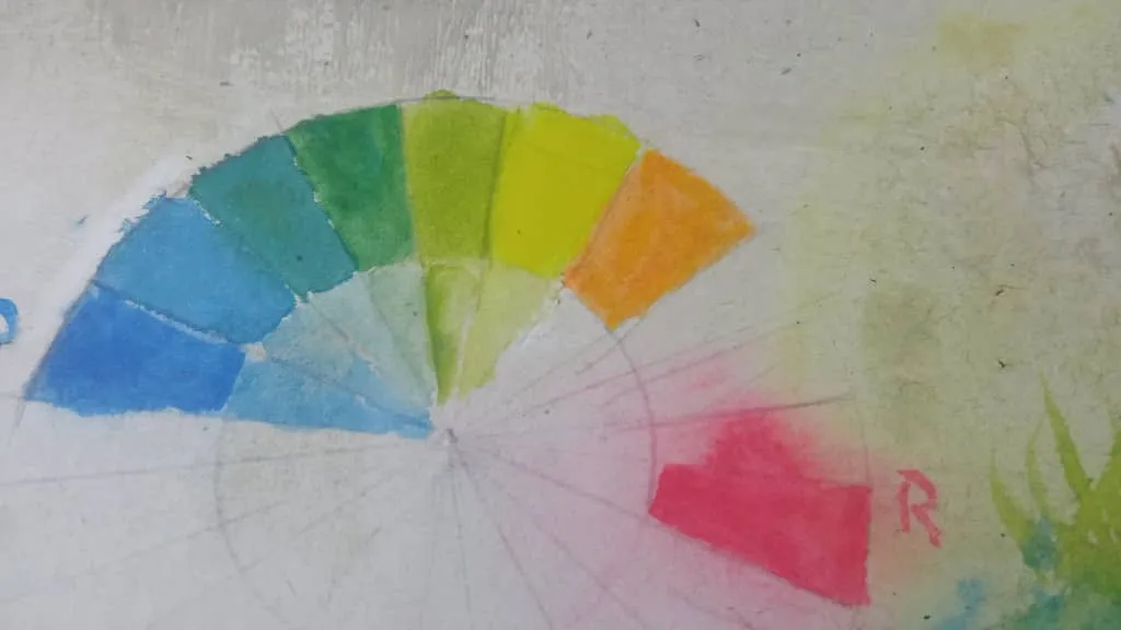
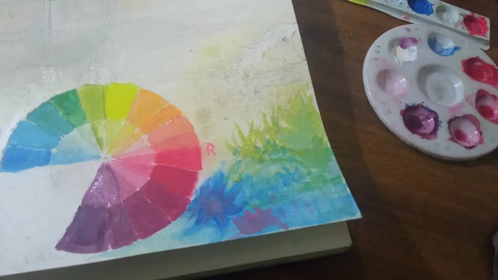
Yellow, blue and red are traditionally used for studies, with the modernization of the format, CMYK, or CIAN, MAGENTA AND YELLOW, which is LEMON YELLOW (TENDING TO GREEN). the circle in question is made with a compass, then you start pouring a very small amount of the above-mentioned primary colors on the palette, these three colors, mixed with one or the other in greater or lesser amount, you get in general, all the colors that could be needed cleanly and with a pure tone...
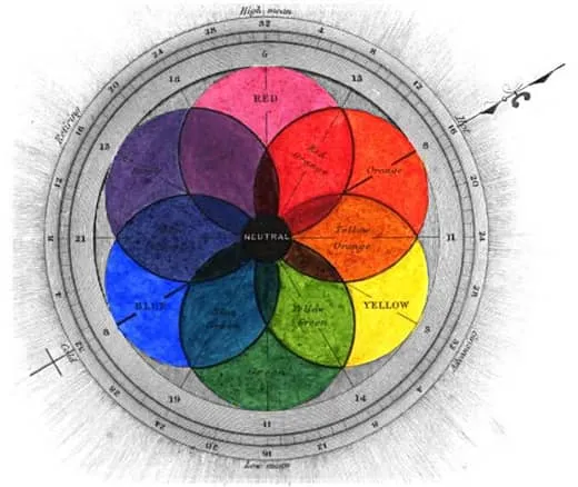
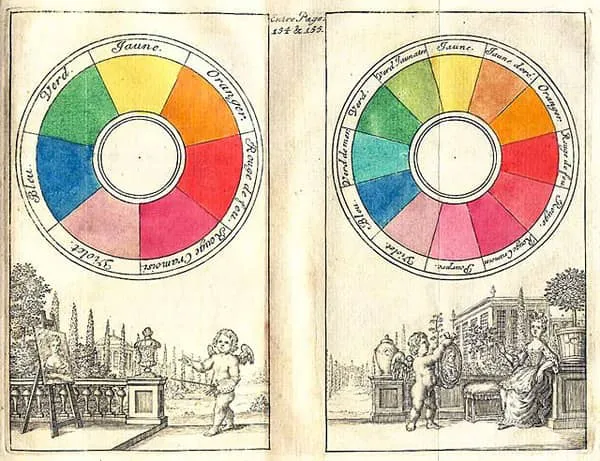
Let us remember that there are divisions of such a Chromatic circle, or color.
The primaries: yellow, blue / cyan, and magenta or red, depending.
The secondaries: are the result of the mixture of the primaries: green, oranges, browns or earth colors, toasted earth, violet, etc.
The tertiary: red orange, amber or yellow orange, green yellow or chartreuse, blue green or turquoise, blue purple or violet and red purple.
among other shades, these are variations, resulting from the transition from the primary to the secondary (green, orange, indigo, violet) ... total, of 7 mentioned colors, they are divided in turn in other seven giving thus forty-nine main visible colors in total, of these one can vary shades and tonal values giving thus about 16 million tones of the visible spectrum of the observable light, millions of other colors escape us already our current human vision.
Ya lo primero es conocer lo que se va a hacer en cuestión, los artistas en antaño por ejemplo, pasaban más de la mitad de su tiempo en no solo conseguir materiales de calidad por ellos mismos, sino también aprender a usarlos, mezclarlos, y conseguir un acabado prominente.
En este caso es un simple ensayo de cómo mezclar los colores básicos, AMARILLO LIMON, CIAN Y/O AZUL, Y ROJO Y/O MAGENTA.
El amarillo, azul y rojo es el usado tradicionalmente para estudios, con la modernización se emplean el formato, CMYK, O CIAN, MAGENTA Y YELLOW, QUE ES AMARILLO LIMON(CON TENDENCIA AL VERDE)se hace el circulo en cuestión con compás, luego se empieza a verter poquísima cantidad de susodichos colores primarios en la paleta, estos tres colores, mezclados con uno o el otro en mayor o menor cantidad, se logra conseguir en general, todos los colores que podrían necesitarse de forma limpia y con un tono puro…
Recordemos que existen divisiones de tal círculo Cromático, o del color.
Los primarios: amarillo, azul / cian, y magenta o rojo, dependiendo.
Los secundarios: son el resultado de la mezcla de los primarios: verde, naranjas, marrones o colores tierra, tierra tostada, violeta, etc.Los terciarios: rojo naranja, ámbar o amarillo naranja, verde amarillo o chartreuse, azul verde o turquesa, azul púrpura o violeta y rojo púrpura.
entre otros matices, estos son variaciones, resultado de la transicion de los primarios hasta los secundarios(verde, naranja, indigo, violeta) ... total, de 7 colores mencionados, se dividen a su vez en otros siete dando asi cuarenta y nueve colores visibles principales en total, de estos se puede variar matices y valores tonales dando asi unos 16 millones de tonos del espectro visible de la luz observable, se nos escapan millones de otros colores que ya nuestra actual vision humana
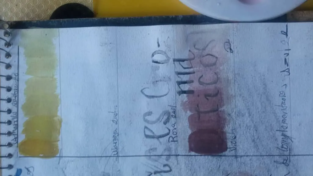
"ejemplo de 150 variaciones tonales para un mismo tono rojo, de internet".
Complementary shades
They are obtained from the mixture of the primaries with their opposite in the circle.
Giving more realistic colors, because in nature we do not find colors as bright as a pure yellow or an absolute black or an absolute white, or a king blue so strong, so strident, by making this type of mixtures, we make them fade, they become gray until they “break” or fade to a stained gray, dirty ...
These tones obtained from the diverse mixtures, must go in sequences in diverse small containers, separated one from the others to conserve them, and not to have to begin from zero, it must be sequential, and then to go placing it in the other container, and thus they leave consequent, natural scales, because we are using a portion of the previous mixture for the following one and they are getting darker with greater portion of the subsequent color.
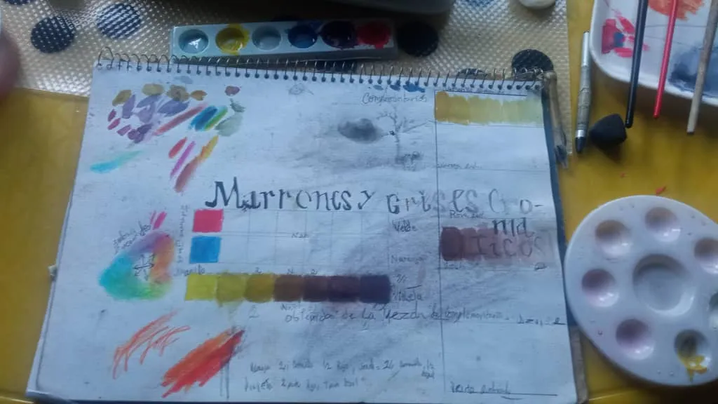
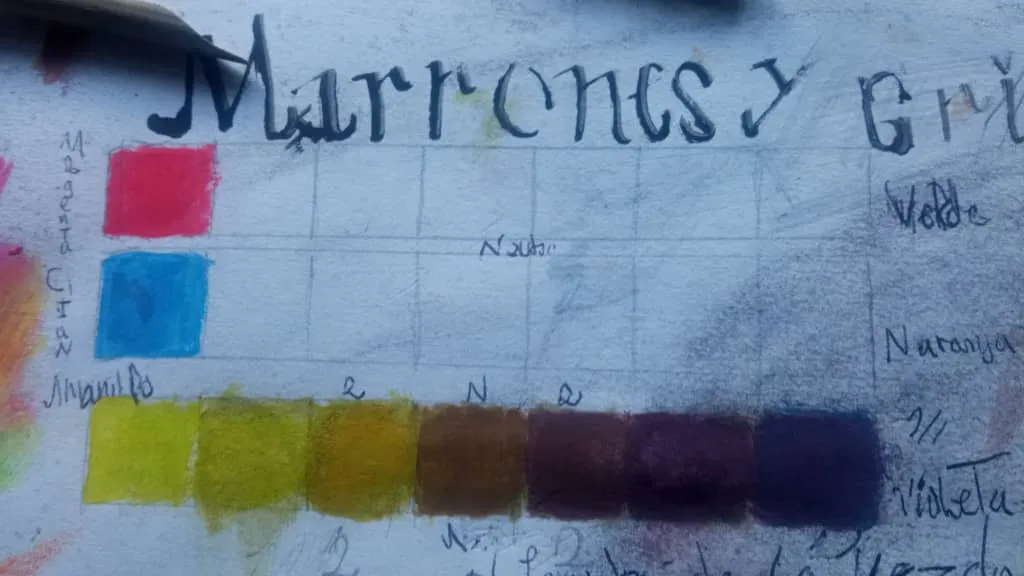
Luego de estos se pueden obtener más variaciones aplicando más o menos cantidad de su color aliado, si de mezcla amarillo y rojo, empieza a perder el amarillo, 90/10, 60/40, 40/60, y de ahí empiezan de naranjas, hasta marrones y oscurecerse más y más hasta llegar a tonos marrones pardos, oscuros, y hasta el magenta, Si se hace lo mismo, mezclando azul con magenta, 60 partes azul y 40 magenta, hasta llegar 10% azul y 90% magenta, empieza a tornarse violáceos, hasta llegar a tonos apagados, azules como acuamarinas, hasta oscurecerse más que el violeta…
Los complementarios
Se obtienen de la mezcla de los primarios con su opuesto en el círculo
Dando colores más realistas, pues en la naturaleza no se encuentran colores tan brillantes como un amarillo puro o un negro absoluto o un blanco absoluto, o un azul rey tan fuerte, tan estridentes, al hacer este tipo de mezclas, hacemos que se vayan apagando, se van tornando grises hasta “quebrarse” o apagarse hasta llegar a un gris manchado, sucio…
Estos tonos obtenido de las diversas mezclas, deben ir en secuencias en diversos recipientes pequeños, separados uno de los otros para conservarlos, y no tener que empezar desde cero, debe ser secuencial, y luego ir colocándolo en el otro recipiente, y así salen escalas consecuentes, naturales, porque estamos usando una porción de la mezcla anterior para la siguiente y se van oscureciendo con mayor porción del color subsiguiente.
Primero en el circulo, se colocan muestra en el papel de los c. primos, luego se mezclan para los secundos, como verde, violeta, naranja y añil. etc...
The tone is the pigment itself, yellow, green, red, violet, carmine, ultramarine, etc.
Value is equivalent to the degree of luminosity, how light or how dark the hue is (the color combined with white or black): light blue, dark blue. The lighter the color, the “higher” the value. The darker, the “lower” the value.
And when we talk about saturation, we are talking about the purity of the color. The term alludes to whether it is a pure, bright, vivid tone, or whether it is a dull tone. A pure color is a fully saturated color. As that color becomes duller (grayer), it is said to be “desaturated”.
NOTA: Ya se va notando que no usamos color negro para oscurecer el tono, sino el color que le sigue primero, para oscurecer el naranja (naranja=1/1 amarillo+rojo) no se le aplica color negro, solamente se va añadiendo paulatinamente el color rojo hasta llegar al tono deseado… De forma tal hay concepto a esclarecer En cuanto al color en la pintura: Cuando se habla de Color, se definen diversos conceptos como: Tono Valor Y Saturación
El tono es el pigmento en si, amarillo, verde, rojo, violeta, carmín, ultramar etc.
Valor, equivale al grado de luminosidad, de cuán claro o cuán oscuro es dicho tono (el color combinado con blanco o con negro): azul claro, azul oscuro. Cuanto más claro es el color, el valor es más “alto”. Cuanto más oscuro, el valor es más “bajo”.
Y cuando hablamos de saturación, hablamos de la pureza del color. El término alude a si es un tono puro, brillante, vivo, o si es un tono apagado. Un color puro es un color completamente saturado. A medida que ese color se va apagando (agrisando), se dice que se va “desaturando”.
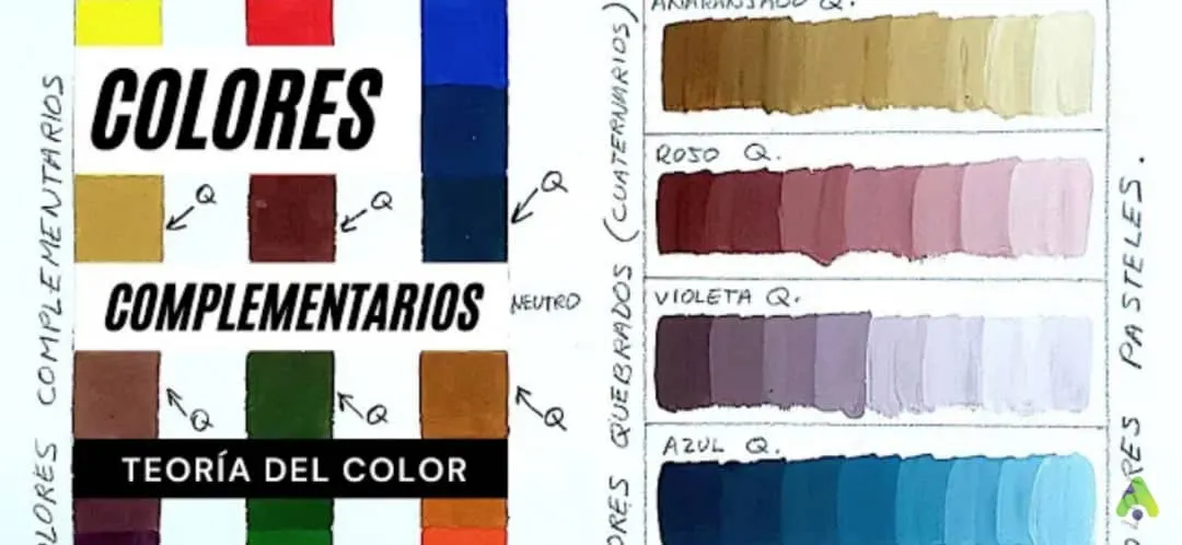
imagen referencial de internet
Resultados practica
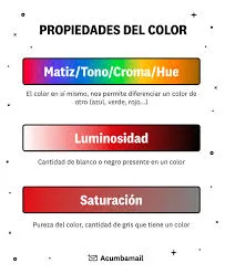
imagen referencial de internet
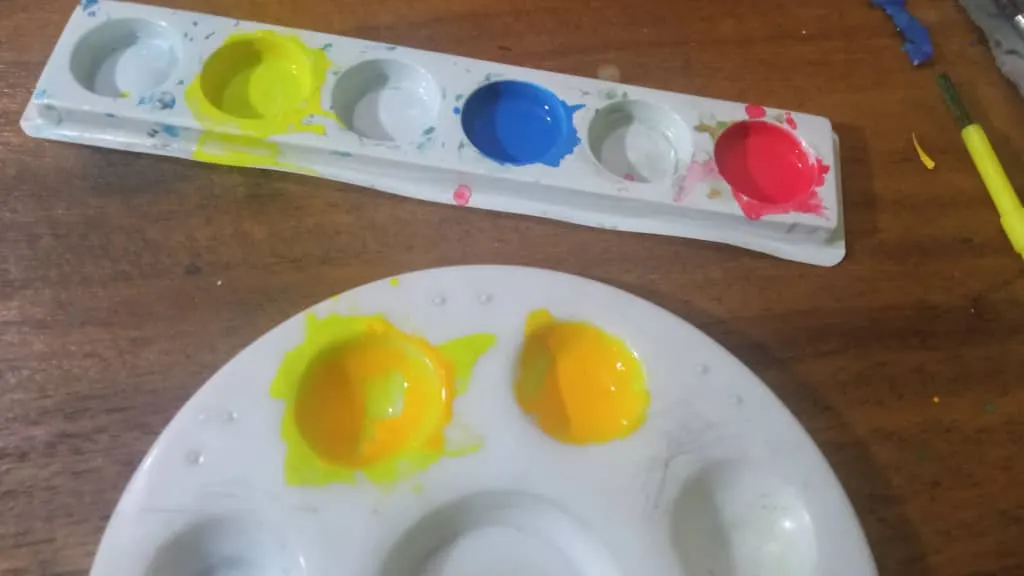
This because to yield more tempera in this case, the pigment itself is added in another hole and there if it is the one we are going to use, to have a sample of the pure pigment, and another with the same pigment but we could dilute it in water.
I repeat.
We make some of the pigment itself to use from the primaries in the palette apart from each other.
That same pigment of the palette will be made with the dry flat brush in another hole or sample, to dilute with some water and to yield better the painting.
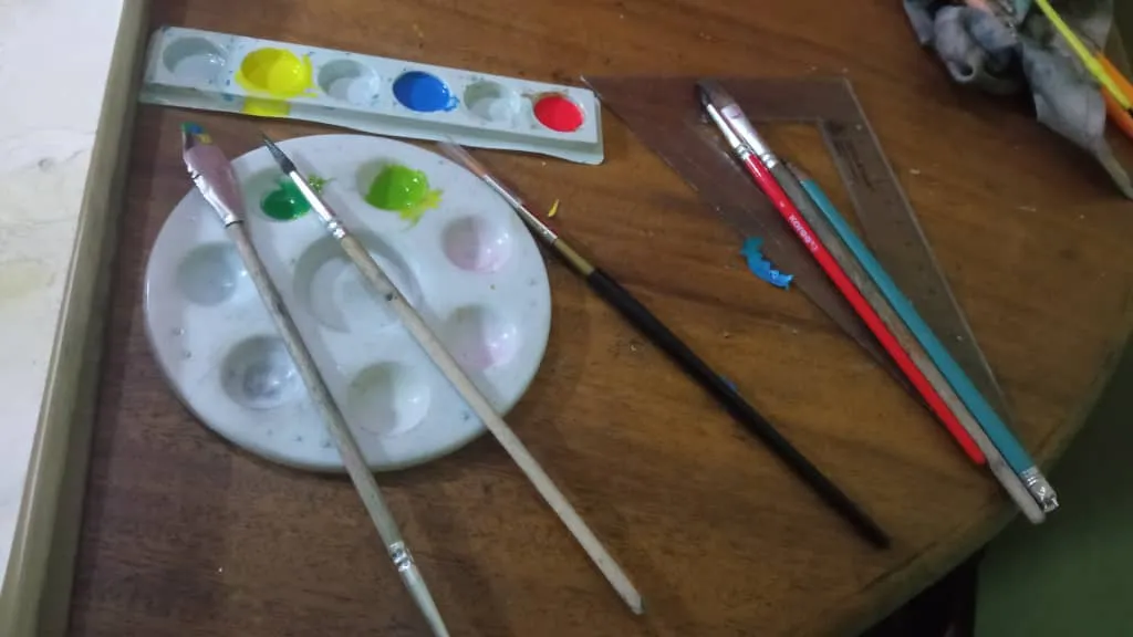
Then in the other sample of the pigment, for example yellow, you start to make the mixtures that you are going to want.
Let's start mixing the primaries with each other to achieve the aforementioned secondaries
Yellow + magenta = oranges, earth tones, even dark browns.
Yellow + blue or cyan = greenish tones, from apple green, yellowish, to intense green.
Cyan + magenta or magenta + cyan (the order does not matter, only the quantity) = from cyan 60% cyan + 40% magenta, you will begin to observe subtle changes in tone, from magentas to violets, purples, etc. The difference between mixing cyan with lemon yellow, to mixing it with magenta, is the tone you get, because, with yellow, you get blue tones already mentioned as aquamarines to greenish blues and reach the green, green yellows and reach the pure tone yellow. .... .
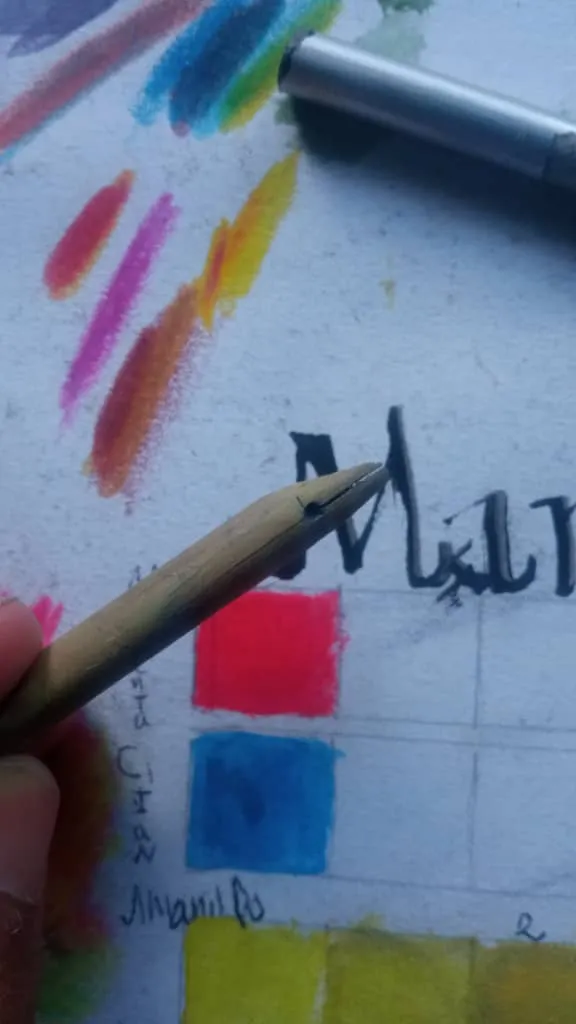
Empezaba solo colocando las divisiones, y así añadiendo una pequeña cantidad de la mezcla pura de los tres pigmentos primarios, un poco en un agujero de la paleta distinto, también puede ser plano pero se va a derramar y hay que evitar ensuciar el sitio de trabajo, mantener un orden. O un plato de cocina algo hondo también puede ser. Esto porque para rendir más la tempera en este caso, se va añadiendo el pigmento en sí mismo, en otro agujero y ahí si es el que vamos a usar, para tener una muestra del pigmento puro, y otro con el mismo pigmento pero que podríamos diluir en agua Repito.
- Se hecha algo del pigmento en sí a usar de los primarios en la paleta aparte uno del otro
- Ese mismo pigmento de la paleta se hechara con el pincel plano seco en otro agujero o muestra, para diluir con algo de agua y rendir mejor la pintura
- Luego en la otra muestra del pigmento por ejemplo amarillo, se empieza a hacer las mezclas que vas a querer
- Vamos a empezar a mezclar los primarios entre sí para así lograr conseguir los secundario ya mencionados
- Amarillo + magenta= tonos naranjas, tierras, hasta marrón oscuro
- Amarillo + azul o cian= tonos verdosos, desde verdes manzanas, amarillentos, hasta verdes intensos
- Cian + magenta o magenta + cian (el no orden no importa, sino la cantidad) = desde el cian 60% cian + 40% magenta, se empezará a observar cambios de tonalidad sutiles, desde magentas a violáceos, purpuras, etc. La diferencia entre mezclar el cian con amarillo limón, a mezclarlo con magenta, es el tono que se consigue, pues, con amarillo, se consiguen tonos azules ya mencionados como acuamarinas hasta azules verdoso y llegar al verde, verde amarillos y llegar al amarillo de tono puro.
Los quebrados son conseguidos por combinar los complementarios, estos se llaman asi porque se mezclan los colores obtenidos con sus complementarios, los que están de frente en el ek círculo entre si… Amarillo + violeta = un tono agrisado de los mismos. Por eso se llaman quebrados o complementarios, estos son los usados por pictóricos académicos para un mejor resultado en la obra, más natural y realistas, resultados prerrafaelitas, renacentistas o barroco. En cambio si no hacemos esto y usamos los primarios, secundarios o terciarios, o incluso sus tonos aclarados con blanco, la obra pierde realismo, porque son muy puto, estridentes y hasta llamativos, obras como más caricaturescas o fantasiosas pueden hacerse con estas mezclas. Estos también se pueden aclarar de la misma forma dando de los tres primarios, igual de los verdes, violáceos, o anaranjados y tierras, infinitud o múltiples cantidad de combinaciones para sus obras, sean de acuarelas, témperas, u óleo, o acrílicos etc. Técnicas secas como lápices de colores, no se puede hacer lo mismo, a no ser que se hagan polvo la barrita comprimida dentro del lápiz y se diluya en agua y aglutine con alguna sustancia pegante… Hay también colores diluibles en agua que ya vienes así, o hasta barras compactas, barras pastel, pkatilinas que pueden usarse y mezclarse consiguiendo acabados más o menso parecidos, realistas. Etc. Dependiendo del objetivo a fin a buscar
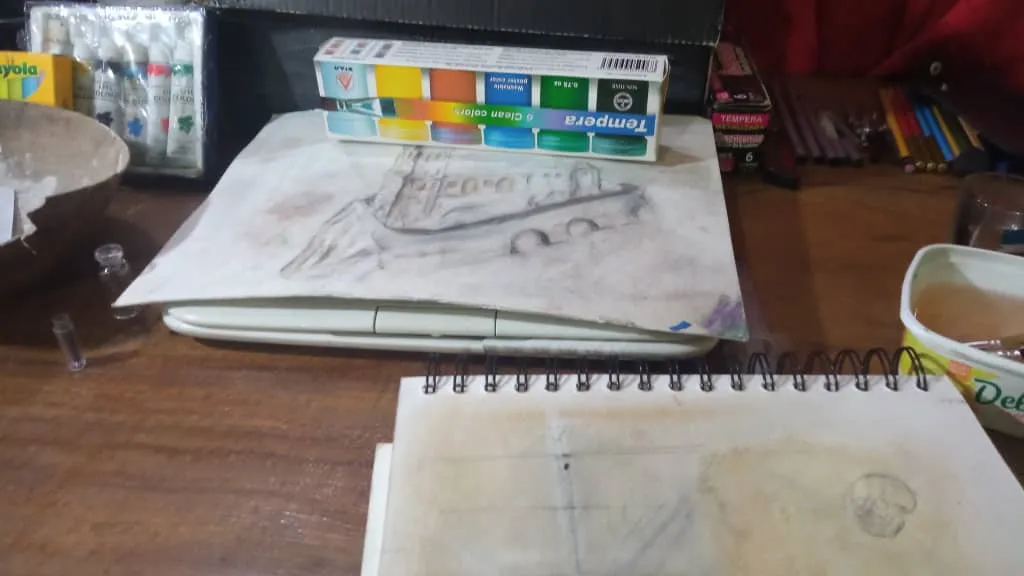
libro artesanal, de notas personal
I am enthusiastic about the world of the arts, a self-taught student, who brushes the classical to the renaissance of the great masters, both in classical music, Bach, Mozart, Handel, Beethoven, Chopin, etc.. Up to the art, dance, handicraft, writing, calligraphy, natural science, botany, history, archeology, mythology, etc....
Art is a way to improve science with realistic illustrations, which manage to capture a reality.
Si quisieran que hablara de algún tema en específico en siguientes publicación, por favor se los agradecería dejarlo en comentarios.
Soy entusiasta en cuanto al mundo de las artes, estudiante autodidacta, que roza lo clásico al renacimiento de los grandes maestros, tanto en la música clásica, Bach, Mozart, Handel, Beethoven, chopin, etc. Hasta el arte, danza, poseía, escritura, caligráfica, ciencia naturales, botánica, historia, arqueología, mitología, etc…
El arte es una forma de mejorar la ciencia con ilustraciones realistas, Que logren plasmar una realidad.
Thanks to the hive arte community for their kindness and hospitality to our members who manage to make a nice experience in this recreational platform...
Greetings.
“una ciencia para mejorar el arte, un arte para expresar de mejor manera la ciencia” citando a, Leonardo de Vinci, Italia.
Gracias a la comunidad hive arte por su amabilidad y hospitalidad a nuestros integrantes que logran hacer una bonita experiencia en esta plataforma recreativa…
Saludos.
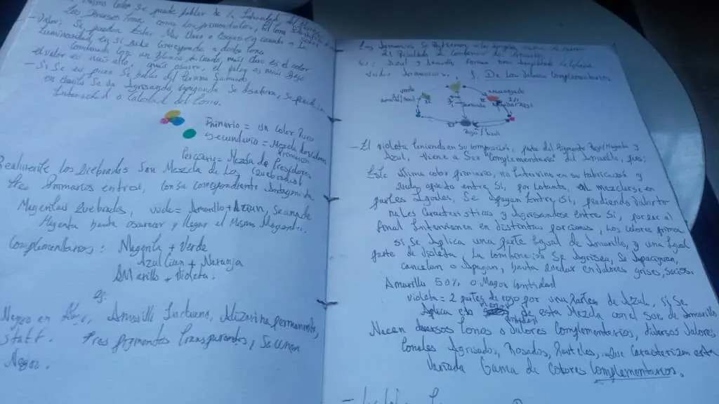
libro de notas hecho a mano de forma tradicional por mi persona.

Aun de viaje, por motivos medicos y pese a las adversidades, "A donde vaya; nuestro arte ira conmigo"