So I was trying to make one of those bubble maps, which would show you with bubbles over countries proportional to how much curation rewards was earned there. I found the process of cleaning up location data in Google Sheets, mapping them to countries and also coming up with a solution for the users who have known locations but don't set them in their profiles, was more complex and ambitious than I had hoped when I started earlier today.
I think I might have come up with something even better though! I think the map below really shows just how global Hive is better than any I've seen until now.
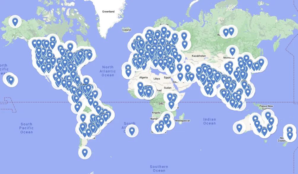
This is a map you can explore yourself. Every node is based on a user - or a larger set of users - who has set a location in their profile which is meaningful enough for Google to understand. Points will show the combined Hive Power of all users with that specific location, as well as their combined Author and Curation Rewards for the month of February. Some points represent many users, eg. a single "Venezuela" marker represents over 500 users, but most markers will represent just one or a few users with a more precise location given.
Of course there is a massive caveat that many of the largest stakeholders do not include a meaningful location in their profile data, and as such are not included on the map. Also there is no verification for accuracy, people can put anything in their location profiles.
As a special bonus, this map includes New Zealand. I almost cut it off in my screenshot though...
Now what might be cooler going forward would be to make it a live map, where the sheet it is based on is automatically updated by regularly querying @hivesql. As of now it's a static dataset.