In my first post about user retention and cohorts on Hive, it was shown how very few users are still posting from the original groups. The old guard from 2016 who are still active for example, are truly a tiny minority both of those who joined in 2016, and among those active today. In my second post on the topic, it was shown that although users drop off quickly, the longer a user has stayed already, the less likely they are to give up and leave the year after.
In those posts I simply was counting how many members of a cohort were active at all. Just because two people are active in the year, does not mean that they are contributing the same in terms of activity. So let's look at which cohorts make up most of the activity on Hive.
Posting Activity
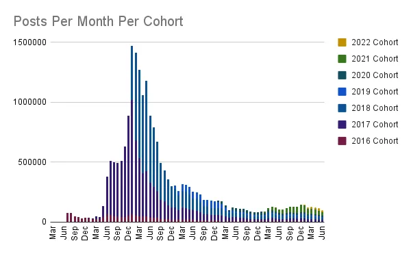
The following chart shows how many posts (top level comments) were made each month, with a colour coding to show how many posts by each cohort, since the beginning of Steem in March 2016.
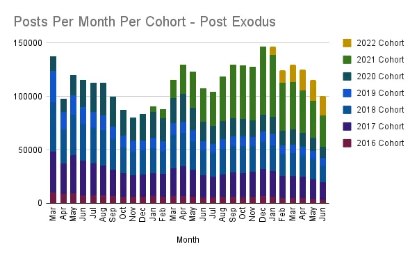
Here is the chart only since the month of the Hive exodus hard fork in March 2020.
As can be seen, the very small groups who have remained active from 2016, 2017 and 2018 are making a large portion of new posts today. Indeed in the last month over half of all posts were made by an account created in 2020 at the latest. In the same month the 2017 and 2018 cohorts together represented 5,964 users, but they posted more than the largest still active cohort of 2021 which represented 12,448 users.
Author Rewards
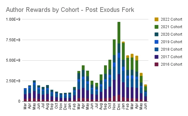
Those same groups earn a larger share of the rewards as well. Below is chart of how author rewards have been shared among cohorts every month since the beginning.
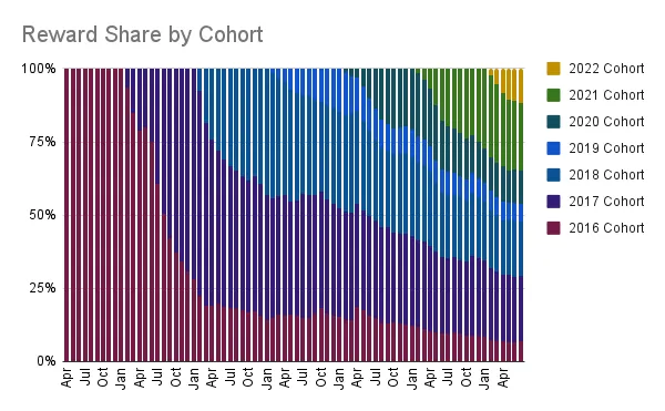
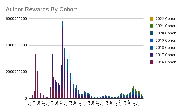
The above may start to explain why user retention on Hive is difficult. As new users join, they need to break in to a rewards pool already being collected by a smaller number of much more established users. Unless the price of Hive rises to compensate, it just means there is less and less to go around for new joiners, and what little reward share is going to the new cohort, is being shared among a much larger group. Below is the same thing but adjusted for total author rewards and average price during the month. The units on the Y axis are not correct, but it should give an idea of how much rewards were given out per group and total.
Same chart post Hive exodus fork
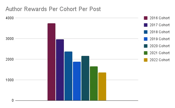
If we divide the June rewards per cohort by the number of posts, we can see how well Hive rewards an established user per post compared to a newcomer. Again the units on Y-Axis are not correct.
All data in this post was collected using @hivesql