SPANISHEl día de hoy me gustaría hablar de como podemos darle más personalidad a nuestros post en Hive.
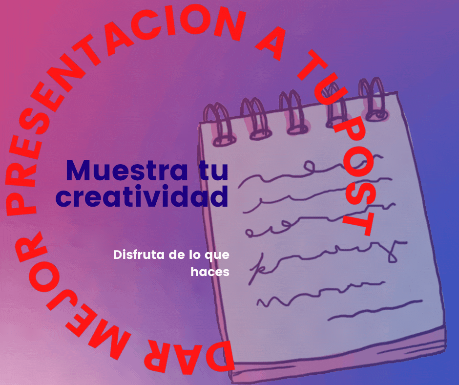
Es importante que partiendo de que cada uno de nosotros es auténtico e irrepetible, mostremos eso también en nuestro Blog y en cada una de nuestras publicaciones, diferenciarnos con creatividad, permitirá que nuestros post resalten de lo demás, es por eso que debes esforzarte un poco en mostrar esa distinción en tus publicaciones.
Darle personalidad a nuestros post, muestra un poco de nosotros dentro de las publicaciones es por eso que quiero enseñarte a usar algunas herramientas en Canva, con la que podrás darle mejor presentación a tus publicaciones.
Generalmente cuando hacemos un post, usamos fotos o elementos que permitan al lector descansar la vista y fortalecer con imágenes el contenido que estamos mostrando, herramientas como los separadores de texto nos pueden ayudar con esto. No son difíciles de crear y los puedes hacer con diferentes software de diseño, pero si no sabes nada de diseño, nada de qué preocuparse, con Canva puedes resolver este problema.
Lo primero sería que, si no conoces el programa el canva, te registres en su página, es complementa gratuito, aunque tiene su versión paga, pero con la versión gratis se pueden hacer muchísimas cosas. Puedes registrarte usando tu correo Gmail, o vinculando tu cuenta Facebook, es lo que hago para agilizar el proceso, sin embargo, si quieres colocar un email y claves específico para acceder a la web, también lo puedes hacer.

Como hacer un separado de texto.
Los separadores de texto son muy utiles, como ya te lo comente en parrafos anteriores, puedes darle diversas funciones, con este tutorial lo que pretendo que aprendas a diseñarlos de una manera rápida y sencilla.
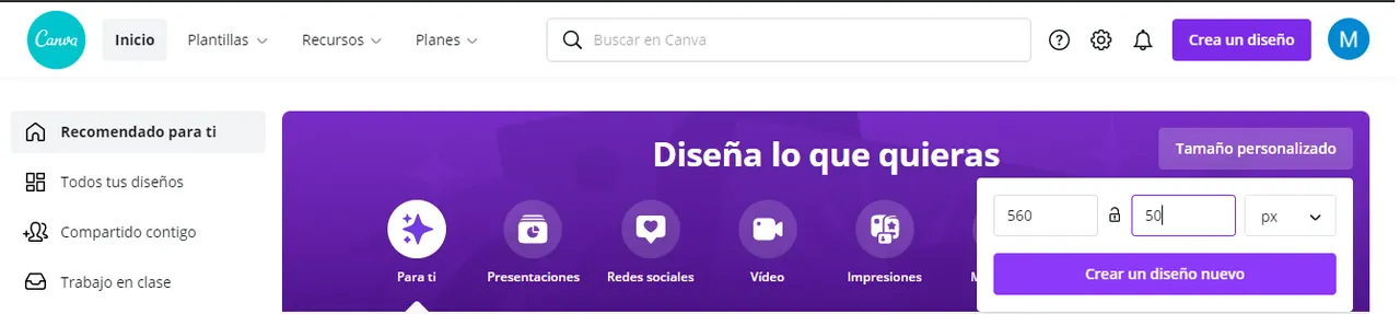
Primero que debes hacer es personalizar las medidas de tu diseño 560 x 50 px. Este es un tamaño con el que puedes trabajar para elaborar diseños pequeños.
Los segundo seria ya comenzar a explorar en la plataforma de canva, "Elementos", imagenes, formas para elaborar el diseño de tu separador.
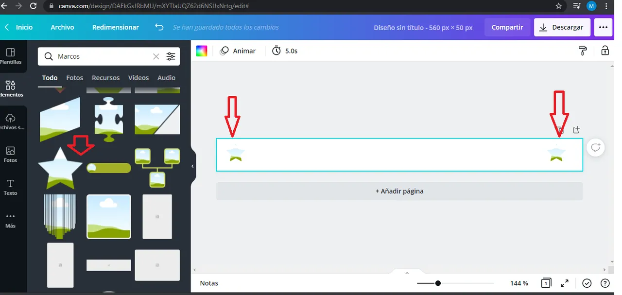
Yo añadi dos estrellas a los estremos para luego rellenarla con texturas o colores de mi preferencia. Tu puedes usar las formas que desees o incluso jugar a colocar la forma en medio, como más te guste.
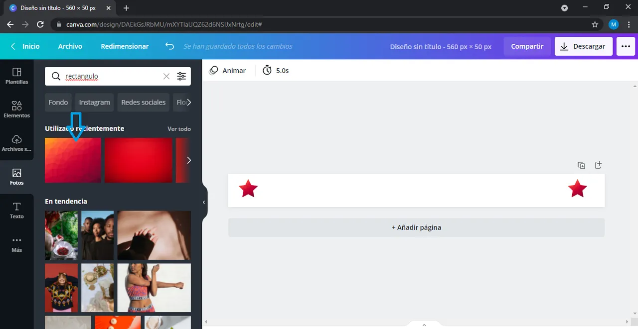
Coloca en la barra de busqueda la palabra fondo y te saldran una serie de fondos con los que podrás rellenar los elementos que estes usando, tambien puedes colocar "gradient" para utilizar fondos en degradado. Utiliza el de tu preferencia.
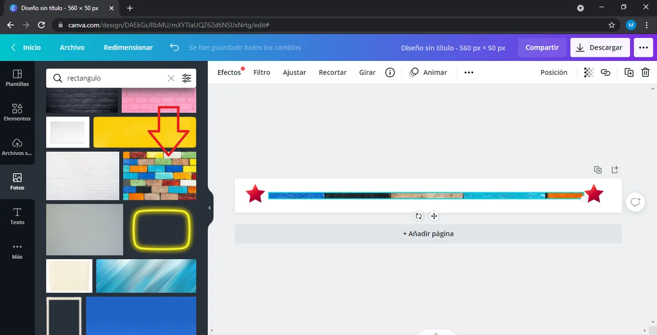
Luego buscas la palabra rectangulo, y ves la variedad que te sale, yo tome el que indica la flecha de la imagen lo arrastre hasta mi diseño y adapte las medidas que me gustaron. Ya aqui tienes un separador sencillo de texto, sin embargo puedes incluso darle movimiento. El siguiente paso seria ya descargar.
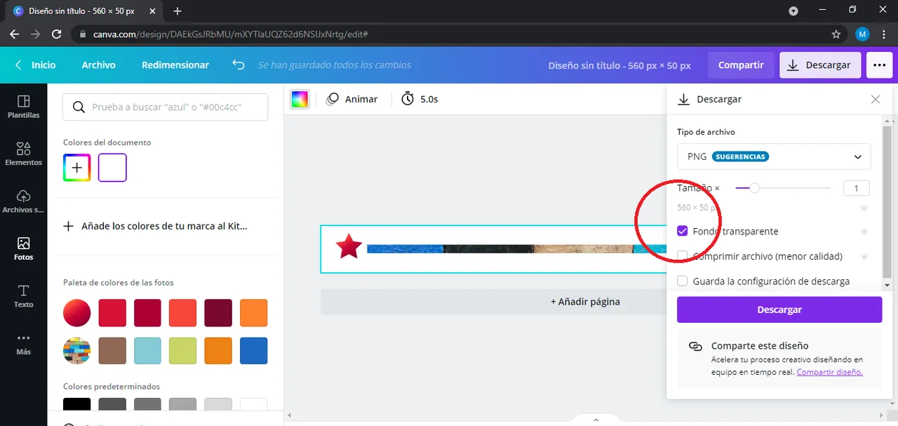
Cuando vayas a descargar debes tener dar Fondo Transparente para evitar el fondo blanco y que se vea un diseño mucho mas limpio al momento de utilizarlo.
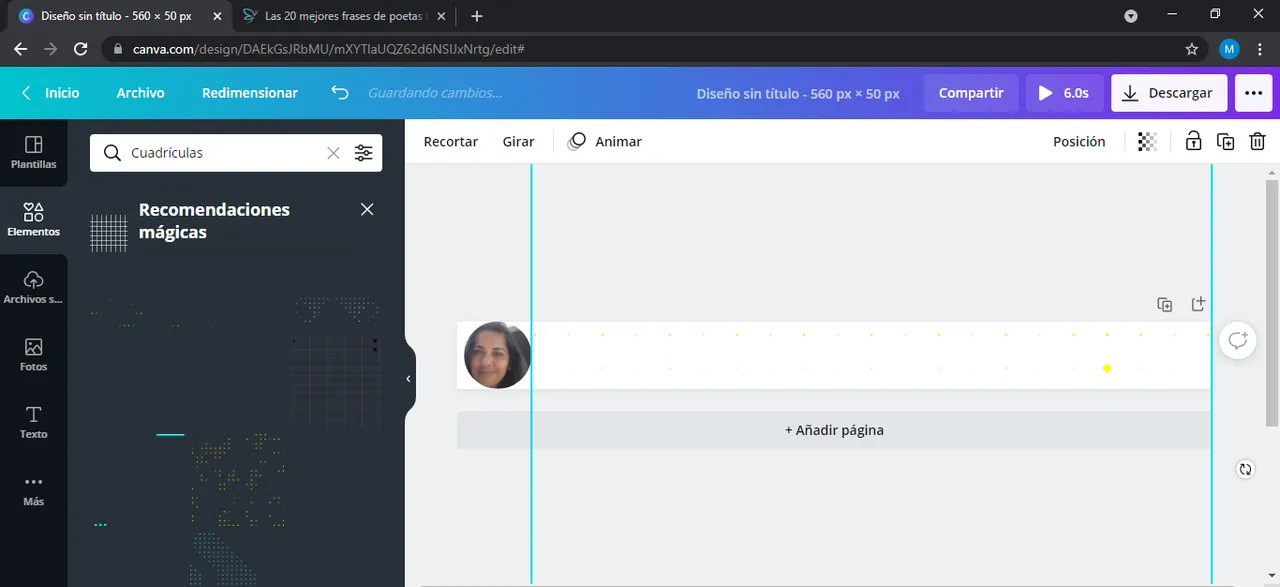
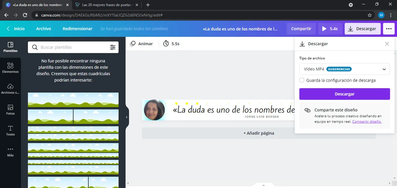
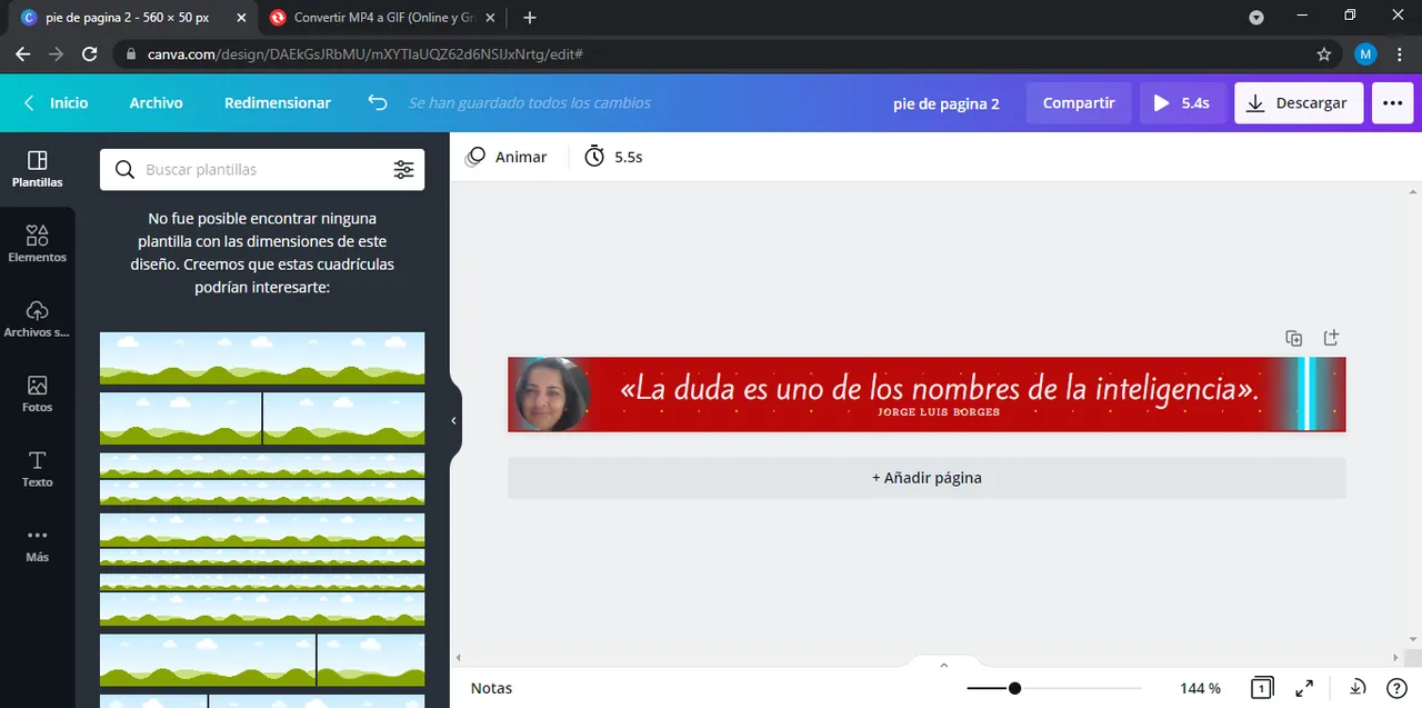
Yo como estaba un poco creativa el dia que lo realice aproveche y hice un pie de pagina para mis post, ya que los que normalmente usaba los queria actualizar. Asi que bajo las mismas medidas, busque en elementos un redondo y subi una imagen mia para rellenar ese circulo, tal como lo ven en la imagen de abajo.
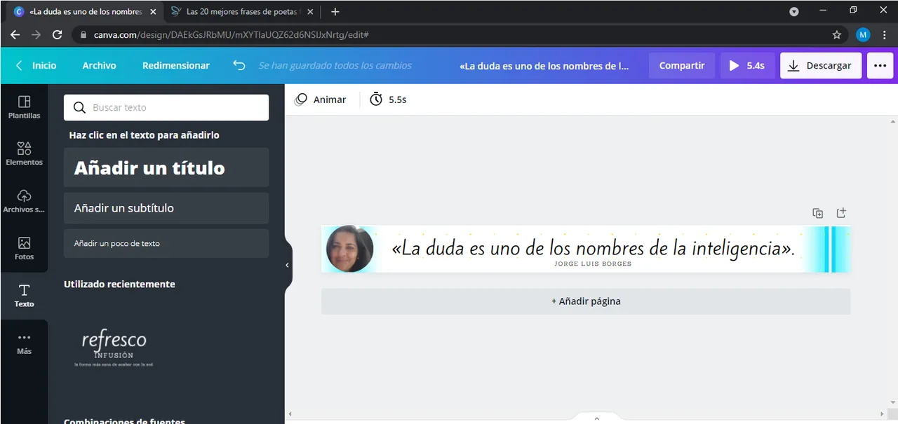
Despues de este paso pense en añadir "Texto" alguna frase con la que me identifique, pero esto queda a libre decisión, podria colocarse texto como no, yo busque uno de mis autores preferidos Jorge Luis Borges el autor de EL Hacedor y gran intelectual latinoamericano,y coloque una frase del autor. Añadir un "rectangulo azul" al final el cual ajuste hasta obtener lo que me gusto.
Posterior a esto, le añadi algo de movimento, podrian colocar en el buscador "Fondo animado", y utilizar el que mas le agrade, yo use unas pintas amarillas que me agrado. Lo descargue en formato "GIF" que es el que puedo subir de manera sencilla a la plataforma de Hive, y lo guarde en una carpeta que dedico solo a mis publicaciones ne HIVE.
Ya listos mi separador y mi pie de pagina, jugue un poco mas con los colores para tener alternativas de uso y de manera igual lo descargue en gif y los guarde.
Esta es una manera sencilla de darle un poco mas de personalidad de a nuestros post y sencilla de hacerlo. Espero que este post te sea de utilidad.
Nos vemos, hasta la proxima 😊

ENGLISH
Greetings dear friends!
Today I would like to talk about how we can give more personality to our posts on Hive.
It is important that starting from the fact that each one of us is authentic and unrepeatable, we also show that in our Blog and in each of our publications, differentiating ourselves with creativity, will allow our posts to stand out from the rest, that's why you should make an effort to show that distinction in your publications.
Giving personality to our posts, shows a little bit of us within the publications, that is why I want to teach you how to use some tools in Canva, with which you can give a better presentation to your publications.
Generally when we make a post, we use photos or elements that allow the reader to rest his eyes and strengthen with images the content we are showing, tools like text separators can help us with this. They are not difficult to create and you can make them with different design software, but if you do not know anything about design, nothing to worry about, with Canva you can solve this problem.
The first thing would be that, if you do not know the Canva program, you should register in its page, it is free, although it has a paid version, but with the free version you can do a lot of things. You can register using your Gmail email, or linking your Facebook account, is what I do to speed up the process, however, if you want to put a specific email and passwords to access the web, you can also do it.
How to make a text separator.
The text separators are very useful, as I commented in previous paragraphs, you can give various functions, with this tutorial what I intend to learn to design them in a quick and easy way.
First you must do is to customize the measures of your design 560 x 50 px. This is a size you can work with to make small designs.
The second would be to start exploring in the canva platform, "Elements", images, shapes to elaborate the design of your separator.
I added two stars to the corners and then fill it with textures or colors of my preference. You can use any shape you want or even play with placing the shape in the middle, as you like.
Put in the search bar the word background and you will get a series of backgrounds with which you can fill the elements you are using, you can also put "gradient" to use gradient backgrounds. Use the one of your preference.
Then you look for the word rectangle, and see the variety that you get, I took the one that indicates the arrow in the image and dragged it to my design and adapted the measures that I liked. Here you have a simple text separator, however you can even give it movement. The next step would be to download.
When you go to download you must give Transparent Background to avoid the white background and that a much cleaner design is seen at the moment of using it.
As I was a little creative the day I made it, I took advantage of it and made a footer for my posts, since I wanted to update the ones I normally used. So under the same measures, I searched in elements for a round and uploaded an image of mine to fill that circle, as you can see in the image below.
After this step I thought about adding "Text" some phrase with which I identify myself, but this is a free decision, I could place text or not, I looked for one of my favorite authors Jorge Luis Borges the author of EL Hacedor and great Latin American intellectual, and I placed a phrase of the author. Add a "blue rectangle" at the end which I adjusted until I got what I liked.
After this, I added some movement, you can type in the search engine "Animated background", and use the one you like the most, I used some yellow paints that I liked. I downloaded it in "GIF" format, which is the one I can easily upload to the Hive platform, and I saved it in a folder that I dedicate only to my HIVE publications.
My separator and footer are ready, I played a little more with the colors to have alternatives of use and in the same way I downloaded them in gif and saved them.
This is a simple way to give a little more personality to our posts and easy to do. I hope you find this post useful.