English
Greetings to all, fellow Hive members. For some time I had been preparing my participation for the SKP logo contest, but to be honest I saw so many good designs that at a certain point I got discouraged and I said to myself "there are many good designers here, why am I going to participate".
I wasn't in the best mood either, but I decided to resume what I had done and finished the logos that I had abandoned at the beginning. Today I will show you my proposal for the three logos, I hope you like them.
Español
Saludos a todos, compañeros de Hive. Desde hace un tiempo había estado preparando mi participación para el concurso de logos de SKP, pero siendo honesto vi tantos diseños tan buenos que en cierto punto me desanimé y me dije a mí mismo “aquí hay muchos diseñadores buenos, para qué voy a participar”.
Tampoco estaba con los mejores ánimos pero me decidí a retomar lo que había hecho y terminé los logos que en un comienzo abandoné. Hoy les mostraré mi propuesta para los tres logos, espero les gusten.
When I was designing the logos I wondered how I should make them. I immediately thought of some drawing or something similar to KFC, I don't know, it seemed nice to see something like that in the blockchain logos but in the end nothing came out, maybe in other circumstances I would have had enough inspiration.
Still, I set out to start with the base design, the standard I would use for the three logos. Then, from there. I started building everything else. I made it circular, like most of the tokens that are on the blockchain.
Cuando estaba diseñando los logos me pregunté cómo debía hacerlos. De inmediato pensé en algún dibujo o algo parecido a KFC, no sé, me pareció bonito ver algo así en los logos de la blockchain pero al final no salió nada, quizás en otras circunstancias habría tenido suficiente inspiración.
Aún así, me dispuse a comenzar con el diseño base, el estándar que usaría para los tres logos. Luego, a partir de allí. Comencé a construir todo lo demás. Lo hice de forma circular, como la mayoría de los tokens que hay en la blockchain.

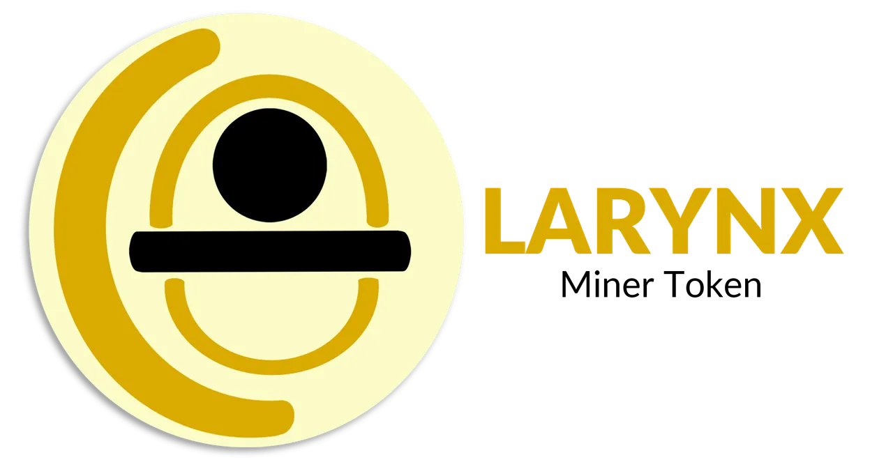
Once I had the base logo design, I started to think about what would inspire me for each logo. So, I started working on the logo for LARYNX, the mining token.
Una vez que tuve el diseño base del logo, comencé a idear en qué me inspiraría para cada logo. Así pues, comencé a trabajar en el logo de LARYNX, el token minero.
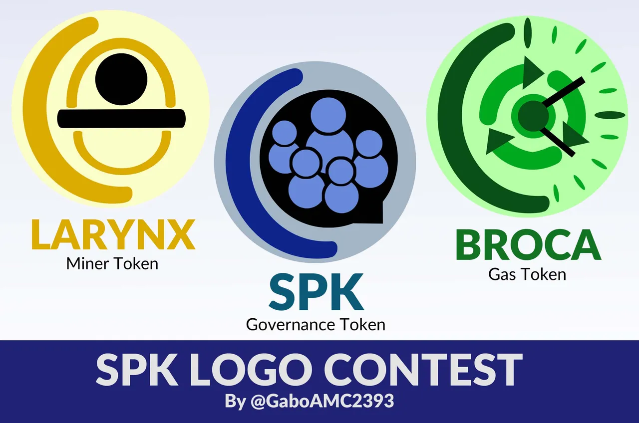
LARYNX Token
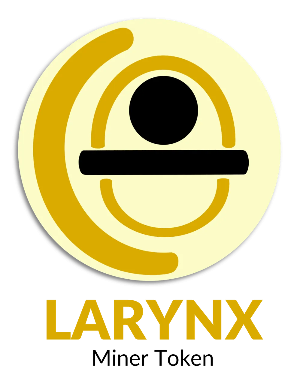
- LARYNX Miner Tokens
LARYNX Miner tokens should be thought as, as physical miner rigs, but in a digital form. The only way SPK Governance tokens can be earned is by staking LARYNX Miner tokens and running SPK Network Peer to Peer infrastructure nodes. When staked, LARYNX Miner Tokens are locked permanently so as to identify legitimate infrastructure miners, willing to stake value into the network. The more LARYNX burned for mining, the more profitable/efficient the mining becomes.
What was my inspiration?
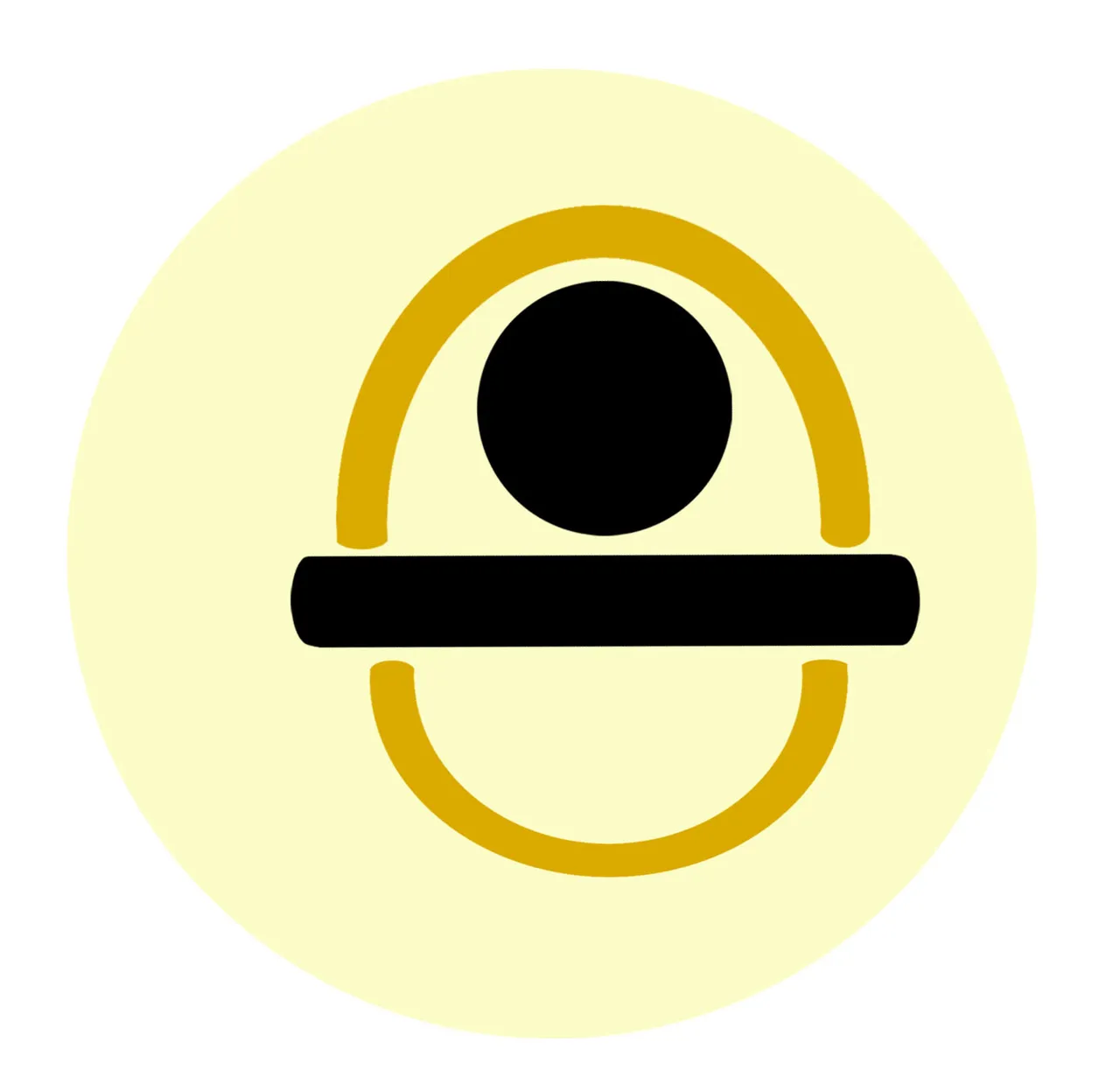
Basically the tools of a miner. Although you can't see it at first glance, in the logo there is a person's head with a helmet and a miner's pickaxe. In the image below you can see on the left the miner's pickaxe and on the right the person with his work helmet.
¿En qué me inspiré?
Básicamente en las herramientas de un minero. Aunque no se aprecia a simple vista, en el logo está la cabeza de una persona con un casco y un pico minero. En la imagen a continuación pueden ver a la izquierda el pico minero y a la derecha a la persona con su casco de trabajo.
 |  |
|---|
When you combine both things you get this logo, which says a little bit about the utility of this LARYNX token, which is mining. I chose the color because yellow is the usual color given, for example, to a working machinery.
Al combinar ambas cosas pues se obtiene este logo, que dice un poco sobre la utilidad de este token LARYNX, que es la minería. Elegí el color porque el color amarillo es el color habitual que se le da, por ejemplo, a una maquinaria de trabajo.

As for the text, I used a simple and serious font, with a color similar to those seen in the logo. A short text that serves to give a precise description of what the token does.
En cuanto al texto pues usé una fuente sencilla y seria, con un color similar a los que se ven en el logo. Una texto breve que sirva para dar una descripción precisa de lo que hace el token.
Although at the beginning I placed it as a vertical logo, the truth is that the first design I did it horizontally. It is a design that I liked more, since it can be used, for example, for cards and things like that. Here's a look at the horizontal logo.
Aunque en un comienzo lo coloqué como un logo vertical, lo cierto es que el primer diseño lo hice en horizontal. Es un diseño que me gustó más, ya que así se puede usar, por ejemplo, para tarjetas y cosas así. A continuación un vistazo del logo en horizontal.
And also in black and white, just because.
Y también a blanco y negro, porque sí.

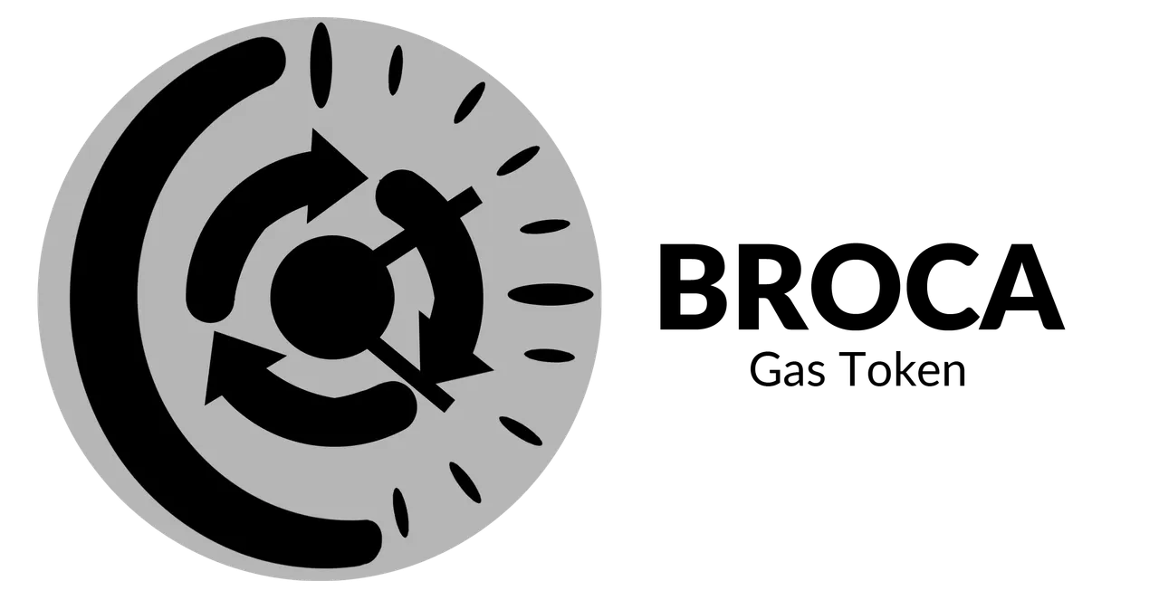
BROCA Token
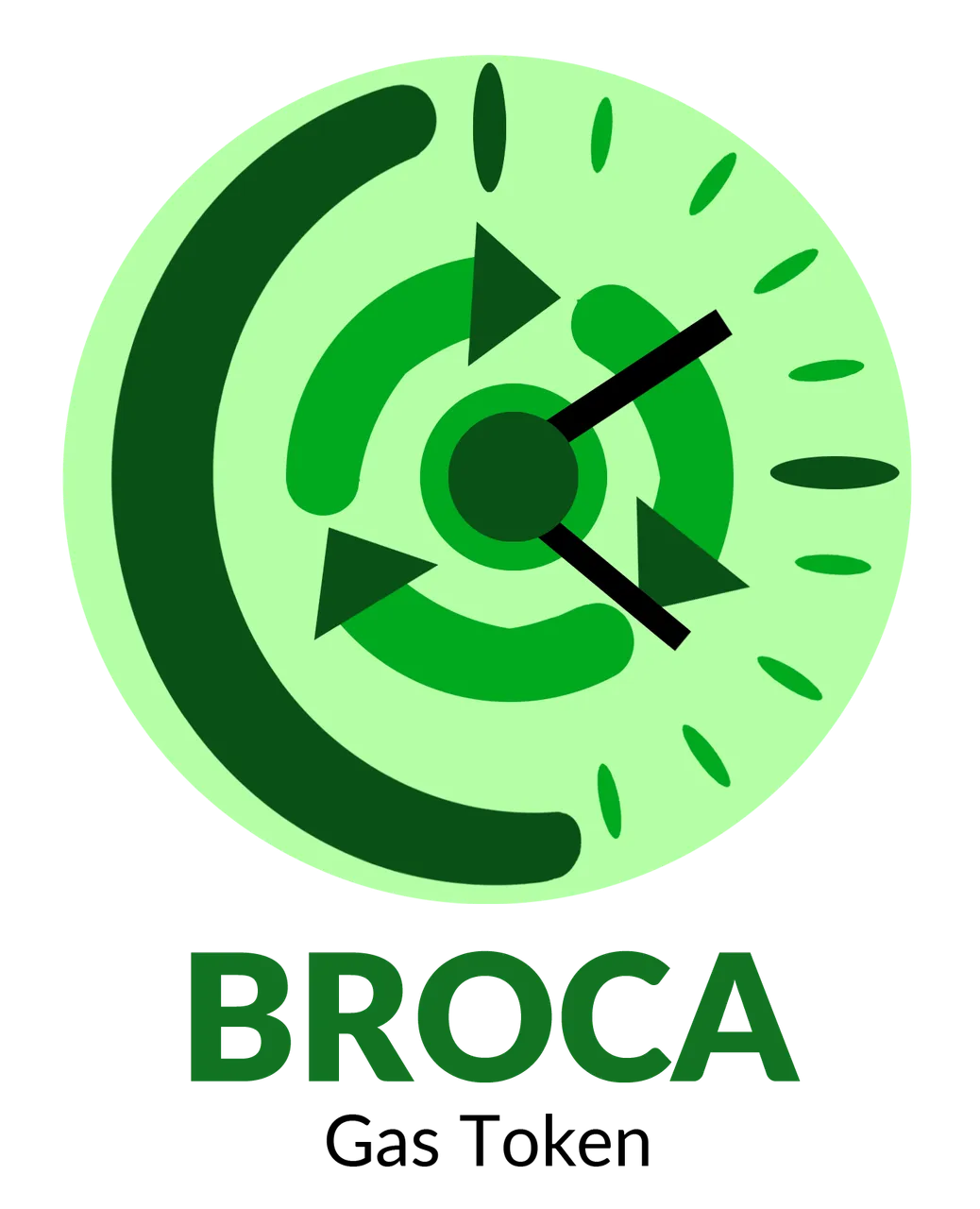
- BROCA
BROCA is the Network's gas token to limit spam. It is consumed when the user uploads content to the Network and automatically regenerates each day if the user powers up their liquid SPK tokens.
The creative process for this logo was very similar to the previous one. If all three work together, I decided to make them somewhat similar, but not the same.
What was my inspiration?
Well, I understand that the token regenerates every day, right? So I made that sort of circle that gives the feeling that it's constantly rotating and will always be there the token every day.
I made a clock also because you have to wait every day for it to regenerate. Also, I chose green because it's a nice color to look at.
El proceso creativo de este logo fue muy similar al anterior. Si los tres trabajan en conjunto, decidí que fueran algo similar, pero no igual.
¿En qué me inspiré?
Pues bien, entiendo que el token se regenera cada día, ¿no? Por ello hice esa especie de círculo que da la sensación de que gira constantemente y siempre estará ahí el token cada día.
Hice un reloj también porque hay que esperar cada día a que se regenere. Además, elegí el color verde porque es un color agradable a la vista.
 |  |
|---|
Both the center of the rotating circle and the center of the clock hands are the same at the center point of the token, so by combining the two, they are part of the same thing.
Tanto el centro del circulo giratorio como el centro de las agujas del reloj son lo mismo en el punto central del token, así que al combinar las dos cosas, estas son parte de lo mismo.

For the text, I used the same font and design as for the previous logo.
Para el texto, usé la misma fuente y el mismo diseño que para el logo anterior.
I also designed it vertically, as it is the style I like the most. There is also a black and white version.
También lo diseñé en vertical, como es el estilo que me gusta más. También está su variante a blanco y negro.
SKP Token
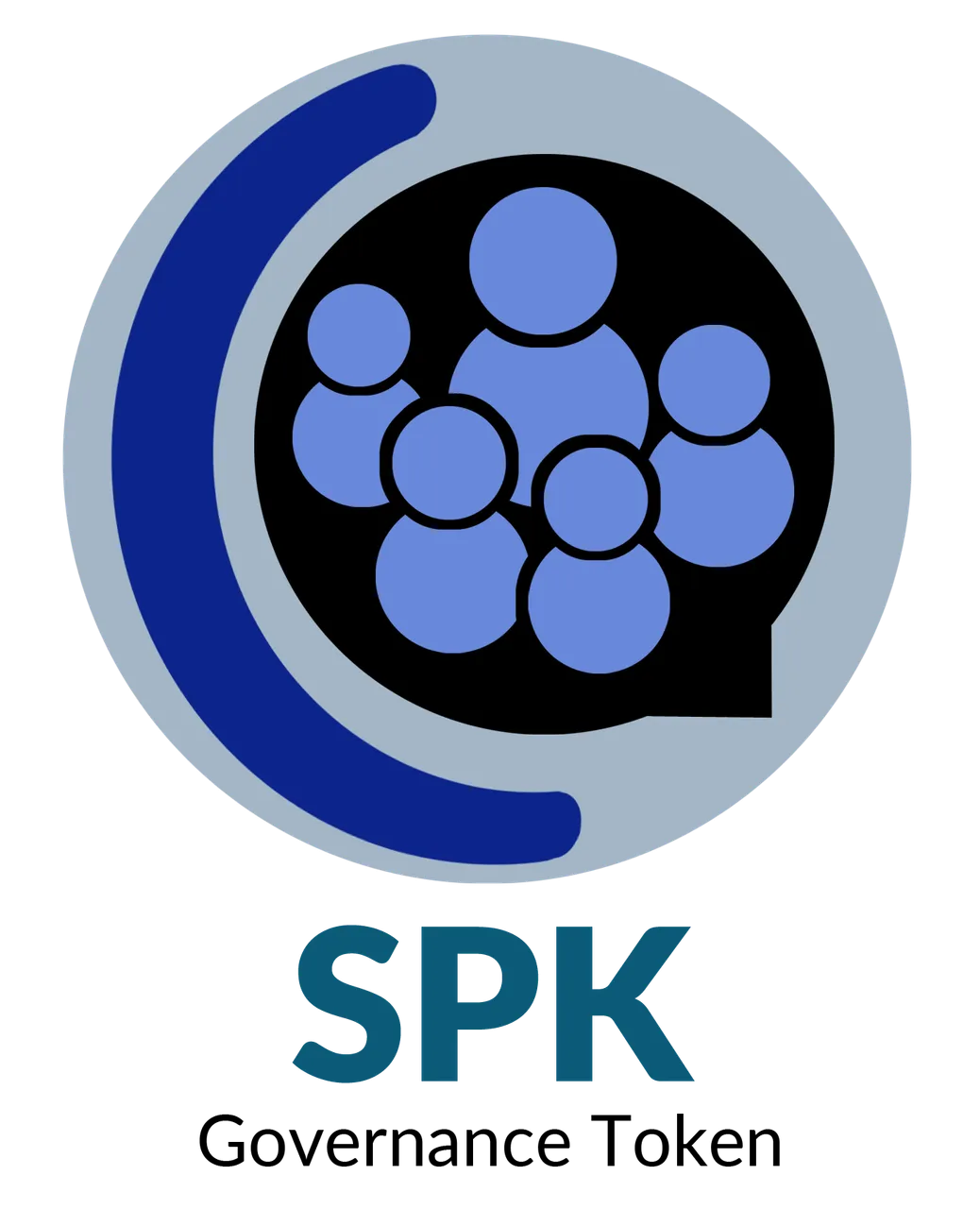
- SPK
SPK token is the capped governance token of the Network. An SPK token holder is able to influence the governance of the Network with their voting weight, based on how much of the SPK token they have Powered up. In order to vote a user must have powered up their SPK for at least 30 days. This gives the Network time to protect itself in case of a Sybil-type attack.
What was my inspiration?
Well, we come to the governance token. I understand that this token has a utility and serves to give influence in the network. The more voting power you have, I imagine you will have more influence.
So, for this token I decided to group a set of little people that I designed and give them different sizes, because some will have more power than others and more influence than others; even so I put them all together in a circle because no matter how much influence they have, they are all inside the network.
In addition, I made the circle as a kind of dialog box, alluding to the SKP Network logo.
¿En qué me inspiré?
Bien, llegamos al token de gobernanza. Entiendo que este token tiene una utilidad y sirve para dar influencia en la red. Mientras más poder de voto se tenga, imagino que tendrá mas influencia.
Por ello, para este token decidí agrupar a un conjunto de personitas que diseñé y darle distintos tipos de tamaño, porque algunos tendrán más poder que otros y mayor influencia que otros; aún así los coloqué todos juntos dentro de un círculo porque sin importar la influencia que tengan, todos estan dentro de la red.
Además, hice el círculo como una especie de cuadro de dialogo, en alusión al logo de SKP Network.

As for the text, it is the same design as the previous ones. A fresh, serious font that says just enough about the token.
En cuanto al texto, es el mismo diseño que los anteriores. Una fuente fresca, seria y que diga lo justo y necesario sobre el token.

To complement the SPK section, I also leave you the logo in vertical, along with a black and white design of the same.
Para complementar el apartado de SPK, también les dejo el logo en vertical, junto a un diseño a blanco y negro del mismo.


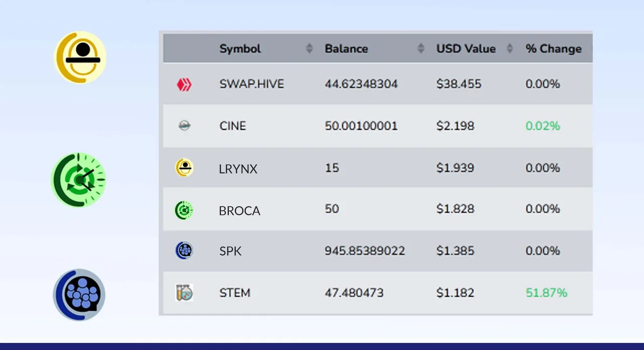
It should be noted, you have to see how these tokens are displayed on the network; so I took the designs and placed them in a screenshot for testing. It also gives us an idea of what they would look like as buttons or favicon.
Below is a glimpse of the logos on a hive-engine wallet.
Cabe destacar, que hay que ver cómo se visualizan estos tokens en la red; así que tomé los diseños y los coloqué en un capture de pantalla para hacer una prueba. También nos da una idea de cómo se verían como botones o como favicon.
A continuación un vistazo de los logos en una wallet de hive-engine.
Well friends, that's all for now. It's still April 30th in my country so I hope I made it in time to participate. For me it has been a pleasure to have done these three logos, at least to have finished them. The truth is that I was satisfied with the work and happy because I was able to bring them.
I invite you to leave your opinions below in the comments, as always I will be happy to read them. Without more to add, I say goodbye then...
See you next time!
Bien amigos, esto ha sido todo por ahora. Aún es 30 de Abril en mi país así que espero haber llegado a tiempo para participar. Para mi ha sido un placer haber hecho estos tres logos, haberlos terminado por lo menos. La verdad quedé satisfecho con el trabajo y contento porque pude traerlos.
Los invito a dejar sus opiniones abajo en los comentarios, como siempre estaré encantado de leerlos. Sin más que agregar, me despido entonces...
¡Hasta la próxima!
Traducido con DeepL
Photoshop - Inkscape
Meat and Cheese Pizza
Gabo Play: Mekorama Story
Continúa la historia: La despedida