Español
Desde que tengo memoria, me he sentido inclinado hacia el arte en muchas sus facetas; música, escritura, pintura, dibujo, escultura y hasta fotografía. Esta última es en la que menos he incursionado; sin embargo, desde que la he estado practicando, he aprendido cosas realmente interesantes que me han hecho entender que hay todo un mundo por aprender detrás de este arte.
Con la intención de poner en práctica lo aprendido, decidí participar en el concurso fotográfico de la comunidad Celf.Magazine.
Pueden leer más sobre el concurso siguiendo este enlace:
@celf.magazine/f-o-t-o-c-e-l-f-concurso-fotografico-or-photography-contest-12-esp-eng
La temática es blanco y negro, así que tuve que ver algunos tutoriales y documentarme un poco lograr unas cuantas fotos que estuviesen a la altura del concurso. Les presento pues, esta publicación que titulé: Black & White Flowers.
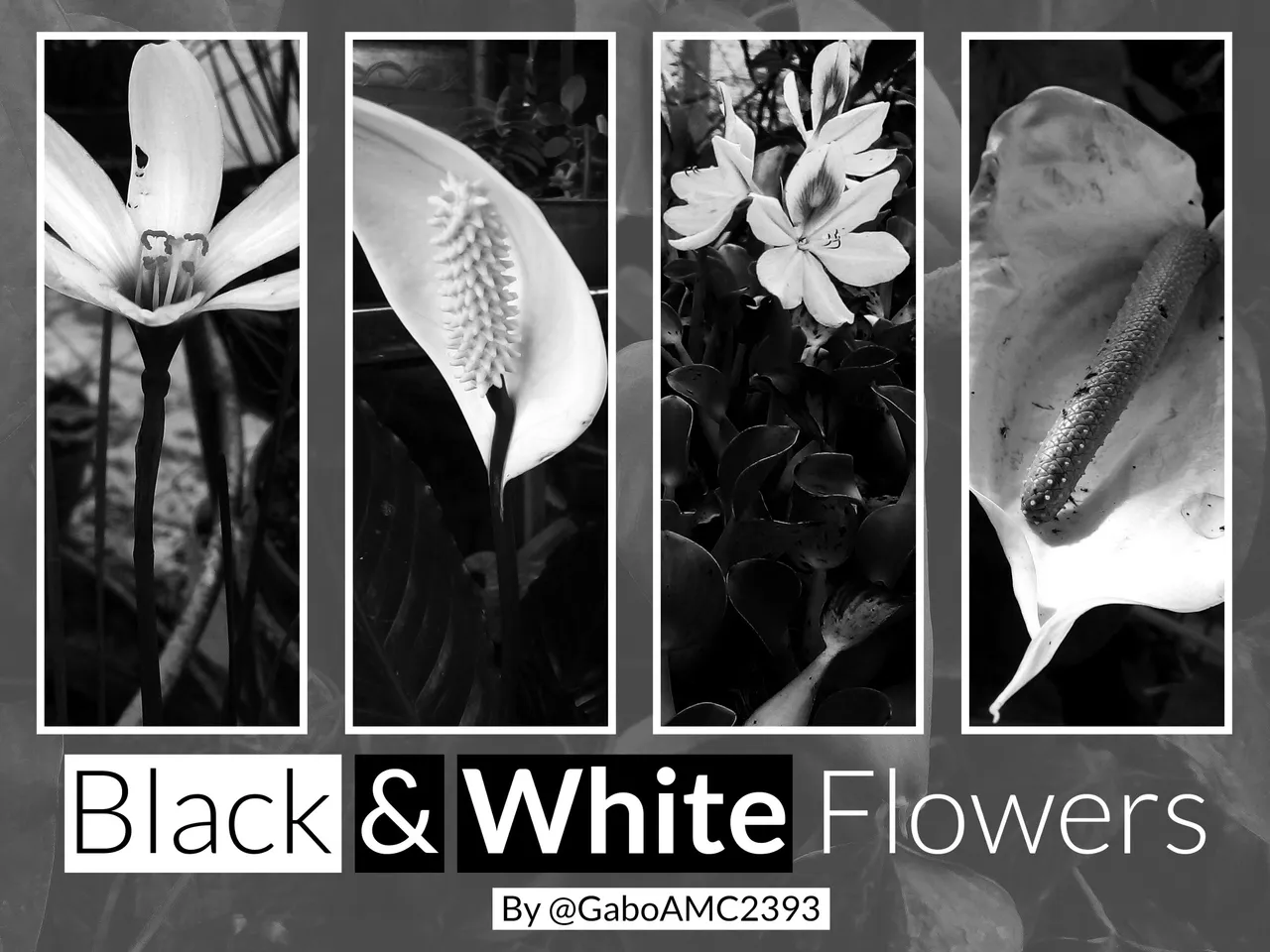
Colocar una fotografía de una flor a blanco y negro podría parecer una tontería para cualquiera, por la gran cantidad de colores que una flor puede lucir en una foto a todo color; sin embargo, hay que entender lo que se busca lograr al echibir una fotografía a blanco y negro.
Con esta técnica puedes concentrar la atención en el objeto principal de tu composición, puedes crear contraste y hasta resaltar ciertos objetos que en una fotografía a color pasarían desapercibidos.
No es un desperdicio colocar una fotografía de una flor a blanco y negro. Te mostraré lo que hice y entenderás por qué lo digo.
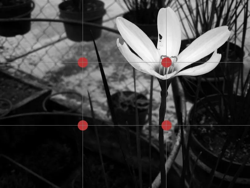
1era Fotografía:
En esta fotografía pueden observar una pequeña flor de color blanco. Si prestan atención al fondo de la fotografía, se darán cuenta que es un fondo claro que, de estar a todo color, no haría demasiado contraste con la propia flor en sí, que es el objeto principal de la fotografía.
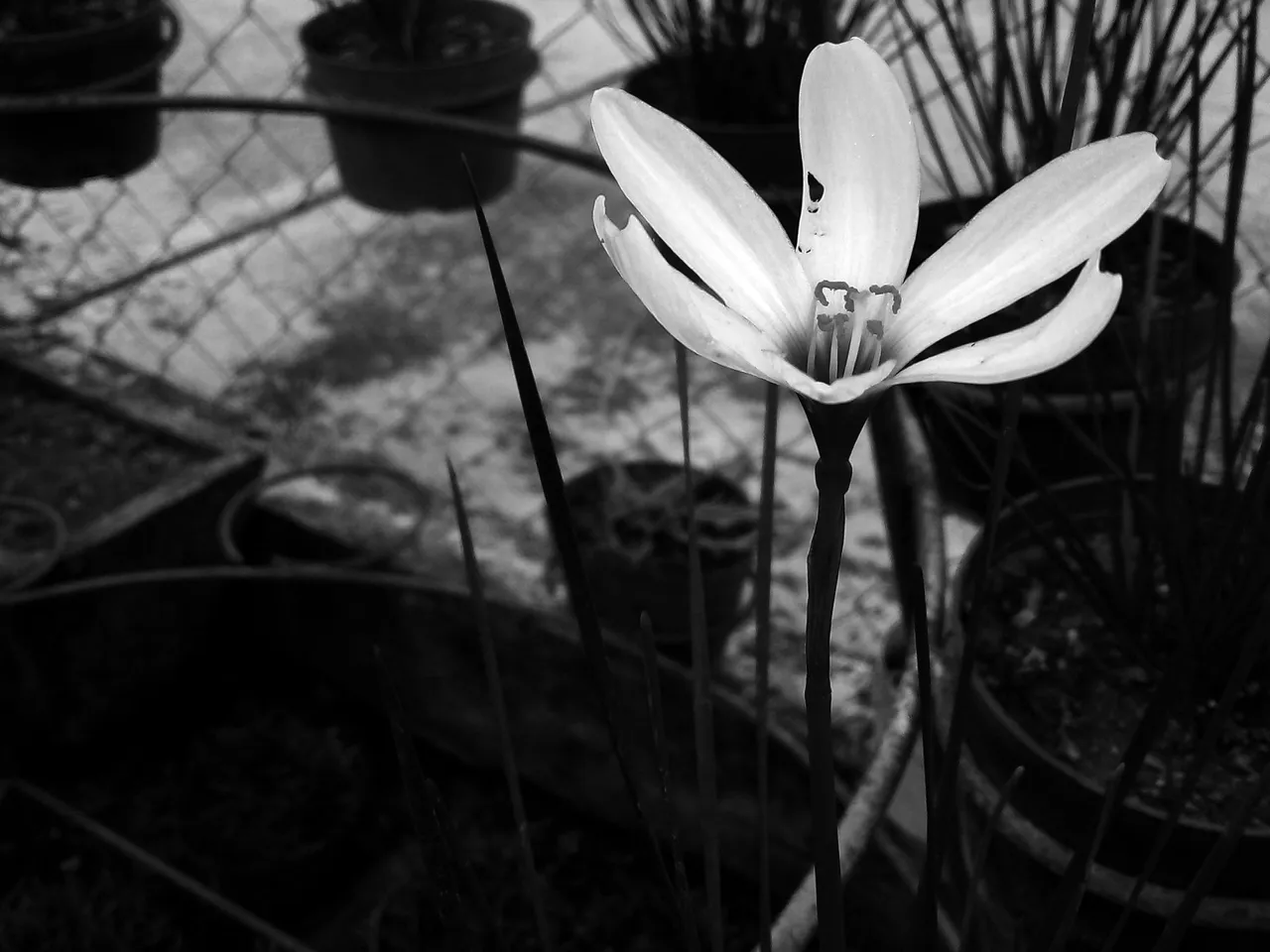
Es una flor pequeña, así que tratar de fijar la vista en algo tan pequeño es difícil, más si se tiene en cuenta la cantidad de objetos que hay en la composición, como otras hojitas de color verde, macetas, trozos de hierro, entre otras cosas que podrían distraer al espectador de la pequeña flor.
En la foto logré aislar los otros colores, de modo que resalten más las tonalidades blancas de la flor, convirtiéndola en el objeto más llamativo de la composición. Para decirlo de manera sencilla, ese será el lugar a donde irá tu mirada apenas veas la fotografía.

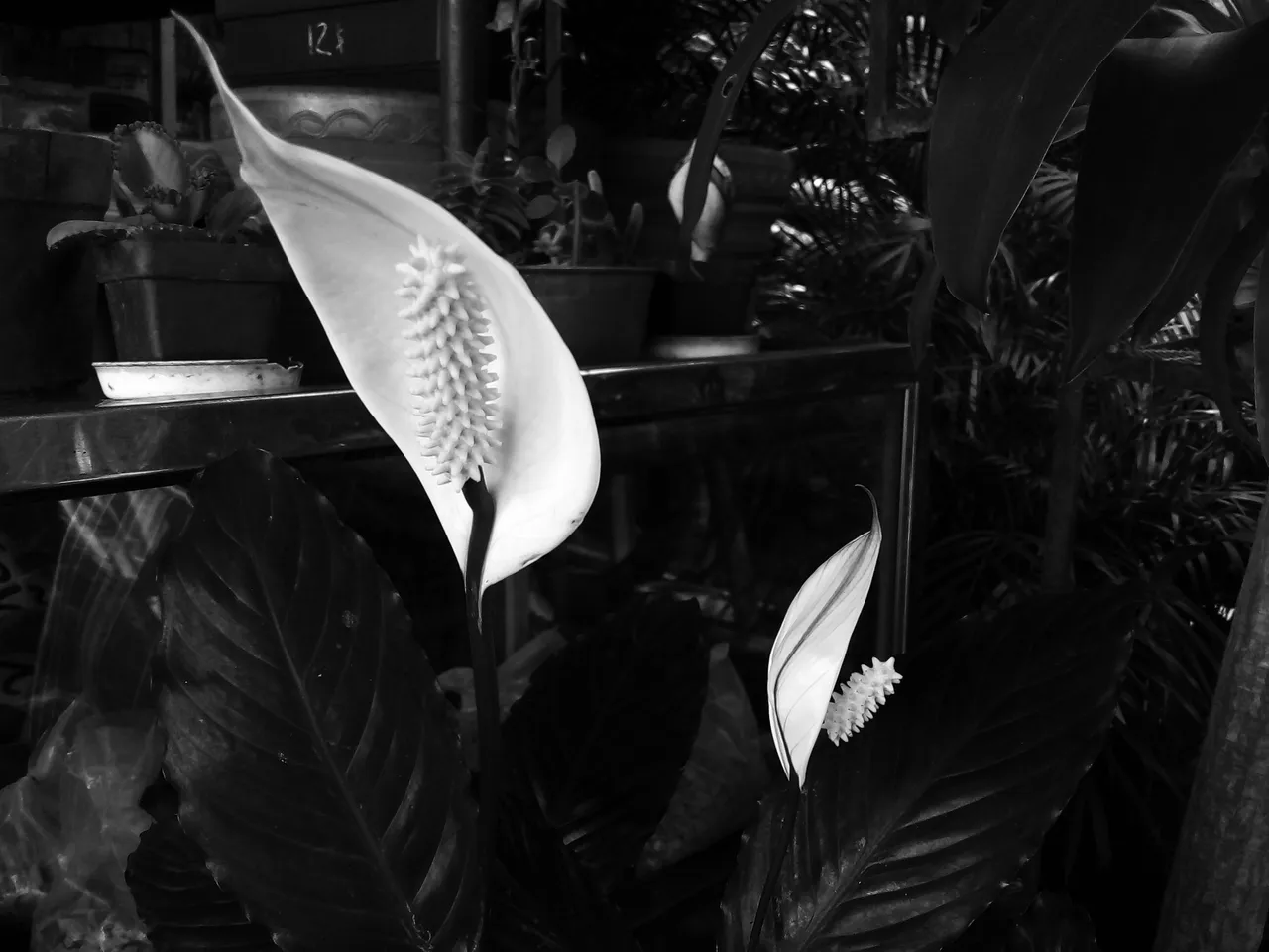
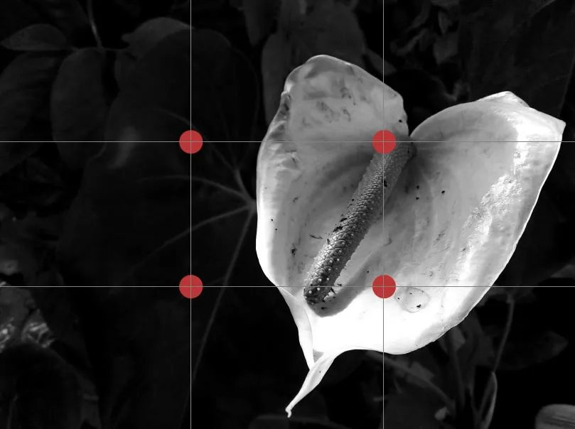
2da Fotografía:
Otra de las cosas que se pueden resaltar en la fotografía a blanco y negro son las texturas.
Cuando vemos una fotografía a todo color, lo primero en lo que nos concentramos es precisamente en eso, los colores. Ante la ausencia de estos, podemos darnos el lujo de apreciar otros aspecto de una composición, como lo son las texturas.
En esta fotografía la flor no es tan pequeña como la anterior, así que es fácil que la vista se concentre en esta. Sin embargo, hay algo que llama mucho más la atención y es la parte central de la propia flor.
La forma y la textura de esta parte de la flor se puede apreciar mejor, ya que no hay colores que distraigan nuestra atención de la simetría y las formas tan interesantes que hay aquí.
De esta manera, se pueden destacar detalles en las texturas de los objetos, detalles que normalmente no apreciamos.

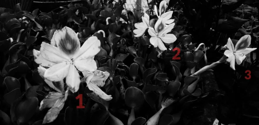
3era fotografía:
Cuando comparo la foto a color con la que les muestro acá, ciertamente mi vista se dirije hacia otros objetos que hay en el espacio vacío, como macetas y hojas hojas.
Aunque traté de situar los actores principales de la fotografía siguiendo la regla de los tercios, con tantos colores y objetos alrededor es fácil desviar La mirada hacia otro lado.
Por el contrario, cuando la fotografía está a blanco y negro, el espectador inmediatamente centra su atención en los dos objetos que más resaltan y comparten protagonismo.
Las dos flores blancas de la composición resaltan por encima de las tonalidades oscuras de los otros objetos. Incluso, gracias a las sombras, podemos visualizar con mejor detalle las formas que luce la flor en una se sus partes...

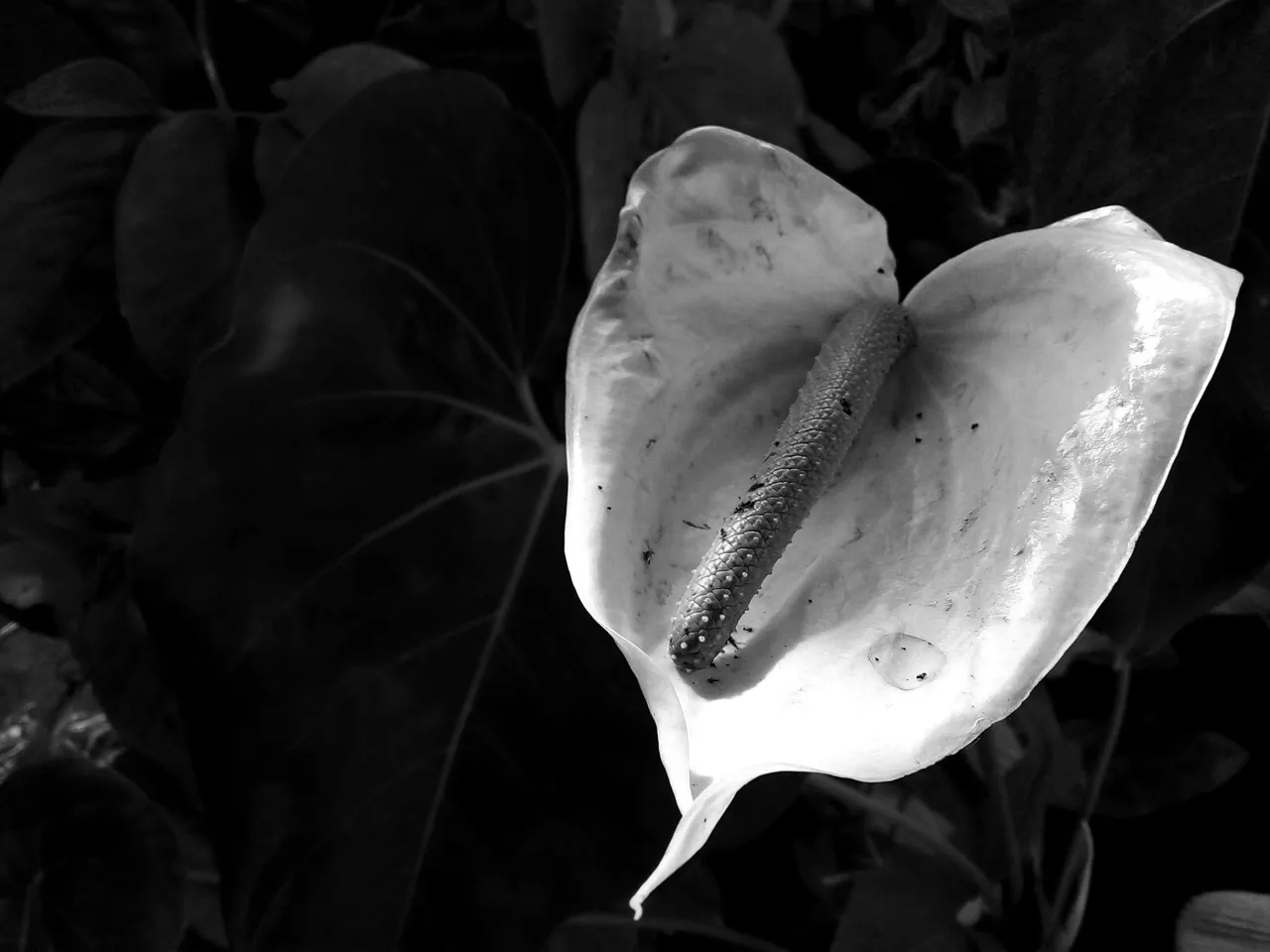
4ta Fotografía:
Esta es la última fotografía que decidí compartir. No es la mejor, pero sí nos permite entender algo que he estado comentando.
En esta fotografía, que está cargada de muchos objetos con formas tan variadas y curiosas, busqué centrar la atención en mis tres protagonistas, las 3 flores que se aprecian en la foto.
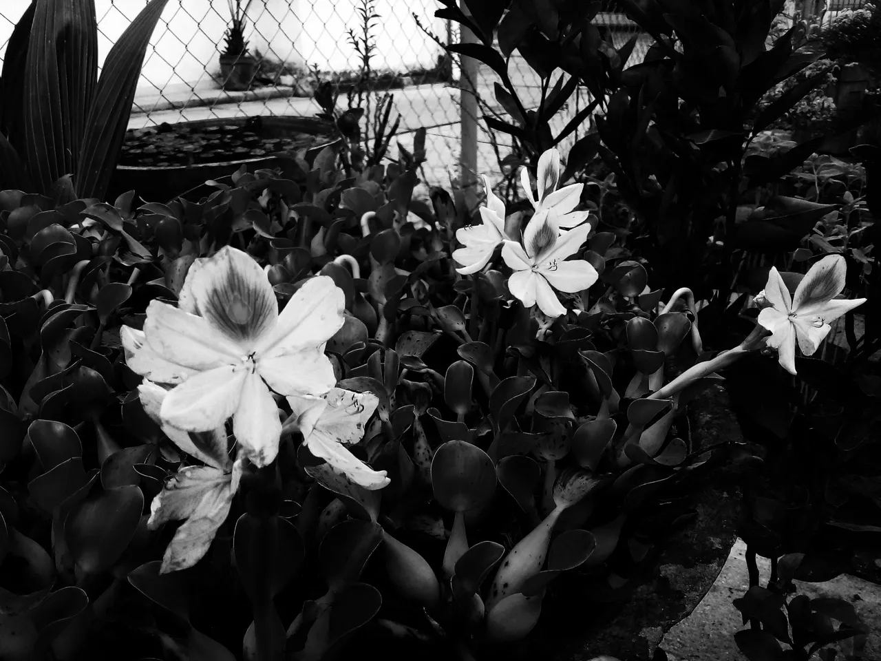
Indudablemente la fotografía se vería mejor a color, porque se disfruta más de la belleza que exhibe la flor, pero con todo lo dicho anteriormente, en esta fotografía centramos nuestra atención en las 3 flores principales, también en las formas y texturas que ofrecen...

Detalles técnicos:
Regla de los tercios
En la mayoría de las fotografías intenté seguir la regla de los tercios.
En fotografía existen unas líneas imaginarias que debemos seguir para situar al protagonista de nuestra composición en el punto donde estas líneas se cruzan, dejando un espacio vacío que puede aprovecharse, por ejemplo, para colocar un texto.
De esta manera se aprovecha mejor el espacio y la fotografía es más agradable a la vista.
Regla de los impares
En una sola foto logré aplicar esta regla. La regla de los impares establece que una fotografía es más agradable a la vista cuando hay un número impar de objetos, en lugar de uno par.
Esto permite comparar las formas o colores del objeto principal con los otros, que sirven como coprotagonistas en la composición.
Blanco y negro
Finalmente, la ténica que apliqué en todas las fotos, el blanco y negro.
Ya les he comentado lo que se puede lograr con esta técnica. Pero también me gustaría mostrarles cómo se vería una de las fotos a color, junto a su otra mitad a blanco y negro.
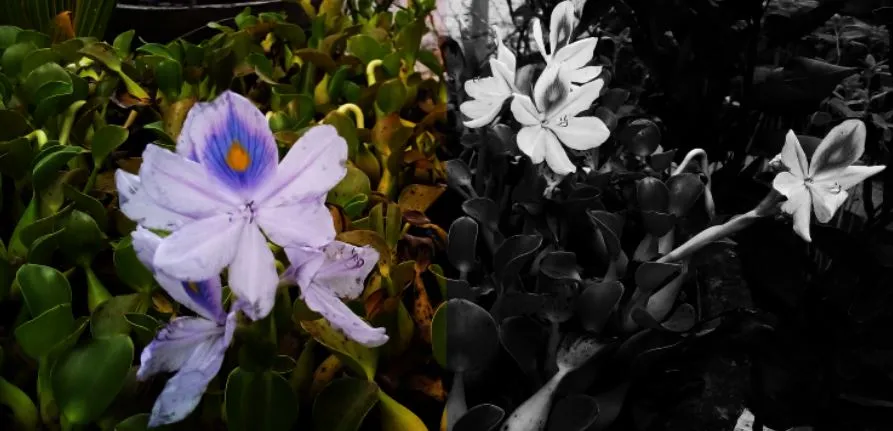
Como pueden ver, en el área de color es fácil perderse entre tantos colores. Y aunque la flor llama la atención, hay otros objetos coloridos que también resaltan. En el lado de blanco y negro, solo las flores resaltan por encima de lo demás...
Bien amigos, esto ha sido todo por ahora. Para mi ha sido un placer haber participado en este concurso. Creo que nunca había participado desde que estoy en la plataforma y me resutla grato poder unirme con esta participación.
Espero que mis fotografías les haya gustado. Soy un aficionado en esto y puede que esté equivocado en algunos conceptos, así que siempre es bueno investigar, estudiar y leer por su propia cuenta e ir aprendiendo todos los dias de aquello que les gusta.
Por mi parte, los invito a dejar sus opiniones abajo en los comentarios, como siempre estaré encantado de leerlos. Sin más que agregar, me despido entonces...
¡Hasta la próxima!
English
For as long as I can remember, I have felt inclined towards art in many of its facets; music, writing, painting, drawing, sculpture and even photography. This last one is the one I have been less involved in; however, since I have been practicing it, I have learned really interesting things that have made me understand that there is a whole world to learn behind this art.
With the intention of putting into practice what I have learned, I decided to participate in the photo contest of the Celf.Magazine community.
You can read more about the contest by following this link:
@celf.magazine/f-o-t-o-c-e-l-f-concurso-fotografico-or-photography-contest-12-esp-eng
The theme is black and white, so I had to watch some tutorials and do some research to get a few photos that were up to the contest. I present to you, then, this publication that I titled: Black & White Flowers.
Placing a photograph of a flower in black and white might seem silly to anyone, because of the great amount of colors that a flower can show in a full color photo; however, you have to understand what you are trying to achieve by taking a black and white photograph.
With this technique you can focus attention on the main object of your composition, you can create contrast and even highlight certain objects that in a color photograph would go unnoticed.
It is not a waste to place a photograph of a flower in black and white. I'll show you what I did and you'll understand why I say so.
1st Photo:
In this photograph you can see a small white flower. If you pay attention to the background of the photograph, you will notice that it is a light background that, if it were in full color, would not contrast too much with the flower itself, which is the main subject of the photograph.
It is a small flower, so trying to fix the eye on something so small is difficult, especially if you take into account the amount of objects in the composition, such as other green leaves, pots, pieces of iron, among other things that could distract the viewer from the small flower.
In the photo I managed to isolate the other colors, so that the white tones of the flower stand out more, making it the most striking object in the composition. To put it simply, that will be the place where your gaze will go as soon as you see the photograph.
2nd Photo:
Another thing that can be highlighted in black and white photography is the textures.
When we see a full color photograph, the first thing we focus on is precisely that, the colors. In the absence of colors, we have the luxury of appreciating other aspects of a composition, such as textures.
In this photograph the flower is not as small as the previous one, so it is easy for the eye to focus on it. However, there is something that attracts much more attention and that is the central part of the flower itself.
The shape and texture of this part of the flower can be better appreciated, as there are no colors to distract our attention from the symmetry and interesting shapes here.
In this way, details in the textures of the objects can be highlighted, details that we normally do not appreciate.
3rd Photo:
When I compare the color photo with the one I show you here, my eye is certainly drawn to other objects in the empty space, such as flower pots and leaves.
Although I tried to place the main actors in the photograph following the rule of thirds, with so many colors and objects around it is easy to look away.
On the contrary, when the photograph is in black and white, the viewer immediately focuses his attention on the two objects that stand out the most and share the limelight.
The two white flowers in the composition stand out from the dark tones of the other objects. Thanks to the shadows, we can even visualize in better detail the shapes of the flower in one of its parts...
4th Photo:
This is the last photograph I decided to share. It is not the best, but it does allow us to understand something I have been commenting on.
In this photograph, which is loaded with many objects with such varied and curious shapes, I sought to focus attention on my three protagonists, the 3 flowers that can be seen in the photo.
Undoubtedly the photograph would look better in color, because you can enjoy more of the beauty that the flower exhibits, but with everything said above, in this photograph we focus our attention on the 3 main flowers, also on the shapes and textures that they offer...
Technical details:
Rule of thirds
In most of the photographs I tried to follow the rule of thirds.
In photography there are imaginary lines that we must follow to place the protagonist of our composition at the point where these lines intersect, leaving an empty space that can be used, for example, to place a text.
This makes better use of space and the photograph is more pleasing to the eye.
Odd rule
In a single photo I managed to apply this rule. The rule of odd numbers states that a photograph is more pleasing to the eye when there is an odd number of objects, rather than an even number.
This makes it possible to compare the shapes or colors of the main object with the others, which serve as co-protagonists in the composition.
Black and white
Finally, the technique that I applied in all the photos, black and white.
I have already told you what can be achieved with this technique. But I would also like to show you how one of the photos would look in color, next to its other half in black and white.
As you can see, in the color area it is easy to get lost among so many colors. And while the flower catches the eye, there are other colorful objects that stand out as well. On the black and white side, only the flowers stand out from the rest...
Well friends, that's all for now. For me it has been a pleasure to have participated in this contest. I don't think I had ever participated since I've been on the platform and I'm glad to be able to join with this participation.
I hope you liked my pictures. I am an amateur in this and I may be wrong in some concepts, so it is always good to investigate, study and read on your own and learn every day of what you like.
For my part, I invite you to leave your opinions below in the comments, as always I will be happy to read them. With nothing more to add, I will say goodbye then...
See you next time!

Traducido con DeepL
Gabo Drawing: Passing Cloud
Digital Restauration #3
Cactus and Succulents