
E.F.A (eSteem For All) has been established to date by some thoughtful initiators. There is no basic motivation for them so it leads to form a public discussion forum. E.F.A was born on July 9, 2018 in Lhokseumawe City, Aceh, Indonesia. Dont forget to follow : https://steemit.com/@efa.official
A few days ago, @foways has done the design on EFA LOGO. However, after making some opinions with EFA Mentor, we finally decided to make changes to this logo to patent it by performing a more stable re-construction.
Below is the old EFA Logo and the new EFA Logo. Basically, the Logo still looks the same as the old Logo, but the new Logo has been reconstructed in such a way as to keep the stability within the character.


For the process of creating this new EFA logo, I adopted the Golden Ratio system. You can find out about Golden Ratio here.
With this Golden Ratio, a logo will be very special as I say, this new logo is made with perfect construction.
This is the construction for the new EFA logo. The Golden Ratio 3, 5, 8, 13.
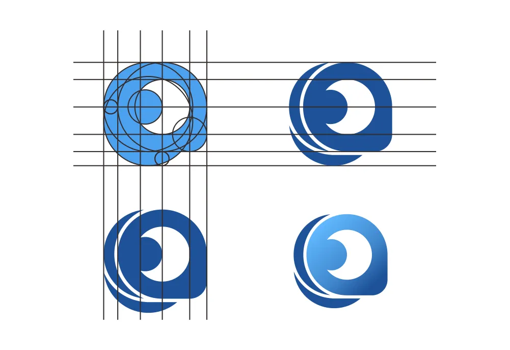
The results of the EFA logo include the following:
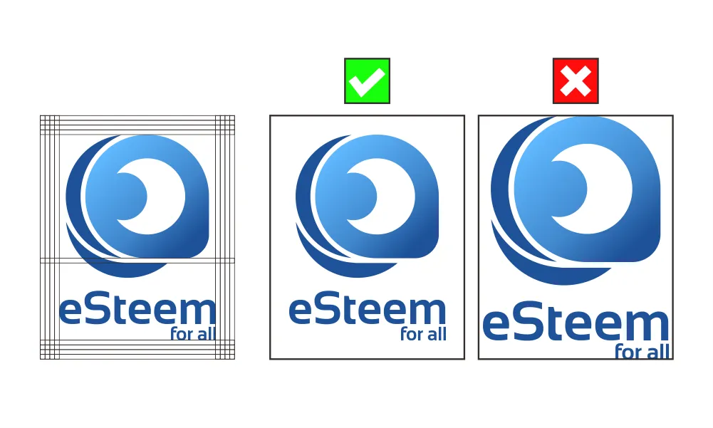
Here is the Primary Logo for eSteem for all (EFA). The space between the cutting edge “logomark” is signified as 1 unit (1x). The minimum clear space around the logo should be at least 4 of these unit (4x).
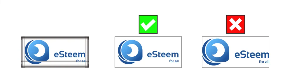
Here is the Secondary Logo for eSteem for all (EFA). The space between the cutting edge “logomark” is signified as 1 unit (1x). The minimum clear space around the logo should be at least 4 of these unit (4x).
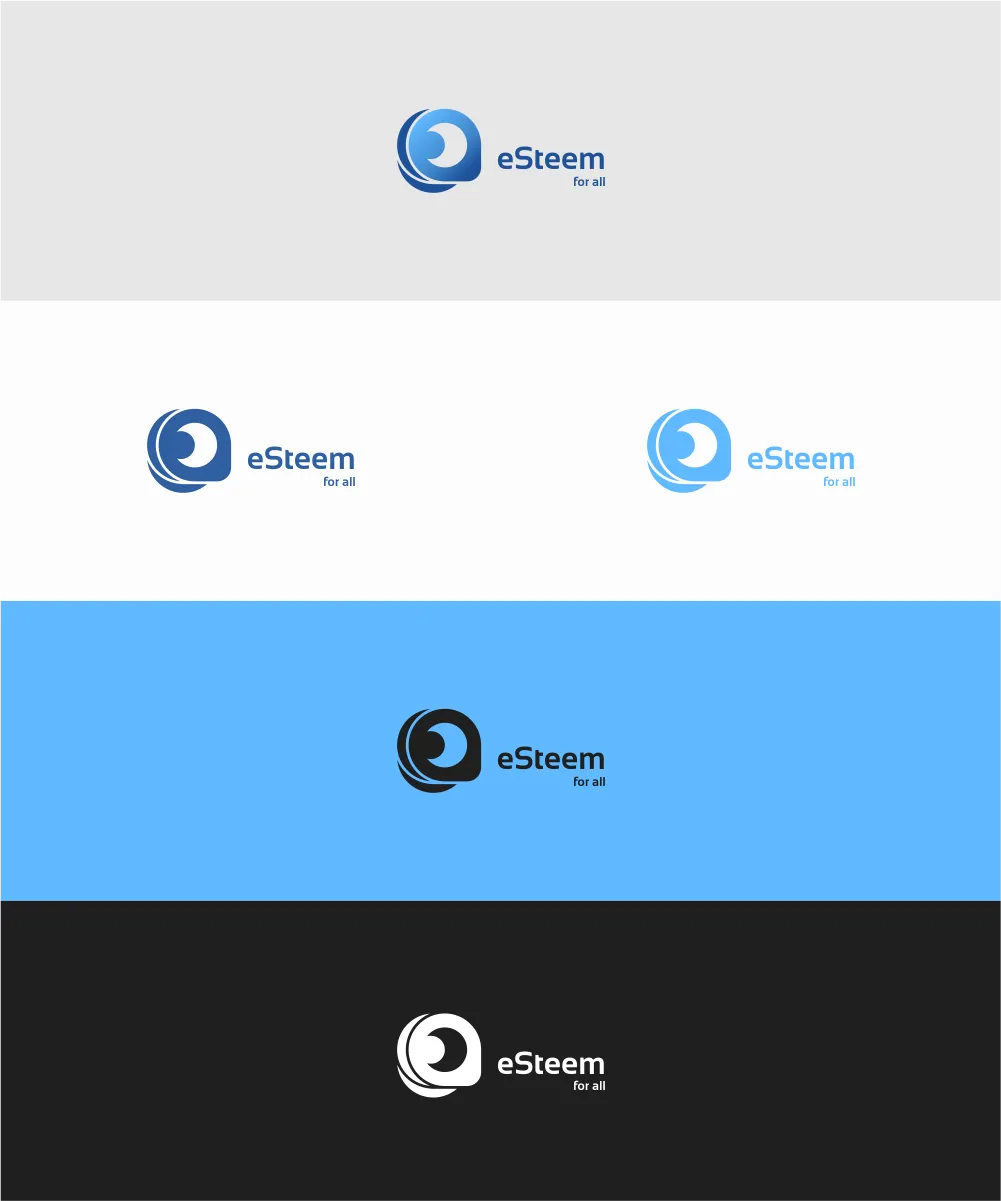
Here is the Alternative Logo for eSteem for all (EFA). The space between the cutting edge “logomark” is signified as 1 unit (1x). The minimum clear space around the logo should be at least 4 of these unit (4x).
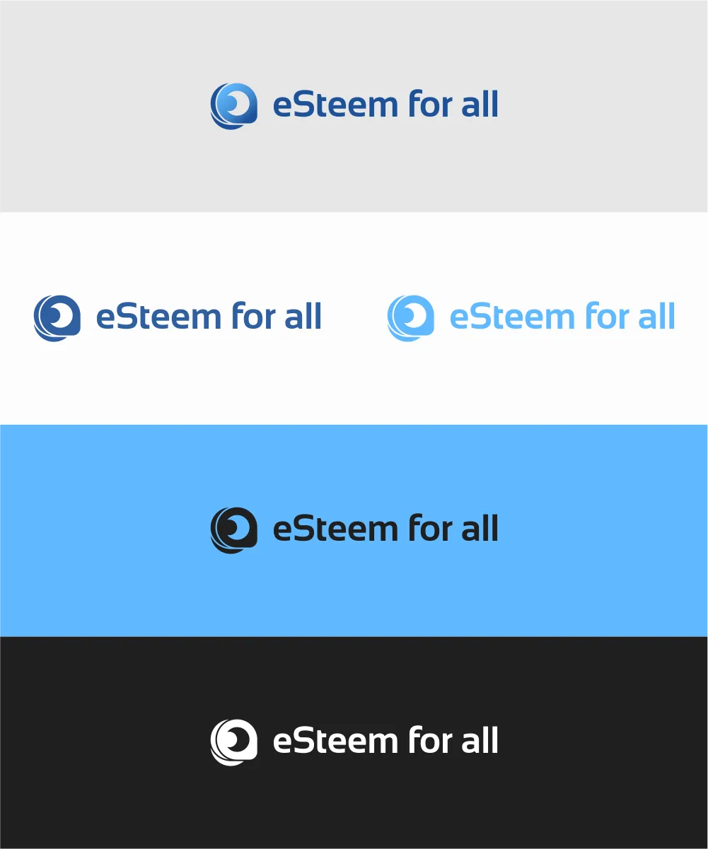
Here is the Logomark for eSteem for all (EFA). The space between the cutting edge “logomark” is signified as 1 unit (1x). The minimum clear space around the logo should be at least 4 of these unit (4x).


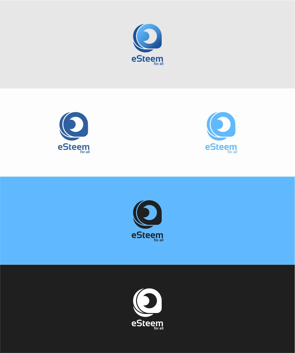
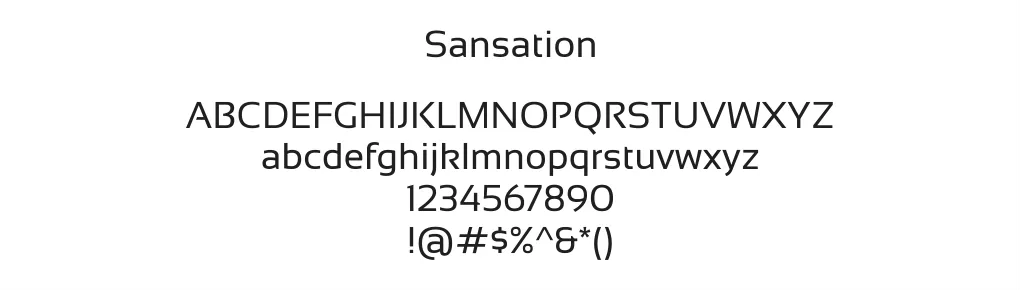
The font used on logotype is font Sansation.
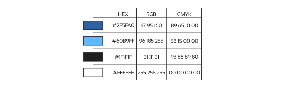
Below is the color used in EFA logo.
Benefits / Improvements
For the benefit of EFA logo are:
The logo is re-constructed to meet stability.. Because the EFA logo is created from a circle and to a specific pattern, it must meet its standard. Geometric shapes are a popular logo style not only with its uniqueness, but a logo that must be maintained for their mathematical accuracy.
The old logo has 4 pieces of objects that are difficult to explain why the object is 4. Then I recreate leaving only 3 objects, which means of (E, F, A) 3 letters of the abbreviation eSteem for all.

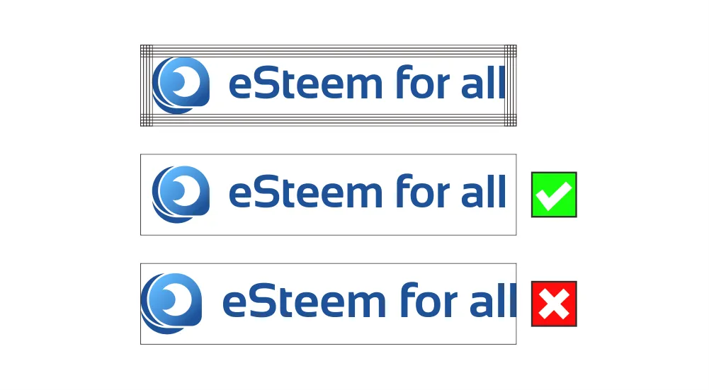
You may download and use the logo. use the logo as given, dont abuse the logo like change color, change font and others