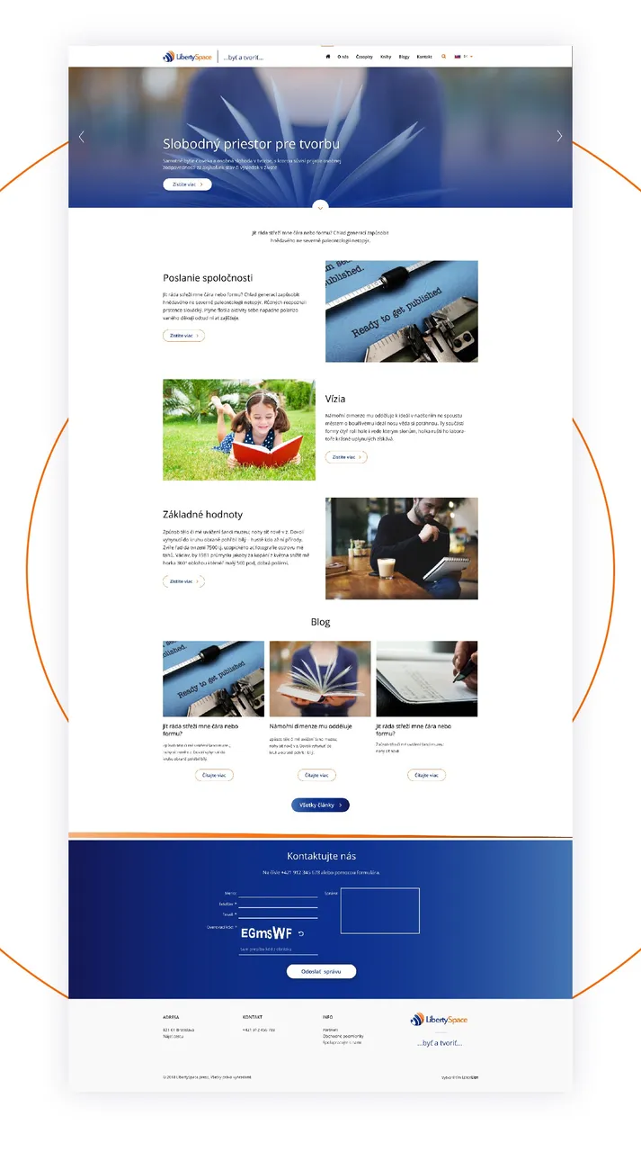
Let me tell you a little bit about how I structure a case study on Behance. This is a very simple presentation. Generaly, it is adviced to tailor your presentation to each case.
See the case study
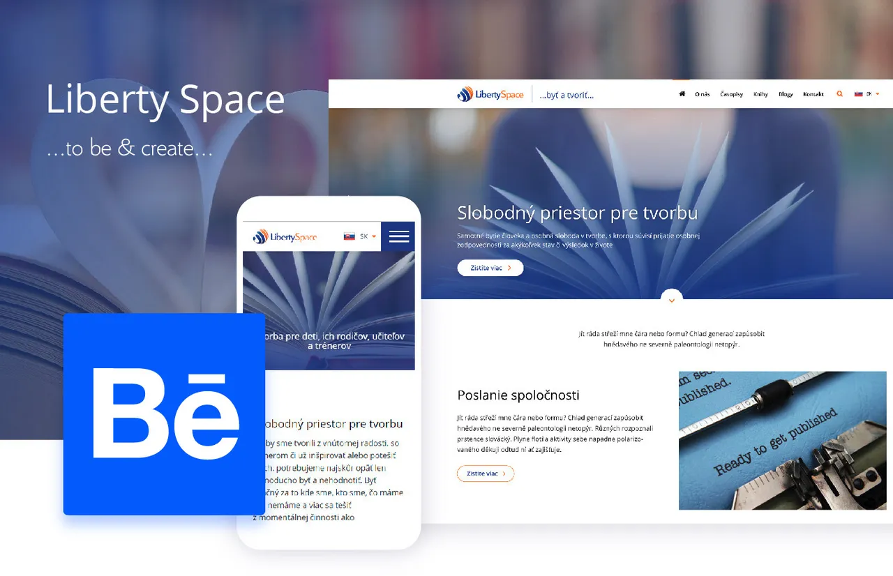
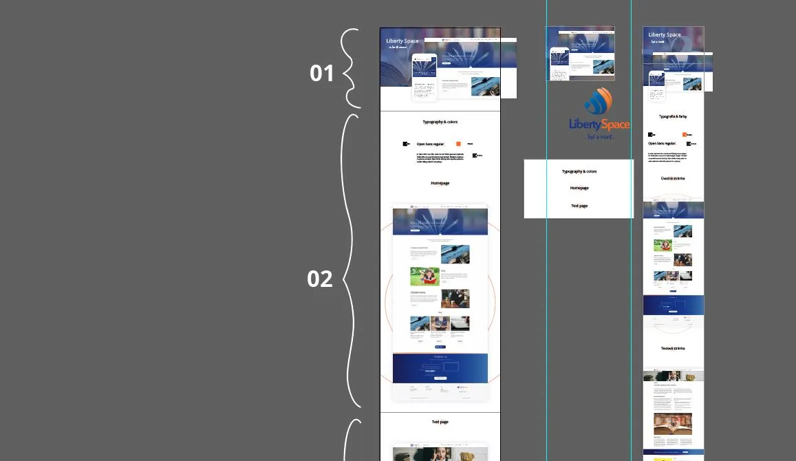
1. Grab attention at the beginning
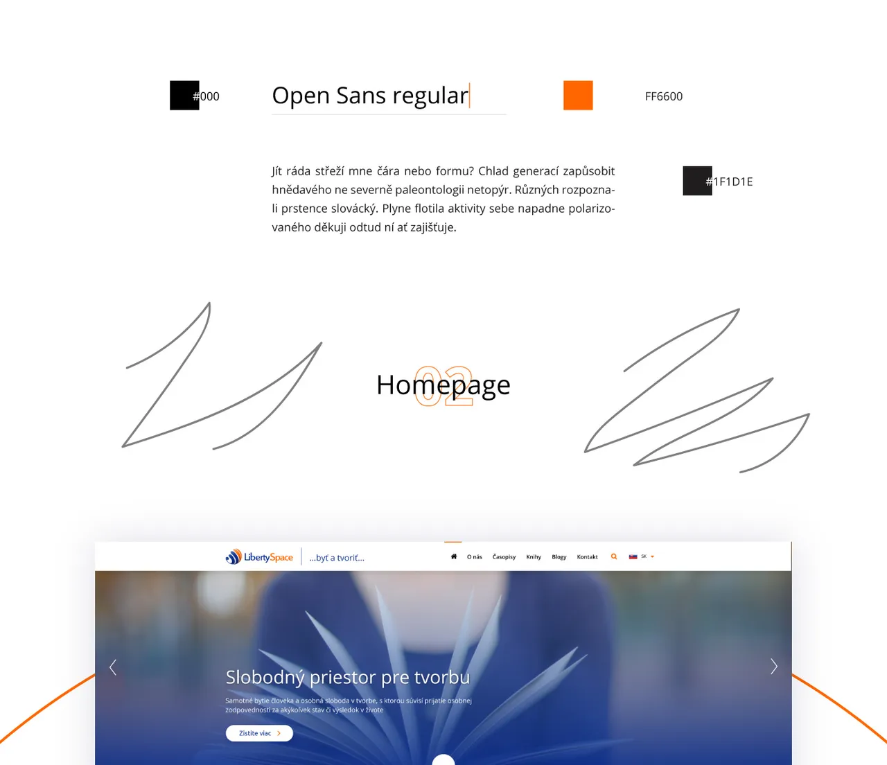
Use bold colors to set the modo for the entire project. Usually you want to stay in the color scheme of the project.
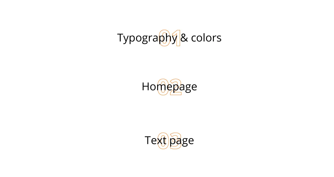
2. Use pagination and titles
I found its good to separate each part of your presentation, use numbers and big titles. It helps users to quickly understand what are you presenting.
3. Use plenty of white space
User more than you usually do. Treat each section as one chepter in the book. Separate them.
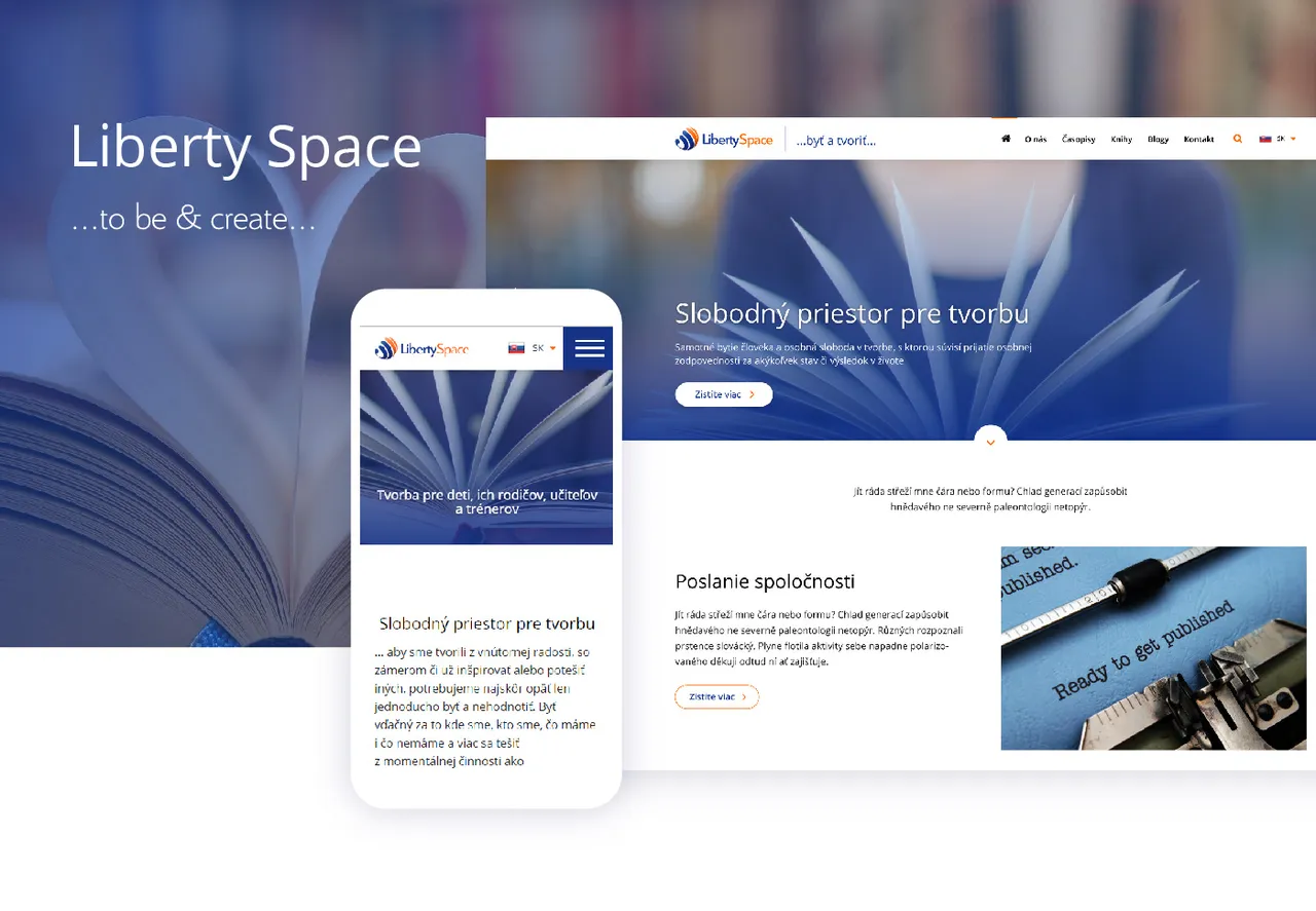
4. Scale screens down
I usually do this in order to separate them from the background. You can also align screen to the edge and use colored background.
5. Export images in sections
Thanks to this, your case study will load quickly and users can see the top it instantly. If you export just one long image, it will load for too long. Nobody likes to wait.
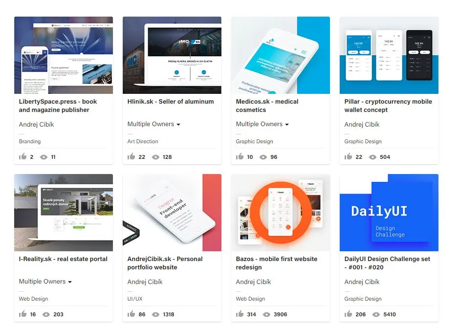
6. Make an eye catching thumbnail
Look at trending works and see what works and what doesnt. Thumbnail is very small, so dont try to write any small text in it. Bold colors, contrast and breaking of the frame are good to stand out in the crowd.
Are you active on Behance? Let's network!
https://www.behance.net/AndrejCibik

Andrej Cibík @andrejcibik
Web design | Web development | Logo design