Today I installed dapplr android app to give it a try!
It looks sooo clean and smooth I love it! But there are also some minor things that I find frustrating.
Reminder that the app is in beta test! My goal is to help its development by giving my experience as a user
What I like
- The overall look, I mean look at that!
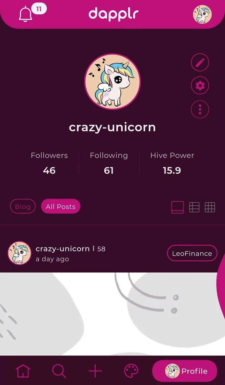
- The coloured fluid on the right edge that you want to pat just to discover it opens a "manage account" tab! Sexy.
- Hot / popular / new are on a separate "explore" tab.
- Ease of use and feeling.
- Finally lots of features for a mobile app (communities, drafts, witnesses, edit image to integrate to your post, ...).
What I dislike / suggestions
- You need to first go to your profile in order to access the settings.
- The theme tab: it's not necessary to have it as a tab as most users will use it one time and stick with their theme. Maybe it could be merged with settings to become a settings tab that will be easier to access.
- Accessing the preview when writing a post does not close your keyboard.
- No pinned post on my profile (I know that I have it on peakd, but maybe it's a peakd only feature?).
- No way to go back to the top of the page.
- user tags and links in posts could be the same color as the accent color of your theme to give some more coherence.
- No passcode to access the app?
Bugs I found
- Notification number reappears some seconds after I clicked on "Mark as read".
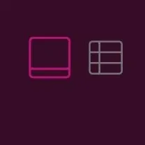
- You cannot have a grid view on the home tab?
- Text in italic seems to be bigger than the regular:
- Scrolling feels a little bit saccaded some time.
So there you have it! I have talked more about the cons because I want to help with the development of @dapplr by giving my user experience feedback. But it looks very promising to me and I'm hyped for what's next!