In Part 8 of this series, we saw that there is no convincing evidence that lockdowns and other non-pharmaceutical interventions (NPIs)—mask mandates, social distancing, quarantines, etc—save lives or even mitigate the impact of covid-19. This raises the disquieting possibility that our understanding of this disease is seriously flawed. If covid-19 is a contagious disease caused by an aerosolized virus, which is spread from infected person to uninfected person through close contact, then surely lockdowns and other NPIs would have a clear and observable effect on the spread of the disease.
But is covid-19 actually contagious?
We already know the answer to this question. Or, rather, we have already examined evidence that allows us to answer this question. In this article, we will review this evidence and supplement it with supporting evidence.
The Stringency Index
If everything we have been told about covid-19 is true, then there ought to be a clear correlation between the impact of the disease in a given state and the stringency of the NPIs imposed by the authorities in that state. A country with very stringent measures ought to have fewer covid-related cases, hospitalizations and deaths than one with much less rigorous measures.
In an earlier article, we saw that there is a commonly accepted method of measuring the stringency of a state’s NPIs—namely the Stringency Index. This is a dimensionless figure between 0 (least restrictive) and 100 (most restrictive). The Stringency Index is a composite measure based on a collection of response indicators, such as social distancing, school closures, business closures, travel restrictions, mask mandates, the banning of large-scale events, stay-at-home orders, the quarantining of healthy people, etc.
The most popular of these indices appears to be the COVID-19 Government Response Tracker, which was developed by the Blavatnik School of Government at the University of Oxford in England:
The Oxford Covid-19 Government Response Tracker (OxCGRT) collects systematic information on policy measures that governments have taken to tackle COVID-19. The different policy responses are tracked since 1 January 2020, cover more than 180 countries and are coded into 23 indicators, such as school closures, travel restrictions, vaccination policy. These policies are recorded on a scale to reflect the extent of government action, and scores are aggregated into a suite of policy indices. The data can help decision-makers and citizens understand governmental responses in a consistent way, aiding efforts to fight the pandemic. Our core working paper (BSG-WP-2020/032) provides more information on methodology and data collection.
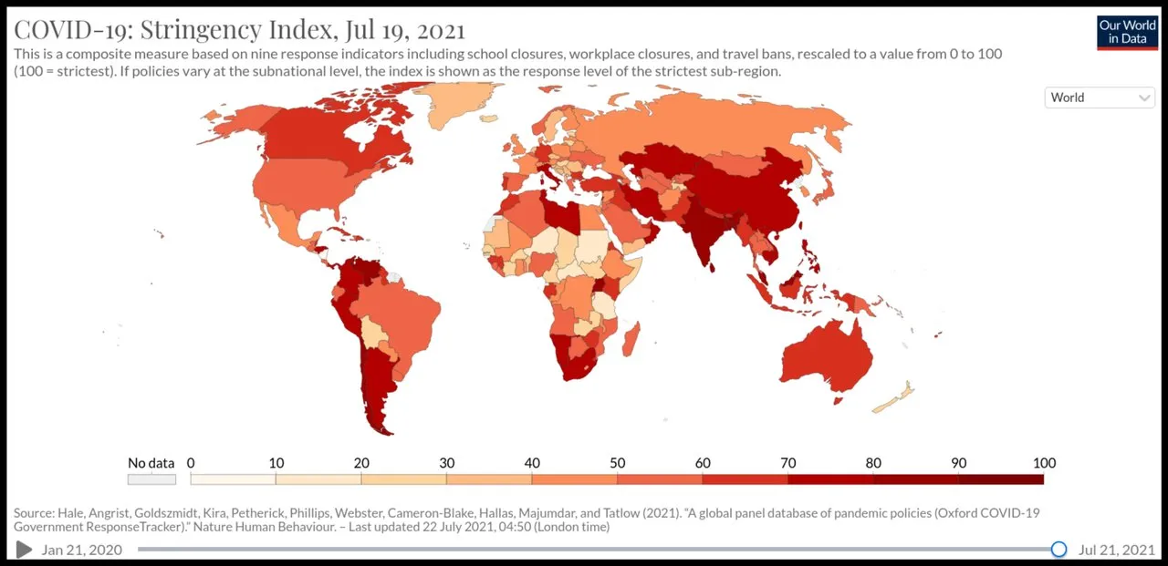
Interactive visualizations of these data are available at Our World in Data.
Covid Mortality
Is there, then, a clear correlation between a state’s Average Stringency Index (ASI) and their success at containing the spread and impact of covid-19? The following graph—from an article on Mises Wire by Anthony Rozmajzl of the Mises Institute—uses Oxford University’s Covid-19 Government Response Tracker, Our World Data:
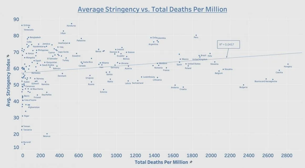
Internationally speaking, the data continue to expose lockdowns as the single greatest public health failure in human history. Plotting lockdown stringency against total covid-19 death toll reveals, yet again, zero correlation between the two variables. (Rozmajzl 6 May 2021)
Clearly, there is no correlation between ASI and total covid-related deaths per million population. There is, in fact, a slight trend in the wrong direction, as indicated by the computer-generated trend line. This may reflect the fact that NPIs cause collateral deaths, or it may just be a quirk of the data, with no statistical significance.
Perhaps the most revealing aspect of this graph is the difference in ASI among those countries that have experienced close to zero covid-related deaths per million. From Burundi, with an ASI of 14, to Eritrea, with an ASI of 86, there are approximately thirty countries, which have all done remarkably well in containing the pandemic despite the disparity in their lockdown strategies.
Note also the wide range of outcomes among the two dozen or so countries that have ASIs around 60. Among these, there is a cluster of five or six countries—unidentified on the graph—with close to zero deaths per million, while Hungary, with the same ASI, has experienced the worst outcome of all 166 nations in this dataset.
The USA also makes for an interesting case study. Here we have a single country with a population of over 330 million, in which each of the fifty states was free to follow its own health policy. This allows us to compare the efficacy of lockdowns of varying strictness in reducing covid-related deaths. The following graph—from the same article by Anthony Rozmajzl of the Mises Institute—uses Oxford University’s Covid-19 Government Response Tracker, and data from the New York Times’ Covid-19 Data Bot, WalletHub and Hallas et al:
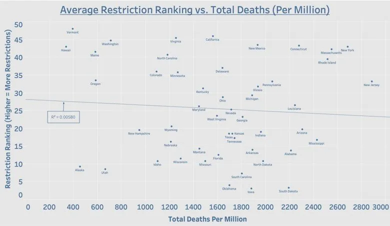
Contrary to what the public health experts have been telling us for more than a year, there is no correlation between the strength of a state’s lockdown measures and total covid-19 deaths. In fact, notorious lockdown states such as New York and New Jersey have some of the worst mortality numbers to date. To blame noncompliance for these poor numbers is ridiculous on its face considering that states with no restrictions, such as Texas and Florida, have far fewer deaths than New York and New Jersey. In fact, you’ll find that every state that has either removed its mask mandate or all covid-19 restrictions entirely is outperforming New York and New Jersey in terms of deaths. (Rozmajzl 6 May 2021)
Once again, the graph speaks for itself. This time, there is a very slight trend in the correct direction, but it is much too weak to indicate any real correlation. This supports the view that the trend in the previous graph has no statistical significance. Both plots are essentially scattergun plots, with no statistically significant trend. In conclusion, it is impossible to predict the impact of covid-19 on a community by looking at the stringency of the measures taken to deal with the epidemic.
Excess Mortality
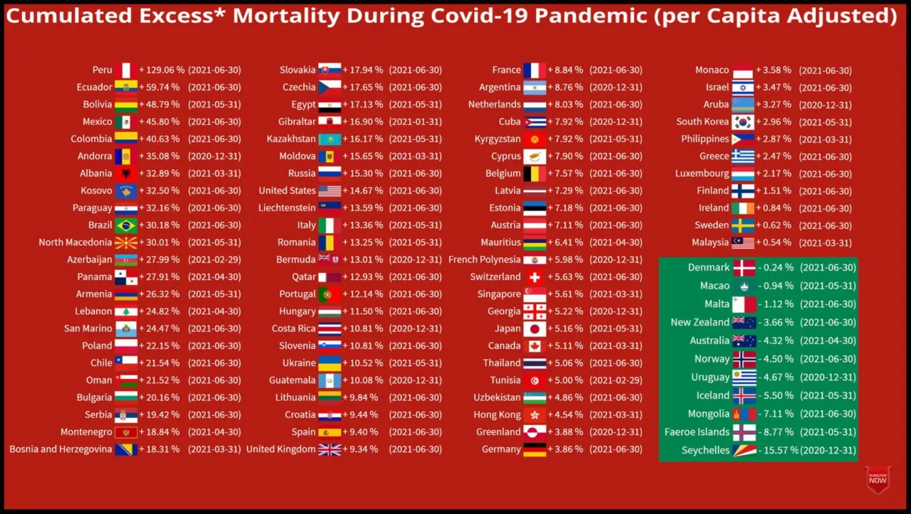
Another source of relevant data was compiled the Norwegian YouTube channel What Da Stat, whose video Excess Mortality During COVID-19 Pandemic (per Capita Adjusted), draws on The World Bank (Population Data), The Human Mortality Database, and The World Mortality Dataset for its data. Ninety-one countries are included in this animation:
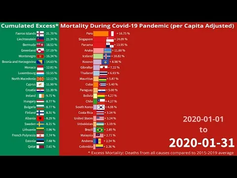
The final screen makes for interesting study. If these data sources are to be trusted, then Peru has had the worst outcome of all ninety-one countries in the dataset. But Peru’s lockdown measures have an ASI of 80, the fifth highest among the 166 countries in the graph presented above. Contrast this with Norway, which has experienced negative excess mortality (ie fewer deaths than would be expected if there were no pandemic) without any mask mandates. Norway’s ASI is just 54. Sweden too has done very well despite its relaxed and somewhat controversial response to the pandemic.
Of course, there are countries in which the mortality figures do line up with the ASI. In Australia and New Zealand, for instance, negative figures for excess mortality are associated with repressive lockdowns. But this does not alter the fact that there is no correlation between ASI and excess mortality.
Fluctuating Fortunes
Another way to test the hypothesis that covid-19 is a contagion is to track the covid-related deaths for a given country or state and see if there is any correlation with variations in the stringency index. Are increases in the severity of the lockdown measures followed by decreases in covid-related mortality? In other words: Is there any indication that government-imposed NPIs are having an impact on the progress of the pandemic?
The following graph from Oxford University shows the 7-day rolling average of covid-related deaths in the Republic of Ireland in violet. The red graph tracks the weekly value of the Stringency Index:
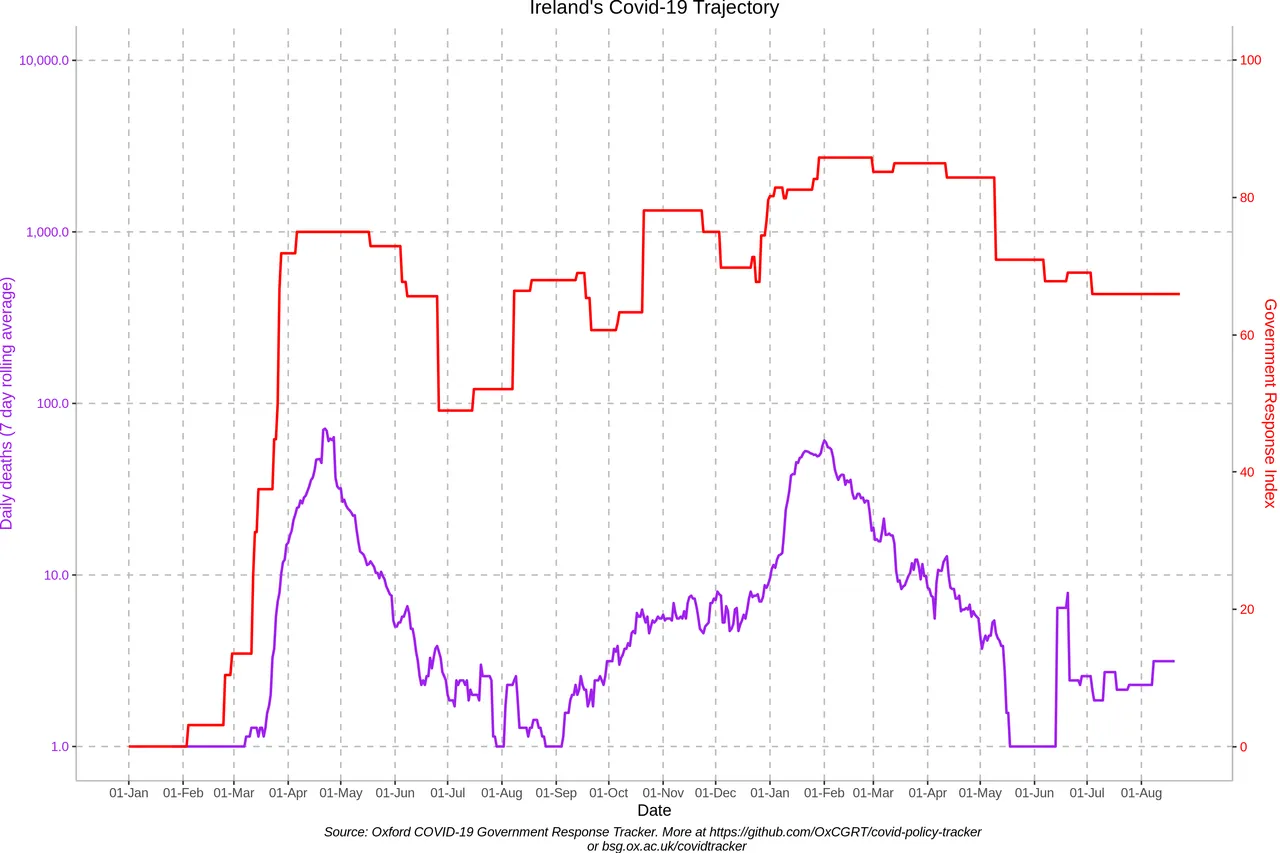
The ramping up of NPIs in February and March 2020 clearly had no impact on the emergence of the first wave of covid-related deaths. And no one could look at this graph and honestly claim that the curve was successfully flattened by these early measures. It might be argued that the restrictive measures employed in April and early May 2020 (SI = 75) played a role in ending the first wave, but this is refuted by the fact that even more stringent measures in October and November (ASI ≈ 78) did nothing to prevent the second wave, which was even worse than the first wave.
In fact, the most curious thing about these two graphs is how well they are positively correlated. That is to say, they both display similar profiles:
An initial dramatic rise to a peak
An equally dramatic fall
A more gradual rise to a second peak
A gradual fall
This is exactly what we would expect to see if the Irish government were simply responding to the rise and fall in covid-related deaths or cases by increasing or decreasing the stringency of the lockdown measures, even though these measures are not having any real effect. When cases or deaths rise, harsher measures are imposed : When cases or deaths fall, the restrictions are eased. Consequently, the red graph (SI) is shadowing the violet graph (covid-related deaths). The same pattern can be seen on the graphs of many different countries (List).
Here is Worldometers’ graph of covid-related deaths for the Republic of Ireland. How many of these deaths were actually caused by a new respiratory illness called COVID-19 is debatable, but for the sake of the argument let us accept the data as true and accurate:
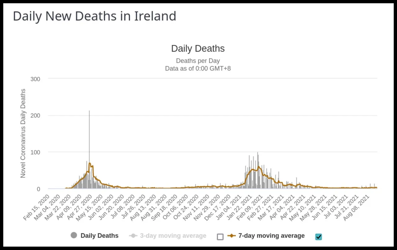
It seems clear from the graph that covid-19 is a seasonal disease, like influenza. In both 2020 and 2021, there were very few covid-related deaths in the summer months of June through September. In fact, the second wave did not emerge until January 2021—the month in which Ireland’s winter burden usually occurs. What this tells us about the nature of the disease is something we will have to investigate in a future article. The seasonality of influenza also presents a challenge to the accepted science of epidemiology.
A similar pattern of mortality can also be seen in EuroMOMO’s graph of the Republic’s z-score, a statistical value that measures trends in all-cause mortality:
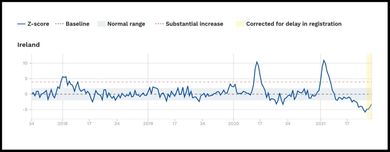
Note how little excess mortality there was in Ireland in week 28 (July) of 2021.
The following image is a rescaling of the Worldometers graph which we have just seen, showing the 7-day average of the covid-related deaths in the Republic of Ireland, superimposed with the dates on which various NPIs were imposed by the Irish government (Level 5 is the most restrictive level of lockdown):
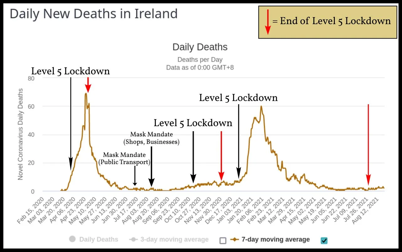
It is hard to see how anyone could conclude from this graph that these NPIs impacted the course of the epidemic. The mandatory wearing of masks and face coverings on public transport and in places of business (including shops) was introduced when the first wave of covid-19 was over and there was virtually no covid-related mortality occurring in the country. But this policy clearly had no effect on the second wave, which duly arrived in the winter and peaked in the first week of February 2021. This second wave was slightly worse than the first wave, when no one had been wearing masks.
The imposition of the first and third level-5 lockdowns were followed almost immediately and inexorably by the first and second waves of covid-related deaths. The second level-5 lockdown was prompted by a new record for the number of positive cases in one day (1205 on 5 October 2020), even though this did not translate into a subsequent surge of deaths. There is simply no correlation between covid-related mortality and government-mandated NPIs.
Comparisons
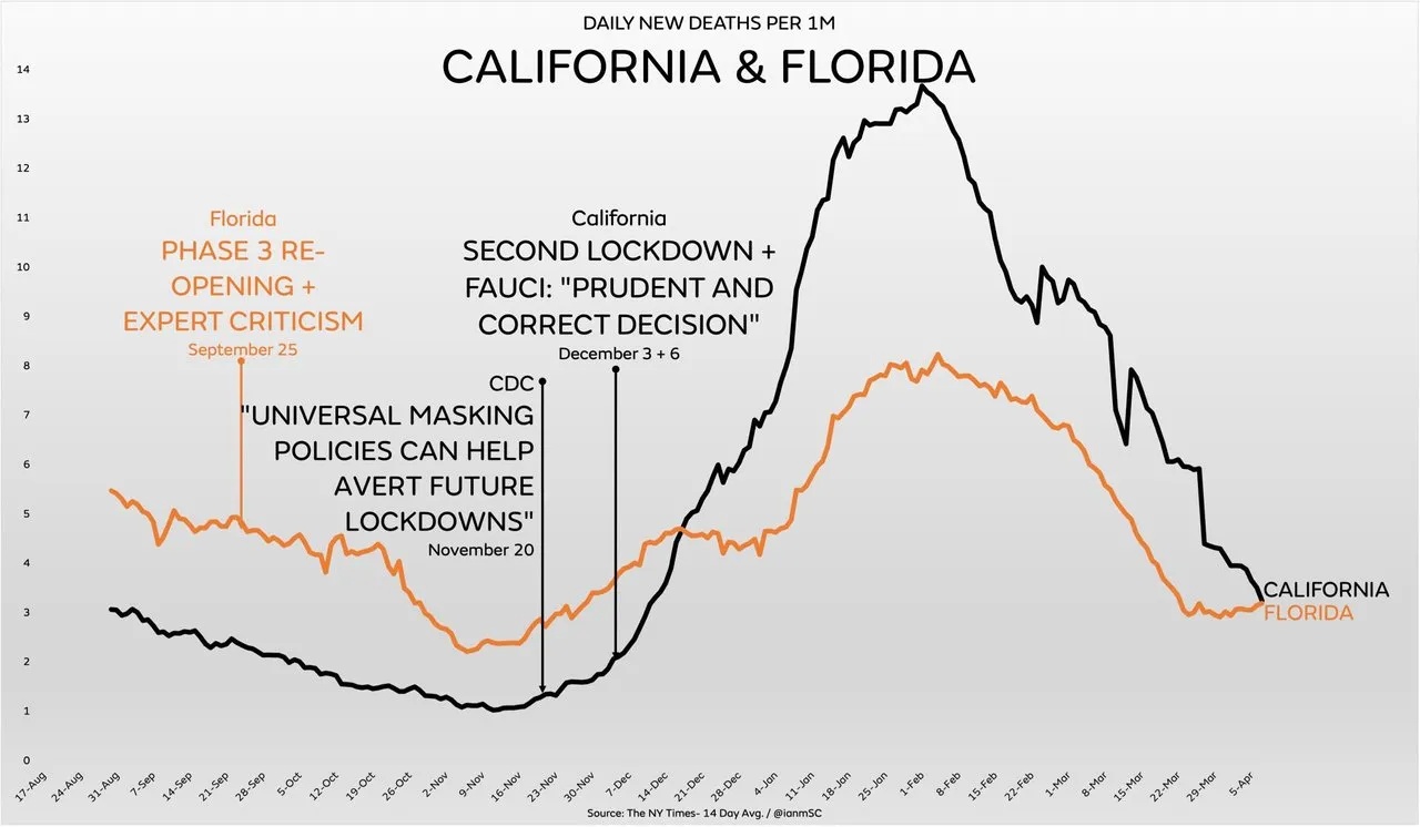
Perhaps the most striking visual images of the ineffectiveness of NPIs in controlling the spread of covid-19 are graphs which include covid-related deaths, hospitalizations or cases from two states with very different policies in place to deal with the pandemic. For example, in the United States of America, Florida and California have taken radically different approaches to the outbreak—approaches that may have been guided more by politics than by medical science. Nevertheless, their outcomes in terms of covid-related deaths are very similar, with both graphs displaying more-or-less the same profile:
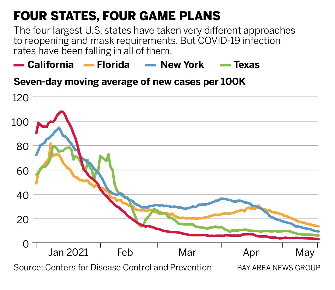
This pattern can also be seen in the graphs of new cases for the four largest states—California, New York, Florida and Texas—despite their very different approaches:
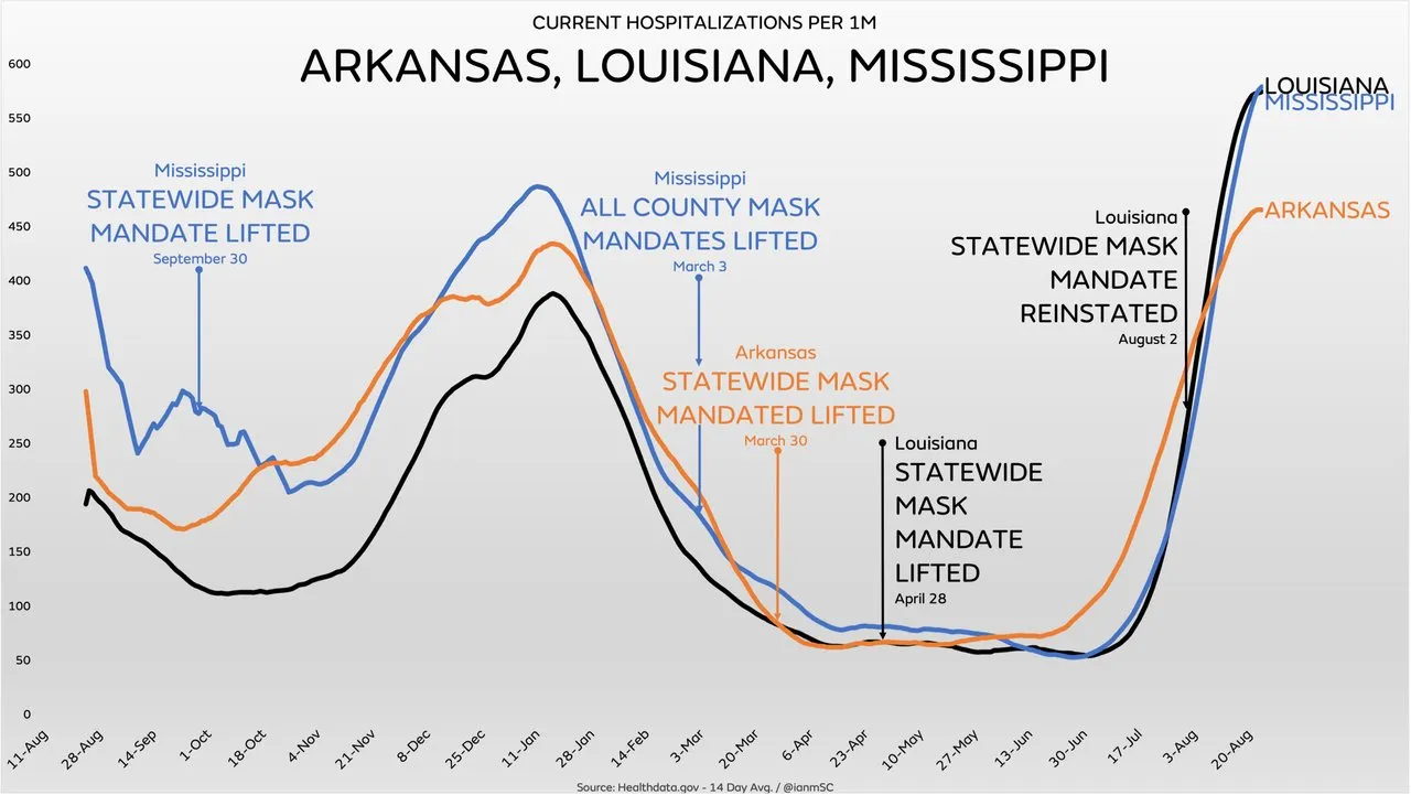
Three neighbouring states in the South Central United States—Arkansas, Louisiana, and Mississippi—have virtually identical mortality curves despite different polices on the use of face masks:
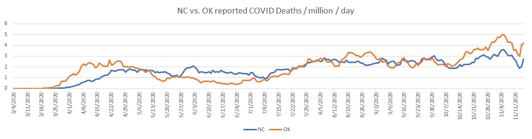
Another example is provided by North Carolina and Oklahoma. Of the fifty states in the US, North Carolina is in the top twelve when it comes to NPIs, scoring an ASI of over 40, whereas Oklahoma’s response to the pandemic has been one of the most relaxed, with an ASI of less than 5. But the graphs tracking their covid-related deaths are essentially the same:
We could continue this game ad infinitum. The Internet is replete with similar graphs in which different states or countries have experienced almost identical outcomes in terms of covid-related deaths irrespective of the measures put in place to control the spread of a contagious pathogen. Of course, one could also cherry-pick cases where different policies correspond to different outcomes. The point is that there is no pattern of correlation. The stringency of the lockdown measures and the covid-related mortality are simply not linked in any observable way.
Cofactors
Obviously, the impact of an epidemic in a given state depends on many factors: the demographic profile of the population, the general health of the population, and the local climate, for example. Geographical and economic factors may also be significant. But covid-19 is a global pandemic, affecting every country in the world. Even allowing for differences in these various cofactors, there ought to remain some observable correlation—specifically, a negative correlation—between the impact of the disease and the stringency of the NPIs. There is none.
Conclusion
What conclusion should we draw from all this data? Some people, who are fundamentally opposed to the use of lockdowns and NPIs, will conclude: virus gonna virus. Others will point out that masks are as effective at preventing the transmission of tiny viruses as chain-link fences are at stopping mosquitos, or that social distancing is useless if the virus is aerosolized and can remain suspended in the air for hours at a time.
But I do not think this is good enough. If covid-19 is an infectious disease caused by a contagious and pathogenic virus, which can be transmitted from person to person through aerosols and close contact, then surely it is only common sense that NPIs ought to have some observable effect, however weak.
Perhaps masks are not very effective at stopping the transmission of viral-loaded aerosols a few microns in diameter. Perhaps such aerosols can be transmitted through the air over distances greater than the one or two metres recommended for social distancing. Perhaps heroically staying at home is only increasing the rate of transmission in the home.
But surely the imposition of a whole raft of such measures ought to be having some observable effect. It stands to reason that masks should be more than 0% effective. A chain-link fence, after all, will obstruct some mosquitos—think of how difficult it sometimes is for a fly to find its way out through an open window. Surely social distancing is better than no distancing. And surely transmission in the community will be reduced to some extent if you lock down the economy and issue stay-at-home orders.
The fact that lockdowns and NPIs are having absolutely no observable effect can mean only one thing: Whatever covid-19 is, it is not a contagion. And once we have accepted this ineluctable conclusion, others follow in its wake:
You cannot catch covid-19 from another person. And if you have covid-19, you cannot transmit it to another person.
Covid-19 is not caused by an infectious pathogen.
So what exactly is covid-19? What causes it and how does it spread? Does it even exist? These are questions we will try to answer in the next article in this series.
And that’s a good place to stop.
References
- Thomas Hale et al, Variation in Government Responses to Covid-19, BSG-WP-2020/032, Version 12.0, Blavatnik School of Government, Oxford University, Oxford (2021)
- Anthony Rozmajzl, Why Is There No Correlation between Masks, Lockdowns, and Covid Suppression?, Mises Wire, 4 May 2021, Mises Institute, Online (2021)
Video Credits
- What Da Stat: © What Da Stat, Fair Use
Image Credits
- COVID-19 Poster: © 2021 Dublin Region Homeless Executive, Fair Use
- Covid-19 Stringency Index (19 July 2021): © Thomas Hale et al, Creative Commons License
- Average Stringency Index Versus Total Deaths per Million (World): © Anthony Rozmajzl, Fair Use
- Average Stringency Index Versus Total Deaths per Million (USA): © Anthony Rozmajzl, Fair Use
- Excess Mortality During Covid-19 Pandemic (Per Capita Adjusted): © What Da Stat, Fair Use
- Covid-Related Deaths and Stringency Index: © Oxford COVID-19 Government Response Tracker, Blavatnik School of Government, University of Oxford., Creative Commons License
- Covid-19-Related Deaths by Date (Republic of Ireland): © Worldometers, Fair Use
- Weekly Z-Scores for Republic of Ireland (September 2017 — August 2021): © EuroMOMO, Fair Use
- Covid-Related Deaths (California and Florida): © The New York Times, Fair Use
- Four States : Four Game Plans: © Centers for Disease Control and Prevention, Public Domain
- Covid-Related Deaths (Arkansas, Louisiana, and Mississippi): HealthData, Public Domain
- Covid-Related Deaths (North Carolina and Oklahoma): The COVID Tracking Project, © The Atlantic Monthly Group, Creative Commons License
- Covid Cases in South Africa during Lockdown: © Benjamin T H Smart, Alex Broadbent, Herkulaas MvE Combrink, Creative Commons License
Online Resources
- The World Bank (Population Data)
- The Human Mortality Database
- The World Mortality Dataset
- Worldometers
- RIP.ie
- Central Statistics Office (CSO)
- Northern Ireland Statistics and Research Agency (NISRA)
- Covid-19 Pandemic
- Covid-19 Pandemic in the Republic of Ireland
- Covid-19 Pandemic in Northern Ireland
- Irish Government Updates on Covid-19
- Northern Ireland Covid-19 Statistics
- The CIA’s World Factbook
- EUROMOMO
- Our World in Data
- Rational Ground