Photography is a never-ending lesson in composition and other elements. As I go through my older pictures, I frequently find an "almost" photograph that with just a little extra tweaking might find some future use. In this case, I'm using this older picture to illustrate my favorite photo-editor - Photoscape, which is free for use on Windows. (With tweaking, it can work on Linux with Wine, but I do find it easier to just use it on Windows... I do not know how to make it work with a Mac without a virtual machine.)
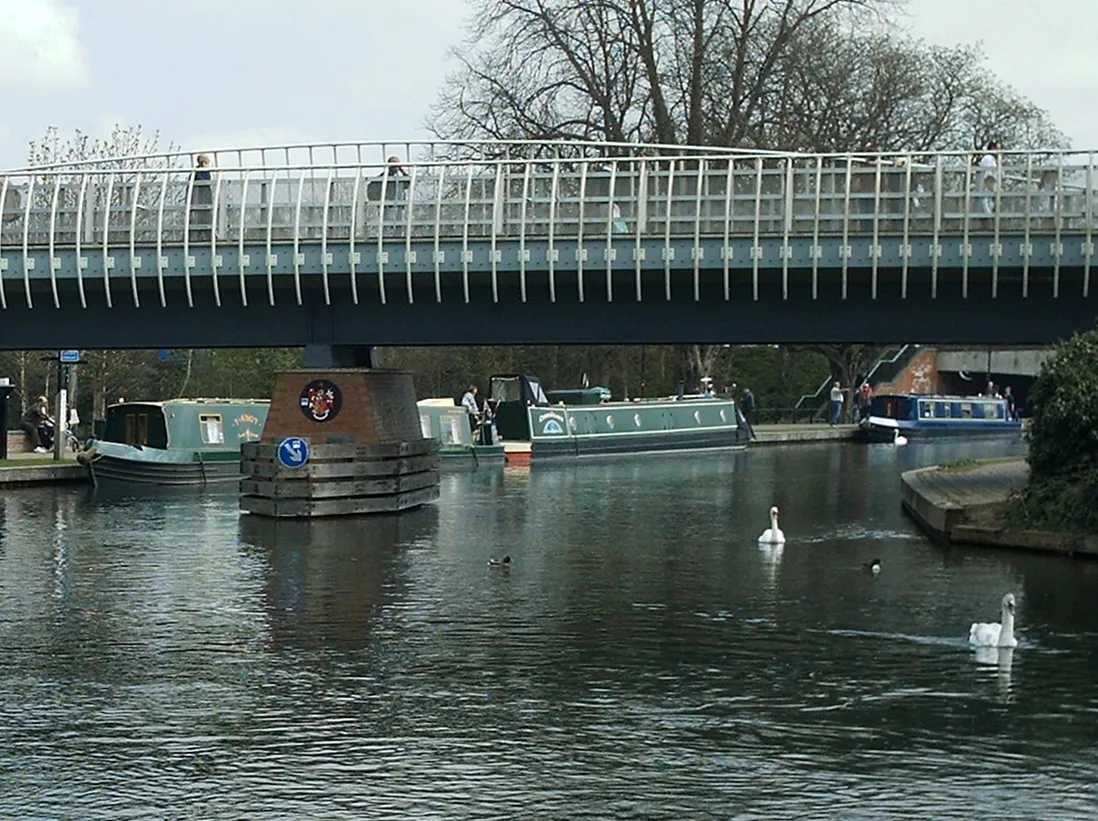
Anyway, here is the original picture, dated 2007 - before I got my Pentax semi-pro camera. So, this was a point-and-shoot compact camera with about 3 megapixels... not much by any standard!
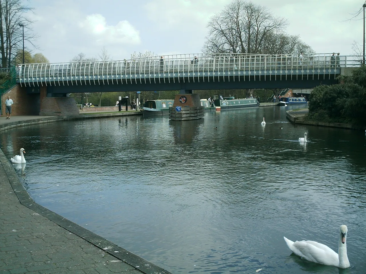
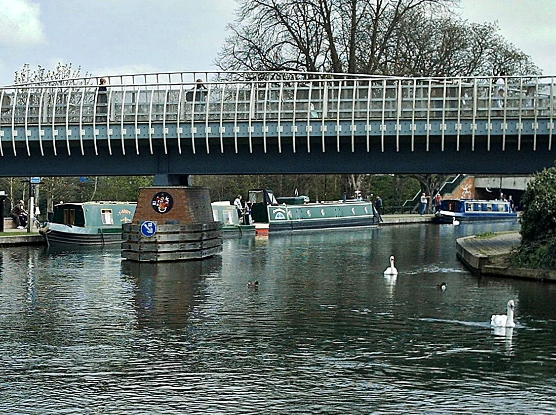
Nice picture, but I've got a lot of problems. The first problem I solve is the tilt. I love Photoscape for its arbitrary rotate function. Under the "Home" tab, there is a rotate icon which looks like a box with a line through it. I click on that and use the slider to put this image upright... In this case, I'll use the center pillar of the bridge, the boats and even those bollards on the walk to make sure it's correct.
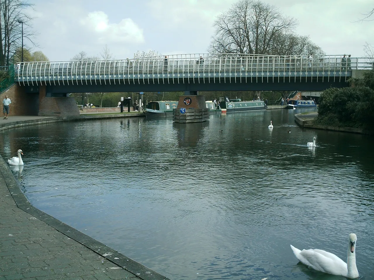
Here we are after 00.45 degrees correction.
Next, I will crop the image.
I don't really want that potentially-identifiable man walking on the path in front of the bridge. I don't have a model-release statement for him, so he really needs to be cropped out. And as much as I love swans, the one in the foreground is too far away from the bridge to add anything. So, I crop it out as well.
To do this, I go to the crop tab of Photoscape's editor. Where it wants to let me "crop freely", I will usually set the image for "crop by original photo ratio" or if I'm putting it on products, "8:10 (8x10 ratio)" seems to work the most frequently without undue hassle.
Here is my cropped image.
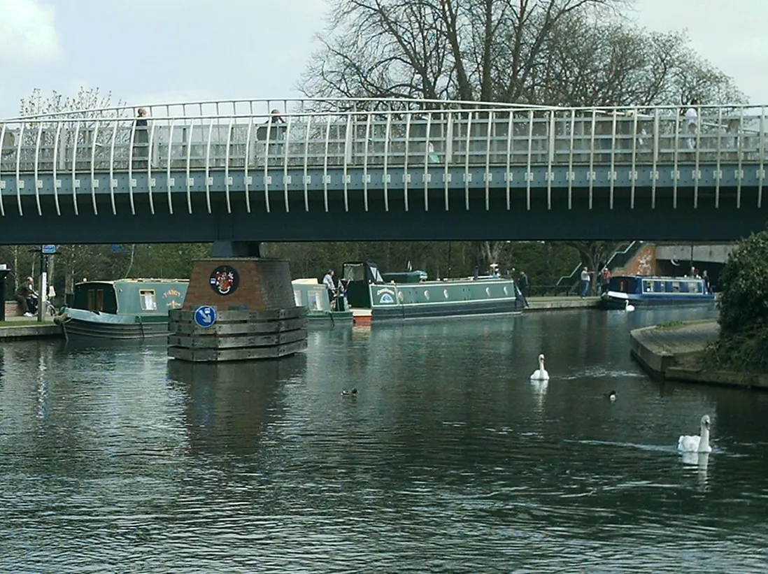
Already, the picture is looking more focused and composed. But I am not done yet. Although the colors look pretty good, I always hit the "autolevel" button (under the Home tab). Sometimes, I "undo" it and try again with the more precise settings found by clicking on the down arrow next to the button, but more often than not the auto settings are pretty good.
Here is the image after the autolevel.
Next, I hit the "sharpen" button. Again, sometimes I "undo" it, but usually, it gives a sharper, more pleasant image.
Here is the sharpened image.

We really are talking about subtle enhancements for the most part right now.
The next thing I'll do is the "contrast enhancement" setting. This is found by using the down arrow next to the "bright, color" button. Normally, I'll choose the "middle" setting for contrast enhancement (top option). Sometimes, I will use the "color enhance" option, further down this field. Sometimes, it's too harsh of a change, especially on people, but it's actually very nice. This particular image would do well with it - bringing out the colors of the canal boats and the bridge. This time, I will stick with "contrast enhancement"... mostly because I want you to see the basic settings rather than getting into the more artistic realm (which this software is actually pretty good at.)

The last main adjustment I will make is backlighting. Still on the "home" tab, I click on "backlight" one or more times. I will often take it "too far" and then just undo until I find the happy balance. I find that it really sheds light onto dark places. In this case, it brings out definition on the pillar and the overhead parts of the bridge.
Here you are.
For this particular image, I will also use a couple of other modifications for use on products at CafePress. On the "Object" tab, I click on the T icon. It brings up a text box upon which I put in my lettering. I type in the location of the image. I mess with my font, color, size and other aspects - which works in the center of the image. After I have the lettering as I want it, I use "anchor" (at the bottom of the text box) to put it where I want. Even after I hit "OK", I can use my mouse to click on the text box. I can move it to a different location or change the size, using one of the corners. This is especially useful where the 100 font size isn't large enough.
I then return to the "Home" tab and use the "Margin" tool to put my basic mat around the image. At the moment, I prefer to use it twice - once with a color that complements the image, then a smaller margin in black, but that's just my personal preference at the moment.
Here is the final image.
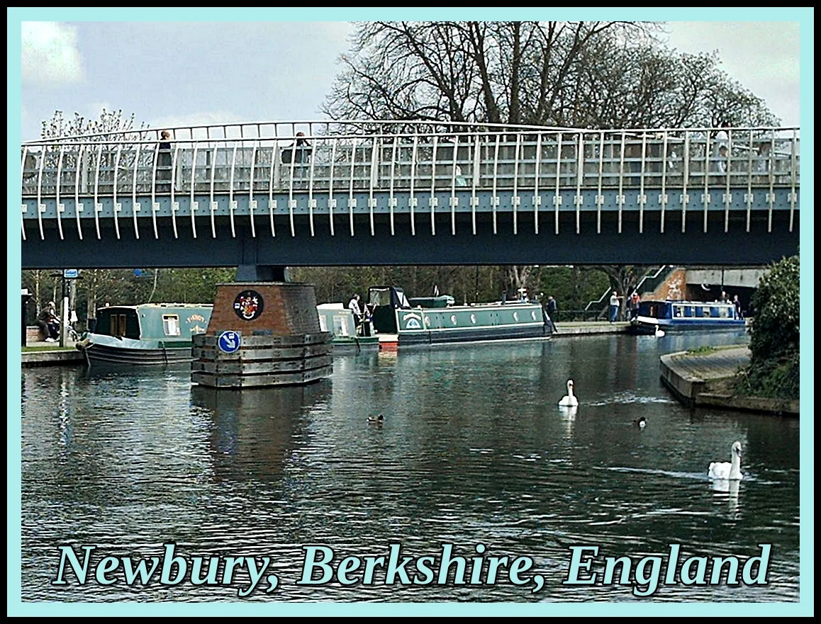
(Image available at RedBubble and ImageKind)
Compare it to the original again...
As much as I did with this image, nothing makes up for the fact that the original image was taken on a 3 megapixel compact camera!
Anyway, I hope you've enjoyed coming with me as I edited this photo.


Lori Aberle Hopkins – photographer at Viking Visual, author, student-of-the-world.
Follow, upvote and resteem me here and on Facebook
Check out my work at: RedBubble, ImageKind, and CafePress.
Camera has changed from time to time, the photographer has not. :-)
All photos are original to me and © 2008-2018.