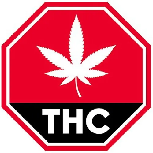
After a 2 month "consultation process", the Canadian government has considered thousands of online and written submissions, as well as input from health and law enforcement experts, governments, patient advocates and industry representatives. They came up with a symbol, to be displayed on all "legalized" cannabis products:

When I first saw it, I thought it was a joke. I checked, and there's still at least a week until April Fool's Day. This is really what millions of dollars, handfuls of experts, and 2 months gets us?
Health Canada has also decreed that brand logos must be small, plain, and single-coloured. Only one brand logo per package. A yellow background with black warning text like "do not use if breastfeeding or pregnant" must appear. (source)
Wait, I've seen that symbol somewhere before...
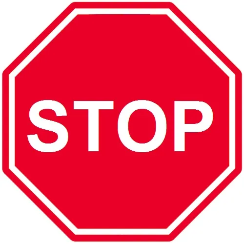
After staring at the symbol for "legalized" cannabis, it dawned on me: It's almost identical to a stop sign!

If you look closely, you too will see the similarities! (I'm being sarcastic here, because we all know a stop sign is EXACTLY what it is.)
Legalization really does boil down to that, though - a great big stop sign! It has never been about making cannabis less illegal, or about making Canadians more free. It's about controlling the people, and monopolizing an already-thriving industry.
Here's my re-design of their new logo, which better encompasses the feeling of legalization and cannabis freedom we expect:

#noprisonforplants #endcannabisprohibition #freetheweed #illegallyhealed #fuckcancer