Image credits: study by me from a photograph
A value and colour study
I wanted to try to create a digital painting from a photograph. This time I wanted to start with a grayscale value study, followed by colouring. A new process to learn... I selected a face because they are difficult. We look at faces all day long and are so used to seeing them, that everything that is slightly off becomes visible. So I had to pay attention to placement and form etc.
You can look at the original image for comparison.
So I started with values:
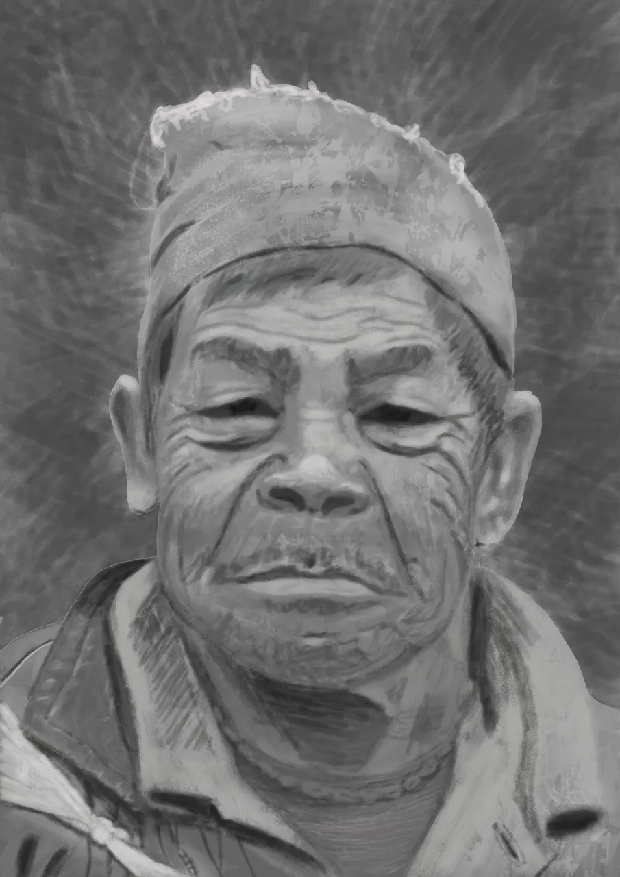
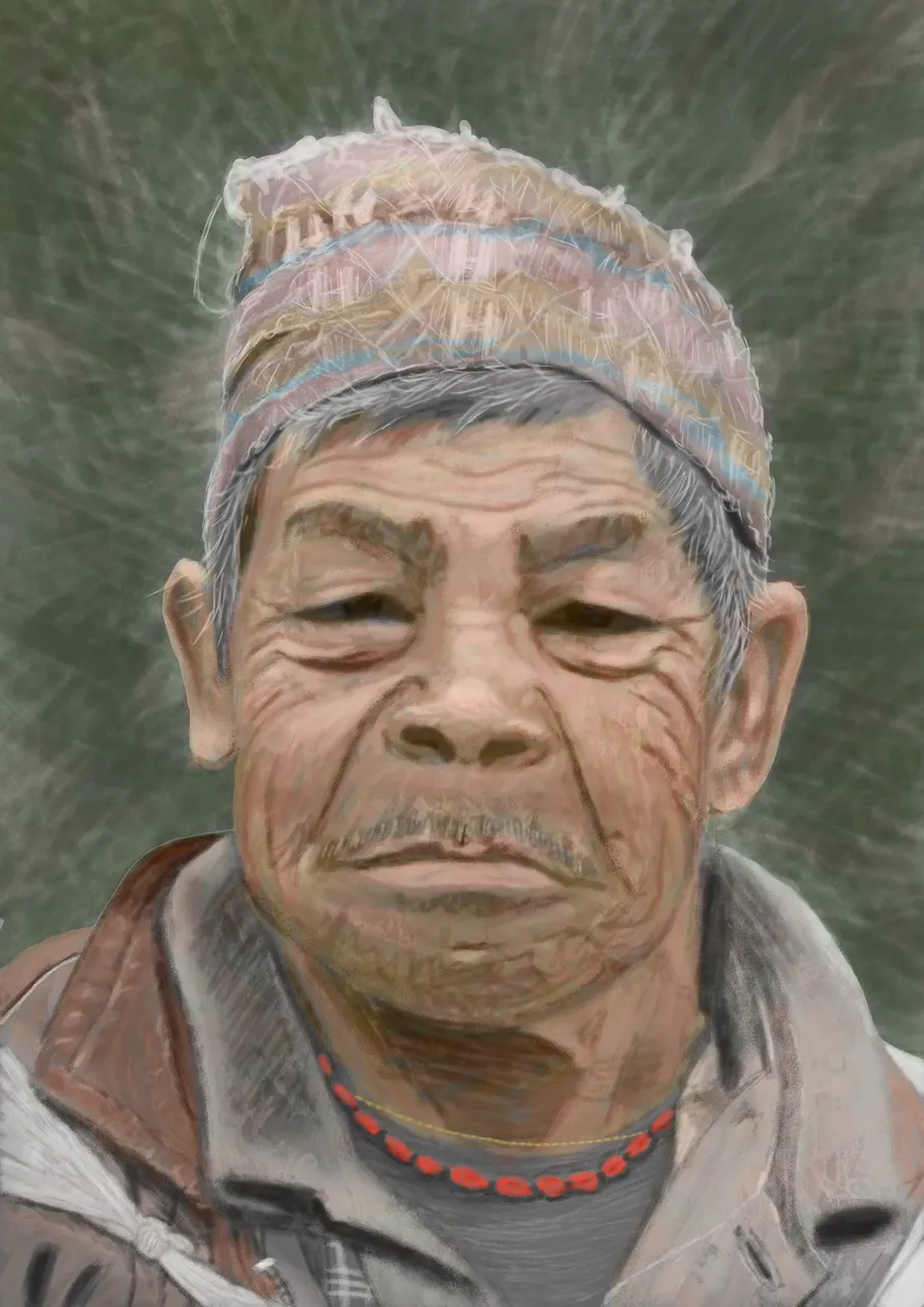
This was a difficult process and took a lot of time, but I didn't give up. I had set my mind upon finishing this one the whole way through. So now I finally had my values in, I started with a colour layer (in Photoshop CS6), filling in the approximate colours. Oh, my! I thought I would hit the right colours easily, because I had the values in place (or so I thought). So no choice to put another normal layer on top of it and paint over it until the colours were right. Loooong process!!! This is the final:
Sorry I fused the colour layers, so I cannot show you the intermediate result (which was garish, Ugh).
Any comments or tips on how to improve are always welcome. I know the colours are not exact and I wanted to keep a painterly feel. Ha, the longer I look at it now, the more 'errors' I find :-) but it was an intense and great learning experience!
Hope you enjoyed it, take care!