Two years ago, as a gift for my birthday, I received a beautiful bouquet of flowers from my parents. Flowers play a big role in how my family shows appreciation. I wanted to create a painting that would juice the gratitude I felt looking at the flowers, while also preserving their effect. A still life made as an ode to their beauty. Hence, my infatuation with the impressionists; I think they achieved this nicely.
First, to study value and find a good composition, I practiced a few charcoal drawings. For more detailed studies I use graphite. Drawing from life is great when learning to "see" better. It helps painting become more intuitive and natural. A contemporary painter named Ben Stahl mentions the importance of drawing and many other basic techniques of classical artists, especially impressionists, in a Bob Ross Episode Titled "A Portrait of Sally" you can find on youtube. I recommend watching this video if you are interested in learning a bit about him and his advice to artists.
After drawing, I noticed more about the flowers and began to understand them better. The blossoms were made of sharp, porcupine-like pedals with a supple light pink hue. Dark green stems and leaves made a nice contrast in value and color. Pale blues and greens reflected off the water and the vase's glass corners. As I studied, the view pulled me into a realm of higher awareness and even greater gratefulness! Evoking positive emotion within myself brings meaning to my art and gives me the inspiration to continue creating. The meaning behind the painting becomes a simple, yet much needed, message of love. At this point, I am ready to paint.
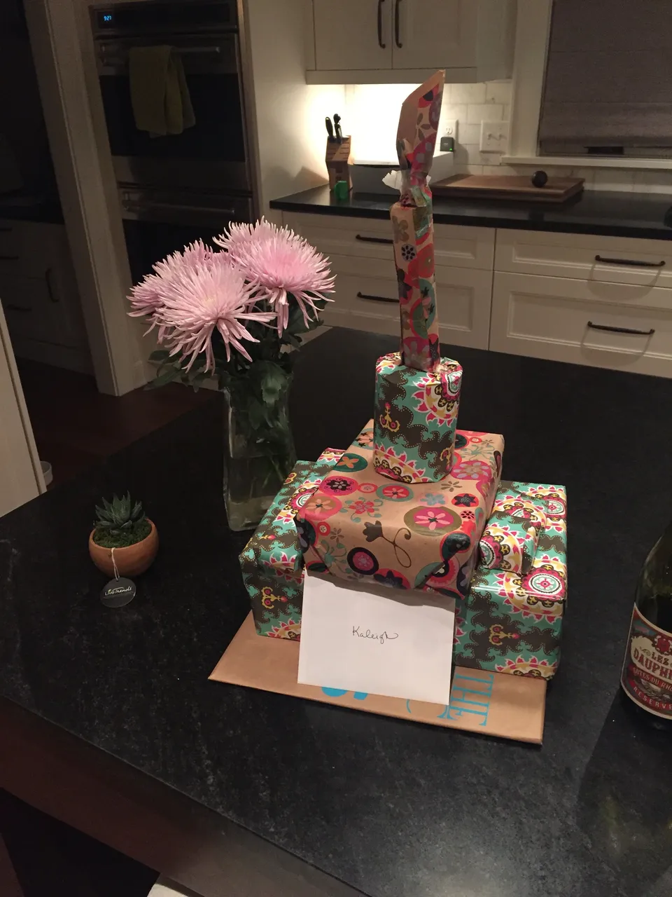
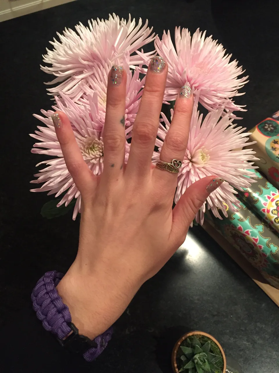
Here are some photos of the flowers when I received them. I always love to get my nails done with sparkles around my birthday for extra pizzaz.
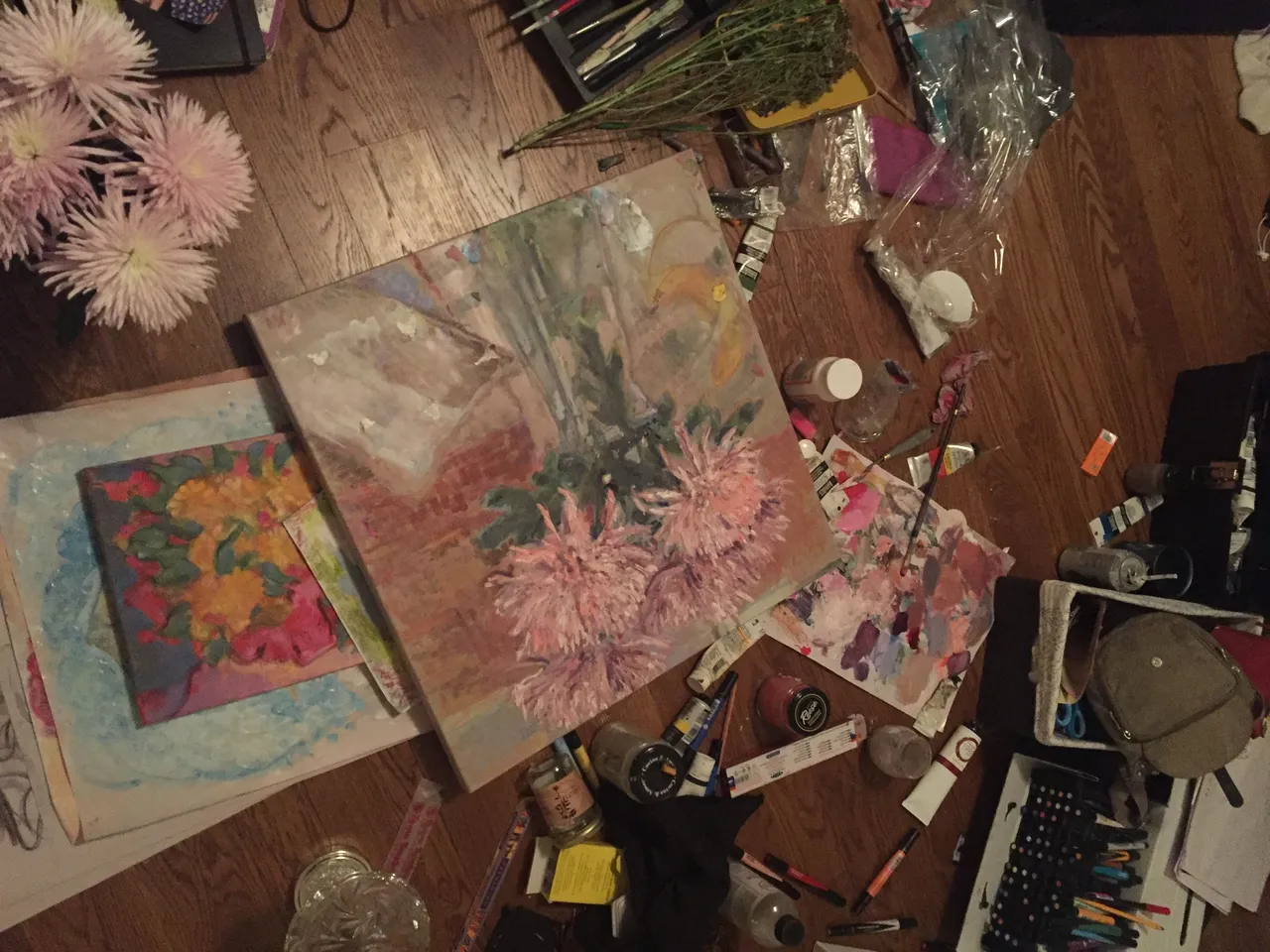
Here's a photo of the flowers and art materials on the floor of my room. A few other pieces I made at the time make an appearance in this photo, as well as in the painting. Van Gogh inspires this type of raw setup and inclusive representation that you can still find in my paintings today.
From the materials in this photo I can see that I made this painting by layering oil paint over acrylics.
Here is a close up of the painting when it was finished. Unfortunately, I didn't capture process photos of this piece, but I do remember that I made it in two sittings, about 6 hours each. It is a lower quality photo, but I will have better ones soon that I will post to a website.
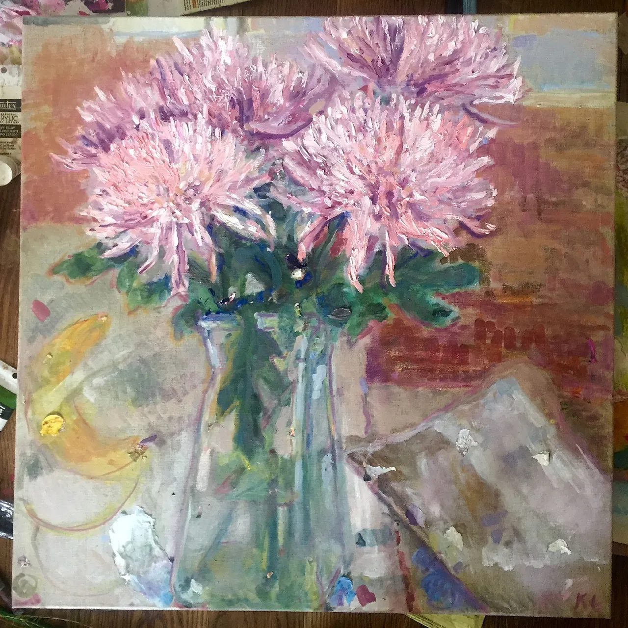
One aspect of this piece I feel is successful are the different areas of color harmony. The contrast of the red-orange wood floor with the blue greens of the leaves near the center of the painting are vibrant and dark. They lead the eye to the brightly textured blossoms. Soft transitions in color and texture are used, not only to create a greater focus on the flowers, but to fill the negative space in an interesting manner. A drawing of a banana on newsprint is seen on the left. More newsprint paper lies folded over on the right. I like this piece overall, and although it's closer to a frumpy and frustrated tone like some of Vincent's work, rather than the peaceful and poetic one of Monet's, I find the earnest attempt I made commendable. After all this is what I find charming about Van Gogh. Pieces of dried paint are lined up with colors that are naturally occurring in the painting to create more balance with the impasto pedals (Impasto is a technique of thickly applying paint to the canvas).
One weakness of the painting, in my eyes, is the lack of value. I remember being out of any cobalt, ultramarine, or french blue. I added some chips of dried Ultramarine oil paint to create a few dark focal points. Without wanting to use earth tones or black to darken areas, out of fear I would muddy them, I used green paints to make the stems. Typically I enjoy mixing colors from primary ones. Another aspect of this painting I dislike is the crop. The flowers and vase are both cut off at the top and bottom of the painting which make it look more like a scene and take away focus from the flowers. With that said, the fact that multiple subjects lead off the painting, creates a decent balance in terms of composition.
I've learned much about myself and painting since I made this piece, still, I can appreciate where I was.
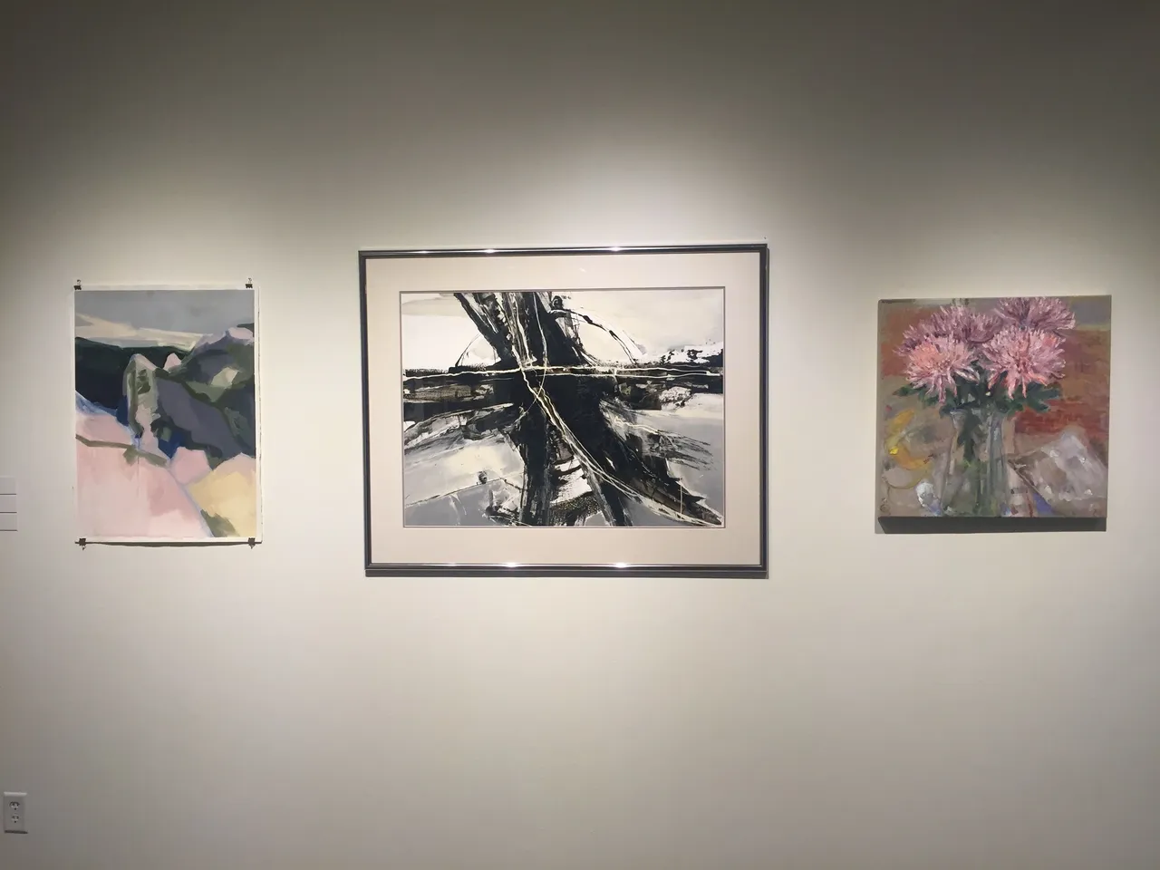
This painting hung at MCAD for the month of May last year in an exhibit for those taking CCE (College Of Continue Education) classes. I submitted some other pieces but this one was accepted. Here it is hanging along some carefully complimented paintings of other CCE Students. The class I took was on figure painting using oils.
Thank you for continuing to follow and support me even though I took an extended leave from the Steemit Community. I've been off of all social media for years now, with the exception of the occasional instagram, and have put a halt sharing my journey for far too long now. I will start to post more. To be fair, I've been focusing on the woman in the mirror, and this has taken much of my energy. I hope to make peace with putting myself out there.
Thanks for Reading!
Colorful love and light,